Understanding Server Traffic logs and detecting Denial of Service Attacks
With increased cyber-attacks, there is always a threat to the Internet Security. Distributed Denial of Service or DDoS attacks is the most common way - where a perpetrator renders network of hosts temporarily or indefinitely unavailable disrupting and taking down the servers and the services provided to their customers. This downtime costs affected companies millions of dollars due to service interruption and business unavailability. Nevertheless, many Intrusion Detection System are still manual, requiring a team of engineers monitoring 24/7. This could be solved using Predictive Analysis.
In my blog, which summarizes my presentation at EARL 2017 in San Francisco, I aim to explain what a DDoS is, mention types of ddos, describe the impact it could have on businesses and daily internet usage. Then using R language, I visualize the data that captures this information and build a Machine learning model based on Anomaly Detection that would help understand if the incoming internet traffic could be a DDoS Attack. Following this, we will analyze the performance metrics used to evaluate the prediction model.
The main intention of this talk was to walk the audience through the different stages of solving a data science problem from the very beginning in R language. As EARL is a R conference, most of the coding for the below tasks were performed in open source R and Microsoft R server.
What is DoS attack? Why is it important?
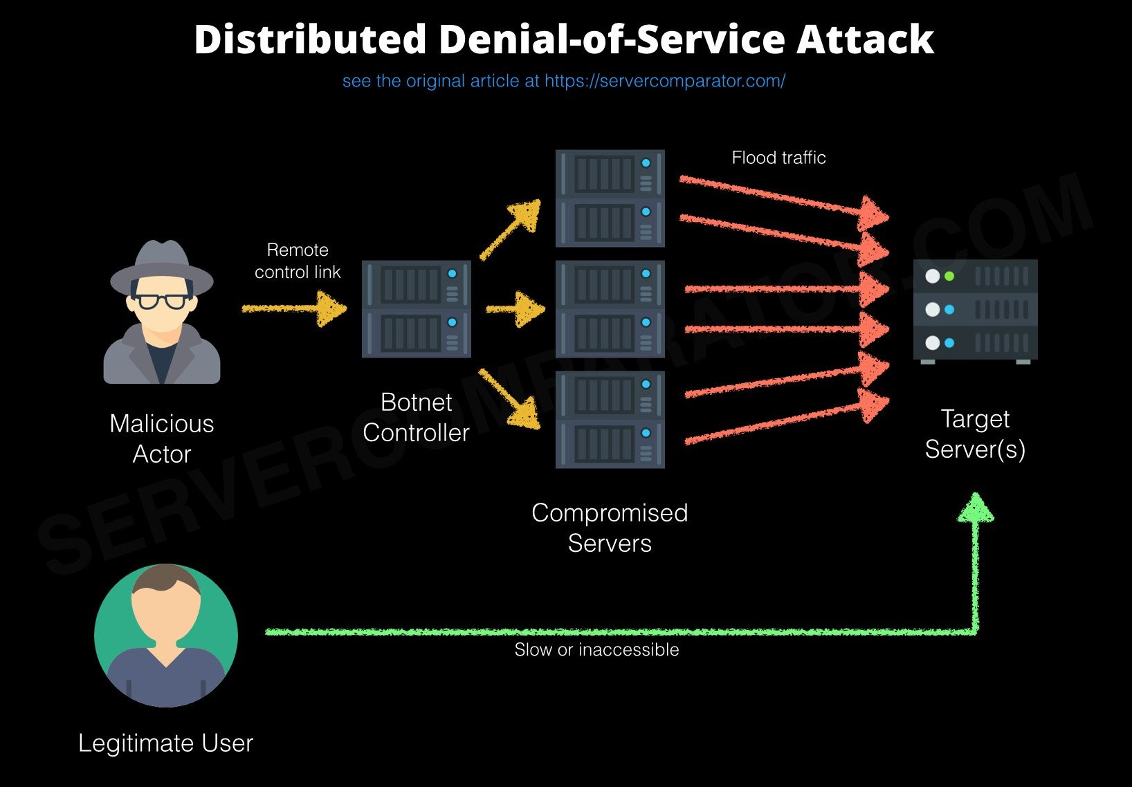
Denial of Service Attack is when a perpetuator floods the victim’s server with incoming traffic with the intention of either temporarily or permanently bring down the server and all the services that depend on the server. There are multiple types of DoS attacks based on the methodologies that is employed in performing these attacks. All of us are familiar with the TCP three-way handshake, where the requesting server sends a ACK, the target server sends an ACK-SYN back and the requesting server sends a SYN in return to establish connection. The SYN Flood attack leverages on this architecture and sends the initial ACK with a wrong source IP. The target server then sends ACK-SYN to the wrong server waiting for a response that would never come and wasting loads of resources of the server. Ultimately most of the resources are utilized rendering the server unavailable for incoming legit requests. Other common attack types are: Ping of Death (flooding the server with malformed Pings), HTTP Flood, UDP Flood, etc.
Being a victim of DoS attacks could result in long interruptions, service unavailability, loss of brand name, increased tech support, reduced productivity all leading to millions of dollars in loss. Read more about the DYN attack led by Mirai Bots that brought down Netflix, Spotify, Twitter, Heroku etc. last October leading to approximately $110 Billion loss. This attack compromised IoT devices like baby monitors and temperature sensors as zombies to flood traffic to the actual target servers. This is called Distributed Denial of Service Attack. Here’s a neat architecture from this article.

The Data
I’m using University of New South Wale’s cyber security dataset that is granted for free use for research purposes. It has over 2M records of traffic information that is labelled as an attack or not and in specific the type of attack. The dataset I extracted from this for over a period of few hours contains predominantly DOS attack and a few other related attacks.
These were some of the relevant features that the dataset had:
> colnames(complete_data)
[1] "srcip" "sport" "dstip" "dsport" "proto" "state"
[7] "dur" "sbytes" "dbytes" "sttl" "dttl" "sloss"
[13] "dloss" "service" "Sload" "Dload" "Spkts" "Dpkts"
[19] "swin" "dwin" "stcpb" "dtcpb" "smeansz" "dmeansz"
[25] "trans_depth" "res_bdy_len" "Sjit" "Djit" "Stime" "Ltime"
[31] "Sintpkt" "Dintpkt" "tcprtt" "synack" "ackdat" "is_sm_ips_ports"
[37] "ct_state_ttl" "ct_flw_http_mthd0" "is_ftp_login0" "ct_ftp_cmd0" "ct_srv_src" "ct_srv_dst"
[43] "ct_dst_ltm" "ct_src_ ltm" "ct_src_dport_ltm" "ct_dst_sport_ltm" "ct_dst_src_ltm" "isAttack"
| Duration | Incoming Source Bytes (sbytes) | Incoming Destination Bytes (dbytes) | Source Time to Live (sttl) | Destination Time to Live (dttl) |
| Source packet loss (sloss) | Destination packet loss (dloss) | Source bits pers second (Sload) | Destination bits per second (Dload) | Source average mean packet size (smeansz) |
| Destination average mean packet size (dmeansz) | Count of requests from same source port to the destination IP (ct_dst_sport_ltm) | TCP round trip time (tcprtt) | Time to SYN-ACK in the TCP connection (synack) | Response Body length (res_bdy_len) |
Data Visualization
As I wanted to explore interactive options for data visualizations, I discovered Plot.ly – an graphing library that was very interactive and provides almost all types of graphs that I wanted. The main purpose of these visualizations was to understand the distribution of the underlying dataset, the range of certain features, the skewedness of certain columns, how some features could be visually related to the response variable and to get an idea of the overall information the dataset contained.
Histogram of the Requests over a period
This graph shows you the number of requests in a window of 3 hours, the unit of X axis being minutes.
This is a Box plot showing the range of the packet sizes for both source and the destination packets.
Protocol Distribution shows the distribution of different protocols represented in the dataset, that helps understand that the dataset has predominantly TCP and UDP connections.
This graph helps understand the destination packet loss and how this feature is relevant to the attacks (shown as red dotted lines).
Mbps over time in relation to the attacks (shown as red dotted lines)
Source packet TTL vs Time with marked attack information.