Designing With Customers in Mind
Office 2010 User Research & Design
My name is Shawn Lipstein and I work in Microsoft’s Office Design Group (ODG) as a User Experience Research Lead. I wanted to take the opportunity in today’s post to both introduce ODG and share a bit about what we do. I’ll also give you a peek at future posts we’ll be writing.
Who is ODG and what do we do?
The Office Design Group is made up of both User Experience Designers and User Experience Researchers. Our job is to represent you, the end-user of our software products. We partner with product teams within Office to identify user needs and create compelling experiences. By understanding who you are and how you work we can build better software.
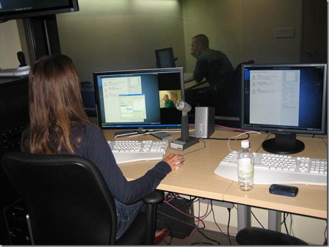
We identify user needs and create compelling experiences in a number of ways. For example, User Experience Researchers work to understand user needs early in the product development cycle using methods such as Field Visits. A field visit is when Researchers visit with users in their own environment and observe how they work with software to get their tasks done. Researchers also utilize methods such as Lab Studies (see image below) where we bring users into controlled lab environments and have them work through real world scenarios. While doing so, we use prototypes as primitive as paper drawings to actual working builds; depending on the phase we are at in the product development cycle.
The above image is a photograph of a Lab Study conducted using an early working build. |
As another example, User Experience Designers work to solve difficult design issues in innovative ways by using methods such as Wire Framing where the basic idea of a design is blueprinted. Designers also produce many iterations of a solution using high fidelity drawings and even working prototypes to ensure that all possibilities around the interaction, visual look and feel, and animations have been considered.
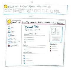
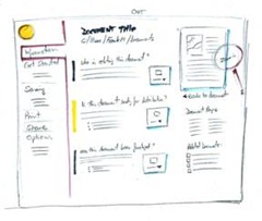
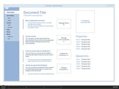
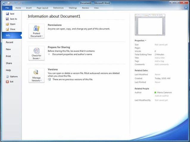
The images below show an example of the ‘Office 2010 Backstage’ going from a sketch to a working build (click on the images for a larger version).
1. Early on in the development cycle Designers will develop a multitude of hand drawn concept sketches. |
|
2. Wire Frames are made to explore layout and proportion as we begin to refine our ideas. |
3. A high fidelity rendering is created to finalize the look and feel and to clearly communicate the design intent to the rest of the team. |
|
|
|
4. A screenshot of the final build shows the accuracy that is achieved in relation to the high fidelity rendering.
As you’ve read above, the Office Design Group - made up of both Designers and Researchers - use a number of techniques to identify user needs and create compelling experiences. I’m excited to get feedback from a broader set of customers as we begin to make 2010 available. This feedback helps to ensure our software is intuitive and usable.
What is the Office Design Group (ODG) planning to post here in the future?
ODG plans to post more topics in a series on this blog about ‘Office 2010 User Research & Design.’ Some questions that my colleagues are planning to answer are:
- What Research Tools and Techniques does ODG use? Find out about the different Research tools and techniques we used in order to deliver Office 2010.
- What Design Tools and Techniques does ODG use? Find out about the different Design tools and techniques we used in order to deliver Office 2010.
- What process does ODG go through to develop Visuals and Branding? Discover the process that we go through to ensure that we have a great visuals and branding story for Office 2010.
- How does ODG Understand User Usage? The Customer Experience Improvement Program is one way that we understand how users are using the Office programs. Join us as we explain how we understand user usage which in turn helps us make design decisions as we develop Office 2010.
I look forward to reading your comments and questions about this and subsequent posts.
Comments
Anonymous
January 01, 2003
I had to switch to Office 2007 in 2007 and I have been in the same boat as so many here: I hated the ribbon and would have switched back to the old menu structure in a heart beat... if that option had been available. Then, in 2008, I had to work at a client site, on their computers, on office 2003. And guess what, I hated it! I had to search for everything because it didn't make sense anymore! And I realized that the ribbon, while taking some time to get used to, is a much more user friendly solution. Since then I tell people not to upgrade if they don't want new features. And if they upgrade because they want them, then they shouldn't complain about it...Anonymous
October 06, 2009
Have been using the Technical preview for a few weeks now. For the most part it is very stable. Two items. In receiving the preview, I received no instructions on reorting errors. I have been using the smile and frown to report issues, but they do not provide any feedback mechanism. Second, are there any updates to the original code I received? I don't find any updates on the connect site and I'm sure some of the issues I have found must have been resolved.Anonymous
October 06, 2009
fascinating if the sketches had been on a touch screen then .....Anonymous
October 06, 2009
Hi, Good that we have the User Experience Team getting involved in this blog. It would be great to have some information in conjunction with the positioning of so called "File" button Vs. The Office 2007 Orb Button. It's true that first timers might have had tough time (for a few minutes, may be?) to figure out what happened to the "File" menu! But it's been a long time since people must have got adapted to it and found the Office Button to be more user friendly and easy to access than the "File" menu. However, it is natural that not ALL people will be adaptable to "changes leading to innovation and better evolution" but most people appreciate changes that are brought to enhance user experience. In view of this, I personally do not feel the current "File" menu is in anyway more "usable" than the Office 2007 Orb Button. Not to mention about the Orb that was initially found in your sketches and wireframes (which went missing all of a sudden in the final design). If you feel the re-invented "File" menu (which brings the backstage view), is bettre in terms of evolution in designing, please justify. Was there any survey conducted as to what's more usable for end-users? If the point is to satisfy those who are finding it hard to migrate from Office 2003 to Office 2007, then the positioning of this crucial menu option (i.e. the Orb / the File menu) must be customizable. Users must have the option to choose and see what they want. Please have a look at this blog that I came across: http://blog.arkidect.com/2009/01/office-14-and-%E2%80%9Cscenic%E2%80%9D-one-small-change-can-destroy-the-ribbon.html For instance, in Windows 95 till XP we had the "Start" text in the Task Bar's Start Button. Now that it's become easier for people to recognize where the Start button is, you have removed the text and just put an Orb in the Task Bar of Windows Vista and Windows 7. That's acceptable and is welcome. But the Orb feature in Office 2007 was a real cool thing - that it's such a bad idea to remove that idea and go back to history! Hope this is listened to.Anonymous
October 08, 2009
One menu back per version is fine Why not just do this... http://tinypic.com/view.php?pic=18n19x&s=4 At least you wont lose the market shareAnonymous
October 08, 2009
I thought we had finally ridded ourselves of the dreaded File -> Exit misnomer in Office 2007... please don't revive it!Anonymous
October 08, 2009
I don't see much of a difference between images 3 and 4. Can anyone guide me to any?Anonymous
October 09, 2009
I am using very good presentation about Office 2007 design on my UI design courses. is it possible to make few presentations and short (up to 2 hours) video presentation about Office 2010 user interface design and polishing. One more thing. I see that Microsoft design guys made equation editing easear, but it is still quite bad for large number of equations. And only few design changes are required to make is almost perfect. if you are insrested to talk about this with guy who make UI design and types many equations, you re welcome to write at info dog pprog dot info :-)Anonymous
October 11, 2009
I'm waiting for your further posts, hurry up!Anonymous
October 13, 2009
The comment has been removedAnonymous
October 16, 2009
Thanks Shawn. Am pretty much looking forward for the "Office Button vs. File Tab" post. And more importantly, looking forward for a suitable design that would satisfy both worlds. Personally I will opt for the "Orb" to be back!! Let the Back Stage View be where it is... It can come up when the Orb is used! Looking forward to hear from the team again!Anonymous
October 21, 2009
i hope for the love of mankind you are putting in an option to have the menus/format UI look like the classic menus prior to 2007 version. i have used office for years, and i have tried for several weeks to get used to 2007 version, and i ABSOLUTELY FRIGGIN HATE IT!!!!!. a bad analogy - the 2007 UI rework is akin to Ford/GM deciding to re-arrange the clutch, gas and brake pedals, with no option to have them in the original format - why? Just because some dufus thinks its better. I can't express the level of dis-satisfaction i have with 2007. if 2010 is similar to 2007 in that regard, then i may be just one person, but i'll be switching over to some other office sutie, and lay foundations with a different company, one that hopefully won't pull the rug out from under its end-users, just because somebody thought it would be a good idea to put the steering wheel on the opposite side of the car, so to speak, just because they thought it would be a good idea. i used to LOVE excel and word. was a daily, devoted user. now i ABSOLUTELY HATE IT. good job. fyiAnonymous
November 17, 2009
If they wanted to improve Office they SHOULD have -
- Made outlook open multiple e-mail accounts as full exchange -not an additional mailbox with some functionality or pop/imap with very limited functionality but two seperate exchange profiles simultaneously from multiple exchange servers.
- Full OLE support for pictures in access - umm wasn't that functional with Office XP - why take that out? Why should someone have to code to add pictures to a personal database? Might was well use oracle or a real database if you are going to have to use code. Adding Office XP photo editor is the work around but why not just add photo editor back into office if that is the solution?
- Offer the old menu bar for people (most of my clients) who don't want to learn the new menu bar. You can finally modify the ribbon to some extent in 2010 however my clients just want their old ribbon bar. Frankly I have no issue with the new menu bar but I'm one person and most of my clients don't like it so prefer to stick with office 2003. MS could make money selling the new version if they just offered the old menu as a choice with the new ribbon.
Anonymous
November 21, 2009
I'm with Charles up there. I'm pretty good about adopting new s/w, and when I was forced years ago to move from WordPerfect to MSWord, I did it. But the DRASTIC UI switch from 2003 to 2007 was more than I could take. I bought a new computer in early 200 and had to go with Vista (sigh). I dutifully bought Office 2007. A week later I had uninstalled it and took the package back to the store, and got my money back. At the time I was working on an hourly basis, and used Excel extensively. I opened my first file and took about an hour to figure out how to do something that took me 2 seconds previously. I was patient for a few days, and tried to learn, but no one paid for my time, and it made my productivity (and earnings!) take such a HUGE hit, I gave up. I reiterate the comments about not changing the steering wheel, etc. I'd have been fine with transitioning to the ribbon, if they had options to use the old menu (please, MS, it could not have been THAT hard to do!). I hope 2010 will e a program that 2003 users can take on and adapt gradually. Personally I felt like I was pushed off a cliff with no chance to protest (buying 2003 was like landing in a net and climbing down a ladder). I agree with the poster who said that if MS does not make 2010 adaptable for users familiar with all the pre-2007 versions, I will absolutely give up and go learn a completely new s/w. If I have to spend time learning, I'd rather it be with a company I trust not to move my steering wheel.Anonymous
December 01, 2009
If Microsoft was designing with customers in mind, it would have either retained the classic toolbar as an option in the Office 2007 suite, or provided this as a download. Office 2007 was inflicted upon me at work. I am finding it faster to get work done by reverting to Wordperfect, which I also have on my desktop. I will not upgrade at home.Anonymous
December 02, 2009
Hey Shawn, Thanks for posting about user research. Looking forward to more. Are you going to talk about surveys and survey tools and how they are used in your User Research? Thanks.Anonymous
January 17, 2010
I don't really see a way to make a feature request for Outlook other than posting here, so here goes: I'd like a way to "lock" the positioning of the folder tree inside of the Navigation Pane's Mail Folders. I'm not talking about a password protect lock - I'm talking about a positioning and modification lock on the folder tree. Several times a week when working with email, I accidentally move/drag mail folders inside of other mail folders. It's really easy to do, particularly when you have a multiple monitor setup like I do. I'd simply like to request a lock that would prevent the moving or modification of folders in the tree.Anonymous
January 18, 2010
The comment has been removedAnonymous
February 04, 2010
The comment has been removedAnonymous
February 13, 2010
The comment has been removedAnonymous
March 13, 2010
The comment has been removed
