The Magic of Background Removal
Hi, I’m Tucker Hatfield and I’m a Program Manager on the Office Graphics team.
Pictures are great – worth 1,000 words they say – so it’s a great idea to use them to spice up a document or add some flair to a presentation. The problem is that they usually end up being self-contained rectangles in the middle of things, and they don’t really flow into the content. You can put borders or effects on them to make them look more artistic, but up until now the only way to isolate part of the picture was to go into an expensive photo editing package and learn the cumbersome process of selecting and removing portions of the image.
Background Removal is a new feature in Word, Excel, PowerPoint and Outlook that makes this process quick and easy for any picture. Unlike similar tools, the Office Background Removal tool doesn’t just select color ranges or trim to a border you draw. Background Removal uses new capabilities and algorithms from the Microsoft Research in Cambridge, UK to achieve better results automatically with very little effort or fine tuning from the user.
So, how does it work?
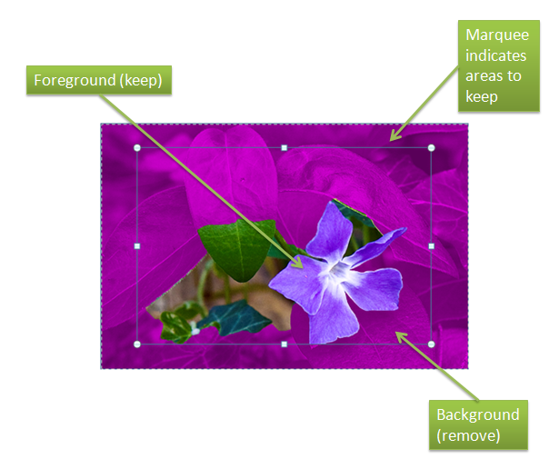
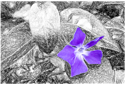
Even though I can’t explain the deepest secrets of how the code works, I can show you how to use it effectively. Let’s start with this picture and assume that we want to remove the background and keep only the flower.
Clicking the Remove Background button in Picture Tools will start the process. First off, Background Removal tries to figure out what portion of your picture is the foreground, the portion to keep, and which is the background, the portion to remove. The first step in this process is the marquee selection area that gets drawn when you first start Background Removal. When you first start the tool, you’ll see the marquee and portions of the image are overlaid with magenta. Everything marked with magenta is what Background Removal has marked as the background. The normally colored portions are foreground, and will be kept.
You’ll probably notice that the marquee is inset slightly by default. Why is that? Well, it’s rare that the subject of a photo fills the picture completely, and insetting the marquee slightly makes it easier for Background removal to figure out what is the foreground and what is the background. In general, the less background included inside the marquee the more accurate Background Removal will be.
As you can see above, if the goal is to isolate the flower, the default marquee size doesn’t really get the desired result. As it stands, the result would look like this:
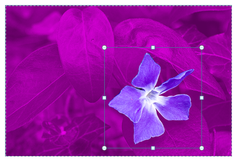
To further refine what we get, we’ll need to adjust the shape and size of the marquee. The important rule to remember is that you want the marquee to contain everything you want to keep. It’s okay if there are portions of what’s in the marquee that you don’t want to keep – the magic will do its best to figure out what to keep and what to ignore – but nothing that sticks very far outside of the marquee will be kept, so it’s important to make sure everything you want is inside. Let’s size the marquee so that it is just slightly bigger than the flower. The marquee is sized just the same as any shape or image, by grabbing the handles and resizing or dragging the whole shape to a new location.
Background removal figures out what you wanted and isolates the flower, which results in everything but the flower being removed.
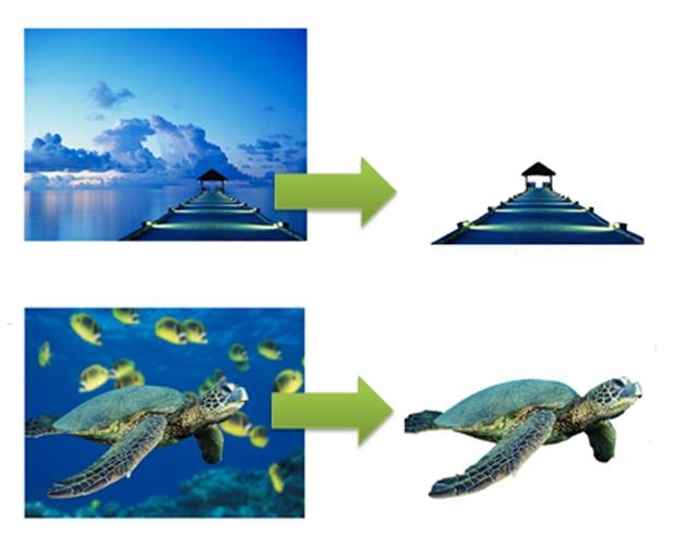
Since the system Background Removal uses to isolate foreground objects from the background isn’t simply based on color choices or contrast values, it can extract even similarly-colored objects from the background.
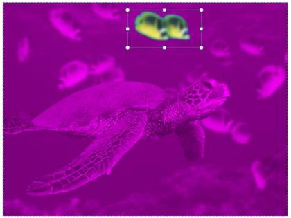
Or you can even choose to keep something other than the obvious…
Of course, no matter how good the logic is that’s trying to figure out what the foreground of the picture is, there will always be some cases where simply adjusting the marquee can’t figure out what should be kept and what should be discarded. For those cases Background Removal has some simple tools to mark up and refine your selection. We’ll talk about how to use those tools remove the background from an image that presents a problem in a future post. For now, let me close with a couple of quick illustrations of how you might use that flower we removed in the first example.
Comments
Anonymous
October 20, 2009
This is pretty awesome feature. Even I wonder what code the Office 2010 is using. But I'm eagerly waiting for it to be releasedAnonymous
October 20, 2009
what I'd really like to see is being able to flow text around the new foreground, not the original rectangular image - in this example to follow the flower petals. will that work?Anonymous
October 20, 2009
You can wrap text in Word and edge effects like Glow follow the edges of the image. Reflection and Shadows only show the foreground portion, as well. However, borders or bevels follow the rectangular bounds. Tucker Hatfield, Program Manager, MicrosoftAnonymous
October 21, 2009
This is a wonderful feature. Now I won't need to buy an expensive Masking tool any more. Thousand thanks to all the developers.Anonymous
October 21, 2009
this is pretty awesome! Just tried it - it's great!!!! I was always dreaming of it!Anonymous
October 23, 2009
That's a great feature. I already use Excel to do a lot of design work and this was something that I always wished Microsoft would include. ThanksAnonymous
October 26, 2009
Background Removal looks like a great new feature that I am sure it will come in handy. It will be nice when the public beta of Office 2010 comes out, hopefully in November so I can test this new feature out. I know this feature would have come in handy on some of the PowerPoint presentations/Posters I had to prepare in the past.Anonymous
October 26, 2009
I wish to use this feature ASAP... its awesome... keep going people...Anonymous
October 26, 2009
What an extremely cool feature! And in all programs, will make my work a lot more colorful :-)Anonymous
October 26, 2009
This will be a huge time saver for work and home use! I just tried it and am blown away with the result! Way to impact our products and add user-value!!Anonymous
October 26, 2009
Nifty! These are those small little additions that'll come in handy once every now and then, but when they do - boy, will you like it :)Anonymous
October 27, 2009
Wow. That's quite impressive. Well done!Anonymous
October 27, 2009
Great feature!!! and works awesome..I remember how difficult it was to extract a picture with removing the background.. Kudos to office team!!!Anonymous
October 28, 2009
Wow. Great job. I wonder if this "technology" will be ported over to the Mac version of office 2010. Can't wait for VBA again! Finally my mac can be useful (other than running Windows on it)Anonymous
October 29, 2009
The comment has been removedAnonymous
November 04, 2009
As an IT tutor delivering in the main all the Microsoft Office applications, I get so excited by any new features that are introduced. This looks terrific and really is quite exciting. Can't wait to start using it myself and passing on my newfound skills to clients.Anonymous
November 09, 2009
A m a z i n g !!!Anonymous
November 13, 2009
Can I recolor vector pictures, like I can with PowerPoint in Office 2003?Anonymous
November 13, 2009
Beautiful! Thanks for sharing!! Regards, image clippingAnonymous
November 20, 2009
@Yogesh Mhatre - they are using Grabcut http://www.stat.ucla.edu/~yuille/courses/Stat238-Winter09/paper_siggraph04.pdfAnonymous
December 01, 2009
Nicely done, Tucker!Anonymous
December 02, 2009
Awesome feature Helps even beginners to do wondersAnonymous
December 14, 2009
Works great in Excel and Powerpoint but I can't get it working in Word or Outlook....Anonymous
December 14, 2009
Awesome. Thanks for sharing.Anonymous
February 16, 2010
Great background removal tool!!! It would be even better if your company ever got Outlook 2010 Beta to work. I have installed it app 10 days ago and have been able to use it for two days. I tried to contact your MS Office crew to ask for instructions on how to restore my old Outlook back but they are ignoring the requests. Keep up the good work. With staff like yours why worry about the competition putting you out to pasture?Anonymous
April 16, 2010
hé, look what i've found... http://www.youtube.com/watch?v=anoGVGi1iqI apple is using this for many years, it even works easier/better. I know where i'm talking about, use both mac osX and windows. And tried iWork and Office 2010. guess, iWork wins. When are u guys gonna make things easy to use. You make even easy to use tools less easy. :SAnonymous
April 18, 2010
No, Thomas. Office 2010's background removal works much better. And iWork is a joke compared to Office 2010. Windows 7 is the best OS in the World. I guess Microsoft wins and Apple loses. Not that big a surprise, is it?Anonymous
April 20, 2010
@ Dean I've been in IT (yes with windows) for few years and now i'm working with mac. I use dual boot and tested both, and think you're wrong. I use both, just because office has more features it is better.Anonymous
June 22, 2010
I can't wait to give it a try, fingers crossed

