Time chart
Applies to: ✅ Microsoft Fabric ✅ Azure Data Explorer ✅ Azure Monitor ✅ Microsoft Sentinel
A time chart visual is a type of line graph. The first column of the query is the x-axis, and should be a datetime. Other numeric columns are y-axes. One string column values are used to group the numeric columns and create different lines in the chart. Other string columns are ignored. The time chart visual is similar to a line chart except the x-axis is always time.
Note
This visualization can only be used in the context of the render operator.
Syntax
T | render timechart [with (propertyName = propertyValue [, ...])]
Learn more about syntax conventions.
Parameters
| Name | Type | Required | Description |
|---|---|---|---|
| T | string |
✔️ | Input table name. |
| propertyName, propertyValue | string |
A comma-separated list of key-value property pairs. See supported properties. |
Supported properties
All properties are optional.
| PropertyName | PropertyValue |
|---|---|
accumulate |
Whether the value of each measure gets added to all its predecessors (true or false). |
legend |
Whether to display a legend or not (visible or hidden). |
series |
Comma-delimited list of columns whose combined per-record values define the series that record belongs to. |
ymin |
The minimum value to be displayed on Y-axis. |
ymax |
The maximum value to be displayed on Y-axis. |
title |
The title of the visualization (of type string). |
xaxis |
How to scale the x-axis (linear or log). |
xcolumn |
Which column in the result is used for the x-axis. |
xtitle |
The title of the x-axis (of type string). |
yaxis |
How to scale the y-axis (linear or log). |
ycolumns |
Comma-delimited list of columns that consist of the values provided per value of the x column. |
ysplit |
How to split multiple the visualization. For more information, see ysplit property. |
ytitle |
The title of the y-axis (of type string). |
ysplit property
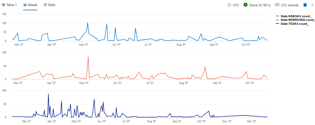
This visualization supports splitting into multiple y-axis values:
ysplit |
Description |
|---|---|
none |
A single y-axis is displayed for all series data. (Default) |
axes |
A single chart is displayed with multiple y-axes (one per series). |
panels |
One chart is rendered for each ycolumn value (up to some limit). |
Examples
Render a timechart
let min_t = datetime(2017-01-05);
let max_t = datetime(2017-02-03 22:00);
let dt = 2h;
demo_make_series2
| make-series num=avg(num) on TimeStamp from min_t to max_t step dt by sid
| where sid == 'TS1'   //  select a single time series for a cleaner visualization
| extend (baseline, seasonal, trend, residual) = series_decompose(num, -1, 'linefit')  //  decomposition of a set of time series to seasonal, trend, residual, and baseline (seasonal+trend)
| render timechart with(title='Web app. traffic of a month, decomposition')
Label a time chart
StormEvents
| where StartTime between (datetime(2007-01-01) .. datetime(2007-12-31))
    and DamageCrops > 0
| summarize EventCount = count() by bin(StartTime, 7d)
| render timechart
    with (
    title="Crop damage over time",
    xtitle="Date",
    ytitle="Crop damage",
    legend=hidden
    )
View multiple y-axes
StormEvents
| where State in ("TEXAS", "NEBRASKA", "KANSAS") and EventType == "Hail"
| summarize count() by State, bin(StartTime, 1d)
| render timechart with (ysplit=panels)
Related content
Supported properties
All properties are optional.
| PropertyName | PropertyValue |
|---|---|
series |
Comma-delimited list of columns whose combined per-record values define the series that record belongs to. |
title |
The title of the visualization (of type string). |
Example
let min_t = datetime(2017-01-05);
let max_t = datetime(2017-02-03 22:00);
let dt = 2h;
demo_make_series2
| make-series num=avg(num) on TimeStamp from min_t to max_t step dt by sid
| where sid == 'TS1'   //  select a single time series for a cleaner visualization
| extend (baseline, seasonal, trend, residual) = series_decompose(num, -1, 'linefit')  //  decomposition of a set of time series to seasonal, trend, residual, and baseline (seasonal+trend)
| render timechart with(title='Web app. traffic of a month, decomposition')


