Начало работы с Службы коммуникации Azure библиотекой пользовательского интерфейса, вызываемой в Приложения Голосовой связи Teams
Этот проект направлен на запуск вызова из Службы коммуникации Azure вызова веб-пакета SDK для Teams в очередь вызовов Teams и автосекретаря с помощью библиотеки пользовательского интерфейса коммуникации Azure.
В соответствии с вашими требованиями вам может потребоваться предложить клиентам простой способ связаться с вами без сложной настройки.
Вызов очереди звонков Teams и автосекретарь — это простая и эффективная концепция, которая упрощает мгновенное взаимодействие с поддержкой клиентов, финансовым консультантом и другими командами, которые сталкиваются с клиентами. Цель этого руководства — помочь вам в инициировании взаимодействия с клиентами при нажатии кнопки в Интернете.
Если вы хотите попробовать его, вы можете скачать код с GitHub.
В этом руководстве будет приведено следующее:
- Позволяет управлять аудио- и видеосообращением клиентов в зависимости от вашего сценария клиента.
- Узнайте, как создать мини-приложение для запуска вызовов в веб-приложении с помощью библиотеки пользовательского интерфейса.
Необходимые компоненты
Эти действия необходимы для выполнения этого руководства. Обратитесь к администратору Teams за последними двумя элементами, чтобы убедиться, что вы правильно настроены.
- Visual Studio Code на одной из поддерживаемых платформ.
- рекомендуется Node.js, active LTS (долгосрочная поддержка) и версии Node 20. Используйте команду
node --version, чтобы проверить установленную версию. - Ресурс Служб коммуникации Azure. Создание ресурса связи
- Выполните настройку клиента Teams для взаимодействия с ресурсом Службы коммуникации Azure
- Работа с очередями вызовов Teams и Службы коммуникации Azure.
- Работа с автосекретарями Teams и Службы коммуникации Azure.
Проверка узла и Visual Studio Code
Вы можете проверить правильность установки узла с помощью этой команды.
node -v
Выходные данные сообщают о том, что у вас есть версия, она завершается ошибкой, если узел не установлен и добавлен в ваш PATH. Как и в случае с узлом, можно проверить, установлен ли VS Code с помощью этой команды.
code --version
Как и в случае с node, эта команда завершается ошибкой, если на компьютере возникла проблема с установкой VS Code.
Начало работы
В этом руководстве содержится 7 шагов, и в конце приложения можно будет вызвать голосовое приложение Teams. Вот что нужно сделать:
- Настройка проекта
- Получение зависимостей
- Начальная настройка приложения
- Создание мини-приложения
- Стиль мини-приложения
- Настройка значений удостоверений
- Запуск приложения
1. Настройка проекта
Используйте этот шаг, только если вы создаете новое приложение.
Чтобы настроить приложение React, мы используем средство командной create-react-app строки. Это средство позволяет легко запускать приложение TypeScript на базе React.
Чтобы убедиться, что на компьютере установлен узел, выполните следующую команду в PowerShell или терминале, чтобы просмотреть версию узла:
node -v
Если на компьютере не create-react-app установлено, выполните следующую команду, чтобы установить ее в качестве глобальной команды:
npm install -g create-react-app
После установки этой команды выполните следующую команду, чтобы создать новое приложение React, чтобы создать пример в:
# Create an Azure Communication Services App powered by React.
npx create-react-app ui-library-calling-widget-app --template typescript

# Change to the directory of the newly created App.
cd ui-library-calling-widget-app
После завершения этих команд необходимо открыть созданный проект в VS Code. Проект можно открыть с помощью следующей команды.
code .
2. Получение зависимостей
Затем необходимо обновить массив зависимостей в пакетеpackage.json, чтобы включить некоторые пакеты из Службы коммуникации Azure для работы с мини-приложением:
"@azure/communication-calling": "^1.23.1",
"@azure/communication-chat": "^1.4.0",
"@azure/communication-react": "^1.15.0",
"@azure/communication-calling-effects": "1.0.1",
"@azure/communication-common": "2.3.0",
"@fluentui/react-icons": "~2.0.203",
"@fluentui/react": "~8.98.3",
Чтобы установить необходимые пакеты, выполните следующую команду Node диспетчер пакетов.
npm install
После установки этих пакетов все настроено, чтобы начать написание кода, который создает приложение. В этом руководстве мы изменим файлы в каталоге src .
3. Начальная настройка приложения
Чтобы приступить к работе, замените предоставленное App.tsx содержимое главной страницей, которая:
- Сохраните все сведения о коммуникации Azure, необходимые для создания CallAdapter для работы с вызовами.
- Отображение нашего мини-приложения, которое предоставляется конечному пользователю.
Файл App.tsx должен выглядеть следующим образом:
src/App.tsx
import "./App.css";
import {
  CommunicationIdentifier,
  MicrosoftTeamsAppIdentifier,
} from "@azure/communication-common";
import {
  Spinner,
  Stack,
  initializeIcons,
  registerIcons,
  Text,
} from "@fluentui/react";
import { CallAdd20Regular, Dismiss20Regular } from "@fluentui/react-icons";
import logo from "./logo.svg";

import { CallingWidgetComponent } from "./components/CallingWidgetComponent";

registerIcons({
  icons: { dismiss: <Dismiss20Regular />, callAdd: <CallAdd20Regular /> },
});
initializeIcons();
function App() {
  /**
   * Token for local user.
   */
  const token = "<Enter your ACS Token here>";

  /**
   * User identifier for local user.
   */
  const userId: CommunicationIdentifier = {
    communicationUserId: "Enter your ACS Id here",
  };

  /**
   * Enter your Teams voice app identifier from the Teams admin center here
   */
  const teamsAppIdentifier: MicrosoftTeamsAppIdentifier = {
    teamsAppId: "<Enter your Teams Voice app id here>",
    cloud: "public",
  };

  const widgetParams = {
    userId,
    token,
    teamsAppIdentifier,
  };

  if (!token || !userId || !teamsAppIdentifier) {
    return (
      <Stack verticalAlign="center" style={{ height: "100%", width: "100%" }}>
        <Spinner
          label={"Getting user credentials from server"}
          ariaLive="assertive"
          labelPosition="top"
        />
      </Stack>
    );
  }

  return (
    <Stack
      style={{ height: "100%", width: "100%", padding: "3rem" }}
      tokens={{ childrenGap: "1.5rem" }}
    >
      <Stack tokens={{ childrenGap: "1rem" }} style={{ margin: "auto" }}>
        <Stack
          style={{ padding: "3rem" }}
          horizontal
          tokens={{ childrenGap: "2rem" }}
        >
          <Text style={{ marginTop: "auto" }} variant="xLarge">
            Welcome to a Calling Widget sample
          </Text>
          <img
            style={{ width: "7rem", height: "auto" }}
            src={logo}
            alt="logo"
          />
        </Stack>

        <Text>
          Welcome to a Calling Widget sample for the Azure Communication
          Services UI Library. Sample has the ability to connect you through
          Teams voice apps to a agent to help you.
        </Text>
        <Text>
          As a user all you need to do is click the widget below, enter your
          display name for the call - this will act as your caller id, and
          action the <b>start call</b> button.
        </Text>
      </Stack>
      <Stack
        horizontal
        tokens={{ childrenGap: "1.5rem" }}
        style={{ overflow: "hidden", margin: "auto" }}
      >
        <CallingWidgetComponent
          widgetAdapterArgs={widgetParams}
          onRenderLogo={() => {
            return (
              <img
                style={{ height: "4rem", width: "4rem", margin: "auto" }}
                src={logo}
                alt="logo"
              />
            );
          }}
        />
      </Stack>
    </Stack>
  );
}

export default App;
В этом фрагменте кода мы регистрируем два новых значка <Dismiss20Regular/> и <CallAdd20Regular>. Эти новые значки используются внутри компонента мини-приложения, который мы создадим в следующем разделе.
4. Создание мини-приложения
Теперь нам нужно сделать мини-приложение, которое может отображаться в трех разных режимах:
- Ожидание. Это состояние мини-приложения заключается в том, как компонент будет находиться до и после вызова
- Настройка: это состояние, когда мини-приложение запрашивает информацию от пользователя, как его имя.
- В вызове: мини-приложение заменено здесь на call call Composite библиотеки пользовательского интерфейса. Этот режим мини-приложения — это когда пользователь вызывает голосовое приложение или разговаривает с агентом.
Позволяет создать папку с именем src/components. В этой папке создайте новый файл с именем CallingWidgetComponent.tsx. Этот файл должен выглядеть следующим фрагментом кода:
CallingWidgetComponent.tsx
import {
  IconButton,
  PrimaryButton,
  Stack,
  TextField,
  useTheme,
  Checkbox,
  Icon,
  Spinner,
} from "@fluentui/react";
import React, { useEffect, useRef, useState } from "react";
import {
  callingWidgetSetupContainerStyles,
  checkboxStyles,
  startCallButtonStyles,
  callingWidgetContainerStyles,
  callIconStyles,
  logoContainerStyles,
  collapseButtonStyles,
} from "../styles/CallingWidgetComponent.styles";

import {
  AzureCommunicationTokenCredential,
  CommunicationUserIdentifier,
  MicrosoftTeamsAppIdentifier,
} from "@azure/communication-common";
import {
  CallAdapter,
  CallAdapterState,
  CallComposite,
  CommonCallAdapterOptions,
  StartCallIdentifier,
  createAzureCommunicationCallAdapter,
} from "@azure/communication-react";
// lets add to our react imports as well
import { useMemo } from "react";

import { callingWidgetInCallContainerStyles } from "../styles/CallingWidgetComponent.styles";

/**
 * Properties needed for our widget to start a call.
 */
export type WidgetAdapterArgs = {
  token: string;
  userId: CommunicationUserIdentifier;
  teamsAppIdentifier: MicrosoftTeamsAppIdentifier;
};

export interface CallingWidgetComponentProps {
  /**
   *  arguments for creating an AzureCommunicationCallAdapter for your Calling experience
   */
  widgetAdapterArgs: WidgetAdapterArgs;
  /**
   * Custom render function for displaying logo.
   * @returns
   */
  onRenderLogo?: () => JSX.Element;
}

/**
 * Widget for Calling Widget
 * @param props
 */
export const CallingWidgetComponent = (
  props: CallingWidgetComponentProps
): JSX.Element => {
  const { onRenderLogo, widgetAdapterArgs } = props;

  const [widgetState, setWidgetState] = useState<"new" | "setup" | "inCall">(
    "new"
  );
  const [displayName, setDisplayName] = useState<string>();
  const [consentToData, setConsentToData] = useState<boolean>(false);
  const [useLocalVideo, setUseLocalVideo] = useState<boolean>(false);
  const [adapter, setAdapter] = useState<CallAdapter>();

  const callIdRef = useRef<string>();

  const theme = useTheme();

  // add this before the React template
  const credential = useMemo(() => {
    try {
      return new AzureCommunicationTokenCredential(widgetAdapterArgs.token);
    } catch {
      console.error("Failed to construct token credential");
      return undefined;
    }
  }, [widgetAdapterArgs.token]);

  const adapterOptions: CommonCallAdapterOptions = useMemo(
    () => ({
      callingSounds: {
        callEnded: { url: "/sounds/callEnded.mp3" },
        callRinging: { url: "/sounds/callRinging.mp3" },
        callBusy: { url: "/sounds/callBusy.mp3" },
      },
    }),
    []
  );

  const callAdapterArgs = useMemo(() => {
    return {
      userId: widgetAdapterArgs.userId,
      credential: credential,
      targetCallees: [
        widgetAdapterArgs.teamsAppIdentifier,
      ] as StartCallIdentifier[],
      displayName: displayName,
      options: adapterOptions,
    };
  }, [
    widgetAdapterArgs.userId,
    widgetAdapterArgs.teamsAppIdentifier.teamsAppId,
    credential,
    displayName,
  ]);

  useEffect(() => {
    if (adapter) {
      adapter.on("callEnded", () => {
        /**
         * We only want to reset the widget state if the call that ended is the same as the current call.
         */
        if (
          adapter.getState().acceptedTransferCallState &&
          adapter.getState().acceptedTransferCallState?.id !== callIdRef.current
        ) {
          return;
        }
        setDisplayName(undefined);
        setWidgetState("new");
        setConsentToData(false);
        setAdapter(undefined);
        adapter.dispose();
      });

      adapter.on("transferAccepted", (e) => {
        console.log("transferAccepted", e);
      });

      adapter.onStateChange((state: CallAdapterState) => {
        if (state?.call?.id && callIdRef.current !== state?.call?.id) {
          callIdRef.current = state?.call?.id;
          console.log(`Call Id: ${callIdRef.current}`);
        }
      });
    }
  }, [adapter]);

  /** widget template for when widget is open, put any fields here for user information desired */
  if (widgetState === "setup") {
    return (
      <Stack
        styles={callingWidgetSetupContainerStyles(theme)}
        tokens={{ childrenGap: "1rem" }}
      >
        <IconButton
          styles={collapseButtonStyles}
          iconProps={{ iconName: "Dismiss" }}
          onClick={() => {
            setDisplayName(undefined);
            setConsentToData(false);
            setUseLocalVideo(false);
            setWidgetState("new");
          }}
        />
        <Stack tokens={{ childrenGap: "1rem" }} styles={logoContainerStyles}>
          <Stack style={{ transform: "scale(1.8)" }}>
            {onRenderLogo && onRenderLogo()}
          </Stack>
        </Stack>
        <TextField
          label={"Name"}
          required={true}
          placeholder={"Enter your name"}
          onChange={(_, newValue) => {
            setDisplayName(newValue);
          }}
        />
        <Checkbox
          styles={checkboxStyles(theme)}
          label={
            "Use video - Checking this box will enable camera controls and screen sharing"
          }
          onChange={(_, checked?: boolean | undefined) => {
            setUseLocalVideo(!!checked);
            setUseLocalVideo(true);
          }}
        ></Checkbox>
        <Checkbox
          required={true}
          styles={checkboxStyles(theme)}
          disabled={displayName === undefined}
          label={
            "By checking this box, you are consenting that we will collect data from the call for customer support reasons"
          }
          onChange={async (_, checked?: boolean | undefined) => {
            setConsentToData(!!checked);
            if (callAdapterArgs && callAdapterArgs.credential) {
              setAdapter(
                await createAzureCommunicationCallAdapter({
                  displayName: displayName ?? "",
                  userId: callAdapterArgs.userId,
                  credential: callAdapterArgs.credential,
                  targetCallees: callAdapterArgs.targetCallees,
                  options: callAdapterArgs.options,
                })
              );
            }
          }}
        ></Checkbox>
        <PrimaryButton
          styles={startCallButtonStyles(theme)}
          onClick={() => {
            if (displayName && consentToData && adapter) {
              setWidgetState("inCall");
              adapter?.startCall(callAdapterArgs.targetCallees, {
                audioOptions: { muted: false },
              });
            }
          }}
        >
          {!consentToData && `Enter your name`}
          {consentToData && !adapter && (
            <Spinner ariaLive="assertive" labelPosition="top" />
          )}
          {consentToData && adapter && `StartCall`}
        </PrimaryButton>
      </Stack>
    );
  }

  if (widgetState === "inCall" && adapter) {
    return (
      <Stack styles={callingWidgetInCallContainerStyles(theme)}>
        <CallComposite
          adapter={adapter}
          options={{
            callControls: {
              cameraButton: useLocalVideo,
              screenShareButton: useLocalVideo,
              moreButton: false,
              peopleButton: false,
              displayType: "compact",
            },
            localVideoTile: !useLocalVideo ? false : { position: "floating" },
          }}
        />
      </Stack>
    );
  }

  return (
    <Stack
      horizontalAlign="center"
      verticalAlign="center"
      styles={callingWidgetContainerStyles(theme)}
      onClick={() => {
        setWidgetState("setup");
      }}
    >
      <Stack
        horizontalAlign="center"
        verticalAlign="center"
        style={{
          height: "4rem",
          width: "4rem",
          borderRadius: "50%",
          background: theme.palette.themePrimary,
        }}
      >
        <Icon iconName="callAdd" styles={callIconStyles(theme)} />
      </Stack>
    </Stack>
  );
};
В этой CallAdapterOptionsстатье мы видим некоторые звуковые файлы, на которые ссылается ссылка, эти файлы предназначены для использования функции "Вызывающие звуки" в этой CallCompositeстатье. Если вы хотите использовать звуки, просмотрите полный код для скачивания звуковых файлов.
5. Стиль мини-приложения
Необходимо написать некоторые стили, чтобы убедиться, что мини-приложение выглядит соответствующим образом и может содержать составный вызов. Эти стили уже должны использоваться в мини-приложении при копировании фрагмента кода, добавленного в файл CallingWidgetComponent.tsx.
Позволяет создать новую папку src/styles , вызываемую в этой папке, создать файл с именем CallingWidgetComponent.styles.ts. Файл должен выглядеть следующим фрагментом кода:
import {
  IButtonStyles,
  ICheckboxStyles,
  IIconStyles,
  IStackStyles,
  Theme,
} from "@fluentui/react";

export const checkboxStyles = (theme: Theme): ICheckboxStyles => {
  return {
    label: {
      color: theme.palette.neutralPrimary,
    },
  };
};

export const callingWidgetContainerStyles = (theme: Theme): IStackStyles => {
  return {
    root: {
      width: "5rem",
      height: "5rem",
      padding: "0.5rem",
      boxShadow: theme.effects.elevation16,
      borderRadius: "50%",
      bottom: "1rem",
      right: "1rem",
      position: "absolute",
      overflow: "hidden",
      cursor: "pointer",
      ":hover": {
        boxShadow: theme.effects.elevation64,
      },
    },
  };
};

export const callingWidgetSetupContainerStyles = (
  theme: Theme
): IStackStyles => {
  return {
    root: {
      width: "18rem",
      minHeight: "20rem",
      maxHeight: "25rem",
      padding: "0.5rem",
      boxShadow: theme.effects.elevation16,
      borderRadius: theme.effects.roundedCorner6,
      bottom: 0,
      right: "1rem",
      position: "absolute",
      overflow: "hidden",
      cursor: "pointer",
      background: theme.palette.white,
    },
  };
};

export const callIconStyles = (theme: Theme): IIconStyles => {
  return {
    root: {
      paddingTop: "0.2rem",
      color: theme.palette.white,
      transform: "scale(1.6)",
    },
  };
};

export const startCallButtonStyles = (theme: Theme): IButtonStyles => {
  return {
    root: {
      background: theme.palette.themePrimary,
      borderRadius: theme.effects.roundedCorner6,
      borderColor: theme.palette.themePrimary,
    },
    textContainer: {
      color: theme.palette.white,
    },
  };
};

export const logoContainerStyles: IStackStyles = {
  root: {
    margin: "auto",
    padding: "0.2rem",
    height: "5rem",
    width: "10rem",
    zIndex: 0,
  },
};

export const collapseButtonStyles: IButtonStyles = {
  root: {
    position: "absolute",
    top: "0.2rem",
    right: "0.2rem",
    zIndex: 1,
  },
};

export const callingWidgetInCallContainerStyles = (
  theme: Theme
): IStackStyles => {
  return {
    root: {
      width: "35rem",
      height: "25rem",
      padding: "0.5rem",
      boxShadow: theme.effects.elevation16,
      borderRadius: theme.effects.roundedCorner6,
      bottom: 0,
      right: "1rem",
      position: "absolute",
      overflow: "hidden",
      cursor: "pointer",
      background: theme.semanticColors.bodyBackground,
    },
  };
};
6. Настройка значений удостоверений
Перед запуском приложения перейдите App.tsx к значениям заполнителей и замените их идентификаторами Службы коммуникации Azure удостоверениями и идентификатором учетной записи ресурса для приложения Голосовой связи Teams. Ниже приведены входные значения для tokenuserId и teamsAppIdentifier.
./src/App.tsx
/**
 * Token for local user.
 */
const token = "<Enter your ACS Token here>";

/**
 * User identifier for local user.
 */
const userId: CommunicationIdentifier = {
  communicationUserId: "Enter your ACS Id here",
};

/**
 * Enter your Teams voice app identifier from the Teams admin center here
 */
const teamsAppIdentifier: MicrosoftTeamsAppIdentifier = {
  teamsAppId: "<Enter your Teams Voice app id here>",
  cloud: "public",
};
7. Запуск приложения
Наконец, мы можем запустить приложение, чтобы сделать наши звонки! Выполните следующие команды, чтобы установить наши зависимости и запустить наше приложение.
# Install the newe dependencies
npm install

# run the React app
npm run start
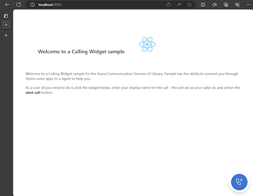
После запуска приложения его http://localhost:3000 можно увидеть в браузере. Появится следующий экран-заставка:
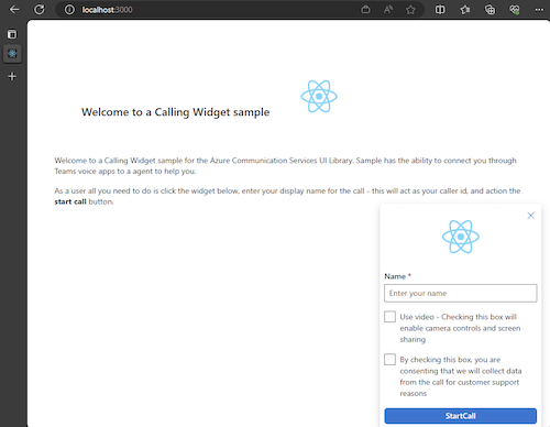
Затем при действии кнопки мини-приложения вы увидите небольшое меню:
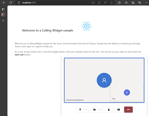
После заполнения имени нажмите кнопку "Начать звонок" и вызов должен начинаться. Мини-приложение должно выглядеть так после запуска вызова:
Следующие шаги
Дополнительные сведения о голосовых приложениях Teams см. в нашей документации по автосекретарям Teams и очередям вызовов Teams. Кроме того, ознакомьтесь с нашим руководством по созданию аналогичного интерфейса с пакетами JavaScript.
Краткое руководство. Присоединение вызывающего приложения к очереди вызовов Teams
Краткое руководство. Присоединение вызывающего приложения к автосекретарю Teams
Обратная связь
Ожидается в ближайшее время: в течение 2024 года мы постепенно откажемся от GitHub Issues как механизма обратной связи для контента и заменим его новой системой обратной связи. Дополнительные сведения см. в разделе https://aka.ms/ContentUserFeedback.
Отправить и просмотреть отзыв по