Exercise - Gain insights by using intelligent insights dashboards
Intelligent insights helps you perform deeper analysis on your calculated and precalculated emissions data. An advanced AI model powers these intelligence insights, and you can generate them monthly to highlight outliers, trends, and correlations.
Intelligent insights are based on historical trends, seasonality, and data anomalies. This functionality scans your organization’s data in Microsoft Sustainability Manager. It identifies opportunities, short-term and long-term, for reductions that align to your sustainability initiatives. Additionally, it enhances decision making and credibility by improving the accuracy of emissions reporting and helping you progress toward your carbon footprint goals.
Intelligent insights provides a centralized location for you to view all your outlier, trend, and correlation insights. You can use the natural language expressions to gain a clear explanation of each insight and then bookmark the insights that matter to you the most. You can also select a day of the month on which to generate new insights on your data.
In this exercise, you assume the persona of Amber Rodriguez, the sustainability specialist for Contoso Corp. You view the intelligent insights dashboards to gain deeper insights on your calculated and precalculated emissions data. In this exercise, you use the sample data provided at the time of deployment.
Task: Schedule an intelligent insights model run
In this task, Amber schedules an intelligent insights model run on the twenty-fifth day of every month. However, you can schedule it for any day between the first and the twenty-eighth of the month.
Note
Model runs occur once a month on your entire All emissions table, dating back four years at most. The default day on which Microsoft Sustainability Manager runs the model is the fifth day of every month.
Note
When the system generates new insights, it deletes previous insights that aren't bookmarked.
In Microsoft Sustainability Manager, go to the Settings area and then select Application.
On the General page, select the Insights (preview) tab.
In the dropdown box, select the day of the month for the model run and then select Save.
Task: Review the Intelligent insights dashboard
In this task, Amber explores the Intelligent insights dashboard, which provides an overview of outliers, trends, and correlations that the functionality breaks down by facility, date range, carbon emissions, organizational unit, and country/region.
In Microsoft Sustainability Manager, select Analytics > Intelligent insights (preview) on the left navigation pane.
Review the Outliers dashboard, which displays the significant difference in emissions from others within the same context. The dashboard helps you discover data quality issues or areas that require action.
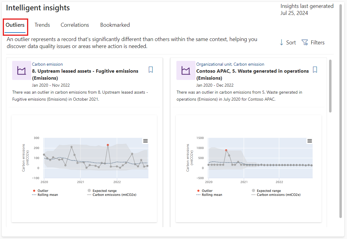
Select Filters in the upper-right corner.
You can filter the Intelligent insights up or down by facility, date range, carbon emissions, organizational unit, and country/region. Additionally, you can layer filters for more fine-tuned results.
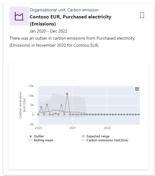
You can filter insights with the Purchased electricity category to receive the results as shown in the following screenshot.


You can view more details of outlier subtypes.
- Time series - Time series outliers show outliers in the time series data in various contexts after the monthly data aggregation. They also show the rolling mean of the series and the expected range for the series to help provide more context about why specific datapoints are detected as outliers.
Change point - A change point is a sudden jump or drop in the data. It can result from data quality issues, missing data, or by not ingesting data regularly.
Contribution - Contribution outliers highlight areas where an individual entity contributes a significant portion of the emissions compared to other entities in the same context.
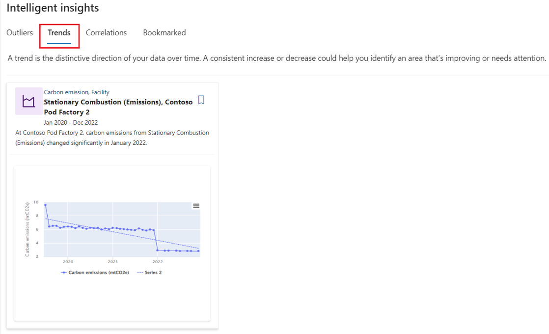
Select the Trends tab.
A trend is the distinctive direction of your data over time. It shows the direction in which your data is trending over time, in an increasing or decreasing manner. In addition to regular trends, such as the one shown in the following image, anomalous trends occur. When the system detects many trends in the data, it analyzes them collectively to determine if anomalous trends increased or decreased faster than the other trends.
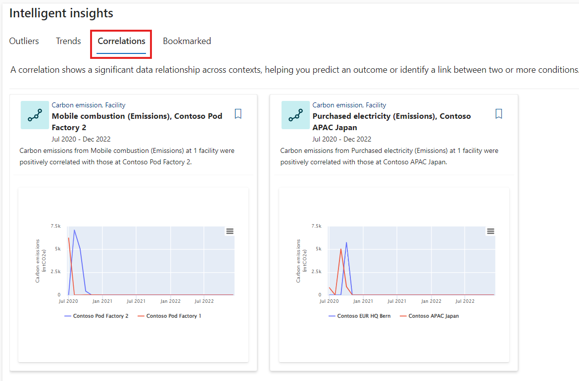
Select the Correlations tab.
Correlation shows a significant data relationship across contexts, which helps you predict an outcome or identify a link between two or more conditions.
Select Sort in the upper-right corner.
You can sort the insights based on statistical significance as calculated by the algorithm, impact score, and relevance score.
Select the bookmark icon on the insight that you want to know more about.
You can bookmark an insight when it's interesting, important, or if you want to maintain it for later viewing.After you bookmark an insight, you can review it under the Bookmarked tab.


You successfully explored the various dashboards for intelligent insights. You can use these dashboards to gain insights into your emissions data. Additionally, you filtered to gain insights on the purchased electricity. You also learned how to bookmark insights for later viewing.