R tutorial: Explore and visualize data
Applies to:
SQL Server 2016 (13.x) and later
Azure SQL Managed Instance
In part two of this five-part tutorial series, you'll explore the sample data and generate some plots. Later, you'll learn how to serialize graphics objects in Python, and then deserialize those objects and make plots.
In part two of this five-part tutorial series, you'll review the sample data and then generate some plots using the generic barplot and hist functions in base R.
A key objective of this article is showing how to call R functions from Transact-SQL in stored procedures and save the results in application file formats:
- Create a stored procedure using
barplotto generate an R plot as varbinary data. Use bcp to export the binary stream to an image file. - Create a stored procedure using
histto generate a plot, saving results as JPG and PDF output.
Note
Because visualization is such a powerful tool for understanding data shape and distribution, R provides a range of functions and packages for generating histograms, scatter plots, box plots, and other data exploration graphs. R typically creates images using an R device for graphical output, which you can capture and store as a varbinary data type for rendering in application. You can also save the images to any of the support file formats (.JPG, .PDF, etc.).
In this article, you'll:
- Review the sample data
- Create plots using R in T-SQL
- Output plots in multiple file formats
In part one, you installed the prerequisites and restored the sample database.
In part three, you'll learn how to create features from raw data by using a Transact-SQL function. You'll then call that function from a stored procedure to create a table that contains the feature values.
In part four, you'll load the modules and call the necessary functions to create and train the model using a SQL Server stored procedure.
In part five, you'll learn how to operationalize the models that you trained and saved in part four.
Review the data
Developing a data science solution usually includes intensive data exploration and data visualization. So first take a minute to review the sample data, if you haven't already.
In the original public dataset, the taxi identifiers and trip records were provided in separate files. However, to make the sample data easier to use, the two original datasets have been joined on the columns medallion, hack_license, and pickup_datetime. The records were also sampled to get just 1% of the original number of records. The resulting down-sampled dataset has 1,703,957 rows and 23 columns.
Taxi identifiers
The medallion column represents the taxi's unique ID number.
The hack_license column contains the taxi driver's license number (anonymized).
Trip and fare records
Each trip record includes the pickup and drop-off location and time, and the trip distance.
Each fare record includes payment information such as the payment type, total amount of payment, and the tip amount.
The last three columns can be used for various machine learning tasks. The tip_amount column contains continuous numeric values and can be used as the label column for regression analysis. The tipped column has only yes/no values and is used for binary classification. The tip_class column has multiple class labels and therefore can be used as the label for multi-class classification tasks.
This walkthrough demonstrates only the binary classification task; you are welcome to try building models for the other two machine learning tasks, regression and multiclass classification.
The values used for the label columns are all based on the tip_amount column, using these business rules:
Derived column name Rule tipped If tip_amount > 0, tipped = 1, otherwise tipped = 0 tip_class Class 0: tip_amount = $0
Class 1: tip_amount > $0 and tip_amount <= $5
Class 2: tip_amount > $5 and tip_amount <= $10
Class 3: tip_amount > $10 and tip_amount <= $20
Class 4: tip_amount > $20
Create plots using R in T-SQL
Important
Starting in SQL Server 2019, the isolation mechanism requires you to give appropriate permissions to the directory where the plot file is stored. For more information on how to set these permissions, see the File permissions section in SQL Server 2019 on Windows: Isolation changes for Machine Learning Services.
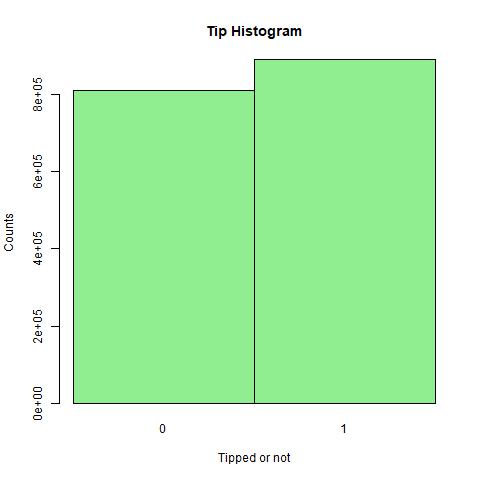
To create the plot, use the R function barplot. This step plots a histogram based on data from a Transact-SQL query. You can wrap this function in a stored procedure, RPlotHistogram.
In SQL Server Management Studio, in Object Explorer, right-click the NYCTaxi_Sample database and select New Query. Or, in Azure Data Studio, select New Notebook from the File menu and connect to the database.
Paste in the following script to create a stored procedure that plots the histogram. This example is named RPlotHistogram.
CREATE PROCEDURE [dbo].[RPlotHistogram]
AS
BEGIN
  SET NOCOUNT ON;
  DECLARE @query nvarchar(max) =
  N'SELECT tipped FROM [dbo].[nyctaxi_sample]'
  EXECUTE sp_execute_external_script @language = N'R',
                                     @script = N'
   image_file = tempfile();
   jpeg(filename = image_file);
   #Plot histogram
   barplot(table(InputDataSet$tipped), main = "Tip Histogram", col="lightgreen", xlab="Tipped or not", ylab = "Counts", space=0)
   dev.off();
   OutputDataSet <- data.frame(data=readBin(file(image_file, "rb"), what=raw(), n=1e6));
   ',
   @input_data_1 = @query
   WITH RESULT SETS ((plot varbinary(max)));
END
GO
Key points to understand in this script include the following:
The variable
@querydefines the query text ('SELECT tipped FROM nyctaxi_sample'), which is passed to the R script as the argument to the script input variable,@input_data_1. For R scripts that run as external processes, you should have a one-to-one mapping between inputs to your script, and inputs to the sp_execute_external_script system stored procedure that starts the R session on SQL Server.Within the R script, a variable (
image_file) is defined to store the image.The
barplotfunction is called to generate the plot.The R device is set to off because you are running this command as an external script in SQL Server. Typically in R, when you issue a high-level plotting command, R opens a graphics window, called a device. You can turn the device off if you are writing to a file or handling the output some other way.
The R graphics object is serialized to an R data.frame for output.
Execute the stored procedure and use bcp to export binary data to an image file
The stored procedure returns the image as a stream of varbinary data, which obviously you cannot view directly. However, you can use the bcp utility to get the varbinary data and save it as an image file on a client computer.
In Management Studio, run the following statement:
EXEC [dbo].[RPlotHistogram]Results
plot 0xFFD8FFE000104A4649...
Open a PowerShell command prompt and run the following command, providing the appropriate instance name, database name, username, and credentials as arguments. For those using Windows identities, you can replace -U and -P with -T.
bcp "exec RPlotHistogram" queryout "plot.jpg" -S <SQL Server instance name> -d NYCTaxi_Sample -U <user name> -P <password> -TNote
Command switches for bcp are case-sensitive.
If the connection is successful, you will be prompted to enter more information about the graphic file format.
Press ENTER at each prompt to accept the defaults, except for these changes:
For prefix-length of field plot, type 0.
Type Y if you want to save the output parameters for later reuse.
Enter the file storage type of field plot [varbinary(max)]:
Enter prefix-length of field plot [8]: 0
Enter length of field plot [0]:
Enter field terminator [none]:

Do you want to save this format information in a file? [Y/n]
Host filename [bcp.fmt]:
Results
Starting copy...
1 rows copied.
Network packet size (bytes): 4096
Clock Time (ms.) Total     : 3922   Average : (0.25 rows per sec.)
Tip
If you save the format information to file (bcp.fmt), the bcp utility generates a format definition that you can apply to similar commands in future without being prompted for graphic file format options. To use the format file, add
-f bcp.fmtto the end of any command line, after the password argument.The output file will be created in the same directory where you ran the PowerShell command. To view the plot, just open the file plot.jpg.

Create a stored procedure using hist
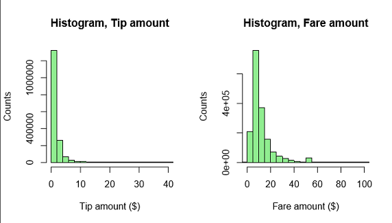
Typically, data scientists generate multiple data visualizations to get insights into the data from different perspectives. In this example, you will create a stored procedure called RPlotHist to write histograms, scatterplots, and other R graphics to .JPG and .PDF format.
This stored procedure uses the hist function to create the histogram, exporting the binary data to popular formats such as .JPG, .PDF, and .PNG.
In SQL Server Management Studio, in Object Explorer, right-click the NYCTaxi_Sample database and select New Query.
Paste in the following script to create a stored procedure that plots the histogram. This example is named RPlotHist .
CREATE PROCEDURE [dbo].[RPlotHist]
AS
BEGIN
  SET NOCOUNT ON;
  DECLARE @query nvarchar(max) =
  N'SELECT cast(tipped as int) as tipped, tip_amount, fare_amount FROM [dbo].[nyctaxi_sample]'
  EXECUTE sp_execute_external_script @language = N'R',
  @script = N'
   # Set output directory for files and check for existing files with same names
    mainDir <- ''C:\\temp\\plots''
    dir.create(mainDir, recursive = TRUE, showWarnings = FALSE)
    setwd(mainDir);
    print("Creating output plot files:", quote=FALSE)

    # Open a jpeg file and output histogram of tipped variable in that file.
    dest_filename = tempfile(pattern = ''rHistogram_Tipped_'', tmpdir = mainDir)
    dest_filename = paste(dest_filename, ''.jpg'',sep="")
    print(dest_filename, quote=FALSE);
    jpeg(filename=dest_filename);
    hist(InputDataSet$tipped, col = ''lightgreen'', xlab=''Tipped'',
        ylab = ''Counts'', main = ''Histogram, Tipped'');
     dev.off();

    # Open a pdf file and output histograms of tip amount and fare amount.
    # Outputs two plots in one row
    dest_filename = tempfile(pattern = ''rHistograms_Tip_and_Fare_Amount_'', tmpdir = mainDir)
    dest_filename = paste(dest_filename, ''.pdf'',sep="")
    print(dest_filename, quote=FALSE);
    pdf(file=dest_filename, height=4, width=7);
    par(mfrow=c(1,2));
    hist(InputDataSet$tip_amount, col = ''lightgreen'',
        xlab=''Tip amount ($)'',
        ylab = ''Counts'',
        main = ''Histogram, Tip amount'', xlim = c(0,40), 100);
    hist(InputDataSet$fare_amount, col = ''lightgreen'',
        xlab=''Fare amount ($)'',
        ylab = ''Counts'',
        main = ''Histogram,
        Fare amount'',
        xlim = c(0,100), 100);
    dev.off();

    # Open a pdf file and output an xyplot of tip amount vs. fare amount using lattice;
    # Only 10,000 sampled observations are plotted here, otherwise file is large.
    dest_filename = tempfile(pattern = ''rXYPlots_Tip_vs_Fare_Amount_'', tmpdir = mainDir)
    dest_filename = paste(dest_filename, ''.pdf'',sep="")
    print(dest_filename, quote=FALSE);
    pdf(file=dest_filename, height=4, width=4);
    plot(tip_amount ~ fare_amount,
        data = InputDataSet[sample(nrow(InputDataSet), 10000), ],
        ylim = c(0,50),
        xlim = c(0,150),
        cex=.5,
        pch=19,
        col=''darkgreen'',
        main = ''Tip amount by Fare amount'',
        xlab=''Fare Amount ($)'',
        ylab = ''Tip Amount ($)'');
    dev.off();',
  @input_data_1 = @query
END
Key points to understand in this script include the following:
The output of the SELECT query within the stored procedure is stored in the default R data frame,
InputDataSet. Various R plotting functions can then be called to generate the actual graphics files. Most of the embedded R script represents options for these graphics functions, such asplotorhist.The R device is set to off because you are running this command as an external script in SQL Server. Typically in R, when you issue a high-level plotting command, R opens a graphics window, called a device. You can turn the device off if you are writing to a file or handling the output some other way.
All files are saved to the local folder C:\temp\Plots. The destination folder is defined by the arguments provided to the R script as part of the stored procedure. To output the files to a different folder, change the value of the
mainDirvariable in the R script embedded in the stored procedure. You can also modify the script to output different formats, more files, and so on.
Execute the stored procedure
Run the following statement to export binary plot data to JPEG and PDF file formats.
EXEC RPlotHist
Results
STDOUT message(s) from external script:
[1] Creating output plot files:[1] C:\temp\plots\rHistogram_Tipped_18887f6265d4.jpg[1]

C:\temp\plots\rHistograms_Tip_and_Fare_Amount_1888441e542c.pdf[1]

C:\temp\plots\rXYPlots_Tip_vs_Fare_Amount_18887c9d517b.pdf
The numbers in the file names are randomly generated to ensure that you don't get an error when trying to write to an existing file.
View output
To view the plot, open the destination folder and review the files that were created by the R code in the stored procedure.
Go the folder indicated in the STDOUT message (in the example, this is C:\temp\plots)
Open
rHistogram_Tipped.jpgto show the number of trips that got a tip vs. the trips that got no tip (this histogram is similar to the one you generated in the previous step).Open
rHistograms_Tip_and_Fare_Amount.pdfto view distribution of tip amounts, plotted against the fare amounts.
Open
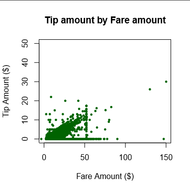
rXYPlots_Tip_vs_Fare_Amount.pdfto view a scatterplot with the fare amount on the x-axis and the tip amount on the y-axis.
Next steps
In this article, you:
- Reviewed the sample data
- Created plots using R in T-SQL
- Output plots in multiple file formats