Poznámka
Na prístup k tejto stránke sa vyžaduje oprávnenie. Môžete sa skúsiť prihlásiť alebo zmeniť adresáre.
Na prístup k tejto stránke sa vyžaduje oprávnenie. Môžete skúsiť zmeniť adresáre.
The Guidelines section covers the core building blocks of Windows app design. These topics define the patterns, rules, and behaviors that ensure your app feels intuitive, polished, and aligned with Fluent Design. From color and typography to motion, layout, and materials, each foundation helps you make consistent decisions that scale across pages, features, and form factors.
Use these fundamentals as a guide throughout your design process—whether you're mapping out your first screens, refining interaction patterns, or ensuring your UI matches Windows conventions. Exploring these foundations early can save development time, reduce rework, and lead to better experiences for your users.
Color
Use color to establish hierarchy, communicate meaning, and create a cohesive visual identity..
Commanding
Present actions in clear, consistent patterns that help users understand what they can do.

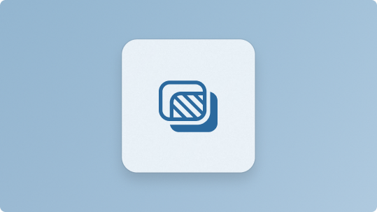
Elevation
Apply depth and layering to guide focus and reinforce the structure of your interface.
Geometry
Use shape, sizing, and spatial relationships to create balanced, predictable layouts.
Iconography
Communicate actions and concepts quickly with familiar, purposeful icons.
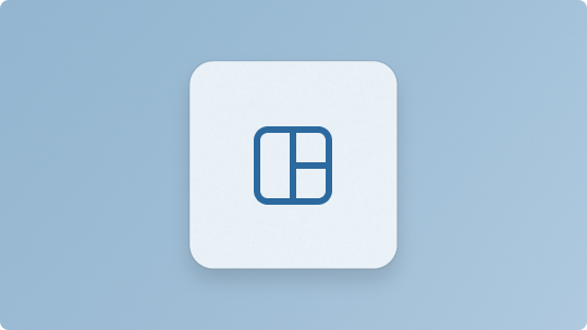
Layout
Organize content with grids, spacing, and alignment patterns that improve clarity and flow.
Materials
Enhance your UI with Fluent materials like Mica and Acrylic to add depth and warmth.
Motion
Use motion to provide feedback, guide attention, and create smooth, responsive interactions.
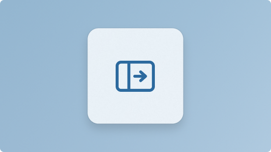
Navigation
Help users move through your app with predictable, well-structured navigation patterns.

Sound
Use audio cues to provide feedback, reinforce actions, and support accessibility.
Typography
Set the tone and improve readability with consistent type choices and hierarchy.
Usability
Ensure your app is easy to use through intuitive interactions, clear affordances, and accessibility.
Widgets
Extend your app with glanceable, interactive surfaces that surface key information and actions.
Writing
Use clear, concise, and helpful language to improve understanding and reduce cognitive load.
Spolupráca s nami v službe GitHub
Zdroj tohto obsahu nájdete v službe GitHub, kde môžete vytvárať a skúmať problémy a žiadosti o prijatie zmien. Ďalšie informácie nájdete v našom sprievodcovi prispievateľom.

Windows developer