View key statistics and data about your authorization system
Permissions Management provides a summary of key statistics and data about your authorization system. This information is available for Amazon Web Services (AWS), Microsoft Azure, and Google Cloud Platform (GCP).
View metrics related to avoidable risk
The data provided by Permissions Management includes metrics related to avoidable risk. These metrics allow the Permissions Management administrator to identify areas where they can reduce risks related to the principle of least permissions.
You can view the following information in Microsoft Entra:
The Permission Creep Index (PCI) heat map on the Permissions Management Dashboard identifies:
- The number of users who have been granted high-risk permissions but aren't using them.
- The number of users who contribute to the permission creep index (PCI) and where they are on the scale.
The Analytics dashboard provides a snapshot of permission metrics within the last 90 days.
Components of the Permissions Management Dashboard
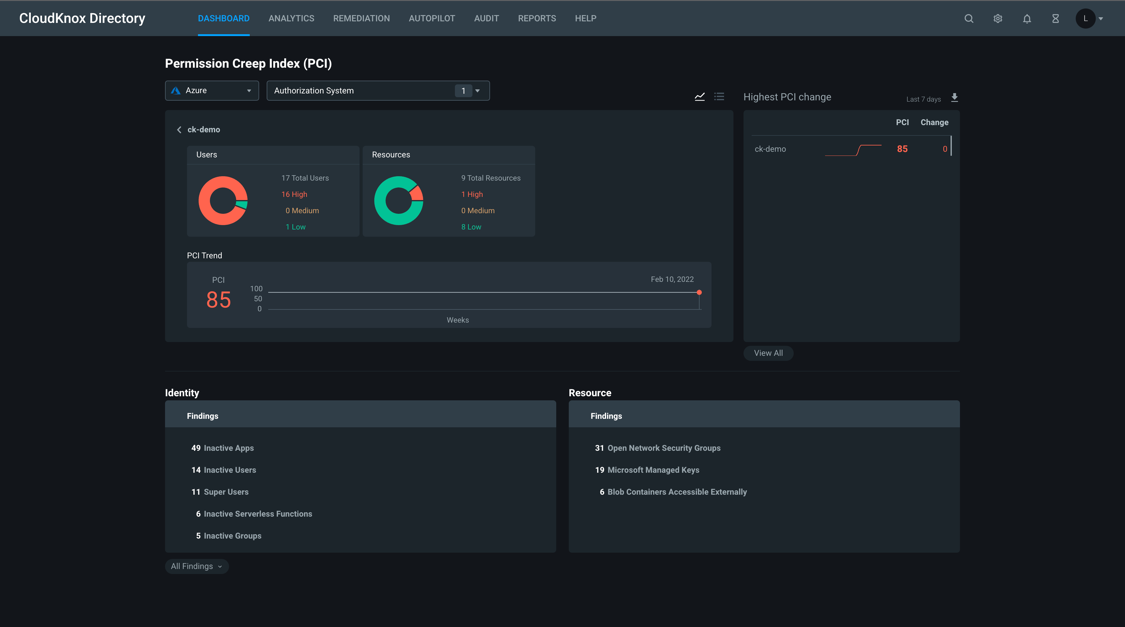
The Permissions Management Dashboard displays the following information:
Authorization system types: A dropdown list of authorization system types you can access: AWS, Azure, and GCP.
Authorization System: Displays a List of accounts and Folders in the selected authorization system you can access.
- To add or remove accounts and folders, from the Name list, select or deselect accounts and folders, and then select Apply.
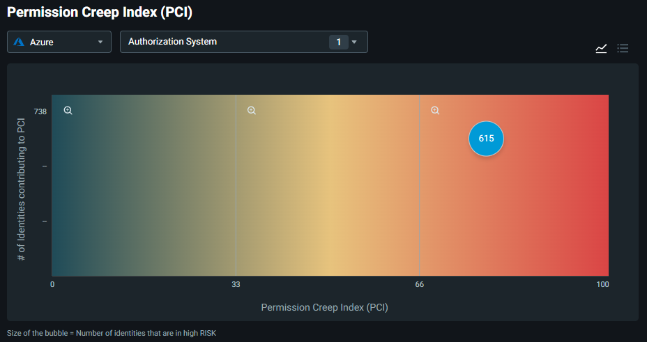
Permission Creep Index (PCI): The graph displays the # of identities contributing to PCI.
The PCI graph may display one or more bubbles. Each bubble displays the number of identities that are considered high risk. High-risk refers to the number of users who have permissions that exceed their normal or required usage.
- To display a list of the number of identities contributing to the Low PCI, Medium PCI, and High PCI, select the List icon in the upper right of the graph.
- To display the PCI graph again, select the Graph icon in the upper right of the list box.
Highest PCI change: Displays a list of your accounts and information about the PCI and Change in the index over the past 7 days.
To download the list, select the down arrow in the upper right of the list box.
The following message displays: We'll email you a link to download the file.
- Check your email for the message from the Permissions Management Customer Success Team. The email contains a link to the PCI history report in Microsoft Excel format.
- The email also includes a link to the Reports dashboard, where you can configure how and when you want to receive reports automatically.
To view all the PCI changes, select View all.
Identity: A summary of the Findings that includes:
- The number of Inactive identities that haven't been accessed in over 90 days.
- The number of Super identities that access data regularly.
- The number of identities that can Access secret information: A list of roles that can access sensitive or secret information.
- Over-provisioned active identities that have more permissions than they currently access.
- The number of identities With permission escalation: A list of roles that can increase permissions.
To view the list of all identities, select All findings.
Resources: A summary of the Findings that includes the number of resources that are:
- Open security groups
- Microsoft managed keys
- Instances with access to S3 buckets
- Unencrypted S3 buckets
- SSE-S3 Encrypted buckets
- S3 Bucket accessible externally
The PCI heat map
The Permission Creep Index heat map shows the incurred risk of users with access to high-risk permissions, and provides information about:
Users who were given access to high-risk permissions but aren't actively using them. High-risk permissions include the ability to modify or delete information in the authorization system.
The number of resources a user has access to, otherwise known as resource reach.
The high-risk permissions coupled with the number of resources a user has access to produce the score seen on the chart.
Permissions are classified as high, medium, and low.
- High (displayed in red) - The score is between 68 and 100. The user has access to many high-risk permissions they aren't using, and has high resource reach.
- Medium (displayed in yellow) - The score is between 34 and 67. The user has access to some high-risk permissions that they use, or have medium resource reach.
- Low (displayed in green) - The score is between 0 and 33. The user has access to few high-risk permissions. They use all their permissions and have low resource reach.
The number displayed on the graph shows how many users contribute to a particular score. To view detailed data about a user, hover over the number.
The distribution graph displays all the users who contribute to the permission creep. It displays how many users contribute to a particular score. For example, if the score from the PCI chart is 14, the graph shows how many users have a score of 14.
The PCI Trend graph shows you the historical trend of the PCI score over the last 90 days.
- To download the PCI history report, select Download.
View information on the heat map
Select the number on the heat map bubble to display:
- The total number of Identities and how many of them are in the high, medium, and low categories.
- The PCI trend over the last several weeks.
The Identity section below the heat map on the left side of the page shows all the relevant findings about identities, including roles that can access secret information, roles that are inactive, over provisioned active roles, and so on.
- To expand the full list of identities, select All findings.
The Resource section below the heat map on the right side of the page shows all the relevant findings about resources. It includes unencrypted S3 buckets, open security groups, and so on.
The Analytics summary
You can also view a summary of users and activities section on the Analytics dashboard. This dashboard provides a snapshot of the following high-risk tasks or actions users have accessed, and displays the total number of users with the high-risk access, how many users are inactive or have unexecuted tasks, and how many users are active or have executed tasks:
Users with access to high-risk tasks: Displays the total number of users with access to a high risk task (Total), how many users have access but haven't used the task (Inactive), and how many users are actively using the task (Active).
Users with access to delete tasks: A subset of high-risk tasks, which displays the number of users with access to delete tasks (Total), how many users have the delete permissions but haven't used the permissions (Inactive), and how many users are actively executing the delete capability (Active).
High-risk tasks accessible by users: Displays all available high-risk tasks in the authorization system (Granted), how many high-risk tasks aren't used (Unexecuted), and how many high-risk tasks are used (Executed).
Delete tasks accessible by users: Displays all available delete tasks in the authorization system (Granted), how many delete tasks aren't used (Unexecuted), and how many delete tasks are used (Executed).
Resources that permit high-risk tasks: Displays the total number of resources a user has access to (Total), how many resources are available but not used (Inactive), and how many resources are used (Active).
Resources that permit delete tasks: Displays the total number of resources that permit delete tasks (Total), how many resources with delete tasks aren't used (Inactive), and how many resources with delete tasks are used (Active).
Next steps
- For information on how to view authorization system and account activity data on the Permissions ManagementDashboard, see View data about the activity in your authorization system.
- For an overview of the Analytics dashboard, see An overview of the Analytics dashboard.

