Add visuals to a Power BI report (part 2)
APPLIES TO:
Power BI Desktop
Power BI service
In part 1 of this series of two articles, you created a basic visualization by selecting checkboxes next to field names. In this article, you learn how to use drag-and-drop and the Data and Visualizations panes to create and modify visualizations.
Create a new visualization
In this tutorial, you use the Retail Analysis Sample semantic model to create a few visualizations.
Prerequisites
Download the Retail Analysis Sample PBIX file.
In Power BI Desktop, select File > Open report.
Browse to and select the Retail Analysis Sample PBIX file, and then select Open.
The Retail Analysis Sample PBIX file opens in report view.

At the bottom, select the green plus symbol
 to add a new page to the report.
Note
If you want to share your report with a colleague, you both need to have individual Power BI Pro licenses or the report needs to be saved in Premium capacity. For more information, see Share a filtered Power BI report.
Add visualizations to the report
You can create a visualization by selecting a field in the Data pane. Power BI uses the type of field that you select to determine which visualization type to use. You can change the visualization type by selecting a different icon in the Visualizations pane. Keep in mind that not all visualizations can display all data types. For example, geographic data doesn't display well in a funnel chart or line chart.
Add an area chart that compares this year's sales to last year's sales
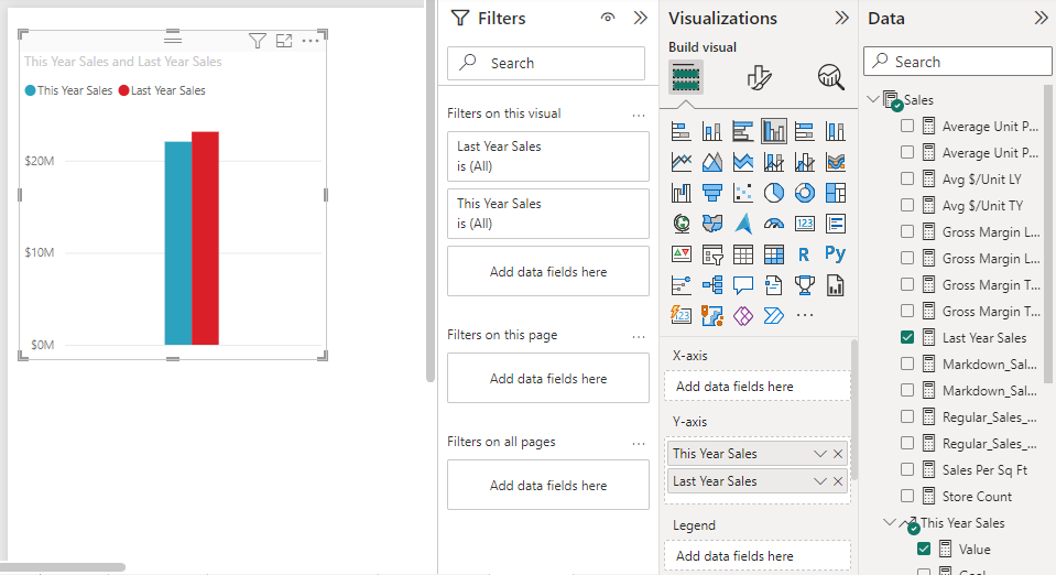
In the Data pane, expand Sales and select the Last Year Sales checkbox. Then expand This Year Sales and select the Value checkbox. Power BI creates a column chart. This chart is interesting, and you want to look closer. What do the sales look like by month?

In the Data pane, expand Time and drag FiscalMonth to the X-axis area of the Visualizations pane. You can now see comparisons by month:

In this step, you change the visualization type. There are many visualization types to choose from. To decide which type to use, see descriptions of each, tips for best practices, and tutorials. To use an area chart, in the Visualizations pane, select the Area chart button:

Sort the visualization by selecting More options (...) at the top of the chart and then selecting Sort axis > FiscalMonth:

Resize the visualization by selecting it and dragging one of the frame handles. Make it wide enough to eliminate the scrollbar but small enough to leave room for another visualization:

Save the report.
Add a map visualization that illustrates sales by location
In the Data pane, expand Store and select Territory. Power BI recognizes that Territory is a location and creates a map visualization. Drag Total Stores to the Bubble size area on the Visualizations pane:

To add a legend, drag Store > Chain to the Legend area. You now see the data sorted by store name, and there's a legend above the map:

Related content
- Learn more about visualizations in Power BI reports.
- If you have questions, see the Power BI Community site.

 to add a new page to the report.