Drill mode in the Power BI service
APPLIES TO:
Power BI service for business users
Power BI service for designers & developers
Power BI Desktop
Requires Pro or Premium license
This article shows you how to use the drill mode in the Microsoft Power BI service. You can explore in-depth details about your data by using the drill-down, drill-up, and expand features on your visual. To learn how to create a hierarchy, read hierarchies in Power BI
Drill mode requirements
To use the drill mode, the Power BI visual must have an explicit or implicit hierarchy. Report designers often add explicit date hierarchies to reports. Those hierarchies are marked with the hierarchy icon. A common date hierarchy is one that contains fields for the year, quarter, month, and day. A report might have implicit hierarchies too. These informal hierarchies don't have the icon. But the relationship, and therefore a drill path, exists. For example, you might have a visual that shows the number of medals won in a sports competition. The drill path in this example is the sport, which has specific unique types of the sport, and the events. By default, the visual shows the medal count by sport, like gymnastics, skiing, and aquatics. Then, you can select one of the visual elements, like a bar, line, or bubble, to display the individual sports. For example, selecting the aquatics element shows you data for swimming, diving, and water polo. Then, selecting the diving element opens the next level in the hierarchy and shows you details for springboard, platform, and synchronized diving events.
You can tell if a visual has a hierarchy by hovering over it. If the drill control options appear in the action bar, your visual has a hierarchy.
![]()
Drill down and up
The following example is a bar chart that has a hierarchy made up of category, manufacturer, segment, and product. The bar chart shows the total number of units sold in the year 2014 by category. Category is the top level of the hierarchy. The chart is filtered by the categories Rural and Urban.

Ways to access the drill features
There are two ways to access the drill-down, drill-up, and expand features for visuals.
One way is to hover over a visual to use the icons in the action bar. Turn on the drill-down option by selecting the single downward arrow. The grey background indicates that the drill-down option is turned on.

Another way to access the drill features is by right-clicking a data point on the visual to open a menu with available options.

Drill down all fields at once
There are many ways to drill into your visual. Selecting the double arrow drill-down icon ![]() takes you to the next level in the hierarchy. For example, if you're at the category level, you can drill down to the manufacturer level, then the segment level, and, finally, the product level for all categories. Each step in the path shows you new information.
takes you to the next level in the hierarchy. For example, if you're at the category level, you can drill down to the manufacturer level, then the segment level, and, finally, the product level for all categories. Each step in the path shows you new information.
To go up a level in the hierarchy, select the drill-up icon. ![]()
Drill down one field at a time
The double arrow drill-down icon drills down all fields on the canvas at once. This example shows how to drill down one field at a time.
From the category level, where the chart shows Rural and Urban, select the drill-down icon
 to turn it on.
Now you have the option of drilling down one field at a time by selecting a visual element, like a bar, bubble, or leaf.

Note
If you don't turn on the drill-down option and you select a visual element, it cross-filters the other charts on the report page rather than drilling down.
Select the bar for Rural. The bar chart now shows all the Rural manufacturers.

At this point, you can:
Continue drilling down for Rural.
Drill down for a particular Rural manufacturer.
Expand.
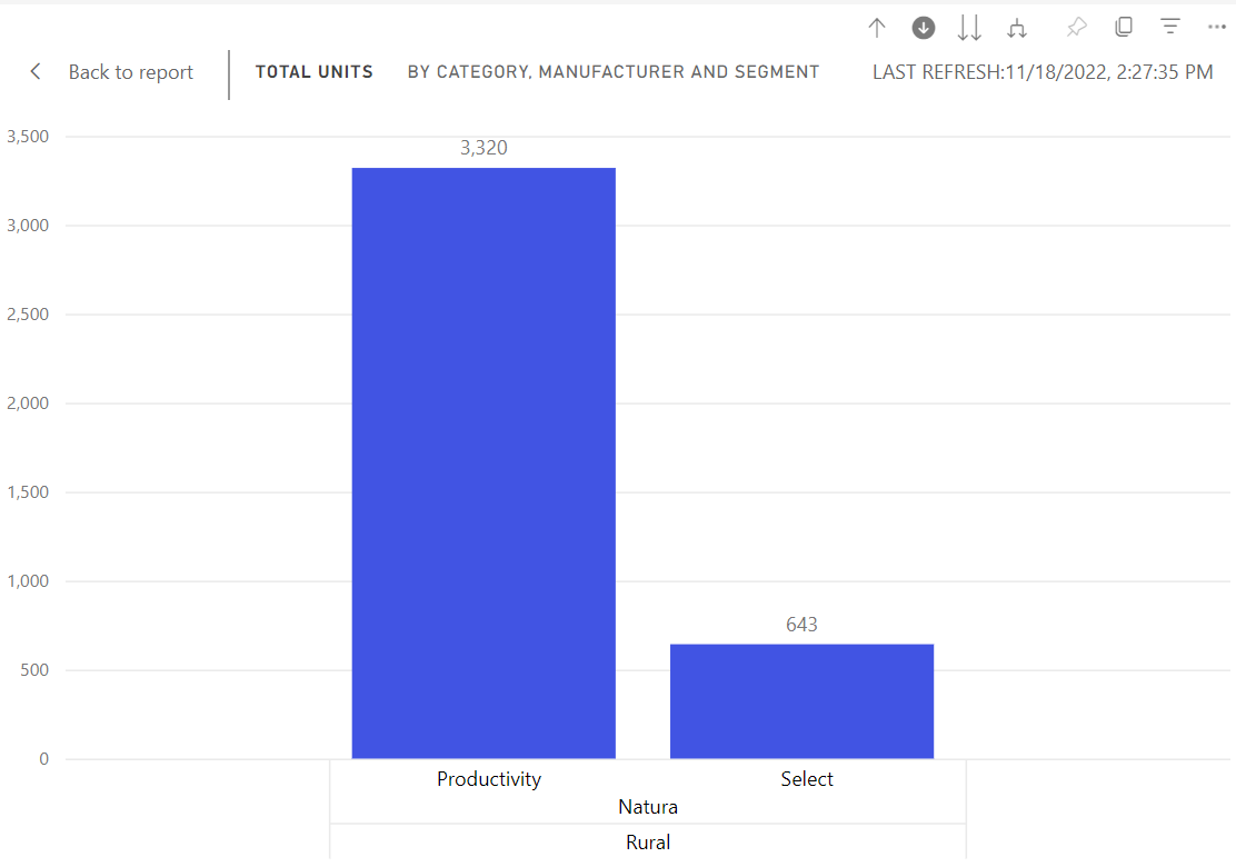
Continue to drill down one field at a time by selecting Natura. The bar chart now shows the segments for the Natura manufacturer in the Rural category.

Notice that the title changes to show which level you are on as you drill down and back up again.
Drill down to the products by selecting the Productivity bar. Now you are at the product level.
Expand fields
![]()
The Expand option adds another hierarchy level to the current view. If you're at the category level, which shows Rural and Urban, you can expand all current bars at the same time. The first time you expand, the manufacturer is added for both Rural and Urban. Expand again and, in addition to the manufacturer, segment data is added for both Rural and Urban. Each step in the path shows the previous information and adds on one level of new information.
Expand all fields at once
The following example shows how to use this feature to expand all fields at one time.
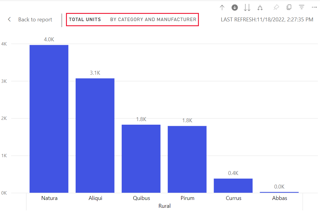
From the previous step, select the drill-up arrow until you reach the second level, Total Units by Category and Manufacturer.

Confirm that the drill-down option
 is still turned on and select the expand down icon.
  The bar chart shows more detail. It now shows category, manufacturer, and segment.
Select the expand down icon
 one more time to display all four hierarchy levels of detail for Rural. To see more detail, hover over a bar.
Expand one field at a time
To get detailed data for one field, you can expand down one level in the hierarchy.
From the previous step, select the drill-up icon until you reach the category level.
With the drill-down icon turned off, select the Rural bar, and then select the expand down icon.

 On the next level, the data for the field you selected is emphasized.
When you drill down, you only go to the next level of the hierarchy. When you expand, you go to the next level of the hierarchy while also preserving the data of the level you're on.
Show the data in a table as you drill
Use Show as a table to get a look behind the scenes. Each time you drill or expand, Show as a table displays the data used to build the visual. This feature makes it easier to see how hierarchies, drill, and expand work together to build visuals.
In the upper right corner, select More options (...), and then select Show as a table.

The data that makes up the bar chart appears below the visual.
Select the double arrow icon to drill down all fields at once. Watch the data in the table change to reflect the data that's being used to create the bar chart. The following table shows the results of drilling down all fields at once from the category level to the product level.
The first table represents the top level of the hierarchy. It shows the categories Rural and Urban. The next three tables represent the bar chart's data as you drill down all levels at once, from category to manufacturer to segment to product.
Considerations and limitations
By default, drilling doesn't filter other visuals in a report, but the report designer can change this setting. As you drill, look to see if the other visuals on the page are cross-filtering or cross-highlighting.
To view a report that is shared with you, a Power BI Pro or Premium license is required, or the report must be stored in Power BI Premium capacity. For more information, see Find out which licenses you have.
Related content
More questions? Visit the Power BI Community


