Događaj
Power BI DataViz Svetsko prvenstvo
14. feb 16 - 31. mar 16
Sa 4 šanse za ulazak, možete osvojiti konferencijski paket i stići do LIVE Grand Finale u Las Vegasu
Saznajte višeOvaj pregledač više nije podržan.
Nadogradite na Microsoft Edge biste iskoristili najnovije funkcije, bezbednosne ispravke i tehničku podršku.
Power BI Desktop helps you create insights into your data with just a few actions. But sometimes that data just doesn’t include everything you need to answer some of your most important questions. Measures can help you get there.
Measures are used in some of the most common data analyses. Simple summarizations such as sums, averages, minimum, maximum and counts can be set through the Fields well. The calculated results of measures are always changing in response to your interaction with your reports, allowing for fast and dynamic ad-hoc data exploration. Let’s take a closer look. For more information, see Create measures.
In Power BI Desktop, measures are created and displayed in Report View, Table View, or Model View. Measures you create yourself appear in the Fields list with a calculator icon. You can name measures whatever you want, and add them to a new or existing visualization just like any other field.

Report level measures or report measures are custom calculations or metrics created directly within a report, based on an existing dataset or a live connection. These measures allow users to add specific business logic, create visual calculations, or perform calculations that are relevant to the report's context without altering the original dataset. Report level measures are written using Data Analysis Expressions (DAX) and can be used in visualizations within the report to provide additional insights and tailor the data presentation to meet specific analytical needs. They enhance flexibility, enabling users to derive new insights from existing data models dynamically.
Napomena
You might also be interested in quick measures, which are ready-made measures you can select from dialog boxes. They're a good way to quickly create measures, and also a good way to learn Data Analysis Expressions (DAX) syntax, since their automatically created DAX formulas are available to review. For more information, see quick measures.
Measures calculate a result from an expression formula. When you create your own measures, you’ll use the Data Analysis Expressions (DAX) formula language. DAX includes a library of over 200 functions, operators, and constructs. Its library provides immense flexibility in creating measures to calculate results for just about any data analysis need.
DAX formulas are a lot like Excel formulas. DAX even has many of the same functions as Excel, such like DATE, SUM, and LEFT. But the DAX functions are meant to work with relational data like we have in Power BI Desktop.
Janice is a sales manager at Contoso. Janice has been asked to provide reseller sales projections over the next fiscal year. Janice decides to base the estimates on last year's sales amounts, with a six percent annual increase resulting from various promotions that are scheduled over the next six months.
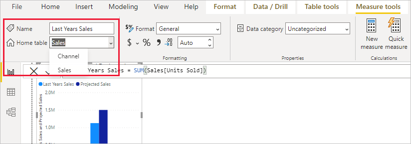
To report the estimates, Janice imports last year's sales data into Power BI Desktop. Janice finds the SalesAmount field in the Reseller Sales table. Because the imported data only contains sales amounts for last year, Janice renames the SalesAmount field to Last Years Sales. Janice then drags Last Years Sales onto the report canvas. It appears in a chart visualization as a single value that is the sum of all reseller sales from last year.
Janice notices that even without specifying a calculation, one has been provided automatically. Power BI Desktop created its own measure by summing up all of the values in Last Years Sales.
But Janice needs a measure to calculate sales projections for the coming year, which will be based on last year's sales multiplied by 1.06 to account for the expected 6 percent increase in business. For this calculation, Janice will create a measure. Janice creates a new measure by using the New Measure feature, then enters the following DAX formula:
Projected Sales = SUM('Reseller Sales'[Last Years Sales])*1.06
Janice then drags the new Projected Sales measure into the chart.

Quickly and with minimal effort, Janice now has a measure to calculate projected sales. Janice can further analyze the projections by filtering on specific resellers or by adding other fields to the report.
You can also pick data categories for measures.
Among other things, data categories allow you to use measures to dynamically create URLs, and mark the data category as a Web URL.
You could create tables that display the measures as Web URLs, and be able to select on the URL that's created based on your selection. This approach is especially useful when you want to link to other Power BI reports with URL filter parameters.
Measures have a Home table that defines where they're found in the field list. You can change their location by choosing a location from the tables in your model.
You can also organize fields in a table into Display Folders. Select Model from the left edge of the Power BI Desktop. In the Properties pane, select the field you want to move from the list of available fields. Enter a name for a new folder in Display folder to create a folder. Creating a folder moves the selected field into that folder.

You can create subfolders by using a backslash character. For example, Finance\Currencies creates a Finance folder and within it, a Currencies folder.
You can make a field appear in multiple folders by using a semicolon to separate the folder names. For example, Products\Names;Departments results in the field appearing in a Departments folder and a Names folder inside a Products folder.
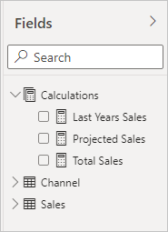
You can create a special table that contains only measures. That table always appears at the top of the Fields. To do so, create a table with just one column. You can use Enter data to create that table. Then move your measures to that table. Finally, hide the column, but not the table, that you created. Select the arrow at the top of Fields to close and reopen the fields list to see your changes.
Napojnica
Hidden measures are displayed and accessible in Power BI Desktop, however, you won't see hidden measures in Excel or the Power BI services, since Excel and the Power BI service are considered client tools.
With dynamic format strings, you can customize how measures appear in visuals by conditionally applying a format string with a separate DAX expression. To learn more, see Dynamic format strings.
We’ve only provided you with a quick introduction to measures here. There’s a lot more to help you learn how to create your own. For more information, see Tutorial: Create your own measures in Power BI Desktop. You can download a sample file and get step-by-step lessons on how to create more measures.
To dive a little deeper into DAX, see Learn DAX basics in Power BI Desktop. The Data Analysis Expressions Reference provides detailed articles on each of the functions, syntax, operators, and naming conventions. DAX has been around for several years in Power Pivot in Excel and SQL Server Analysis Services. There are many other great resources available, too. Be sure to check out the DAX Resource Center Wiki, where influential members of the BI community share their knowledge of DAX.
Događaj
Power BI DataViz Svetsko prvenstvo
14. feb 16 - 31. mar 16
Sa 4 šanse za ulazak, možete osvojiti konferencijski paket i stići do LIVE Grand Finale u Las Vegasu
Saznajte višeObuka
Modul
在 Power BI Desktop 模型中加入量值 - Training
在此課程模組中,您會了解如何使用隱含和明確的量值。 首先要建立簡單的量值,針對單一資料行或資料表提供摘要。 然後,您將根據模型中的其他量值,建立更複雜的量值。 此外還會學習到計算結果欄和量值之間的相似之處,以及兩者之間的差異。
Certifikacija
Microsoft Certified: Power BI Data Analyst Associate - Certifications
示範符合使用 Microsoft Power BI 進行資料建模、視覺化和分析的業務和技術要求的方法和最佳做法。