Create and use combo charts in Power BI
APPLIES TO:
Power BI Desktop
Power BI service
In Power BI, a combo chart is a single visualization that combines a line chart and a column chart. Combining the two charts into one lets you make a quicker comparison of the data.
Combo charts can have one or two Y axes.
When to use a combo chart
Combo charts are a great choice:
- when you have a line chart and a column chart with the same X axis.
- to compare multiple measures with different value ranges.
- to illustrate the correlation between two measures in one visualization.
- to check whether one measure meets the target defined by another measure
- to conserve canvas space.
How to create a combo chart
Note
Sharing your report with a Power BI colleague requires that you both have individual Power BI Pro licenses or that the report is saved in Premium capacity.
To follow along, use the Retail Analysis sample PBIX file.
From the upper left section of the menubar, select File > Open report.
Find your copy of the Retail Analysis Sample PBIX file.
Open the Retail Analysis Sample PBIX file in report view.

Select
 to add a new page.
Create a basic single-axis combo chart
Start on a blank report page and create a column chart that displays this year's sales and gross margin by month.
a. From the Fields pane, select Sales > This Year Sales > Value.
b. Select Sales > Gross Margin This Year and drag it to the Y-axis well.
c. Select Time > FiscalMonth and drag it to the X-axis well.

The new visualization is similar to this one.

In the upper-right corner of the visual, select the More options ellipsis (...) and select Sort axis > FiscalMonth.

Select the ellipsis again and choose Sort axis > Sort ascending.
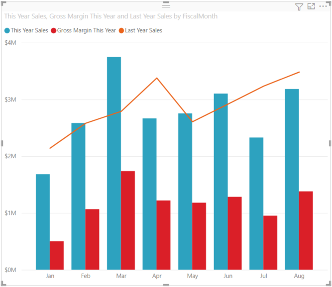
Convert the column chart to a combo chart. There are two combo charts available: Line and stacked column and Line and clustered column. With the column chart selected, from the Visualizations pane select the Line and clustered column chart.

From the Fields pane, drag Sales > Last Year Sales to the Line y-axis bucket.

Your combo chart should look something like this:

Create a combo chart with two axes
In this task, we compare gross margin and sales.
Create a new line chart that tracks Gross Margin Last Year % by FiscalMonth.
Select the ellipsis to sort it by FiscalMonth, then select the ellipsis again and choose Sort axis > Sort ascending.
In January, GM% was 35%, peaked at 45% in April, dropped in July and peaked again in August. Will we see a similar pattern in sales last year and this year?

Add This Year Sales > Value and Last Year Sales to the line chart. The scale of Gross Margin Last Year % is much smaller than the scale of Sales which makes it difficult to compare.

To make the visual easier to read and interpret, convert the line chart to a Line and stacked column chart.

Drag Gross Margin Last Year % from Column y-axis into Line y-axis.

Power BI creates two axes, thus allowing the semantic models to be scaled differently; the left measures sales dollars and the right measures percentage. And we see the answer to our question: yes, we do see a similar pattern.

Add titles to the axes
Select the paintbrush icon
 to open the Formatting pane.
Set Y-axis to On, then select the down arrow to expand the Y-axis options.
Set Y-axis > Values > Display units to Millions.
Set Y-axis > Title to On, then set Style to Show title only

Set Secondary y-axis to On to display options for formatting the line chart portion of the combo chart.

Under Secondary y-axis, set Title to On.
Your combo chart now displays dual axes, both with titles.

Optionally, modify the text font, size, and color and set other formatting options to improve the display and readability of the chart.
From here, you might want to:
- Add the combo chart as a dashboard tile.
- Save the report.
- Make the report more accessible for people with disabilities.
Cross-highlighting and cross-filtering
Highlighting a column or line in a combo chart cross-highlights and cross-filters the other visualizations on the report page, and vice versa. Use visual interactions to change this default behavior.
Considerations and limitations
- The secondary y-axis (line values) automatically shows or hides by default if its data range sufficiently overlaps with the primary y-axis (column values). To force show or hide the secondary y-axis, toggle the top-level toggle switch to "On" or "Off" on the "Secondary y-axis" formatting card to override this automatic behavior.
- The data labels may or may not display, depending on the size of your combo chart. If you don't see data labels, resize the combo chart.
