Not
Åtkomst till den här sidan kräver auktorisering. Du kan prova att logga in eller ändra kataloger.
Åtkomst till den här sidan kräver auktorisering. Du kan prova att ändra kataloger.
A Xamarin.Forms data binding links a pair of properties between two objects, at least one of which is usually a user-interface object. These two objects are called the target and the source:
- The target is the object (and property) on which the data binding is set.
- The source is the object (and property) referenced by the data binding.
This distinction can sometimes be a little confusing: In the simplest case, data flows from the source to the target, which means that the value of the target property is set from the value of the source property. However, in some cases, data can alternatively flow from the target to the source, or in both directions. To avoid confusion, keep in mind that the target is always the object on which the data binding is set even if it's providing data rather than receiving data.
Bindings with a Binding Context
Although data bindings are usually specified entirely in XAML, it's instructive to see data bindings in code. The Basic Code Binding page contains a XAML file with a Label and a Slider:
<ContentPage xmlns="http://xamarin.com/schemas/2014/forms"
             xmlns:x="http://schemas.microsoft.com/winfx/2009/xaml"
             x:Class="DataBindingDemos.BasicCodeBindingPage"
             Title="Basic Code Binding">
    <StackLayout Padding="10, 0">
        <Label x:Name="label"
               Text="TEXT"
               FontSize="48"
               HorizontalOptions="Center"
               VerticalOptions="CenterAndExpand" />

        <Slider x:Name="slider"
                Maximum="360"
                VerticalOptions="CenterAndExpand" />
    </StackLayout>
</ContentPage>
The Slider is set for a range of 0 to 360. The intent of this program is to rotate the Label by manipulating the Slider.
Without data bindings, you would set the ValueChanged event of the Slider to an event handler that accesses the Value property of the Slider and sets that value to the Rotation property of the Label. The data binding automates that job; the event handler and the code within it are no longer necessary.
You can set a binding on an instance of any class that derives from BindableObject, which includes Element, VisualElement, View, and View derivatives. The binding is always set on the target object. The binding references the source object. To set the data binding, use the following two members of the target class:
- The
BindingContextproperty specifies the source object. - The
SetBindingmethod specifies the target property and source property.
In this example, the Label is the binding target, and the Slider is the binding source. Changes in the Slider source affect the rotation of the Label target. Data flows from the source to the target.
The SetBinding method defined by BindableObject has an argument of type BindingBase from which the Binding class derives, but there are other SetBinding methods defined by the BindableObjectExtensions class. The code-behind file in the Basic Code Binding sample uses a simpler SetBinding extension method from this class.
public partial class BasicCodeBindingPage : ContentPage
{
    public BasicCodeBindingPage()
    {
        InitializeComponent();

        label.BindingContext = slider;
        label.SetBinding(Label.RotationProperty, "Value");
    }
}
The Label object is the binding target so that's the object on which this property is set and on which the method is called. The BindingContext property indicates the binding source, which is the Slider.
The SetBinding method is called on the binding target but specifies both the target property and the source property. The target property is specified as a BindableProperty object: Label.RotationProperty. The source property is specified as a string and indicates the Value property of Slider.
The SetBinding method reveals one of the most important rules of data bindings:
The target property must be backed by a bindable property.
This rule implies that the target object must be an instance of a class that derives from BindableObject. See the Bindable Properties article for an overview of bindable objects and bindable properties.
There is no such rule for the source property, which is specified as a string. Internally, reflection is used to access the actual property. In this particular case, however, the Value property is also backed by a bindable property.
The code can be simplified somewhat: The RotationProperty bindable property is defined by VisualElement, and inherited by Label and ContentPage as well, so the class name isn't required in the SetBinding call:
label.SetBinding(RotationProperty, "Value");
However, including the class name is a good reminder of the target object.
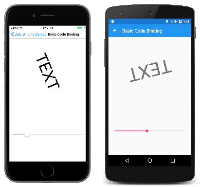
As you manipulate the Slider, the Label rotates accordingly:
The Basic Xaml Binding page is identical to Basic Code Binding except that it defines the entire data binding in XAML:
<ContentPage xmlns="http://xamarin.com/schemas/2014/forms"
             xmlns:x="http://schemas.microsoft.com/winfx/2009/xaml"
             x:Class="DataBindingDemos.BasicXamlBindingPage"
             Title="Basic XAML Binding">
    <StackLayout Padding="10, 0">
        <Label Text="TEXT"
               FontSize="80"
               HorizontalOptions="Center"
               VerticalOptions="CenterAndExpand"
               BindingContext="{x:Reference Name=slider}"
               Rotation="{Binding Path=Value}" />

        <Slider x:Name="slider"
                Maximum="360"
                VerticalOptions="CenterAndExpand" />
    </StackLayout>
</ContentPage>
Just as in code, the data binding is set on the target object, which is the Label. Two XAML markup extensions are involved. These are instantly recognizable by the curly brace delimiters:
- The
x:Referencemarkup extension is required to reference the source object, which is theSlidernamedslider. - The
Bindingmarkup extension links theRotationproperty of theLabelto theValueproperty of theSlider.
See the article XAML Markup Extensions for more information about XAML markup extensions. The x:Reference markup extension is supported by the ReferenceExtension class; Binding is supported by the BindingExtension class. As the XML namespace prefixes indicate, x:Reference is part of the XAML 2009 specification, while Binding is part of Xamarin.Forms. Notice that no quotation marks appear within the curly braces.
It's easy to forget the x:Reference markup extension when setting the BindingContext. It's common to mistakenly set the property directly to the name of the binding source like this:
BindingContext="slider"
But that's not right. That markup sets the BindingContext property to a string object whose characters spell "slider"!
Notice that the source property is specified with the Path property of BindingExtension, which corresponds with the Path property of the Binding class.
The markup shown on the Basic XAML Binding page can be simplified: XAML markup extensions such as x:Reference and Binding can have content property attributes defined, which for XAML markup extensions means that the property name doesn't need to appear. The Name property is the content property of x:Reference, and the Path property is the content property of Binding, which means that they can be eliminated from the expressions:
<Label Text="TEXT"
       FontSize="80"
       HorizontalOptions="Center"
       VerticalOptions="CenterAndExpand"
       BindingContext="{x:Reference slider}"
       Rotation="{Binding Value}" />
Bindings without a Binding Context
The BindingContext property is an important component of data bindings, but it is not always necessary. The source object can instead be specified in the SetBinding call or the Binding markup extension.
This is demonstrated in the Alternative Code Binding sample. The XAML file is similar to the Basic Code Binding sample except that the Slider is defined to control the Scale property of the Label. For that reason, the Slider is set for a range of –2 to 2:
<ContentPage xmlns="http://xamarin.com/schemas/2014/forms"
             xmlns:x="http://schemas.microsoft.com/winfx/2009/xaml"
             x:Class="DataBindingDemos.AlternativeCodeBindingPage"
             Title="Alternative Code Binding">
    <StackLayout Padding="10, 0">
        <Label x:Name="label"
               Text="TEXT"
               FontSize="40"
               HorizontalOptions="Center"
               VerticalOptions="CenterAndExpand" />

        <Slider x:Name="slider"
                Minimum="-2"
                Maximum="2"
                VerticalOptions="CenterAndExpand" />
    </StackLayout>
</ContentPage>
The code-behind file sets the binding with the SetBinding method defined by BindableObject. The argument is a constructor for the Binding class:
public partial class AlternativeCodeBindingPage : ContentPage
{
    public AlternativeCodeBindingPage()
    {
        InitializeComponent();

        label.SetBinding(Label.ScaleProperty, new Binding("Value", source: slider));
    }
}
The Binding constructor has 6 parameters, so the source parameter is specified with a named argument. The argument is the slider object.
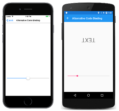
Running this program might be a little surprising:
The iOS screen on the left shows how the screen looks when the page first appears. Where is the Label?
The problem is that the Slider has an initial value of 0. This causes the Scale property of the Label to be also set to 0, overriding its default value of 1. This results in the Label being initially invisible. As the Android screenshot demonstrates, you can manipulate the Slider to make the Label appear again, but its initial disappearance is disconcerting.
You'll discover in the next article how to avoid this problem by initializing the Slider from the default value of the Scale property.
Note
The VisualElement class also defines ScaleX and ScaleY properties, which can scale the VisualElement differently in the horizontal and vertical directions.
The Alternative XAML Binding page shows the equivalent binding entirely in XAML:
<ContentPage xmlns="http://xamarin.com/schemas/2014/forms"
             xmlns:x="http://schemas.microsoft.com/winfx/2009/xaml"
             x:Class="DataBindingDemos.AlternativeXamlBindingPage"
             Title="Alternative XAML Binding">
    <StackLayout Padding="10, 0">
        <Label Text="TEXT"
               FontSize="40"
               HorizontalOptions="Center"
               VerticalOptions="CenterAndExpand"
               Scale="{Binding Source={x:Reference slider},
                               Path=Value}" />

        <Slider x:Name="slider"
                Minimum="-2"
                Maximum="2"
                VerticalOptions="CenterAndExpand" />
    </StackLayout>
</ContentPage>
Now the Binding markup extension has two properties set, Source and Path, separated by a comma. They can appear on the same line if you prefer:
Scale="{Binding Source={x:Reference slider}, Path=Value}" />
The Source property is set to an embedded x:Reference markup extension that otherwise has the same syntax as setting the BindingContext. Notice that no quotation marks appear within the curly braces, and that the two properties must be separated by a comma.
The content property of the Binding markup extension is Path, but the Path= part of the markup extension can only be eliminated if it is the first property in the expression. To eliminate the Path= part, you need to swap the two properties:
Scale="{Binding Value, Source={x:Reference slider}}" />
Although XAML markup extensions are usually delimited by curly braces, they can also be expressed as object elements:
<Label Text="TEXT"
       FontSize="40"
       HorizontalOptions="Center"
       VerticalOptions="CenterAndExpand">
    <Label.Scale>
        <Binding Source="{x:Reference slider}"
                 Path="Value" />
    </Label.Scale>
</Label>
Now the Source and Path properties are regular XAML attributes: The values appear within quotation marks and the attributes are not separated by a comma. The x:Reference markup extension can also become an object element:
<Label Text="TEXT"
       FontSize="40"
       HorizontalOptions="Center"
       VerticalOptions="CenterAndExpand">
    <Label.Scale>
        <Binding Path="Value">
            <Binding.Source>
                <x:Reference Name="slider" />
            </Binding.Source>
        </Binding>
    </Label.Scale>
</Label>
This syntax isn't common, but sometimes it's necessary when complex objects are involved.
The examples shown so far set the BindingContext property and the Source property of Binding to an x:Reference markup extension to reference another view on the page. These two properties are of type Object, and they can be set to any object that includes properties that are suitable for binding sources.
In the articles ahead, you'll discover that you can set the BindingContext or Source property to an x:Static markup extension to reference the value of a static property or field, or a StaticResource markup extension to reference an object stored in a resource dictionary, or directly to an object, which is generally (but not always) an instance of a ViewModel.
The BindingContext property can also be set to a Binding object so that the Source and Path properties of Binding define the binding context.
Binding Context Inheritance
In this article, you've seen that you can specify the source object using the BindingContext property or the Source property of the Binding object. If both are set, the Source property of the Binding takes precedence over the BindingContext.
The BindingContext property has an extremely important characteristic:
The setting of the BindingContext property is inherited through the visual tree.
As you'll see, this can be very handy for simplifying binding expressions, and in some cases — particularly in Model-View-ViewModel (MVVM) scenarios — it is essential.
The Binding Context Inheritance sample is a simple demonstration of the inheritance of the binding context:
<ContentPage xmlns="http://xamarin.com/schemas/2014/forms"
             xmlns:x="http://schemas.microsoft.com/winfx/2009/xaml"
             x:Class="DataBindingDemos.BindingContextInheritancePage"
             Title="BindingContext Inheritance">
    <StackLayout Padding="10">

        <StackLayout VerticalOptions="FillAndExpand"
                     BindingContext="{x:Reference slider}">

            <Label Text="TEXT"
                   FontSize="80"
                   HorizontalOptions="Center"
                   VerticalOptions="EndAndExpand"
                   Rotation="{Binding Value}" />

            <BoxView Color="#800000FF"
                     WidthRequest="180"
                     HeightRequest="40"
                     HorizontalOptions="Center"
                     VerticalOptions="StartAndExpand"
                     Rotation="{Binding Value}" />
        </StackLayout>

        <Slider x:Name="slider"
                Maximum="360" />

    </StackLayout>
</ContentPage>
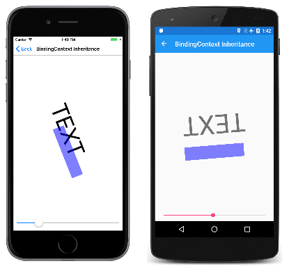
The BindingContext property of the StackLayout is set to the slider object. This binding context is inherited by both the Label and the BoxView, both of which have their Rotation properties set to the Value property of the Slider:
In the next article, you'll see how the binding mode can change the flow of data between target and source objects.


