Not
Åtkomst till den här sidan kräver auktorisering. Du kan prova att logga in eller ändra kataloger.
Åtkomst till den här sidan kräver auktorisering. Du kan prova att ändra kataloger.
Note
This book was published in the spring of 2016, and has not been updated since then. There is much in the book that remains valuable, but some of the material is outdated, and some topics are no longer entirely correct or complete.
The Grid is a powerful layout mechanism that arranges its children into rows and columns of cells. Unlike the similar HTML table element, the Grid is solely for purposes of layout rather than presentation.
The basic Grid
Grid derives from Layout<View>, which defines a Children property that Grid inherits. You can fill this collection in either XAML or code.
The Grid in XAML
The definition of a Grid in XAML generally begins with filling the RowDefinitions and ColumnDefinitions collections of the Grid with RowDefinition and ColumnDefinition objects. This is how you establish the number of rows and columns of the Grid, and their properties.
RowDefinition has a Height property and ColumnDefinition has a Width property, both of type GridLength, a structure.
In XAML, the GridLengthTypeConverter converts simple text strings into GridLength values. Behind the scenes, the GridLength constructor creates the GridLength value based on a number and a value of type GridUnitType, an enumeration with three members:
Absolute— the width or height is specified in device-independent units (a number in XAML)Auto— the height or width is autosized based on cell contents ("Auto" in XAML)Star— leftover height or width is allocated proportionally (a number with "*", called star, in XAML)
Each child of the Grid must also be assigned a row and column (either explicitly or implicitly). Row spans and column spans are optional. These are all specified using attached bindable properties — properties that are defined by the Grid but set on children of the Grid. Grid defines four static attached bindable properties:
RowProperty— the zero-based row; default is 0ColumnProperty— the zero-based column; default is 0RowSpanProperty— the number of rows the child spans; default is 1ColumnSpanProperty— the number of columns the child spans; default is 1
In code, a program can use eight static methods to set and get these values:
Grid.SetRowandGrid.GetRowGrid.SetColumnandGrid.GetColumnGrid.SetRowSpanandGrid.GetRowSpanGrid.SetColumnSpanandGrid.GetColumnSpan
In XAML you use the following attributes for setting these values:
Grid.RowGrid.ColumnGrid.RowSpanGrid.ColumnSpan
The SimpleGridDemo sample demonstrates creating and initializing a Grid in XAML.
The Grid inherits the Padding property from Layout and defines two additional properties that provide spacing between the rows and columns:
RowSpacinghas a default value of 6ColumnSpacinghas a default value of 6
The RowDefinitions and ColumnDefinitions collections aren't strictly required. If absent, the Grid creates rows and columns for the Grid children and gives them all a default GridLength of "*" (star).
The Grid in code
The GridCodeDemo sample demonstrates how to create and populate a Grid in code. You can set the attached properties for each child directly, or indirectly by calling additional Add methods such as Add defined by the Grid.IGridList<T> interface.
The Grid bar chart
The GridBarChart sample shows how to add multiple BoxView elements to a Grid using the bulk AddHorizontal method. By default, these BoxView elements have equal width. The height of each BoxView can then be controlled to resemble a bar chart.
The Grid in the GridBarChart sample shares an AbsoluteLayout parent with an initially invisible Frame. The program also sets a TapGestureRecognizer on each BoxView to use the Frame to display information about the tapped bar.
Alignment in the Grid
The GridAlignment sample demonstrates how to use the VerticalOptions and HorizontalOptions properties to align children in a Grid cell.
The SpacingButtons sample equally spaces Button elements centered in Grid cells.
Cell dividers and borders
The Grid does not include a feature that draws cell dividers or borders. However, you can make your own.
The GridCellDividers demonstrates how to define additional rows and column specifically for thin BoxView elements to mimic dividing lines.
The GridCellBorders program does not create any additional cells but instead aligns BoxView elements in each cell to mimic a cell border.
Almost real-life Grid examples
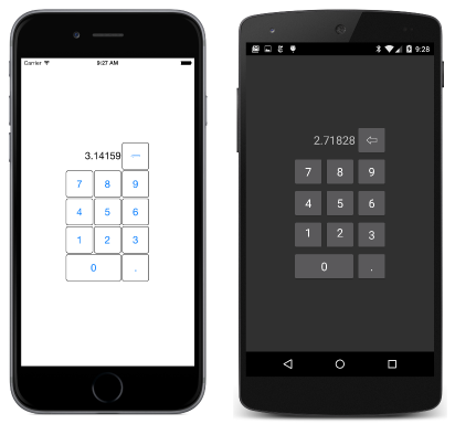
The KeypadGrid sample uses a Grid to display a keypad:
Responding to orientation changes
The Grid can help structure a program to respond to orientation changes. The
GridRgbSliders sample demonstrates a technique that moves an element between a second row of a portrait-oriented phone and the second column of a landscape-oriented phone.
The program initializes Slider elements to a range of 0 to 255, and uses data bindings to display the value of the sliders in hexadecimal. Because the Slider values are floating point, and the .NET formatting string for hexadecimal only works with integers, a DoubleToIntConvert class in the Xamarin.FormsBook.Toolkit library helps out.
