Introduction to controls
In Power Apps, you can add various user interface (UI) elements to your canvas app and configure aspects of their appearance and behavior directly from the toolbar, Properties tab, or formula bar. These UI elements are called Controls. Many of the controls in Power Apps are just like the controls that you've used in other apps, such as labels, text-input boxes, drop-down lists, and navigation elements.
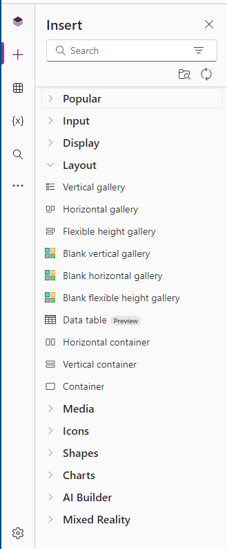
You can find all the controls available in Power Apps on the Insert tab.

You can configure the appearance and behavior of a control by setting one or more of its properties. Each type of control has a different set of properties. Some properties, such as Height and Width, are common to almost every type of control, but other properties, such as ChevronFill are specific to only certain Controls.
In addition to the controls listed above, there are other types of controls that you can add to enhance your apps:
Galleries - These controls are layout containers that hold a set of controls that show data from a data source.

Data table - The Data table control shows data from a data source in a format that includes column headers for each field that the control shows. As an app maker, you have full control over which fields appear and in what order. Like the Gallery control, the Data table control maintains a Selected property that points to the selected row. Therefore, you can link the Data table control to other controls.
Forms - These controls show details about your data and let you create and edit data.
Media - These controls let you add background images and sounds. Some of the more popular controls include a camera button (so that users can take pictures from the app) and a barcode reader for quickly capturing identification information.

Charts - These controls let you add charts so that users can do instant analysis. You can also add a Power BI Tile.

Icons - These controls include shapes, graphics, and symbols to enhance the user interface. They're quickly recognizable by your users to ease their interaction with the app.
![]()
Custom - Components are reusable building blocks for canvas apps so that app makers can create custom controls to use inside an app, or across apps using a component library. Components can use advanced features (such as custom properties) and enable complex capabilities.
In this module, you learn about some of these controls and their properties to see how you can incorporate them into your app to enhance the overall functionality. Before developing your app, take a moment to determine the functionality that you want to provide and then select the control that best fits those needs. The more familiar you are with controls and how to work with them, the easier it is to design your app.
In some cases, certain controls are almost interchangeable, and in those cases, you can use the control that you prefer. For example, the Dropdown and Combo box are similar controls. One key difference between them is that a Combo Box allows you to search for items and select multiple items. The Dropdown control doesn't support this functionality.