Kommentar
Åtkomst till den här sidan kräver auktorisering. Du kan prova att logga in eller ändra kataloger.
Åtkomst till den här sidan kräver auktorisering. Du kan prova att ändra kataloger.
Overview
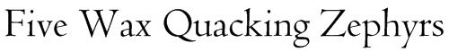
Bruce Rogers, one of the giants of the United States typographic community, designed Centaur in 1914 for the Metropolitan Museum to use for titles. Subsequently, various people reworked Centaur into a text face. It cannot be disguised that, in the opinion of the writer, each version has lost some of the vigor of the version that preceded it. This version is now issued by Monotype Typography. Centaur is what is known as a Venetian face, characterized by oblique stress, minimal contrast between thick and thin strokes, the slanted bar in the e, and heavy serifs. You can stick with it for titles, but Centaur remains legible in much smaller sizes than anybody ever dreamed of. At small sizes, Centaur is like any Venetian face in that you won't be able to tell that it is Centaur.
| Item | Description |
|---|---|
| File name | Centaur.ttf |
| Styles & Weights | Centaur |
| Designers | Bruce Rogers |
| Copyright | Typeface © The Monotype Corporation plc. Data © The Monotype Corporation plc/Type Solutions Inc. 1990-91-92 All Rights Reserved. Portions © 1992 Microsoft Corp. |
| Font vendor | N/A |
| Script Tags | N/A |
| Code pages | 1252 Latin 1 Mac Roman Macintosh Character Set (US Roman) |
| Fixed pitch | False |
| Download | N/A – Exclusively included with Microsoft products and services where applicable. |
Licensing and redistribution info
- Font redistribution FAQ for Windows
- License Microsoft fonts for enterprises, web developers, for hardware & software redistribution or server installations
Products that supply this font
This typeface is available within Office applications. For more information visit this page.
Style & weight examples
Centaur