หมายเหตุ
การเข้าถึงหน้านี้ต้องได้รับการอนุญาต คุณสามารถลอง ลงชื่อเข้าใช้หรือเปลี่ยนไดเรกทอรีได้
การเข้าถึงหน้านี้ต้องได้รับการอนุญาต คุณสามารถลองเปลี่ยนไดเรกทอรีได้
There are two types of layers available in an Azure Maps Power BI visual. The first type focuses on rendering data that is passed into the Fields pane of the visual and consist of the following layers, let's call these data rendering layers.
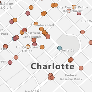
Bubble layer
Renders points as scaled circles on the map.
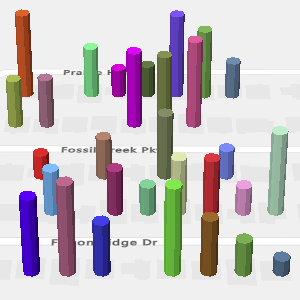
3D column layer
Renders points as 3D columns on the map.
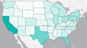
Filled map layer
Provides a visual display to shows differences in values across a geography or region.
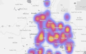
Heat map layer
Shows data "hot spots" on a map.
The second type of layer connects addition external sources of data to map to provide more context and consists of the following layers.
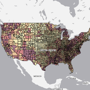
Reference layer
Overlay an uploaded GeoJSON file on top of the map.
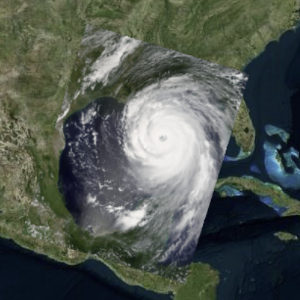
Tile layer
Overlay a custom tile layer on top of the map.
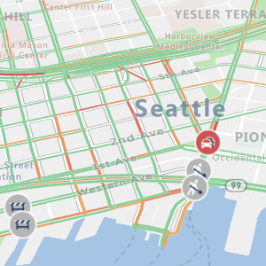
Traffic layer
Overlay real-time traffic information on the map.
All the data rendering layers and the Tile layer, have options for min and max zoom levels that are used to specify a zoom level range these layers should be displayed at. These options allow one type of rendering layer to be used at one zoom level and a transition to another rendering layer at another zoom level.
These layers can also be positioned relative to other layers in the map. When multiple data rendering layers are used, the order in which they're added to the map determines their relative layering order when they have the same Layer position value.
General layer settings
The general layer section of the Format pane are common settings that apply to the layers that are connected to the Power BI dataset in the Fields pane (Bubble layer, 3D column layer).
| Setting | Description |
|---|---|
| Unselected transparency | The transparency of shapes that aren't selected, when one or more shapes are selected. |
| Min data value | The minimum value of the input data to scale against. Good for clipping outliers. |
| Max data value | The maximum value of the input data to scale against. Good for clipping outliers. |
Layer positions
In the Azure Maps visual, certain layers are fixed, meaning they're set at a predefined level and can't be repositioned. Other layers are adjustable, giving users the flexibility to choose from three positioning options: "Above Labels," "Below Labels," or "Below Roads."

Within each Layer position, the order of layers remains consistent. For instance, the 3D bar chart layer always appears above the bubble layer due to its higher layer order, regardless of whether they're placed in "Below Labels" or "Above Labels."
Layer order
The following table outlines the layer order from top to bottom along with their respective layer position types. Layers marked as "Adjustable" can have their position changed using the Layer position dropdown, as shown in the previous screenshot. Layers marked as "Fixed" don't offer this option.
| Layer Name | Layer Order | Position type | Description |
|---|---|---|---|
| Category Labels | 1 | Fixed | The Category Labels is fixed as the top-most layer. You can consider this layer as "fixed" at the highest position. |
| Selection Tools | 2 | Fixed | The Selection tool layer is fixed as the second-highest layer, overlaying all other map layers. "Fixed" means it remains in the second level. |
| 3D Bar chart Layer | 3 | Adjustable | |
| Pie chart Layer Bubble Layer Cluster Bubble Layer Path Layer |
4 | Adjustable | These layers share the same "Layer position" as the bubble layer, and their relative order within this group remains fixed. |
| Heat Map Layer | 5 | Adjustable | |
| Reference Layer | 6 | Fixed | The Reference Layer is fixed at "Below labels". |
| Filled Map Layer | 7 | Adjustable | |
| Tile Layer | 8 | Adjustable | |
| Map Tiles | 9 | Fixed | The Map Tiles layer is fixed as the bottom-most map layer. It's the base map layer of the Azure Maps visual. |
Next steps
Change how your data is displayed on the map:
Add more context to the map: