XAML markup extensions
.NET Multi-platform App UI (.NET MAUI) XAML markup extensions enable properties to be set to objects or values that are referenced indirectly from other sources. XAML markup extensions are particularly important for sharing objects, and referencing constants used throughout an app, but they find their greatest utility in data bindings.
Typically, you use XAML to set properties of an object to explicit values, such as a string, a number, an enumeration member, or a string that is converted to a value behind the scenes. Sometimes, however, properties must instead reference values defined somewhere else, or which might require a little processing by code at runtime. For these purposes, XAML markup extensions are available.
XAML markup extensions are so named because they are backed by code in classes that implement IMarkupExtension. It's also possible to write your own custom markup extensions.
In many cases, XAML markup extensions are instantly recognizable in XAML files because they appear as attribute values delimited by curly braces, { and }, but sometimes markup extensions also appear in markup as conventional elements.
Important
Markup extensions can have properties, but they are not set like XML attributes. In a markup extension, property settings are separated by commas, and no quotation marks appear within the curly braces.
Shared resources
Some XAML pages contain several views with properties set to the same values. For example, many of the property settings for these Button objects are the same:
<ContentPage xmlns="http://schemas.microsoft.com/dotnet/2021/maui"
             xmlns:x="http://schemas.microsoft.com/winfx/2009/xaml"
             x:Class="XamlSamples.SharedResourcesPage"
             Title="Shared Resources Page">
    <StackLayout>
        <Button Text="Do this!"
                HorizontalOptions="Center"
                VerticalOptions="Center"
                BorderWidth="3"
                Rotation="-15"
                TextColor="Red"
                FontSize="24" />
        <Button Text="Do that!"
                HorizontalOptions="Center"
                VerticalOptions="Center"
                BorderWidth="3"
                Rotation="-15"
                TextColor="Red"
                FontSize="24" />
        <Button Text="Do the other thing!"
                HorizontalOptions="Center"
                VerticalOptions="Center"
                BorderWidth="3"
                Rotation="-15"
                TextColor="Red"
                FontSize="24" />
    </StackLayout>
</ContentPage>
If one of these properties needs to be changed, you might prefer to make the change just once rather than three times. If this were code, you’d likely be using constants and static read-only objects to help keep such values consistent and easy to modify.
In XAML, one popular solution is to store such values or objects in a resource dictionary. The VisualElement class defines a property named Resources of type ResourceDictionary, which is a dictionary with keys of type string and values of type object. You can put objects into this dictionary and then reference them from markup, all in XAML.
To use a resource dictionary on a page, include a pair of Resources property-element tags at the top of the page, and add resources within these tags. Objects and values of various types can be added to the resource dictionary. These types must be instantiable. They can’t be abstract classes, for example. These types must also have a public parameterless constructor. Each item requires a dictionary key specified with the x:Key attribute:
<ContentPage xmlns="http://schemas.microsoft.com/dotnet/2021/maui"
             xmlns:x="http://schemas.microsoft.com/winfx/2009/xaml"
             x:Class="XamlSamples.SharedResourcesPage"
             Title="Shared Resources Page">
    <ContentPage.Resources>
        <LayoutOptions x:Key="horzOptions"
                       Alignment="Center" />
        <LayoutOptions x:Key="vertOptions"
                       Alignment="Center" />
    </ContentPage.Resources>
    ...
</ContentPage>
In this example, the two resources are values of the structure type LayoutOptions, and each has a unique key and one or two properties set. In code and markup, it’s much more common to use the static fields of LayoutOptions, but here it’s more convenient to set the properties.
Note
Optional ResourceDictionary tags can be included as the child of the Resources tags.
The resources can then be consumed by the Button objects, by using the StaticResource XAML markup extension to set their HorizontalOptions and VerticalOptions properties:
<Button Text="Do this!"
        HorizontalOptions="{StaticResource horzOptions}"
        VerticalOptions="{StaticResource vertOptions}"
        BorderWidth="3"
        Rotation="-15"
        TextColor="Red"
        FontSize="24" />
The StaticResource markup extension is always delimited with curly braces, and includes the dictionary key. The name StaticResource distinguishes it from DynamicResource, which .NET MAUI also supports. DynamicResource is for dictionary keys associated with values that might change at runtime, while StaticResource accesses elements from the dictionary just once when the elements on the page are constructed. Whenever the XAML parser encounters a StaticResource markup extension, it searches up the visual tree and uses the first ResourceDictionary it encounters containing that key.
It’s necessary to store doubles in the dictionary for the BorderWidth, Rotation, and FontSize properties. XAML conveniently defines tags for common data types like x:Double and x:Int32:
<ContentPage.Resources>
        <LayoutOptions x:Key="horzOptions"
                       Alignment="Center" />
        <LayoutOptions x:Key="vertOptions"
                       Alignment="Center" />
        <x:Double x:Key="borderWidth">3</x:Double>
        <x:Double x:Key="rotationAngle">-15</x:Double>
        <x:Double x:Key="fontSize">24</x:Double>
</ContentPage.Resources>
These additional three resources can be referenced in the same way as the LayoutOptions values:
<Button Text="Do this!"
        HorizontalOptions="{StaticResource horzOptions}"
        VerticalOptions="{StaticResource vertOptions}"
        BorderWidth="{StaticResource borderWidth}"
        Rotation="{StaticResource rotationAngle}"
        TextColor="Red"
        FontSize="{StaticResource fontSize}" />
For resources of type Color, you can use the same string representations that you use when directly assigning attributes of these types. Type converters included in .NET MAUI are invoked when the resource is created. It's also possible to use the OnPlatform class within the resource dictionary to define different values for the platforms. The following example uses this class for setting different text colors:
<OnPlatform x:Key="textColor"
            x:TypeArguments="Color">
    <On Platform="iOS" Value="Red" />
    <On Platform="Android" Value="Aqua" />
</OnPlatform>
The OnPlatform resource gets an x:Key attribute because it’s an object in the dictionary, and an x:TypeArguments attribute because it’s a generic class. The iOS, and Android attributes are converted to Color values when the object is initialized.
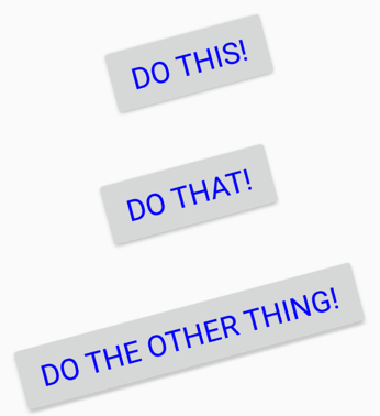
The following example shows the three buttons accessing six shared values:
<ContentPage xmlns="http://schemas.microsoft.com/dotnet/2021/maui"
             xmlns:x="http://schemas.microsoft.com/winfx/2009/xaml"
             x:Class="XamlSamples.SharedResourcesPage"
             Title="Shared Resources Page">
    <ContentPage.Resources>
        <LayoutOptions x:Key="horzOptions"
                       Alignment="Center" />
        <LayoutOptions x:Key="vertOptions"
                       Alignment="Center" />
        <x:Double x:Key="borderWidth">3</x:Double>
        <x:Double x:Key="rotationAngle">-15</x:Double>
        <x:Double x:Key="fontSize">24</x:Double>
        <OnPlatform x:Key="textColor"
                    x:TypeArguments="Color">
            <On Platform="iOS" Value="Red" />
            <On Platform="Android" Value="Aqua" />
            <On Platform="WinUI" Value="#80FF80" />
        </OnPlatform>
    </ContentPage.Resources>

    <StackLayout>
        <Button Text="Do this!"
                HorizontalOptions="{StaticResource horzOptions}"
                VerticalOptions="{StaticResource vertOptions}"
                BorderWidth="{StaticResource borderWidth}"
                Rotation="{StaticResource rotationAngle}"
                TextColor="{StaticResource textColor}"
                FontSize="{StaticResource fontSize}" />
        <Button Text="Do that!"
                HorizontalOptions="{StaticResource horzOptions}"
                VerticalOptions="{StaticResource vertOptions}"
                BorderWidth="{StaticResource borderWidth}"
                Rotation="{StaticResource rotationAngle}"
                TextColor="{StaticResource textColor}"
                FontSize="{StaticResource fontSize}" />
        <Button Text="Do the other thing!"
                HorizontalOptions="{StaticResource horzOptions}"
                VerticalOptions="{StaticResource vertOptions}"
                BorderWidth="{StaticResource borderWidth}"
                Rotation="{StaticResource rotationAngle}"
                TextColor="{StaticResource textColor}"
                FontSize="{StaticResource fontSize}" />
    </StackLayout>
</ContentPage>
The following screenshot verifies the consistent styling:

Although it's common to define the Resources collection at the top of the page, you can have Resources collections on other elements on the page. For example, the following example shows resources added to a StackLayout:
<StackLayout>
    <StackLayout.Resources>
        <Color x:Key="textColor">Blue</Color>
    </StackLayout.Resources>
    ...
</StackLayout>
One of the most common types of objects stored in resource dictionaries is the .NET MAUI Style, which defines a collection of property settings. For more information about styles, see Style apps using XAML.
Note
The purpose of a resource dictionary is to share objects. Therefore, it doesn't make sense to put controls such as a Label or Button in a resource dictionary. Visual elements can't be shared because the same instance can't appear twice on a page.
x:Static Markup Extension
In addition to the StaticResource markup extension, there's also an x:Static markup extension. However, while StaticResource returns an object from a resource dictionary,x:Static accesses a public static field, a public static property, a public constant field, or an enumeration member.
Note
The StaticResource markup extension is supported by XAML implementations that define a resource dictionary, while x:Static is an intrinsic part of XAML, as the x prefix reveals.
The following example demonstrates how x:Static can explicitly reference static fields and enumeration members:
<Label Text="Hello, XAML!"
       VerticalOptions="{x:Static LayoutOptions.Start}"
       HorizontalTextAlignment="{x:Static TextAlignment.Center}"
       TextColor="{x:Static Colors.Aqua}" />
The main use of the x:Static markup extension is in referencing static fields or properties from your own code. For example, here’s an AppConstants class that contains some static fields that you might want to use on multiple pages throughout an app:
namespace XamlSamples
{
    static class AppConstants
    {
        public static readonly Color BackgroundColor = Colors.Aqua;
        public static readonly Color ForegroundColor = Colors.Brown;
    }
}
To reference the static fields of this class in a XAML file, you need to use an XML namespace declaration to indicate where this file is located. Each additional XML namespace declaration defines a new prefix. To access classes local to the root app namespace, such as AppConstants, you could use the prefix local. The namespace declaration must indicate the CLR (Common Language Runtime) namespace name, also known as the .NET namespace name, which is the name that appears in a C# namespace definition or in a using directive:
xmlns:local="clr-namespace:XamlSamples"
You can also define XML namespace declarations for .NET namespaces. For example, here’s a sys prefix for the standard .NET System namespace, which is in the netstandard assembly. Because this is another assembly, you must also specify the assembly name, in this case netstandard:
xmlns:sys="clr-namespace:System;assembly=netstandard"
Note
The keyword clr-namespace is followed by a colon and then the .NET namespace name, followed by a semicolon, the keyword assembly, an equal sign, and the assembly name.
The static fields can then be consumed after declaring the XML namespace:
<ContentPage xmlns="http://schemas.microsoft.com/dotnet/2021/maui"
             xmlns:x="http://schemas.microsoft.com/winfx/2009/xaml"
             xmlns:local="clr-namespace:XamlSamples"
             xmlns:sys="clr-namespace:System;assembly=netstandard"
             x:Class="XamlSamples.StaticConstantsPage"
             Title="Static Constants Page"
             Padding="5,25,5,0">
    <StackLayout>
       <Label Text="Hello, XAML!"
              TextColor="{x:Static local:AppConstants.BackgroundColor}"
              BackgroundColor="{x:Static local:AppConstants.ForegroundColor}"
              FontAttributes="Bold"
              FontSize="30"
              HorizontalOptions="Center" />
      <BoxView WidthRequest="{x:Static sys:Math.PI}"
               HeightRequest="{x:Static sys:Math.E}"
               Color="{x:Static local:AppConstants.ForegroundColor}"
               HorizontalOptions="Center"
               VerticalOptions="CenterAndExpand"
               Scale="100" />
    </StackLayout>
</ContentPage>
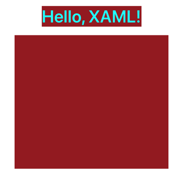
In this example, the BoxView dimensions are set to Math.PI and Math.E, but scaled by a factor of 100:

Other markup extensions
Several markup extensions are intrinsic to XAML and supported in .NET MAUI XAML. Some of these are not used very often but are essential when you need them:
- If a property has a non-
nullvalue by default but you want to set it tonull, set it to the{x:Null}markup extension. - If a property is of type
Type, you can assign it to aTypeobject using the markup extension{x:Type someClass}. - You can define arrays in XAML using the
x:Arraymarkup extension. This markup extension has a required attribute namedTypethat indicates the type of the elements in the array.
For more information about XAML markup extensions, see Consume XAML markup extensions.
Next steps
.NET MAUI data bindings allow properties of two objects to be linked so that a change in one causes a change in the other.
.NET MAUI
 Browse the sample