Directional Pad
A directional pad control that always maps the gamepad directional pad.
Properties
type - "directionalPad". Specifies the control type.
scale - number, optional. Default is 1. Size multiplier, useful since directional pads are placed like buttons and don't scale like joysticks automatically.
deadzone - number, optional. A value between 0 and 1 that specifies the size of the deadzone as a percentage of the control. Note that unlike deadzone for joysticks, directional pad deadzones are always axial (square).
enabled - boolean, optional. Defaults to true. Sets the visual state of the control to enabled/disabled. A disabled control will still receive input from the player, but NOT change the visual style based on the input.
visible - boolean, optional. Defaults to true. Determines whether the control is displayed to the player to interact with. To change during game play see Changing touch layouts using game state.
styles - object, optional. Customization of the visual representation of the control. The styles are represented as an object per state that can be styled.
interaction - object, optional. Property definitions that can alter the interaction mechanisms of the user with the control
Interaction
activationType - string, optional. Defines the type of activation that is allowed for any given direction on the directional pad interaction. Defaults to allowNeighboring. When set to exclusive, only a single direction can be activated on the directional pad at a time (i.e., only one of 'Up', 'Right', 'Down', or 'Left'). When set to allowNeighboring, a direction and either of its neighboring directions can be simultaneously activated by tapping between them (i.e., the user can activate 'Up+Right', 'Right+Down', 'Down+Left', or 'Left+Up' by tapping between each of them, in addition to the ability to activate each individual direction).
States and Styling properties
The directional pad control can have the following states styled:
default- The base style.disabled- The style when the control is disabled. If not specfied, then when the control is disabled, a transformation will be applied to the default style to make it appear disabled.idle- Applied when the player is NOT interacting with the control.activated- Applied when the player is touching the button.
The following properties can be used to style the directional pad control:
opacity - number, optional. The opacity to be applied to the control. Default to 1.0 for all states but disabled.
fill - object, optional. An object with a color defined for the gradient to be used when the direction pad is activated.
gradient - object, optional. An object with a color defined for the gradient to be used when the direction pad is activated.
background - object, optional. Can either be a color or image asset.
stroke - object, optional. Color to be used on the outline of the directional pad. Must be a stroke object.
Asset dimensions
For each of the style objects that accept image assets, a given asset is provided at a base resolution and at 1.5x, 2.0x, 3.0x, and 4.0x scales of that base resolution. The resolution of a given image must be less or equal to the following maximum resolutions:
| Object | @1.0x | @1.5x | @2.0x | @3.0x | @4.0x |
|---|---|---|---|---|---|
| background | 75x75 | 112x112 | 150x150 | 225x225 | 300x300 |
Remarks
The directional pad is used to provide an experience similar to the directional pad on the physical controller.
If this is being used as the primary movement mechanism for the player (normally in the left inner slot), it is recommended to use a scale of 2.
Styling remarks
If using a custom image asset for the background, the maximum resolutions referenced are for scale=1.0. If using a different scale, the maximum resolutions will be equal to the product of resolution and scale. For example, scale=1.5 implies a @1.0x DPI background image can have a maximum resolution of 90x90.
Warning
When streaming via the Windows version of the Content Test Application, not all styling will display correctly.
Samples
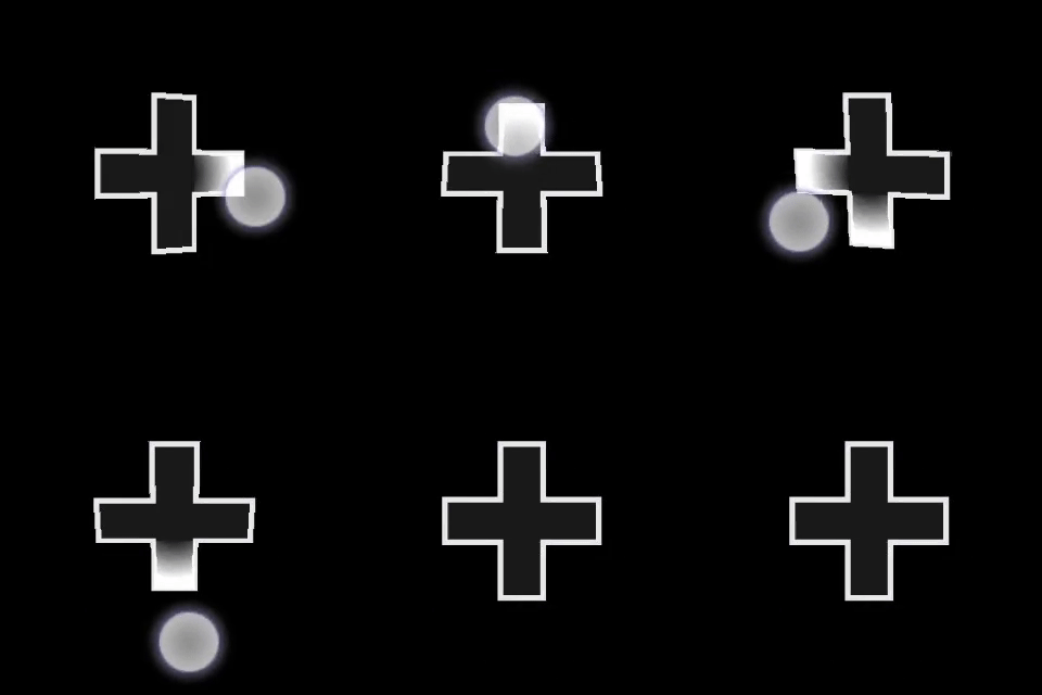
Example 1: Default directional pad
Figure 1. Directional Pad

{
    "type": "directionalPad",
    "scale": 1.0
}
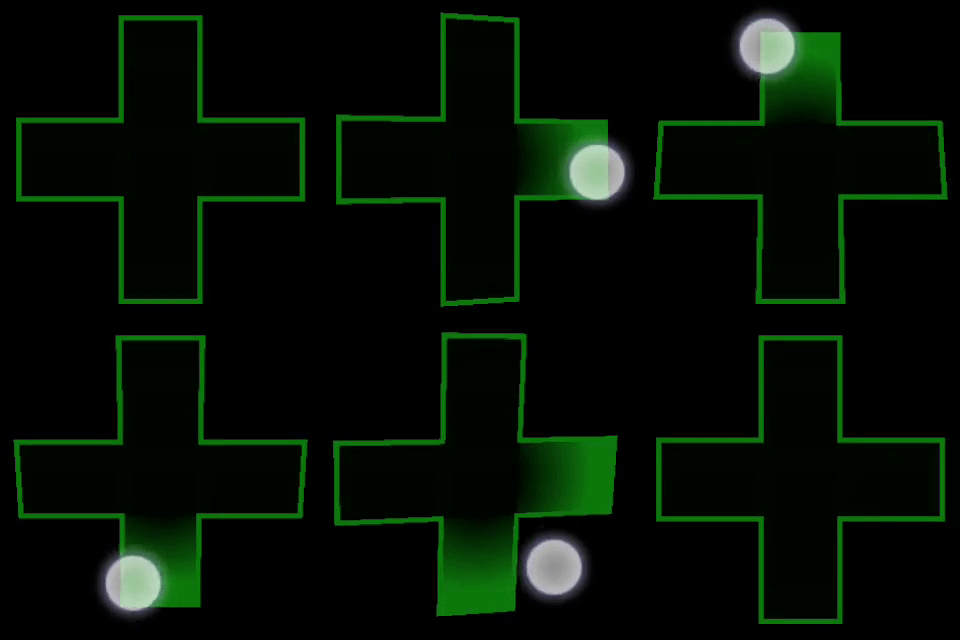
Example 2: Larger directional pad with customized colors.
Figure 1. Customized Directional Pad

{
    "type": "directionalPad" ,
    "scale": 2.0,
    "styles" : {
        "default" : {
            "fill" : "#0e7a0d10",
            "gradient" : {
                "color": "#0e7a0d10"
            },
            "stroke" : {
                "type": "solid",
                "color" : "#0e7a0dff"
            }
        }
    }
}
Requirements
Layout Version: 1.0+, (Styling support in 3.0+, Interaction support in 3.4+).