Exercise: Take a first look at your data
Recall that in our scenario, you've come across a new dataset that contains meteorological information about storms in the US. In this unit, you'll get an initial look at the data itself.
Look at the raw data
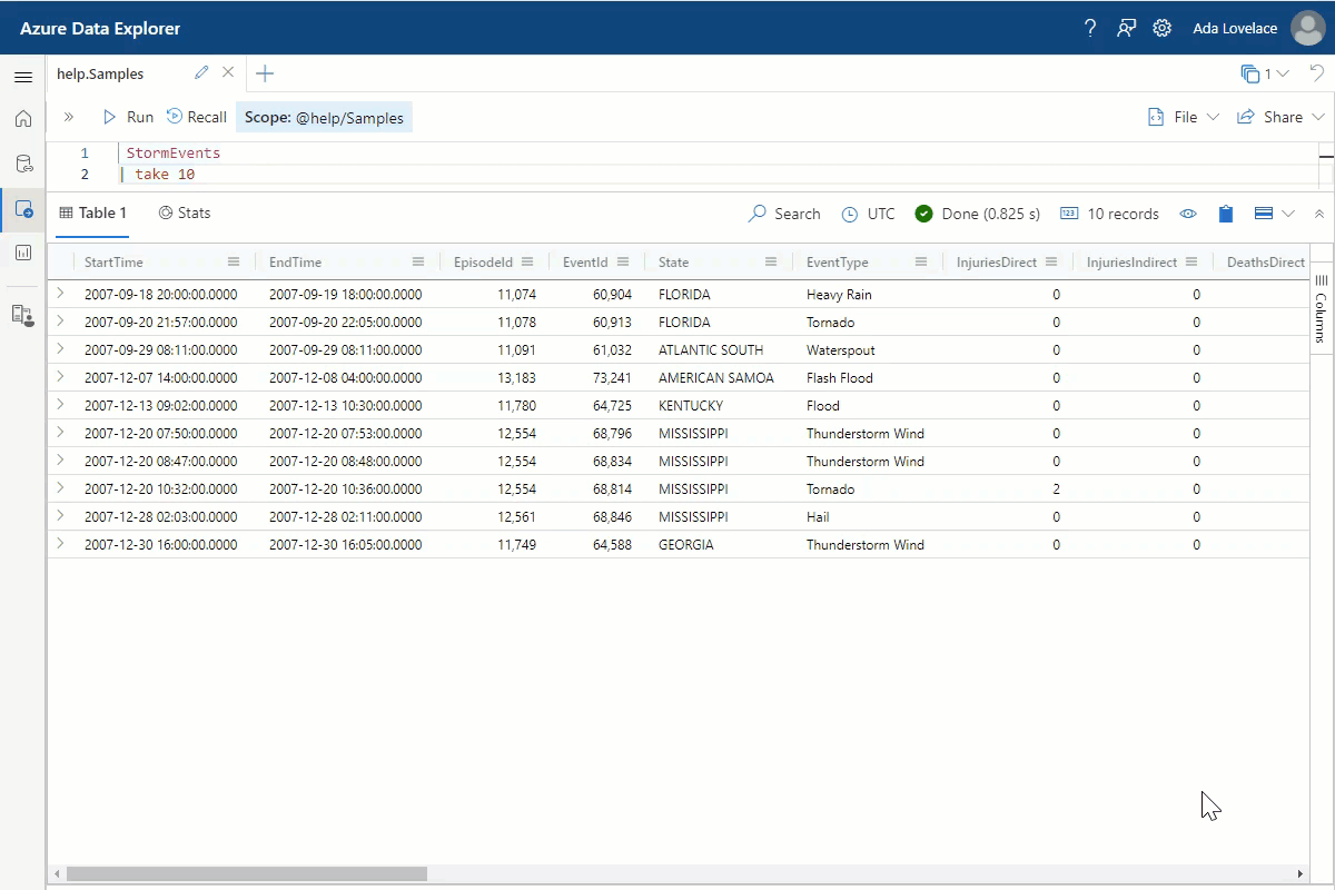
The first thing you want to do is look at the actual data to learn about which columns exist, what type of data is in these columns, and what possible values exist. You don't need to see every line in the data table, so let's take a small selection of the whole table.
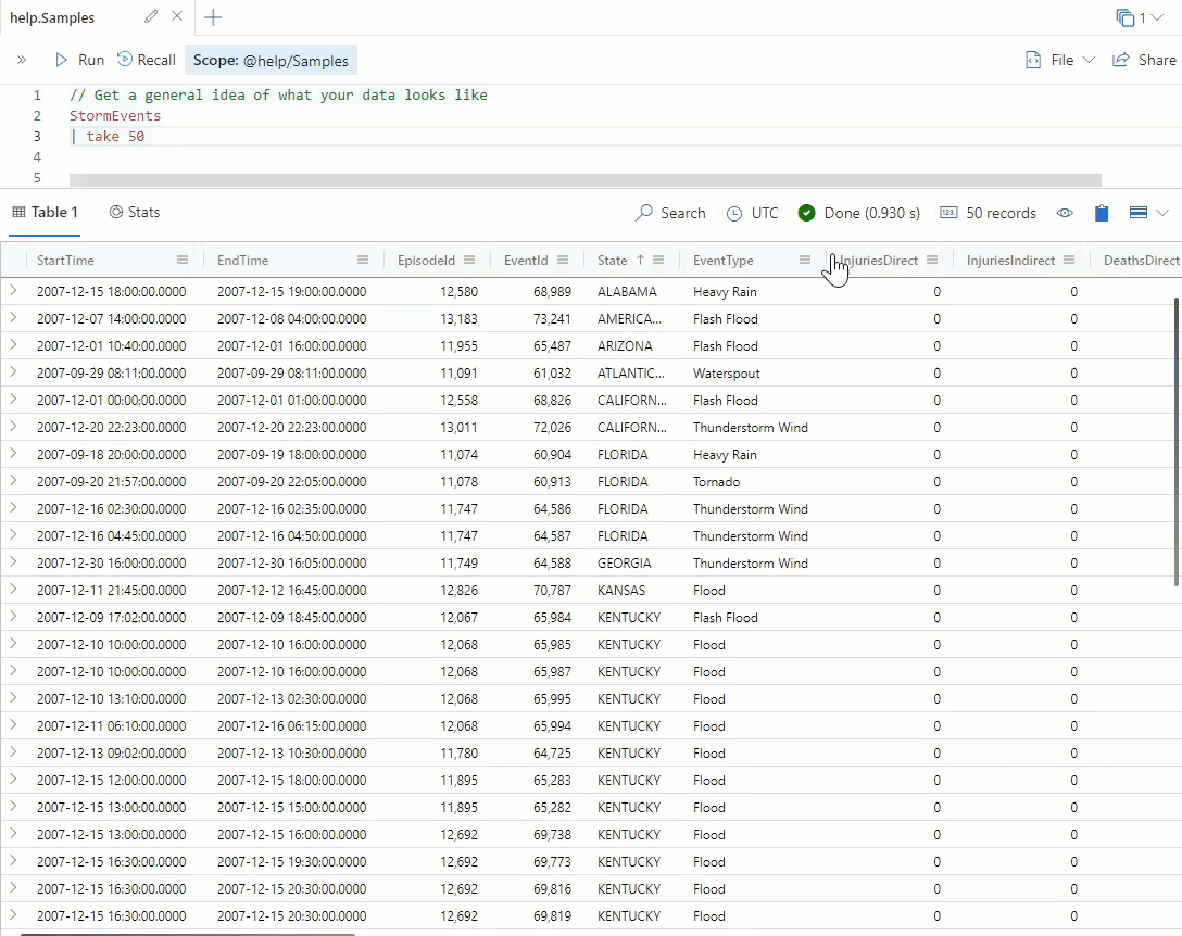
Run the following query to take 50 arbitrary rows of data.
StormEvents
| take 50
You should get results that look like the following image, although the specific lines you see might be different:
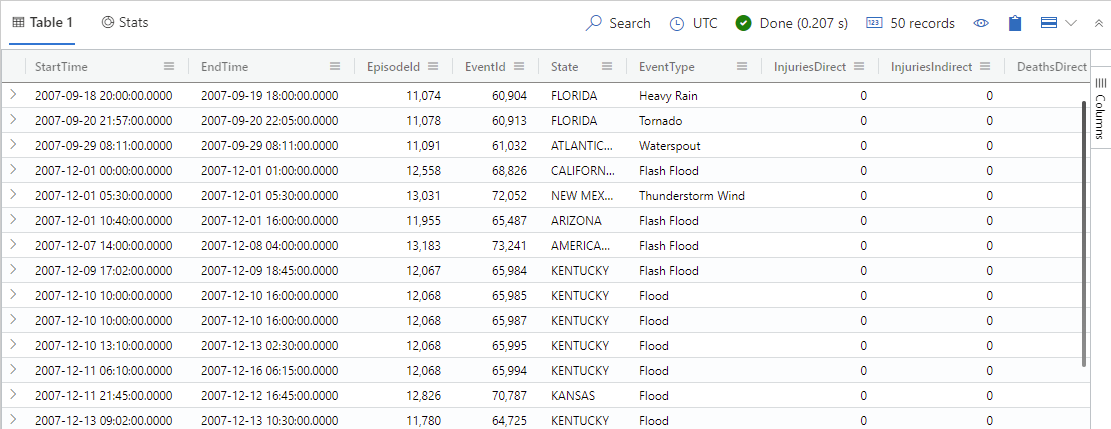
Look at the resulting table below the query, in what's called the Results grid. Scroll to the right side to take note of all columns. Can you get a sense of the types of data and ranges of values in these columns? Remember that the fields shown are just a sampling of the whole table.
Use the results grid to reorganize the data
The results grid offers a range of built-in tools that are probably familiar actions from other environments. For example, you can sort the data based on a certain column.
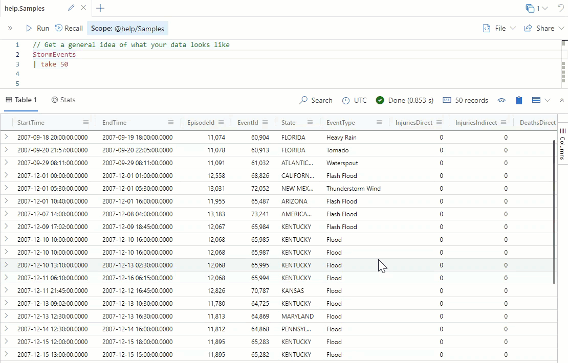
Each of the following examples starts with the results from the take 50 query.
Sort the data on a column
To sort on a specific column, select the name of that column in the results grid. The arrow that appears to the right of the column name indicates if it's sorted in ascending or descending order.
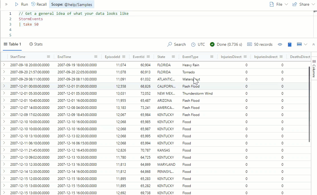
Select the State column.
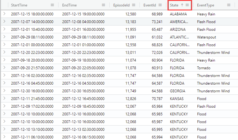
Look at the resulting list. Do you see any states appearing in multiple rows? Remember that you're looking at the 50 rows you selected above, so you shouldn't expect to see a complete list.
Group results
Taking the data sorting one step further, you can group—or aggregate—results by common fields. You might recall that the sorted list above gave several entries for various states.
- Select the menu icon to the right of the column you want to sort. In this case, select the menu on the right side of the State column.
- Select Group by State.
- Each state is followed by a count of associated entries. Select the arrow to the left of the state name to expand these entries.
Select a subset of data
Now that you have an idea of what kind of data exists in your table, you can select a subset of that data; for example, just flooding events.
- In the EventType column, select the events on which you want to filter. Hold down the Shift key on the keyboard to select multiple events, such as Flash Flood, Heavy Rain, and Flood.
- Right-click on a selected field, and select Add selection as filters. The preceding query changes to add filtered fields.
- Rerun the query by selecting the Run button. All resulting events are now one of the selected types.
Filter on a value
You can also filter on a single value. Let's view all events that happened in the state of Ohio.
Select the menu icon to the right of the State column.
Select the funnel icon.
While you could search for any type of string or integer match, you'll want to look for any column that contains the word Ohio. You can also use this filter to find incomplete or empty data fields.
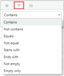
Below the type of filtering, enter the word Ohio. Notice that the results are immediately filtered.
Summarize selected cells
On the bottom-right corner of the results grid, selected cells are summarized. When you select integer values, you can also see a statistical summary of these values.
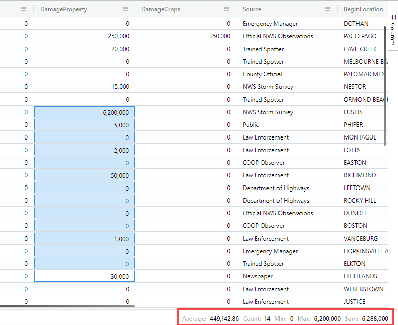
Scroll to the DamageProperty column in the results grid.
Click and drag on a selection of cells in this column. These cells will be highlighted by a blue background to indicate selection.
Look at the bottom-right corner of the results grid. What are the maximum and minimum values displayed? Does this summary help you understand the range of data in this column?
Expand a dynamic field
Scroll to the last column in the data table. Do you see the StormSummary column? This field contains a large amount of data, which isn't all visible. You can expand the cell to view all information inside the dynamic field.
Select the Expand view icon on the top right of the results grid.
Select Right to view the expanded results in the right pane.
Scroll to the rightmost column of the table, StormSummary.
Double-click one of the fields in this column. The field will expand to show the contents in an easier to read format: