Exercise: Use queries to explore trends
You've explored the raw data and range of an unfamiliar meteorological dataset. In this unit, you'll use visualizations to see how the data is distributed.
Timechart
Recall that some of the data columns you saw in the last unit were of type DateTime, and represented start and end times for storm events. To see which dates have storm-data events, you can plot a count of entries versus time.
Note that the previous unit used a subset of 50 data rows, whereas this unit will use the full dataset.
The following query creates a timechart of the number of storm events per 8-hour bin as a function of time.
Run the following query:
StormEvents
| summarize Count = count() by bin (StartTime, 8h)
| render timechart
You should get results that look like the following image:
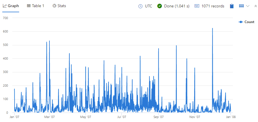
Take a look at the resulting graph. Do you see any obvious gaps or anomalies?
Events by state
Another way to look at data distribution is to group by event location (in this case, state) to see what kind of trends can be understood from the distribution.
Run the following query:
StormEvents
| summarize event = count() by State
| sort by event
| render barchart
You should get results that look like the following image:
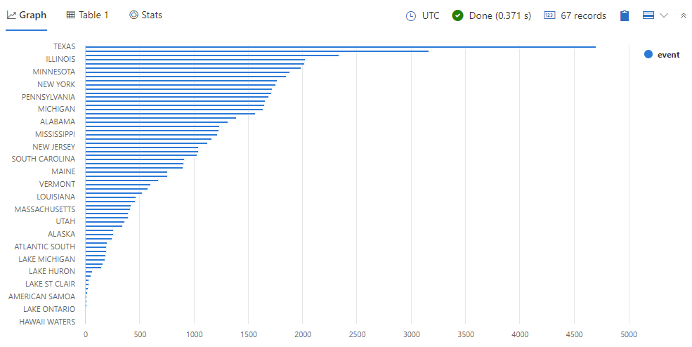
Take a look at the resulting graph. There are 67 different states in the list, including those which aren't official states in the US, such as "American Samoa" and "Hawaii waters". Does this type of geographical storm distribution make sense?
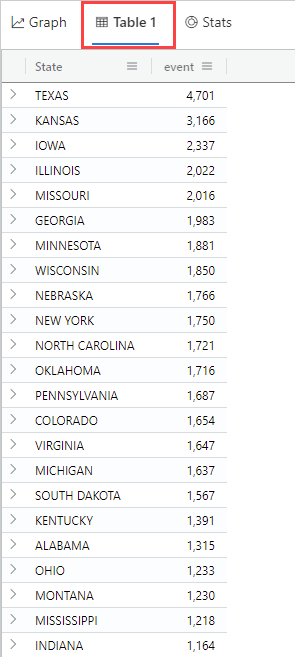
You can look at the underlying data by selecting the Table tab above the chart. Do the actual numbers help you understand the data distribution better?
Events by geographic location
You've seen how the number of events vary based on time and state. Recall that the schema mapping showed that each storm event entry contains latitudinal and longitudinal information. Let's take a look at how the data clusters on a map.
The following query groups events by geographic cell, and counts the number of events in each cell. These results are displayed on a map, where the circle size corresponds to the number of events in that cell. Run the following query:
StormEvents
| project BeginLon, BeginLat
| where isnotnull(BeginLat) and isnotnull(BeginLon)
| summarize count_summary=count() by hash = geo_point_to_s2cell(BeginLon, BeginLat,6)
| project geo_s2cell_to_central_point(hash), count_summary
| extend Events = "count"
| render piechart with (kind = map)
You should get results that look like the following image:
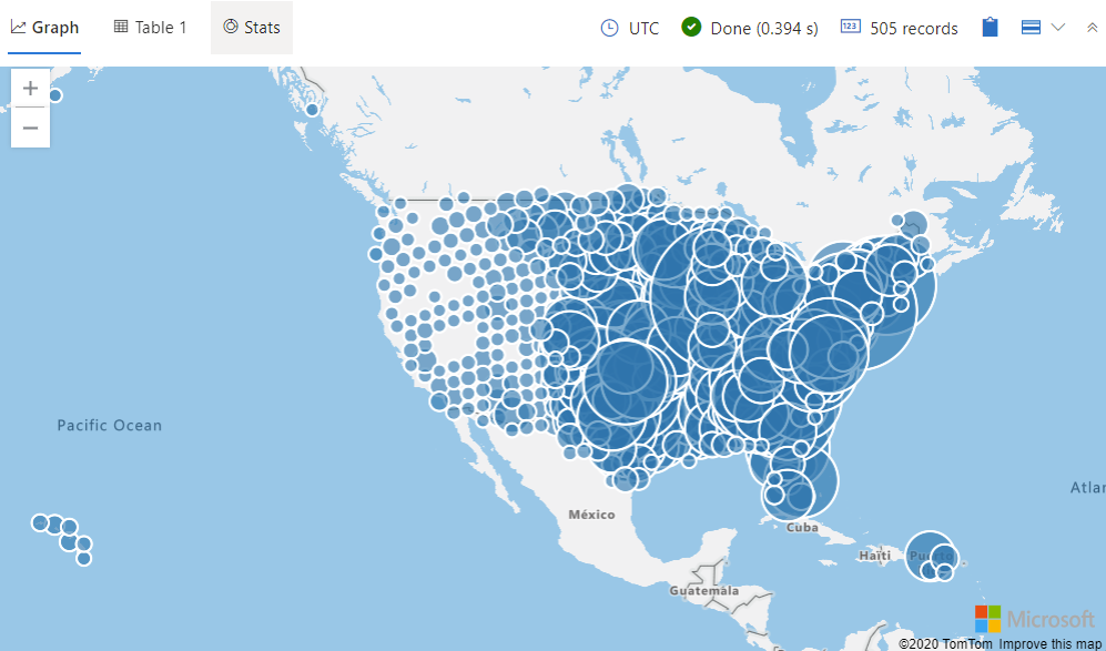
Try zooming in by pressing Ctrl +. Now that you've seen the types of storms represented, does it make sense that there are more of these types of storms in the northeastern area of the US and the gulf of Mexico?