Lưu ý
Cần có ủy quyền mới truy nhập được vào trang này. Bạn có thể thử đăng nhập hoặc thay đổi thư mục.
Cần có ủy quyền mới truy nhập được vào trang này. Bạn có thể thử thay đổi thư mục.
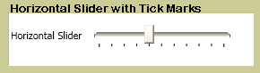
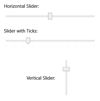
The Slider allows you to select from a range of values by moving a Thumb along a Track. You can configure the slider to display tick marks and customize its appearance through styling.
| Title | Description |
|---|---|
| Customize the Ticks on a Slider | Shows how to customize tick marks on a slider control. |
Styles and templates
This section describes the styles and templates for the Slider control. You can modify the default ControlTemplate to give the control a unique appearance. For more information, see What are styles and templates? and How to create a template for a control.
Content property
This control doesn't define a content property.
Parts
The following table lists the named parts for the Slider control.
| Part | Type | Description |
|---|---|---|
| PART_SelectionRange | FrameworkElement | The element that displays a selection range along the slider. The selection range is visible only if the IsSelectionRangeEnabled property is true. |
| PART_Track | Track | The track element that contains the thumb and provides the slider's range visualization. |
Visual states
The following table lists the visual states for the Slider control.
| VisualState Name | VisualStateGroup Name | Description |
|---|---|---|
| Disabled | CommonStates | The control is disabled. |
| Focused | FocusStates | The control has keyboard focus. |
| InvalidFocused | ValidationStates | The control has a validation error and has keyboard focus. |
| InvalidUnfocused | ValidationStates | The control has a validation error but doesn't have keyboard focus. |
| MouseOver | CommonStates | The mouse is over the control. |
| Normal | CommonStates | The control is in its normal state. |
| Unfocused | FocusStates | The control doesn't have keyboard focus. |
| Valid | ValidationStates | The control is valid and has no validation errors. |
See also
Cộng tác với chúng tôi trên GitHub
Bạn có thể tìm thấy nguồn cho nội dung này trên GitHub, nơi bạn cũng có thể tạo và xem lại các vấn đề và yêu cầu kéo. Để biết thêm thông tin, hãy xem hướng dẫn dành cho người đóng góp của chúng tôi.
.NET Desktop feedback