
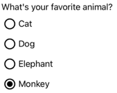
.NET Multi-platform App UI (.NET MAUI) RadioButton 是一种按钮类型,允许用户从集中选择一个选项。 每个选项都表示为一个单选按钮,只能在一组中选择一个单选按钮。 默认情况下,每个 RadioButton 都显示文本:
但是,在某些平台上,RadioButton 可以显示 View,而在所有平台上,可以使用 ControlTemplate 重新定义每个 RadioButton 的外观:
RadioButton 定义以下属性:
Content,类型为object,用于定义要由 RadioButton 显示的string或 View。IsChecked,类型为bool,用于定义是否选中 RadioButton。 此属性使用TwoWay绑定,默认值为false。GroupName,类型为string,用于定义指明哪些 RadioButton 控件互斥的名称。 此属性的默认值为null。Value,类型为object,用于定义与 RadioButton 关联的可选的唯一值。BorderColor,类型为 Color,用于定义边框笔触颜色。BorderWidth,类型为double,用于定义 RadioButton 边框的宽度。CharacterSpacing,类型为double,用于定义任何所显示的文本的字符之间的间距。CornerRadius,类型为int,用于定义 RadioButton 的圆角半径。FontAttributes,类型为FontAttributes,用于确定文本样式。FontAutoScalingEnabled,类型为bool,定义应用的 UI 是否反映操作系统中设置的文本缩放首选项。 此属性的默认值为true。FontFamily,类型为string,用于定义字体系列。FontSize,类型为double,用于定义字体大小。TextColor,类型为 Color,用于定义任何所显示的文本的颜色。TextTransform,类型为TextTransform,用于定义任何所显示的文本的大小写。
这些属性由 BindableProperty 对象提供支持,表示它们可以是数据绑定的目标,并可以设置样式。
RadioButton 还定义了 CheckedChanged 事件,当 IsChecked 属性因为用户或编程操作而发生更改时,会引发该事件。 CheckedChanged 事件附带的 CheckedChangedEventArgs 对象包含名为 Value、类型为 bool 的属性。 该事件被引发时,CheckedChangedEventArgs.Value 属性的值将设置为 IsChecked 属性的新值。
RadioButton 分组可以由 RadioButtonGroup 类管理,该类定义下列附加属性:
GroupName,类型为string,用于定义ILayout中 RadioButton 对象的组名称。SelectedValue,类型为object,表示ILayout组中选中的 RadioButton 对象的值。 默认情况下,此附加属性使用TwoWay绑定。
提示
尽管这不是强制性的,但强烈建议设置 GroupName 属性,以确保 SelectedValue 属性在所有平台上都能正常工作。
有关 GroupName 附加属性的详细信息,请参阅对 RadioButtons 进行分组。 有关 SelectedValue 附加属性的详细信息,请参阅响应 RadioButton 状态更改。
创建 RadioButton
RadioButton 的外观由分配给 RadioButton.Content 属性的数据类型定义:
- 为
RadioButton.Content属性分配string后,该属性将显示在每个平台上,与单选按钮圆圈水平对齐。 - 为
RadioButton.Content分配 View 后,它可在支持的平台(iOS 和 Windows)上显示,而不支持的平台将回退到 View 对象的字符串表示形式 (Android)。 在这两种情况下,内容在单选按钮圆圈旁边水平对齐显示。 - 将 ControlTemplate 应用于 RadioButton 时,可以在所有平台上将 View 分配给
RadioButton.Content属性。 有关详细信息,请参阅重新定义 RadioButton 外观。
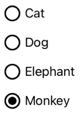
显示基于字符串的内容
当为 Content 属性分配 string 时,RadioButton 显示文本:
<StackLayout>
    <Label Text="What's your favorite animal?" />
    <RadioButton Content="Cat" />
    <RadioButton Content="Dog" />
    <RadioButton Content="Elephant" />
    <RadioButton Content="Monkey"
                 IsChecked="true" />
</StackLayout>
在此示例中,RadioButton 对象被隐式分组到同一个父容器内。 此 XAML 会生成如以下屏幕截图中所示的外观:
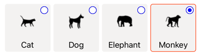
显示任意内容
在 iOS 和 Windows 上,当为 Content 属性分配了 View 时,RadioButton 可以显示任意内容:
<StackLayout>
    <Label Text="What's your favorite animal?" />
    <RadioButton>
        <RadioButton.Content>
            <Image Source="cat.png" />
        </RadioButton.Content>
    </RadioButton>
    <RadioButton>
        <RadioButton.Content>
            <Image Source="dog.png" />
        </RadioButton.Content>
    </RadioButton>
    <RadioButton>
        <RadioButton.Content>
            <Image Source="elephant.png" />
        </RadioButton.Content>
    </RadioButton>
    <RadioButton>
        <RadioButton.Content>
            <Image Source="monkey.png" />
        </RadioButton.Content>
    </RadioButton>
</StackLayout>
在此示例中,RadioButton 对象被隐式分组到同一个父容器内。 此 XAML 会生成如以下屏幕截图中所示的外观:
在 Android 上,RadioButton 对象将显示已设置为内容的 View 对象的基于字符串表示形式。
注意
将 ControlTemplate 应用于 RadioButton 时,可以在所有平台上将 View 分配给 RadioButton.Content 属性。 有关详细信息,请参阅重新定义 RadioButton 外观。
将值与 RadioButton 关联
每个 RadioButton 对象都有一个类型为 object 的 Value 属性,用于定义要与单选按钮关联的可选唯一值。 这样,RadioButton 的值就可以不同于其内容,这在 RadioButton 对象显示 View 对象时特别有用。
以下 XAML 展示了如何在每个 RadioButton 对象上设置 Content 和 Value 属性:
<StackLayout>
    <Label Text="What's your favorite animal?" />
    <RadioButton Value="Cat">
        <RadioButton.Content>
            <Image Source="cat.png" />
        </RadioButton.Content>
    </RadioButton>
    <RadioButton Value="Dog">
        <RadioButton.Content>
            <Image Source="dog.png" />
        </RadioButton.Content>
    </RadioButton>
    <RadioButton Value="Elephant">
        <RadioButton.Content>
            <Image Source="elephant.png" />
        </RadioButton.Content>
    </RadioButton>
    <RadioButton Value="Monkey">
        <RadioButton.Content>
            <Image Source="monkey.png" />
        </RadioButton.Content>
    </RadioButton>
</StackLayout>
在此示例中,每个 RadioButton 都有一个作为其内容的 Image,同时还定义了基于字符串的值。 这样可以很容易地识别选中的单选按钮的值。
对 RadioButtons 进行分组
单选按钮以组方式工作,可通过三种方法对单选按钮进行分组:
- 将它们放在同一个父容器内。 这称为隐式分组。
- 将组中每个单选按钮的
GroupName属性设置为相同的值。 这称为显式分组。 - 在父容器上设置
RadioButtonGroup.GroupName附加属性,后者又在容器中设置任何 RadioButton 对象的GroupName属性。 这也称为显式分组。
重要
RadioButton 对象不必属于同一父对象即可分组。 如果它们共享组名称,则会相互排斥。
使用 GroupName 属性进行显式分组
以下 XAML 示例演示如何通过设置 GroupName 属性对 RadioButton 对象进行显式分组:
<Label Text="What's your favorite color?" />
<RadioButton Content="Red"
             GroupName="colors" />
<RadioButton Content="Green"
             GroupName="colors" />
<RadioButton Content="Blue"
             GroupName="colors" />
<RadioButton Content="Other"
             GroupName="colors" />
在此示例中,每个 RadioButton 由于共享同一 GroupName 值而互斥。
使用 RadioButtonGroup.GroupName 附加属性进行显式分组
RadioButtonGroup 类定义类型为 string 的 GroupName 附加属性,该属性可以在 Layout<View> 对象上设置。 这样,任何布局都可以转换为单选按钮组:
<StackLayout RadioButtonGroup.GroupName="colors">
    <Label Text="What's your favorite color?" />
    <RadioButton Content="Red" />
    <RadioButton Content="Green" />
    <RadioButton Content="Blue" />
    <RadioButton Content="Other" />
</StackLayout>
在此示例中,StackLayout 中的每个 RadioButton 都将其 GroupName 属性设置为 colors,并且互斥。
注意
当设置 RadioButtonGroup.GroupName 附加属性的 ILayout 对象包含设置其 GroupName 属性的 RadioButton 时,RadioButton.GroupName 属性的值将优先。
响应 RadioButton 状态更改
单选按钮有两个状态:“已选中”或“取消选中”。 选中单选按钮时,其 IsChecked 属性为 true。 取消选中单选按钮时,其 IsChecked 属性为 false。 可以通过点击同一组中的另一个单选按钮来清除单选按钮,但不能通过再次点击来清除它。 但是,你可以通过将单选按钮的 IsChecked 属性设置为 false,以编程方式清除它。
响应事件触发
当 IsChecked 属性因为用户或编程操作而发生更改时,将触发 CheckedChanged 事件。 可以注册此事件的事件处理程序以响应更改:
<RadioButton Content="Red"
             GroupName="colors"
             CheckedChanged="OnColorsRadioButtonCheckedChanged" />
代码隐藏包含 CheckedChanged 事件的处理程序:
void OnColorsRadioButtonCheckedChanged(object sender, CheckedChangedEventArgs e)
{
    // Perform required operation
}
sender 参数是负责此事件的 RadioButton。 可以使用它访问 RadioButton 对象,或区分共享同一 CheckedChanged 事件处理程序的多个 RadioButton 对象。
响应属性更改
RadioButtonGroup 类定义类型为 object 的 SelectedValue 附加属性,可以在 ILayout 对象上设置该属性。 此附加属性表示在布局上定义的组中选中的 RadioButton 的值。
当 IsChecked 属性因为用户或编程操作而发生更改时,RadioButtonGroup.SelectedValue 附加属性也会更改。 因此,RadioButtonGroup.SelectedValue 附加属性可以是绑定到存储用户选择的属性的数据:
<ContentPage ...
             xmlns:local="clr-namespace:RadioButtonDemos"
             x:DataType="local:AnimalViewModel">
    <StackLayout Margin="10"
                 RadioButtonGroup.GroupName="{Binding GroupName}"
                 RadioButtonGroup.SelectedValue="{Binding Selection}">
        <Label Text="What's your favorite animal?" />
        <RadioButton Content="Cat"
                     Value="Cat" />
        <RadioButton Content="Dog"
                     Value="Dog" />
        <RadioButton Content="Elephant"
                     Value="Elephant" />
        <RadioButton Content="Monkey"
                     Value="Monkey"/>
        <Label x:Name="animalLabel">
            <Label.FormattedText>
                <FormattedString>
                    <Span Text="You have chosen:" />
                    <Span Text="{Binding Selection}" />
                </FormattedString>
            </Label.FormattedText>
        </Label>
    </StackLayout>
</ContentPage>
在此示例中,RadioButtonGroup.GroupName 附加属性的值由绑定上下文上的 GroupName 属性设置。 同样,RadioButtonGroup.SelectedValue 附加属性的值由绑定上下文上的 Selection 属性设置。 此外,Selection 属性更新为选中的 RadioButton 的 Value 属性。
RadioButton 视觉状态
RadioButton 对象具有 Checked 和 Unchecked 视觉状态,可用于在选中或不选中 RadioButton 时启动视觉更改。
以下 XAML 示例展示了如何为 Checked 和 Unchecked 状态定义视觉状态:
<ContentPage ...>
<ContentPage.Resources>
<Style TargetType="RadioButton">
<Setter Property="VisualStateManager.VisualStateGroups">
<VisualStateGroupList>
<VisualStateGroup x:Name="CheckedStates">
<VisualState x:Name="Checked">
<VisualState.Setters>
<Setter Property="TextColor"
Value="Green" />
<Setter Property="Opacity"
Value="1" />
</VisualState.Setters>
</VisualState>
<VisualState x:Name="Unchecked">
<VisualState.Setters>
<Setter Property="TextColor"
Value="Red" />
<Setter Property="Opacity"
Value="0.5" />
</VisualState.Setters>
</VisualState>
</VisualStateGroup>
</VisualStateGroupList>
</Setter>
</Style>
</ContentPage.Resources>
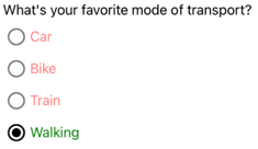
<StackLayout>
<Label Text="What's your favorite mode of transport?" />
<RadioButton Content="Car" />
<RadioButton Content="Bike" />
<RadioButton Content="Train" />
<RadioButton Content="Walking" />
</StackLayout>
</ContentPage>
在此示例中,隐式 Style 以 RadioButton 对象为目标。 Checked VisualState 指定在 RadioButton 处于选中状态时,其 TextColor 属性将设置为绿色,Opacity 值为 1。 Unchecked VisualState 指定在 RadioButton 处于未选中状态时,其 TextColor 属性将设置为绿色,Opacity 值为 0.5。 因此,总体效果是,当未选中 RadioButton 时,它是红色且部分透明的,而当选中时,它是绿色且不透明的:
要详细了解视觉效果状态,请参阅视觉效果状态。
重新定义单选按钮外观
默认情况下,RadioButton 对象使用处理程序来利用受支持平台上的本机控件。 但是,可以使用 ControlTemplate 重新定义 RadioButton 视觉结构,这样 RadioButton 对象在所有平台上都具有相同的外观。 这是可能的,因为 RadioButton 类继承自 TemplatedView 类。
以下 XAML 显示了一个 ControlTemplate,其可用于重新定义 RadioButton 对象的视觉结构:
<ContentPage ...>
    <ContentPage.Resources>
        <ControlTemplate x:Key="RadioButtonTemplate">
            <Border Stroke="#F3F2F1"
                    StrokeThickness="2"
                    StrokeShape="RoundRectangle 10"
                    BackgroundColor="#F3F2F1"
                    HeightRequest="90"
                    WidthRequest="90"
                    HorizontalOptions="Start"
                    VerticalOptions="Start">
                <VisualStateManager.VisualStateGroups>
                    <VisualStateGroupList>
                        <VisualStateGroup x:Name="CheckedStates">
                            <VisualState x:Name="Checked">
                                <VisualState.Setters>
                                    <Setter Property="Stroke"
                                            Value="#FF3300" />
                                    <Setter TargetName="check"
                                            Property="Opacity"
                                            Value="1" />
                                </VisualState.Setters>
                            </VisualState>
                            <VisualState x:Name="Unchecked">
                                <VisualState.Setters>
                                    <Setter Property="BackgroundColor"
                                            Value="#F3F2F1" />
                                    <Setter Property="Stroke"
                                            Value="#F3F2F1" />
                                    <Setter TargetName="check"
                                            Property="Opacity"
                                            Value="0" />
                                </VisualState.Setters>
                            </VisualState>
                        </VisualStateGroup>
                    </VisualStateGroupList>
                </VisualStateManager.VisualStateGroups>
                <Grid Margin="4"
                      WidthRequest="90">
                    <Grid Margin="0,0,4,0"
                          WidthRequest="18"
                          HeightRequest="18"
                          HorizontalOptions="End"
                          VerticalOptions="Start">
                        <Ellipse Stroke="Blue"
                                 Fill="White"
                                 WidthRequest="16"
                                 HeightRequest="16"
                                 HorizontalOptions="Center"
                                 VerticalOptions="Center" />
                        <Ellipse x:Name="check"
                                 Fill="Blue"
                                 WidthRequest="8"
                                 HeightRequest="8"
                                 HorizontalOptions="Center"
                                 VerticalOptions="Center" />
                    </Grid>
                    <ContentPresenter />
                </Grid>
            </Border>
        </ControlTemplate>

        <Style TargetType="RadioButton">
            <Setter Property="ControlTemplate"
                    Value="{StaticResource RadioButtonTemplate}" />
        </Style>
    </ContentPage.Resources>
    <!-- Page content -->
</ContentPage>
在此示例中,ControlTemplate 的根元素是一个 Border 对象,用于定义 Checked 和 Unchecked 视觉状态。 Border 对象使用 Grid、Ellipse 和 ContentPresenter 对象的组合来定义 RadioButton 的视觉结构。 该示例还包括一个隐式样式,该样式将 RadioButtonTemplate 分配给页面上任何 RadioButton 对象的 ControlTemplate 属性。
注意
ContentPresenter 对象将标记视觉结构中将显示 RadioButton 内容的位置。
以下 XAML 展示了通过隐式样式使用 ControlTemplate 的 RadioButton 对象:
<StackLayout>
    <Label Text="What's your favorite animal?" />
    <StackLayout RadioButtonGroup.GroupName="animals"
                 Orientation="Horizontal">
        <RadioButton Value="Cat">
            <RadioButton.Content>
                <StackLayout>
                    <Image Source="cat.png"
                           HorizontalOptions="Center"
                           VerticalOptions="Center" />
                    <Label Text="Cat"
                           HorizontalOptions="Center"
                           VerticalOptions="End" />
                </StackLayout>
            </RadioButton.Content>
        </RadioButton>
        <RadioButton Value="Dog">
            <RadioButton.Content>
                <StackLayout>
                    <Image Source="dog.png"
                           HorizontalOptions="Center"
                           VerticalOptions="Center" />
                    <Label Text="Dog"
                           HorizontalOptions="Center"
                           VerticalOptions="End" />
                </StackLayout>
            </RadioButton.Content>
        </RadioButton>
        <RadioButton Value="Elephant">
            <RadioButton.Content>
                <StackLayout>
                    <Image Source="elephant.png"
                           HorizontalOptions="Center"
                           VerticalOptions="Center" />
                    <Label Text="Elephant"
                           HorizontalOptions="Center"
                           VerticalOptions="End" />
                </StackLayout>
            </RadioButton.Content>
        </RadioButton>
        <RadioButton Value="Monkey">
            <RadioButton.Content>
                <StackLayout>
                    <Image Source="monkey.png"
                           HorizontalOptions="Center"
                           VerticalOptions="Center" />
                    <Label Text="Monkey"
                           HorizontalOptions="Center"
                           VerticalOptions="End" />
                </StackLayout>
            </RadioButton.Content>
        </RadioButton>
    </StackLayout>
</StackLayout>
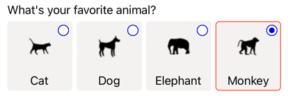
在此示例中,为每个 RadioButton 定义的视觉结构被替换为 ControlTemplate 中定义的视觉结构,因此在运行时,ControlTemplate 中的对象成为每个 RadioButton 的可视化树的一部分。 此外,每个 RadioButton 的内容都被替换到控件模板中定义的 ContentPresenter 中。 这将导致以下 RadioButton 外观:
有关控件模板的详细信息,请参阅控件模板。
禁用 RadioButton
有时,应用会进入选中 RadioButton 不是有效操作的状态。 在这种情况下,可以通过将 RadioButton 的 IsEnabled 属性设置为 false 来对其进行禁用。