本教程演示了 Microsoft Fabric 中 Synapse 数据科学工作流的端到端示例。 此方案生成一个模型来预测银行客户是否流失。 流失率或减员率涉及银行客户与银行结束业务的速度。
本教程介绍以下步骤:
- 安装自定义库
- 加载数据
- 通过探索性数据分析了解和处理数据,并显示 Fabric Data Wrangler 功能的用法
- 使用 scikit-learn 和 LightGBM 训练机器学习模型,并使用 MLflow 和 Fabric 自动记录功能特性跟踪试验
- 评估和保存最终machine learning模型
- 使用 Power BI 可视化效果显示模型性能
先决条件
获取 Microsoft Fabric 订阅。 或者,注册免费的 Microsoft Fabric 试用版。
登录到 Microsoft Fabric。
使用主页左下侧的体验切换器切换到 Fabric。
- 如有必要,请按照在 Microsoft Fabric 中创建 lakehouse中的说明创建 Microsoft Fabric lakehouse。
在笔记本中继续操作
若要在笔记本中继续进行,请选择以下选项之一:
- 打开并运行内置笔记本。
- 从GitHub上传笔记本。
打开内置笔记本
本教程随附示例“客户流失”笔记本。
若要打开本教程的示例笔记本,请按照 为数据科学教程准备系统中的说明进行操作。
在开始运行代码之前,请务必将湖屋附加到笔记本。
从GitHub导入笔记本
AIsample - Bank Customer Churn.ipynb 笔记本随附本教程。
若要打开本教程随附的笔记本,请按照 为数据科学教程准备系统 中的说明将笔记本导入工作区。
如果要复制并粘贴此页面中的代码,可以 创建新的笔记本。
在开始运行代码之前,请务必将湖屋连接到笔记本。
步骤 1:安装自定义库
若要machine learning模型开发或临时数据分析,可能需要为 Apache Spark 会话快速安装自定义库。 有两个选项可用于安装库。
- 请使用笔记本的内嵌安装功能(
%pip或%conda)在当前笔记本中安装库。 - 或者,创建 Fabric 环境。 从公共源安装库或将自定义库上传到该库。 工作区管理员可以将环境附加为工作区的默认值。 环境中的所有库均可在工作区中的任何笔记本和 Spark 作业定义中使用。 有关环境的详细信息,请参阅
在 Microsoft Fabric 。
在本教程中,请使用 %pip install 在笔记本中安装 imblearn 库。
注意
运行 %pip install 后,PySpark 内核将重启。 在运行任何其他单元格之前安装所需的库。
# Use pip to install libraries
%pip install imblearn
步骤 2:加载数据
churn.csv 中的数据集包含 10,000 个客户的变动状态,以及 14 个属性,其中包括:
- 信用评分
- 地理位置(德国、法国、西班牙)
- 性别(男性、女性)
- 年龄
- 任期(该人是该银行的客户年数)
- 帐户余额
- 估计工资
- 客户通过银行购买的产品数
- 信用卡状态(客户是否有信用卡)
- 活动成员状态(此人是否为活动银行客户)
数据集还包括行号、客户 ID 和客户姓氏列。 这些列中的值不应影响客户离开银行的决定。
客户银行帐户关闭事件定义该客户的流失。 数据集 Exited 列指客户的放弃。 由于这些属性的上下文很少,因此不需要有关数据集的背景信息。 你希望了解这些属性如何为 Exited 状态做出贡献。
在这些10,000个客户中,只有2,037个客户(大约20%)离开银行。 由于类别不平衡比率,生成合成数据。 混淆矩阵准确性可能与不平衡分类没有相关性。 你可能想要使用 Precision-Recall 曲线下的面积(AUPRC)测量准确性。
- 下表显示了
churn.csv数据的预览:
| 客户编号 | Surname | 信用评分 | 地理 | 性别 | 年龄 | 任期 | Balance | NumOfProducts | HasCrCard | IsActiveMember | 估算工资 | Exited |
|---|---|---|---|---|---|---|---|---|---|---|---|---|
| 15634602 | 哈格雷夫 | 619 | 法国 | 女性 | 42 | 2 | 0.00 | 1 | 1 | 1 | 101348.88 | 1 |
| 15647311 | Hill | 608 | 西班牙 | 女性 | 41 | 1 | 83807.86 | 1 | 0 | 1 | 112542.58 | 0 |
下载数据集并上传到湖仓系统
定义这些参数,以便可以将此笔记本用于不同的数据集:
IS_CUSTOM_DATA = False  # If TRUE, the dataset has to be uploaded manually

IS_SAMPLE = False  # If TRUE, use only SAMPLE_ROWS of data for training; otherwise, use all data
SAMPLE_ROWS = 5000  # If IS_SAMPLE is True, use only this number of rows for training

DATA_ROOT = "/lakehouse/default"
DATA_FOLDER = "Files/churn"  # Folder with data files
DATA_FILE = "churn.csv"  # Data file name
此代码下载数据集的公开可用版本,然后将该数据集存储在 Fabric Lakehouse 中:
重要
在运行笔记本之前,添加 Lakehouse。 如果未添加 Lakehouse,则会出现错误。
import os, requests
if not IS_CUSTOM_DATA:
# With an Azure Synapse Analytics blob, this can be done in one line

# Download demo data files into the lakehouse if they don't exist
    remote_url = "https://synapseaisolutionsa.z13.web.core.windows.net/data/bankcustomerchurn"
    file_list = ["churn.csv"]
    download_path = "/lakehouse/default/Files/churn/raw"

    if not os.path.exists("/lakehouse/default"):
        raise FileNotFoundError(
            "Default lakehouse not found, please add a lakehouse and restart the session."
        )
    os.makedirs(download_path, exist_ok=True)
    for fname in file_list:
        if not os.path.exists(f"{download_path}/{fname}"):
            r = requests.get(f"{remote_url}/{fname}", timeout=30)
            with open(f"{download_path}/{fname}", "wb") as f:
                f.write(r.content)
    print("Downloaded demo data files into lakehouse.")
开始录制运行笔记本所需的时间:
# Record the notebook running time
import time

ts = time.time()
从湖屋中读取原始数据
此代码从 lakehouse 的 Files 部分读取原始数据,并添加更多列以涵盖不同的日期部分。 创建分区 Delta 表会使用此信息。
df = (
    spark.read.option("header", True)
    .option("inferSchema", True)
    .csv("Files/churn/raw/churn.csv")
    .cache()
)
基于数据集创建 pandas DataFrame
此代码将 Spark 数据帧转换为 pandas 数据帧,以便更轻松地处理和可视化:
df = df.toPandas()
步骤 3:执行探索性数据分析
显示原始数据
使用 display 浏览原始数据。 计算一些基本统计信息,并显示图表视图。 首先,导入数据可视化所需的库,例如 seaborn。 Seaborn 是一个 Python 数据可视化库,它提供一个高级界面,用于在数据帧和数组上生成视觉对象。
import seaborn as sns
sns.set_theme(style="whitegrid", palette="tab10", rc = {'figure.figsize':(9,6)})
import matplotlib.pyplot as plt
import matplotlib.ticker as mticker
from matplotlib import rc, rcParams
import numpy as np
import pandas as pd
import itertools
display(df, summary=True)
使用 Data Wrangler 执行初始数据清理
直接从笔记本启动数据整理器,以浏览和转换 pandas DataFrame。 从水平工具栏中选择“Data Wrangler”下拉列表,浏览可供编辑的已激活的 pandas 数据帧。 选择要在 Data Wrangler 中打开的数据帧。
注意
在笔记本内核繁忙时,无法打开数据整理程序。 在启动数据整理器之前,必须完成单元格执行。 详细了解数据整理器。

Data Wrangler 启动后,它会生成数据面板的描述性概述,如下图所示。 概述包括有关 DataFrame 维度、任何缺失值等的信息。 可以使用 Data Wrangler 生成脚本,以删除缺少值的行、重复行和具有特定名称的列。 然后,可以将脚本复制到单元格中。 下一个单元格显示复制的脚本。


def clean_data(df):
    # Drop rows with missing data across all columns
    df.dropna(inplace=True)
    # Drop duplicate rows in columns: 'RowNumber', 'CustomerId'
    df.drop_duplicates(subset=['RowNumber', 'CustomerId'], inplace=True)
    # Drop columns: 'RowNumber', 'CustomerId', 'Surname'
    df.drop(columns=['RowNumber', 'CustomerId', 'Surname'], inplace=True)
    return df

df_clean = clean_data(df.copy())
确定属性
此代码确定分类、数字和目标属性:
# Determine the dependent (target) attribute
dependent_variable_name = "Exited"
print(dependent_variable_name)
# Determine the categorical attributes
categorical_variables = [col for col in df_clean.columns if col in "O"
                        or df_clean[col].nunique() <=5
                        and col not in "Exited"]
print(categorical_variables)
# Determine the numerical attributes
numeric_variables = [col for col in df_clean.columns if df_clean[col].dtype != "object"
                        and df_clean[col].nunique() >5]
print(numeric_variables)
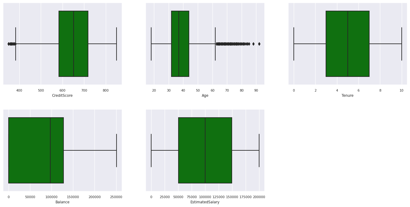
显示五个数字的摘要
使用框图显示五个数字的摘要
- 最低分数
- 第一个四分位数
- 中值
- 第三个四分位数
- 最大分数
表示数值属性。
df_num_cols = df_clean[numeric_variables]
sns.set(font_scale = 0.7)
fig, axes = plt.subplots(nrows = 2, ncols = 3, gridspec_kw =  dict(hspace=0.3), figsize = (17,8))
fig.tight_layout()
for ax,col in zip(axes.flatten(), df_num_cols.columns):
    sns.boxplot(x = df_num_cols[col], color='green', ax = ax)
# fig.suptitle('visualize and compare the distribution and central tendency of numerical attributes', color = 'k', fontsize = 12)
fig.delaxes(axes[1,2])
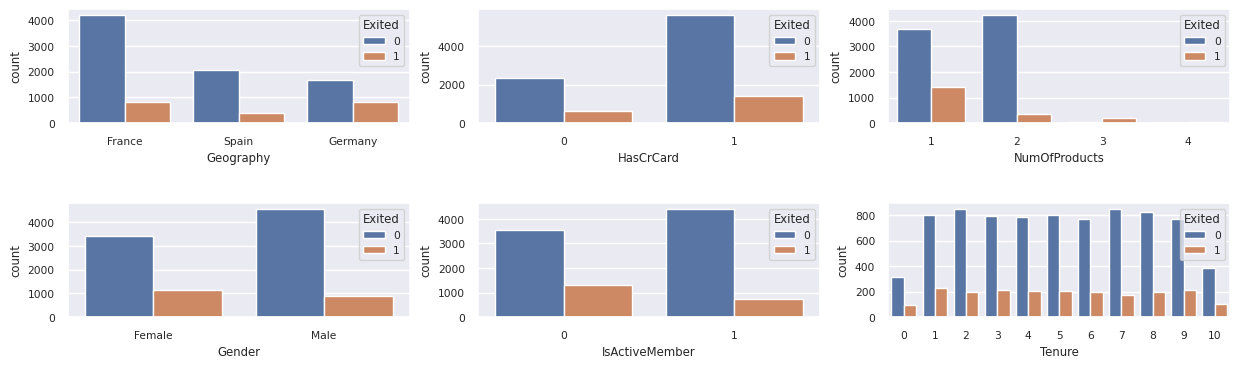
显示已退出客户和非退出客户的分布
显示已退出客户与未退出客户在各类别属性中的分布:
attr_list = ['Geography', 'Gender', 'HasCrCard', 'IsActiveMember', 'NumOfProducts', 'Tenure']
fig, axarr = plt.subplots(2, 3, figsize=(15, 4))
for ind, item in enumerate (attr_list):
    sns.countplot(x = item, hue = 'Exited', data = df_clean, ax = axarr[ind%2][ind//2])
fig.subplots_adjust(hspace=0.7)
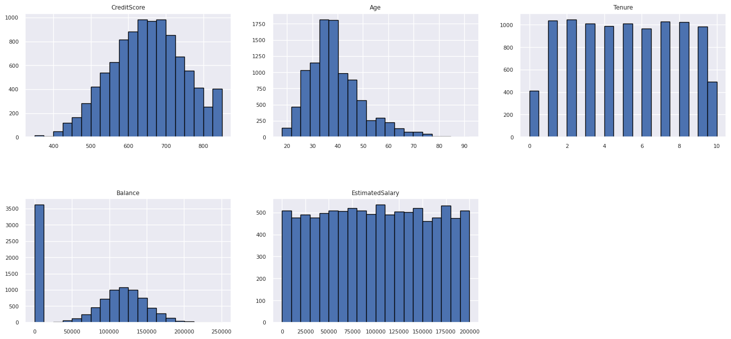
显示数值属性的分布
使用直方图显示数值属性的频率分布:
columns = df_num_cols.columns[: len(df_num_cols.columns)]
fig = plt.figure()
fig.set_size_inches(18, 8)
length = len(columns)
for i,j in itertools.zip_longest(columns, range(length)):
    plt.subplot((length // 2), 3, j+1)
    plt.subplots_adjust(wspace = 0.2, hspace = 0.5)
    df_num_cols[i].hist(bins = 20, edgecolor = 'black')
    plt.title(i)
# fig = fig.suptitle('distribution of numerical attributes', color = 'r' ,fontsize = 14)
plt.show()
执行特征工程
此功能工程基于当前属性生成新属性:
df_clean["NewTenure"] = df_clean["Tenure"]/df_clean["Age"]
df_clean["NewCreditsScore"] = pd.qcut(df_clean['CreditScore'], 6, labels = [1, 2, 3, 4, 5, 6])
df_clean["NewAgeScore"] = pd.qcut(df_clean['Age'], 8, labels = [1, 2, 3, 4, 5, 6, 7, 8])
df_clean["NewBalanceScore"] = pd.qcut(df_clean['Balance'].rank(method="first"), 5, labels = [1, 2, 3, 4, 5])
df_clean["NewEstSalaryScore"] = pd.qcut(df_clean['EstimatedSalary'], 10, labels = [1, 2, 3, 4, 5, 6, 7, 8, 9, 10])
使用数据整理器执行独热编码
使用相同的步骤启动 Data Wrangler,如前所述。 使用 Data Wrangler 执行单热编码。 此单元格显示复制生成的用于独热编码的脚本:


df_clean = pd.get_dummies(df_clean, columns=['Geography', 'Gender'])
创建增量表以生成 Power BI 报表
table_name = "df_clean"
# Create a PySpark DataFrame from pandas
sparkDF=spark.createDataFrame(df_clean)
sparkDF.write.mode("overwrite").format("delta").save(f"Tables/{table_name}")
print(f"Spark DataFrame saved to delta table: {table_name}")
探索数据分析中的观察结果摘要
- 大多数客户来自法国。 与法国和德国相比,西班牙的流失率最低。
- 大多数客户都有信用卡。
- 一些客户年龄在 60 岁以上,信用评分低于 400。 但是,它们不被视为离群值。
- 很少有客户拥有两个以上的银行产品。
- 非活动客户流失率较高。
- 性别和任期年对客户关闭银行账户的决定影响不大。
步骤 4:执行模型训练和跟踪
有了数据,现在可以定义模型。 在此笔记本中应用随机森林和 LightGBM 模型。
使用 scikit-learn 和 LightGBM 库通过几行代码实现模型。 此外,使用 MLfLow 和 Fabric 自动记录来跟踪试验。
此代码示例从湖屋加载 Delta 表。 可以使用其他 Delta 表,这些表本身使用湖屋作为源。
SEED = 12345
df_clean = spark.read.format("delta").load("Tables/df_clean").toPandas()
使用 MLflow 生成用于跟踪和记录模型的试验
本部分演示如何生成试验,并指定模型和训练参数以及评分指标。 此外,它还演示如何训练模型、记录模型以及保存训练的模型以供以后使用。
import mlflow

# Set up the experiment name
EXPERIMENT_NAME = "sample-bank-churn-experiment"  # MLflow experiment name
自动记录会自动捕获机器学习模型在训练过程中输入参数值和输出指标。 然后,此信息将记录到工作区,MLflow API 或工作区中的相应实验可以访问并将其可视化。
完成后,试验将类似于下图:

记录具有各自名称的所有试验,可以跟踪其参数和性能指标。 若要了解有关自动记录的详细信息,请参阅 Microsoft Fabric 中的 Autologging。
设置试验和自动记录规范
mlflow.set_experiment(EXPERIMENT_NAME) # Use a date stamp to append to the experiment
mlflow.autolog(exclusive=False)
导入 scikit-learn 和 LightGBM
# Import the required libraries for model training
from sklearn.model_selection import train_test_split
from lightgbm import LGBMClassifier
from sklearn.ensemble import RandomForestClassifier
from sklearn.metrics import accuracy_score, f1_score, precision_score, confusion_matrix, recall_score, roc_auc_score, classification_report
准备训练和测试数据集
y = df_clean["Exited"]
X = df_clean.drop("Exited",axis=1)
# Train/test separation
X_train, X_test, y_train, y_test = train_test_split(X, y, test_size=0.20, random_state=SEED)
将 SMOTE 应用于训练数据
不平衡分类存在问题:对于模型而言,少数类的示例太少,无法有效地了解决策边界。 为了解决此问题,最广泛使用的技术是合成少数民族过度采样技术(SMOTE),它合成了少数民族类的新样本。 使用在步骤 1 中安装的 imblearn 库来访问 SMOTE。
仅将 SMOTE 应用于训练数据集。 将测试数据集保留在其原始不平衡分布中,以便对原始数据获得模型性能的有效近似值。 此试验表示生产环境中的情况。
from collections import Counter
from imblearn.over_sampling import SMOTE

sm = SMOTE(random_state=SEED)
X_res, y_res = sm.fit_resample(X_train, y_train)
new_train = pd.concat([X_res, y_res], axis=1)
有关详细信息,请参阅 SMOTE 和从随机过度采样到 SMOTE 和 ADASYN。 imbalanced-learn网站托管这些资源。
训练模型
使用随机林训练模型,最大深度为 4,具有 4 个特征:
mlflow.sklearn.autolog(registered_model_name='rfc1_sm')  # Register the trained model with autologging
rfc1_sm = RandomForestClassifier(max_depth=4, max_features=4, min_samples_split=3, random_state=1) # Pass hyperparameters
with mlflow.start_run(run_name="rfc1_sm") as run:
    rfc1_sm_run_id = run.info.run_id # Capture run_id for model prediction later
    print("run_id: {}; status: {}".format(rfc1_sm_run_id, run.info.status))
    # rfc1.fit(X_train,y_train) # Imbalanced training data
    rfc1_sm.fit(X_res, y_res.ravel()) # Balanced training data
    rfc1_sm.score(X_test, y_test)
    y_pred = rfc1_sm.predict(X_test)
    cr_rfc1_sm = classification_report(y_test, y_pred)
    cm_rfc1_sm = confusion_matrix(y_test, y_pred)
    roc_auc_rfc1_sm = roc_auc_score(y_res, rfc1_sm.predict_proba(X_res)[:, 1])
使用随机林训练模型,最大深度为 8,具有 6 个特征:
mlflow.sklearn.autolog(registered_model_name='rfc2_sm')  # Register the trained model with autologging
rfc2_sm = RandomForestClassifier(max_depth=8, max_features=6, min_samples_split=3, random_state=1) # Pass hyperparameters
with mlflow.start_run(run_name="rfc2_sm") as run:
    rfc2_sm_run_id = run.info.run_id # Capture run_id for model prediction later
    print("run_id: {}; status: {}".format(rfc2_sm_run_id, run.info.status))
    # rfc2.fit(X_train,y_train) # Imbalanced training data
    rfc2_sm.fit(X_res, y_res.ravel()) # Balanced training data
    rfc2_sm.score(X_test, y_test)
    y_pred = rfc2_sm.predict(X_test)
    cr_rfc2_sm = classification_report(y_test, y_pred)
    cm_rfc2_sm = confusion_matrix(y_test, y_pred)
    roc_auc_rfc2_sm = roc_auc_score(y_res, rfc2_sm.predict_proba(X_res)[:, 1])
使用 LightGBM 训练模型:
# lgbm_model
mlflow.lightgbm.autolog(registered_model_name='lgbm_sm')  # Register the trained model with autologging
lgbm_sm_model = LGBMClassifier(learning_rate = 0.07,
                        max_delta_step = 2,
                        n_estimators = 100,
                        max_depth = 10,
                        eval_metric = "logloss",
                        objective='binary',
                        random_state=42)

with mlflow.start_run(run_name="lgbm_sm") as run:
    lgbm1_sm_run_id = run.info.run_id # Capture run_id for model prediction later
    # lgbm_sm_model.fit(X_train,y_train) # Imbalanced training data
    lgbm_sm_model.fit(X_res, y_res.ravel()) # Balanced training data
    y_pred = lgbm_sm_model.predict(X_test)
    accuracy = accuracy_score(y_test, y_pred)
    cr_lgbm_sm = classification_report(y_test, y_pred)
    cm_lgbm_sm = confusion_matrix(y_test, y_pred)
    roc_auc_lgbm_sm = roc_auc_score(y_res, lgbm_sm_model.predict_proba(X_res)[:, 1])
查看实验工件以跟踪模型性能
试验运行会自动保存在试验项目中。 可以在工作区中找到工件。 工件名称由实验名称而定。 试验页记录所有已训练的模型、其运行、性能指标和模型参数。
查看试验:
- 在左侧面板中,选择工作区。
- 查找并选择相应的试验名称,在本例中为“sample-bank-churn-experiment”。
步骤 5:评估和保存最终machine learning模型
从工作区打开保存的试验以选择并保存最佳模型:
# Define run_uri to fetch the model
# MLflow client: mlflow.model.url, list model
load_model_rfc1_sm = mlflow.sklearn.load_model(f"runs:/{rfc1_sm_run_id}/model")
load_model_rfc2_sm = mlflow.sklearn.load_model(f"runs:/{rfc2_sm_run_id}/model")
load_model_lgbm1_sm = mlflow.lightgbm.load_model(f"runs:/{lgbm1_sm_run_id}/model")
评估测试数据集上保存的模型的性能
ypred_rfc1_sm = load_model_rfc1_sm.predict(X_test) # Random forest with maximum depth of 4 and 4 features
ypred_rfc2_sm = load_model_rfc2_sm.predict(X_test) # Random forest with maximum depth of 8 and 6 features
ypred_lgbm1_sm = load_model_lgbm1_sm.predict(X_test) # LightGBM
使用混淆矩阵显示真正、假正、真负和假负
若要评估分类的准确性,请生成绘制混淆矩阵的脚本。 还可以使用 SynapseML 工具绘制混淆矩阵,如 欺诈检测示例所示。
def plot_confusion_matrix(cm, classes,
                          normalize=False,
                          title='Confusion matrix',
                          cmap=plt.cm.Blues):
    print(cm)
    plt.figure(figsize=(4,4))
    plt.rcParams.update({'font.size': 10})
    plt.imshow(cm, interpolation='nearest', cmap=cmap)
    plt.title(title)
    plt.colorbar()
    tick_marks = np.arange(len(classes))
    plt.xticks(tick_marks, classes, rotation=45, color="blue")
    plt.yticks(tick_marks, classes, color="blue")

    fmt = '.2f' if normalize else 'd'
    thresh = cm.max() / 2.
    for i, j in itertools.product(range(cm.shape[0]), range(cm.shape[1])):
        plt.text(j, i, format(cm[i, j], fmt),
                 horizontalalignment="center",
                 color="red" if cm[i, j] > thresh else "black")

    plt.tight_layout()
    plt.ylabel('True label')
    plt.xlabel('Predicted label')
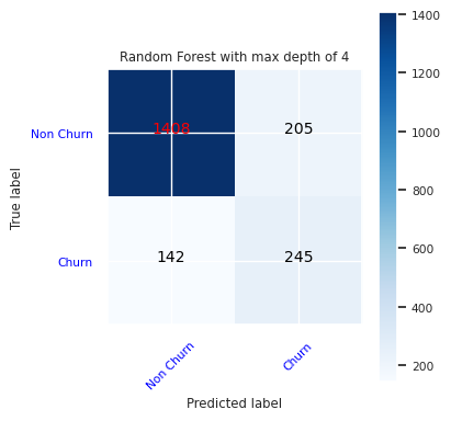
为随机林分类器创建混淆矩阵,最大深度为 4,具有四个特征:
cfm = confusion_matrix(y_test, y_pred=ypred_rfc1_sm)
plot_confusion_matrix(cfm, classes=['Non Churn','Churn'],
                      title='Random Forest with max depth of 4')
tn, fp, fn, tp = cfm.ravel()
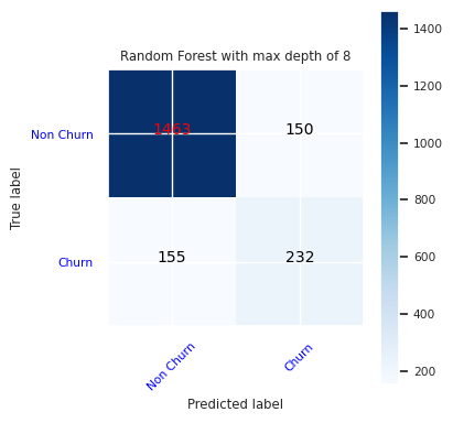
为最大深度为 8 的随机林分类器创建混淆矩阵,其中包含六个特征:
cfm = confusion_matrix(y_test, y_pred=ypred_rfc2_sm)
plot_confusion_matrix(cfm, classes=['Non Churn','Churn'],
                      title='Random Forest with max depth of 8')
tn, fp, fn, tp = cfm.ravel()
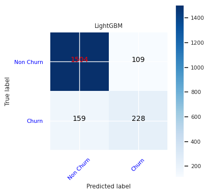
为 LightGBM 创建混淆矩阵:
cfm = confusion_matrix(y_test, y_pred=ypred_lgbm1_sm)
plot_confusion_matrix(cfm, classes=['Non Churn','Churn'],
                      title='LightGBM')
tn, fp, fn, tp = cfm.ravel()
保存 Power BI 的结果
将 Delta 帧保存到 Lakehouse,以便将模型预测结果转移到 Power BI 可视化效果中。
df_pred = X_test.copy()
df_pred['y_test'] = y_test
df_pred['ypred_rfc1_sm'] = ypred_rfc1_sm
df_pred['ypred_rfc2_sm'] =ypred_rfc2_sm
df_pred['ypred_lgbm1_sm'] = ypred_lgbm1_sm
table_name = "df_pred_results"
sparkDF=spark.createDataFrame(df_pred)
sparkDF.write.mode("overwrite").format("delta").option("overwriteSchema", "true").save(f"Tables/{table_name}")
print(f"Spark DataFrame saved to delta table: {table_name}")
步骤 6:在 Power BI 中访问可视化效果
在 Power BI 中访问您保存的表:
- 在左侧,选择“OneLake”。
- 选择已添加到此笔记本的湖屋。
- 在“打开此湖屋”部分中,选择“打开”。
- 在功能区上,选择“新建语义模型”。 选择
df_pred_results,然后选择 确认 以创建新的链接到预测的 Power BI 语义模型。 - 打开新的语义模型。 可以在 OneLake 中找到它。
- 从语义模型页面顶部的工具中选择文件下的“新建报表”,以打开 Power BI 报表创作页面。
以下屏幕截图显示了一些示例可视化效果。 数据面板显示要从表中选择的 Delta 表和列。 选择适当的类别(x)和值(y)轴后,可以选择筛选器和函数-例如,表列的总和或平均值。
注意
在此屏幕截图中,演示的示例描述了 Power BI 中保存的预测结果的分析:

但是,对于实际的客户流失用例,用户可能需要一套更全面的可视化要求,以便根据专家知识和分析经验创建;同时,确保这些可视化与公司和商业分析团队已标准化的指标保持一致。
Power BI 报表显示,使用两个以上的银行产品的客户流失率更高。 但是,很少有客户拥有两个以上的产品。 (请参阅左下面板中的绘图。该银行应收集更多数据,但还应调查与更多产品相关的其他功能。
与法国和西班牙的客户相比,德国的银行客户流失率更高。 (请参阅右下面板中的绘图)。 根据报告结果,对鼓励客户离开的因素进行调查可能会有所帮助。
有更多的中年客户(25至45岁)。 45 到 60 之间的客户倾向于退出更多。
最后,信用评分较低的客户很可能将银行留给其他金融机构。 银行应探索如何鼓励信用评分较低的客户和帐户余额留在银行。
# Determine the entire runtime
print(f"Full run cost {int(time.time() - ts)} seconds.")
相关内容
- Microsoft Fabric 中的机器学习模型
- 训练machine learning模型
- Microsoft Fabric 中的 Machine learning 实验