使用 Power BI 分析 Azure Data Lake Storage Gen2 中的数据

本文介绍如何使用 Power BI Desktop 分析和可视化存储在具有分层命名空间 (Azure Data Lake Storage Gen2) 的存储帐户中的数据。

先决条件

开始本教程之前,必须具有以下先决条件:

  • Azure 订阅。 转到获取 Azure 免费试用版
  • 具有分层命名空间的存储帐户。 按照创建存储帐户中的说明创建一个存储帐户。 本文假定已创建名为 contosoadlscdm 的存储帐户。
  • 确保已被授予存储帐户的以下角色之一:Blob 数据读者Blob 数据参与者Blob 数据所有者
  • 存储帐户中有一名为 Drivers.txt 的示例数据文件。 可从 Azure Data Lake Git 存储库下载此示例,然后将该文件上传到存储帐户。
  • Power BI Desktop。 可以从 Microsoft 下载中心下载此应用程序。

在 Power BI Desktop 中创建报表

  1. 在计算机上启动 Power BI Desktop。

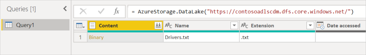
  2. 按照 Azure Data Lake Storage Gen2 连接器文章中的说明连接到示例数据。

  3. 从 Power Query 导航器中,选择加载

    Screenshot of the Navigator, with data from the Drivers.txt file displayed.

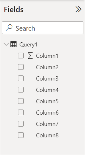
  4. 将数据成功加载到 Power BI 后,字段面板中将显示以下字段。

    Screenshot of the Fields panel, showing Query1, which contains Date accessed, Date created, Date modified, Extension, Folder Path, and Name fields.

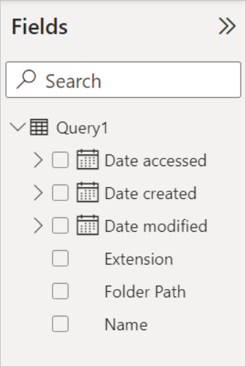
    但是,要可视化和分析数据,可能希望使用以下字段提供数据。

    Screenshot of a data table, with names and addresses from the Content column in the original table displayed in rows.

    在接下来的步骤中,将更新查询,以将导入的数据转换为所需格式。

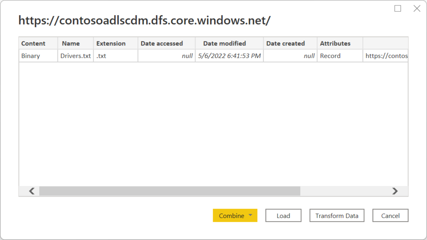
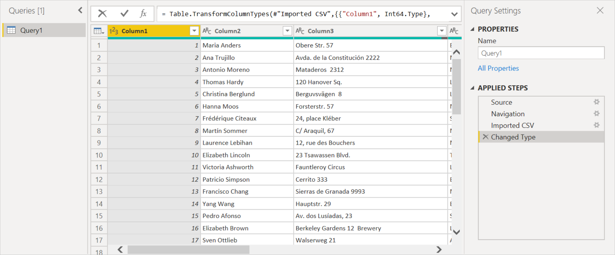
  5. 从功能区的主页选项卡中,选择转换数据。 然后,Power Query 编辑器将打开,其中显示文件的内容。

    Screenshot of the Power Query editor, with the query created from the original Drivers.txt file.

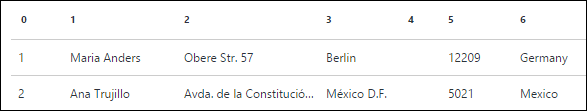
  6. 在 Power Query 编辑器中的内容列下,选择二进制。 该文件将自动检测为 CSV,并包含如下所示的输出。 数据现在已是可用于创建可视化的格式。

    Screenshot of the Power Query editor, showing the data from the Binary field expanded to a table with names and addresses, with Imported CSV and Changed Type added to the Applied Steps panel.

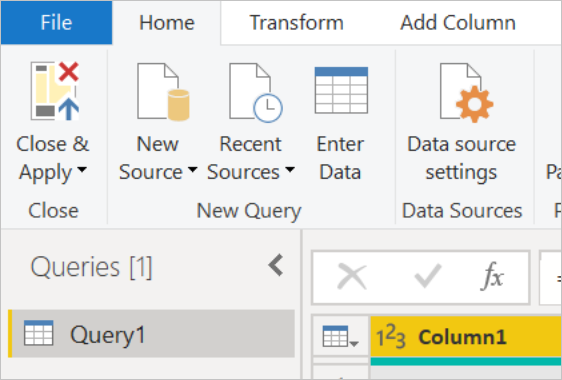
  7. 在功能区的“开始”选项卡中,选择“关闭并应用”。

    Closeup screenshot of the Power Query editor, showing the Close & Apply option.

  8. 更新查询后,字段选项卡将显示可用于可视化效果的新字段。

    Screenshot of the Fields pane in Power BI, with Query1 now displaying Column1 through Column8.

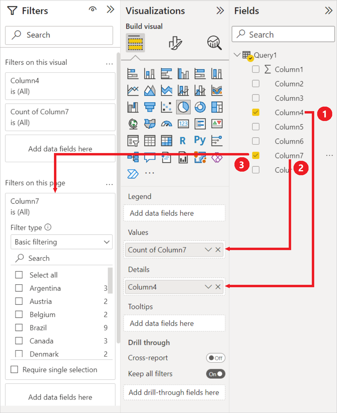
  9. 现在,可以创建一个饼图来表示给定国家/地区每个城市的驱动程序。 为此,请如下进行选择。
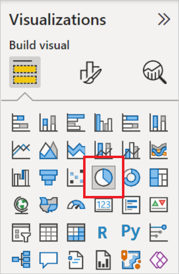
    可视化效果选项卡中,选择饼图的符号。

    Screenshot of the Visualizations pane, with the pie chart symbol emphasized.

    在此示例中,要使用的列是列 4(城市名称)和列 7(国家/地区名称)。 将这些列从字段选项卡拖到可视化效果选项卡,如下所示。
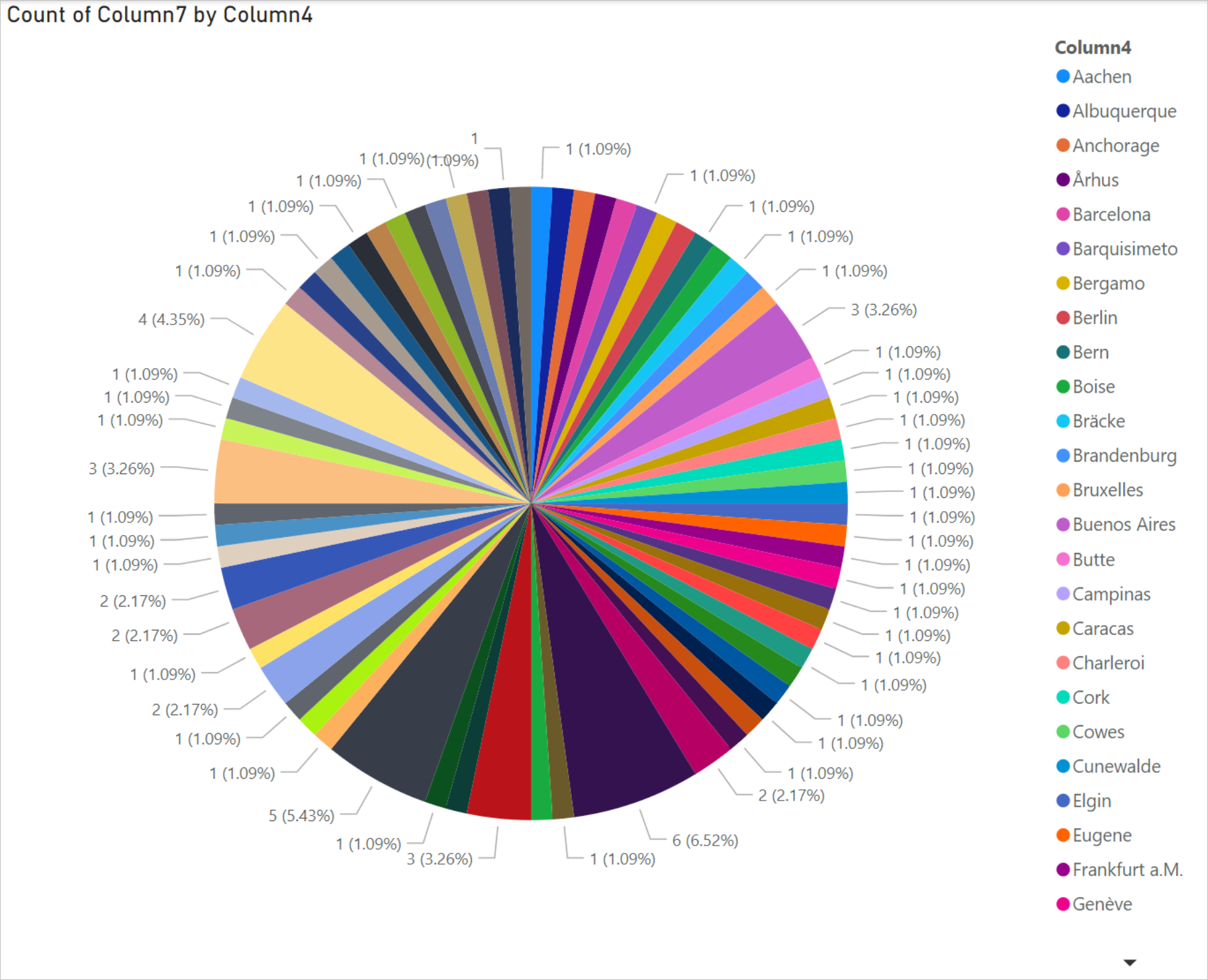
    Screenshot with Column4 dragged and dropped in Details and Column7 dragged and dropped in Values in the Visualization pane, and Column7 also dragged and dropped into Filters on this page in the Filters pane.

    饼图现在应类似于下面显示的饼图。

    Screenshot of pie chart showing the percentages of each slice of the pie, along with color coding of each of the locations, and a column containing all locations and their color code on the right side.

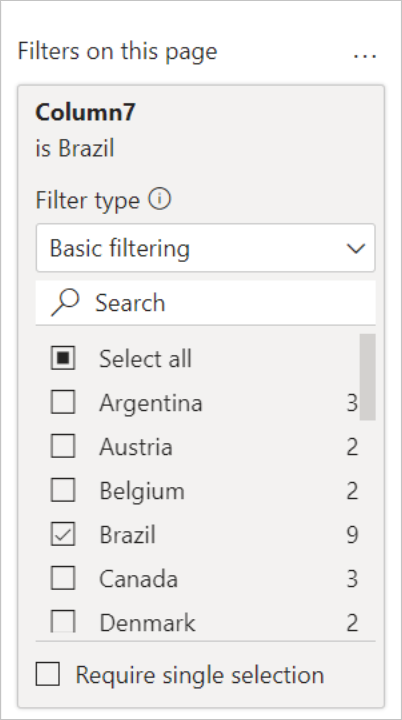
  10. 如果从页面级别筛选器中选择特定国家/地区,将显示所选国家/地区每个城市的驱动程序数量。 例如,在“可视化”选项卡中的“页面级别筛选器”中,选择“巴西”

    Screenshot of the Filters on this page pane, with Brazil selected as the country/region to display.

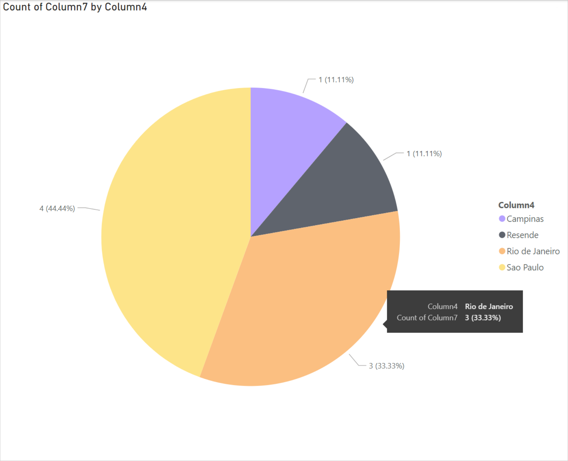
  11. 饼图会自动更新,显示巴西各个城市中的司机。

    Screenshot of pie chart with the percentages of each slice of the pie for locations in Brazil, along with a list of all locations in Brazil and their color code in a column on the right side.

  12. 文件菜单中选择保存,以将可视化效果另存为 Power BI Desktop 文件。

将报表发布到 Power BI 服务

在 Power BI Desktop 中创建可视化效果后,可以通过将其发布到 Power BI 服务来与他人共享。 有关如何执行此操作的说明,请转到 从 Power BI Desktop 发布

另请参阅