支持部分背景
从 SharePoint 框架 v1.8 开始,Web 部件可以识别任何分区背景,并使用这些颜色来改进 Web 部件在具有不同背景的分区中托管时的外观。
将分区配置为使用其他背景
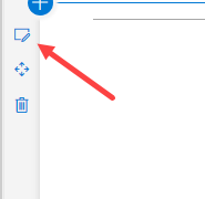
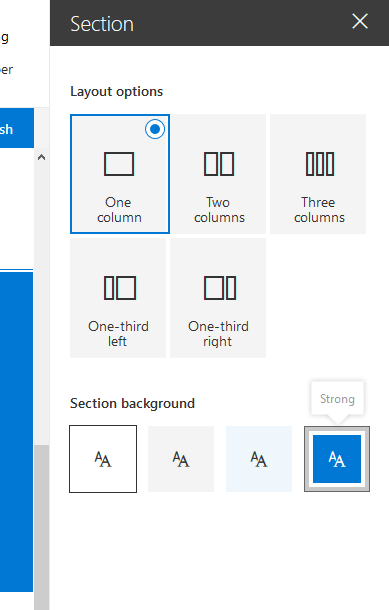
可以设置的分区背景色基于所应用主题的主色。 若要设置节的背景,请打开其属性:
在属性中,可以定义要设置的分区背景类型:
使 Web 部件主题感知
更新清单
需要向 Web 部件的清单添加 supportsThemeVariants 属性,并将其值设置为 true:
{
  // ...

  "supportsThemeVariants": true,

  "version": "*",
  "manifestVersion": 2,

  "requiresCustomScript": false,

  "preconfiguredEntries": [{
    // ...
  }]
}
在非React Web 部件中使用背景色感知
为了使 Web 部件知道任何主题更改,必须实现对服务的支持, ThemeProvider 以便在主题更改发生时引发事件。
import {
  ThemeProvider,
  ThemeChangedEventArgs,
  IReadonlyTheme,
  ISemanticColors
} from '@microsoft/sp-component-base';

...

private _themeProvider: ThemeProvider;
private _themeVariant: IReadonlyTheme | undefined;

protected onInit(): Promise<void> {
  // Consume the new ThemeProvider service
  this._themeProvider = this.context.serviceScope.consume(ThemeProvider.serviceKey);

  // If it exists, get the theme variant
  this._themeVariant = this._themeProvider.tryGetTheme();

  // Register a handler to be notified if the theme variant changes
  this._themeProvider.themeChangedEvent.add(this, this._handleThemeChangedEvent);

  return super.onInit();
}

/**
 * Update the current theme variant reference and re-render.
 *
 * @param args The new theme
 */
private _handleThemeChangedEvent(args: ThemeChangedEventArgs): void {
  this._themeVariant = args.theme;
  this.render();
}
现在, ThemeProvider 使用 可以检索正确的正文文本颜色:
public render(): void {
  const semanticColors: Readonly<ISemanticColors> | undefined = this._themeVariant && this._themeVariant.semanticColors;

  const style: string = ` style="background-color:${semanticColors.bodyBackground}"`;

  this.domElement.innerHTML = `<p${'' || (this._themeProvider && style)}>this is a demo</p>`;
}
在基于React的 Web 部件中使用背景色感知
对于基于 React 的 Web 部件,必须实现代码才能使用 ThemeProvider,就像使用基本 Web 部件一样:
import {
  ThemeProvider,
  ThemeChangedEventArgs,
  IReadonlyTheme
} from '@microsoft/sp-component-base';
...

private _themeProvider: ThemeProvider;
private _themeVariant: IReadonlyTheme | undefined;

protected onInit(): Promise<void> {
  // Consume the new ThemeProvider service
  this._themeProvider = this.context.serviceScope.consume(ThemeProvider.serviceKey);

  // If it exists, get the theme variant
  this._themeVariant = this._themeProvider.tryGetTheme();

  // Register a handler to be notified if the theme variant changes
  this._themeProvider.themeChangedEvent.add(this, this._handleThemeChangedEvent);

  return super.onInit();
}

/**
 * Update the current theme variant reference and re-render.
 *
 * @param args The new theme
 */
private _handleThemeChangedEvent(args: ThemeChangedEventArgs): void {
  this._themeVariant = args.theme;
  this.render();
}
现在,若要在组件中使用主题变体,必须在 方法中 render() 将主题变体发送到组件:
public render(): void {
  const element: React.ReactElement<IBasicSectionBackgroundExampleProps > = React.createElement(
    BasicSectionBackgroundExample,
    {
      themeVariant: this._themeVariant
    }
  );

  ReactDom.render(element, this.domElement);
}
若要在组件中使用该属性,必须将其添加到属性接口定义,在本例中称为 IBasicSectionBackgroundExampleProps:
import { IReadonlyTheme } from '@microsoft/sp-component-base';

export interface IBasicSectionBackgroundExampleProps {
  themeVariant: IReadonlyTheme | undefined;
}
然后,在组件的呈现方法中,可以检索正确的颜色,如下所示:
public render(): React.ReactElement<IBasicSectionBackgroundExampleProps> {

  const { semanticColors }: IReadonlyTheme = this.props.themeVariant;

  return (
    <div style={{backgroundColor: semanticColors.bodyBackground}}>
      <p>This React web part has support for section backgrounds and will inherit its background from the section</p>
    </div>
  );
}