The TextBoxExtensions type provides additional features for the TextBox control through extension methods and attached properties.
Platform APIs:
TextBoxExtensions,TextBoxExtensions.ValidationMode,TextBoxExtensions.ValidationType,SurfaceDialOptions
Text mask
The Mask attached property allows a user to more easily enter fixed width text in TextBox control where you would like them to enter the data in a certain format, ex: phone number, postal code.
The developer adds the mask property to prevent end user to enter any other format but the required one (eg. a postal code in the format "aaa-9999").
The Mask property provides 3 built-in variable characters that can be used to define a mask:
awhich represents [a-Z]9which represents [0-9]*which representsaor9
At the post code example the user will only be allowed to enter from a to Z in the first 3 characters, then there is a fixed character - which the user can change or remove, and the last part which the user can change by entering from 0 to 9 at each character. The Mask property prevents the TextBox from having non specified characters (eg. if you entered 1 or 2 into a mask like 9999).
The Mask property also supports 2 type of characters:
- Variable: which the user can change like
a,9,* - Fixed: which the user can't change and it is any non variable character (eg. the
-in the first example)
Variable characters a represented to end user in form of placeholder so the user can know which characters he can change and which he can't, ex mask aaa-9999 will be presented to user as ___-____. The default placeholder is _, but you can change it using the MaskPlaceholder property.
You can escape variable by using \ (eg. the mask +\964 will be presented to the user as +964). This way, the 9 in the mask is treated as a fixed character, not as a variable. If you needed \ in the mask then you can write it as \\ (eg. 99\\99\\9999 will be presented to the user as __\__\__).
In case you want to add a custom variable character you can use the CustomMask property. You can add a character that represents certain regex as c:[a-c] and once you use character c in the mask the mask will prevent any characters but from a to c inside the TextBox, also you specify multiple variable characters by adding comma , after every character and its representation. This feature is helpful if you want to allow certain language characters (eg. French or Arabic only TextBox).
Syntax
<Page ...
     xmlns:ui="using:Microsoft.Toolkit.Uwp.UI">
    <StackPanel>

        <!-- Mask = "9a9a-a9a*" (9 means [0-9], a means [a-Z], * allows both)-->
        <TextBox ui:TextBoxExtensions.Mask="9a9a-a9a*"/>

        <!-- A mask of "+1999-9999" and an empty space as placeholder. That is,
             characters not yet filled in by the user will just be blank spaces. -->
        <TextBox
            ui:TextBoxExtensions.Mask="+1999-9999"
            ui:TextBoxExtensions.MaskPlaceholder=" "/>

        <!-- Mask = "+964 799 999 9999" (note the escape fore the first 9) -->
        <TextBox ui:TextBoxExtensions.Mask="+\964 799 999 9999"/>

        <!-- Mask = "99\99\9999" (a backslash can be escaped with another backslash) -->
        <TextBox ui:TextBoxExtensions.Mask="99\\99\\9999"/>

        <!-- Custom mask with some user-defined special characters. In this case,
             we define 5 to mean [1-5], and c to mean [a-c]. The mask is "a5c-5c*9" -->
        <TextBox
            ui:TextBoxExtensions.CustomMask="5:[1-5],c:[a-c]"
            ui:TextBoxExtensions.Mask="a5c-5c*9"/>
    </StackPanel>
</Page>
Sample output
A TextBox with Mask set to +1999-9999 and MaskPlaceholder as space (the placeholder represents the characters the user can change on runtime) will be displayed as follows:

Text regex
The Regex attached property allows text validation using a regular expression or using built in validation types.
The developer adds a regular expression to validate the TextBox Text against the regular expression throw Regex property or from selecting ValidationType property on the TextBox.
The validation has 3 modes (TextBoxExtensions.ValidationMode):
Normal(Default): this mode will set theIsValidattached property tofalseortruewhether theTextBoxtext is a valid or not against theRegexproperty.Forced: this mode sets theIsValidproperty and removes theTextBoxtext if not valid when theTextBoxloses focus.Dynamic: this mode extendsNormaland if is the newest input of theTextBoxis invalid, the character which is invalid will be deleted. Note that theTextBoxExtensions.ValidationTypevaluesEmailandPhoneNumberdon't support this validation mode. If you set the validation mode toDynamic,Normalis selected automatically instead.
Syntax
<TextBox
    xmlns:ui="using:Microsoft.Toolkit.Uwp.UI"
    ui:TextBoxExtensions.Regex="^\s*\+?\s*([0-9][\s-]*){9,}$" />

<TextBox
    xmlns:ui="using:Microsoft.Toolkit.Uwp.UI"
    ui:TextBoxExtensions.ValidationMode="Forced"
    ui:TextBoxExtensions.ValidationType="PhoneNumber"
    Text="+61616161611" />

<TextBox
    xmlns:ui="using:Microsoft.Toolkit.Uwp.UI"
    ui:TextBoxExtensions.ValidationType="Email"   />

<TextBox
    xmlns:ui="using:Microsoft.Toolkit.Uwp.UI"
    ui:TextBoxExtensions.ValidationMode="Forced"
    ui:TextBoxExtensions.ValidationType="Decimal" />
Sample output
Here is a TextBox with ValidationType="Email", with the validation occurring when TextChanged is raised:

Surface Dial support
The SurfaceDialOptions property adds features from the Surface Dial control to a numeric TextBox. This enables you to modify the content of the TextBox when rotating the Surface Dial (increasing or decreasing the value) and optionally go to the next focus element by tapping the Surface Dial click button. The various options are set through the SurfaceDialOptions type, which is declared in XAML and used to set all the values to use for a given TextBox from a single place.
Syntax
<Page ...
    xmlns:ui="using:Microsoft.Toolkit.Uwp.UI">

    <TextBox
        Text="0"
        Width="106"
        HorizontalAlignment="Left"
        VerticalAlignment="Top">
        <ui:TextBoxExtensions.SurfaceDialOptions>
            <ui:SurfaceDialOptions
                EnableHapticFeedback="True"
                EnableMinMaxValue="True"
                EnableTapToNextControl="False"
                StepValue="1"
                RotationResolutionInDegrees="12"
                MinValue="0"
                MaxValue="100"
                Icon="Ruler"/>
        </ui:TextBoxExtensions.SurfaceDialOptions>
    </TextBox>
</Page>
Sample output
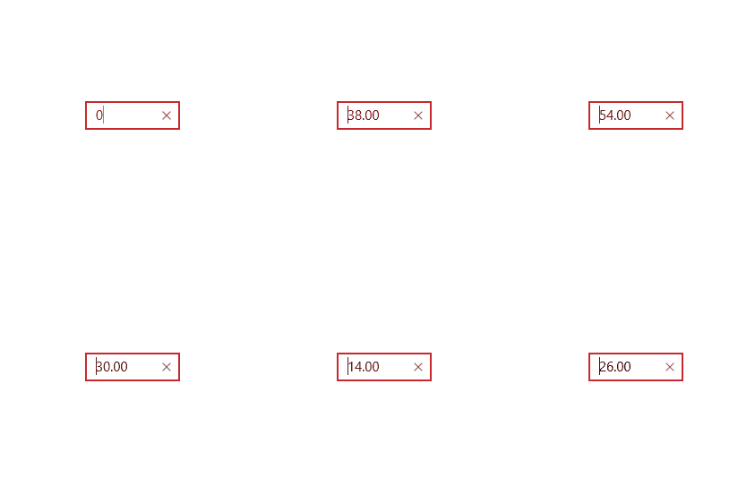
Here is an example of the visual result when scrolling on a Surface Dial over a TextBox:

Examples
You can find more examples in the unit tests.