功能区命令栏中托管的控件受 Windows 功能区框架强制执行的布局规则的约束,并基于功能区标记中声明的默认行为和布局模板(框架定义和自定义)的组合。 这些规则定义功能区框架的自适应布局行为,这些行为会影响命令栏中控件在运行时如何适应各种功能区大小。
简介
自适应布局(由功能区框架定义)是功能区 UI 中所有控件根据运行时功能区大小的变化动态调整其组织、大小、格式和相对缩放的能力。
该框架通过一组专用于指定和自定义各种布局行为的标记元素公开自适应布局功能。 模板集合称为 SizeDefinitions,由框架定义,每个模板都支持各种控件和布局方案。 但是,如果预定义模板不提供应用程序所需的 UI 体验或布局,框架还支持自定义模板。
若要在特定功能区大小的首选布局中显示控件,预定义模板和自定义模板都需要与 ScalingPolicy 元素结合使用。 该元素包含一个尺寸偏好列表,框架在渲染功能区时会将其用作指导。
注意
功能区框架基于一组内置启发式方法,在运行时提供控件的组织和呈现控件,而无需预定义 的 SizeDefinition 模板。 但是,此功能仅用于原型制作。
功能区 SizeDefinition 模板
功能区框架提供了一组全面的 SizeDefinition 模板,用于指定功能区控件组的大小和布局行为。 这些模板涵盖了在功能区应用程序中组织控件的最常见方案。
为了跨功能区应用程序强制实施一致的用户体验,每个 SizeDefinition 模板都会对其支持的控件或控件系列施加限制。
例如,按钮系列控件包括:
输入控件系列包括:
复选框和功能区库既不属于按钮系列,也不属于输入系列。 这两个控件只能用于 SizeDefinition 模板中明确指示的位置。
下面是 SizeDefinition 模板的列表,其中包含每个模板允许的布局和控件说明。
OneButton
一个按钮系列空间。
仅支持大型组大小。

TwoButtons
两个按钮系列控件。
仅支持大组和中型组大小。
ThreeButtons
三个按钮系列控件。
仅支持大组和中型组大小。
ThreeButtons-OneBigAndTwoSmall
三个按钮系列控件。
第一个按钮在所有三个大小中都突出显示。
ThreeButtonsAndOneCheckBox
三个按钮系列控件附带单个 CheckBox 控件。
仅支持大组和中型组大小。
FourButtons
四个按钮系列控件。
FiveButtons
五个按钮系列控件。

FiveOrSixButtons
五个按钮系列控件和可选的第六个按钮。
SixButtons
六个按钮系列控件。
SixButtons-TwoColumns
六个按钮系列控件(交替显示)。
SevenButtons
七个按钮系列控件。
EightButtons
八个按钮系列控件。
EightButtons-LastThreeSmall
八个按钮系列控件(交替显示)。
注意
使用此模板声明的所有控件元素都必须包含在两个 ControlGroup 元素中:一个用于前五个元素,一个用于最后三个元素。
以下示例演示此模板所需的标记。
<Group CommandName="cmdSizeDefinitionsGroup"
       SizeDefinition="EightButtons-LastThreeSmall">
  <ControlGroup>
    <Button CommandName="cmdSDButton1" />
    <Button CommandName="cmdSDButton2" />
    <Button CommandName="cmdSDButton3" />
    <Button CommandName="cmdSDButton4" />
    <Button CommandName="cmdSDButton5" />
  </ControlGroup>
  <ControlGroup>
    <Button CommandName="cmdSDButton6" />
    <Button CommandName="cmdSDButton7" />
    <Button CommandName="cmdSDButton8" />
  </ControlGroup>
</Group>
NineButtons
九个按钮系列控件。
TenButtons
十个按钮系列控件。
ElevenButtons
十一个按钮系列控件。
OneFontControl
一个 FontControl。
仅支持大组和中型组大小。
重要
框架不支持在自定义模板定义中包含 FontControl。
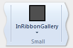
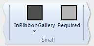
OneInRibbonGallery
一个 InRibbonGallery 控件。
仅支持大组和小型组大小。
InRibbonGalleryAndBigButton
一个 InRibbonGallery 控件和按钮系列控件。
仅支持大组和小型组大小。
InRibbonGalleryAndButtons-GalleryScalesFirst
一个功能区库控件和两个或三个按钮系列控件。
库折叠为中等尺寸和小尺寸的 Popup 表示形式。
ButtonGroups
32 个按钮系列控件的复杂排列(其中大多数是可选的)。
注意
除了大型 ButtonGroups 模板的可选全尺寸按钮之外,使用此模板声明的所有控件元素都必须包含在 ControlGroup 元素中。
以下示例演示使用此模板显示所有 32 个控件元素(必需和可选)所需的标记。
<Group CommandName="cmdSizeDefinitionsGroup"
       SizeDefinition="ButtonGroups">
  <!-- Row 1 -->
  <ControlGroup>
    <ControlGroup>
      <Button CommandName="cmdSDButton1" />
      <Button CommandName="cmdSDButton2" />
      <Button CommandName="cmdSDButton3" />
      <Button CommandName="cmdSDButton4" />
      <Button CommandName="cmdSDButton5" />
      <Button CommandName="cmdSDButton6" />
      <Button CommandName="cmdSDButton7" />
      <Button CommandName="cmdSDButton8" />
      <Button CommandName="cmdSDButton9" />
      <Button CommandName="cmdSDButton10" />
    </ControlGroup>
    <ControlGroup>
      <Button CommandName="cmdSDButton11" />
      <Button CommandName="cmdSDButton12" />
    </ControlGroup>
    <ControlGroup>
      <Button CommandName="cmdSDButton13" />
      <Button CommandName="cmdSDButton14" />
    </ControlGroup>
    <ControlGroup>
      <Button CommandName="cmdSDButton15" />
    </ControlGroup>
    <ControlGroup>
      <Button CommandName="cmdSDButton16" />
    </ControlGroup>
    <ControlGroup>
      <Button CommandName="cmdSDButton17" />
      <Button CommandName="cmdSDButton18" />
    </ControlGroup>
  </ControlGroup>
  <!-- Row 2 -->
  <ControlGroup>
    <ControlGroup>
      <Button CommandName="cmdSDButton19" />
      <Button CommandName="cmdSDButton20" />
      <Button CommandName="cmdSDButton21" />
      <Button CommandName="cmdSDButton22" />
      <Button CommandName="cmdSDButton23" />
      <Button CommandName="cmdSDButton24" />
      <Button CommandName="cmdSDButton25" />
      <Button CommandName="cmdSDButton26" />
      <Button CommandName="cmdSDButton27" />
      <Button CommandName="cmdSDButton28" />
    </ControlGroup>
    <ControlGroup>
      <Button CommandName="cmdSDButton29" />
    </ControlGroup>
    <ControlGroup>
      <Button CommandName="cmdSDButton30" />
      <Button CommandName="cmdSDButton31" />
    </ControlGroup>
  </ControlGroup>
  <Button CommandName="cmdSDButton32" />
</Group>
ButtonGroupsAndInputs
两个输入系列控件(第二个是可选的),后跟 29 个按钮系列控件的复杂排列(其中大多数是可选的)。
仅支持大组和中型组大小。
注意
使用此模板声明的所有控件元素都必须包含在 ControlGroup 元素中。
以下示例演示使用此模板显示所有控件元素(必需和可选)所需的标记。
<Group CommandName="cmdSizeDefinitionsGroup"
       SizeDefinition="ButtonGroupsAndInputs">
  <!-- Row 1 -->
  <ControlGroup>
    <ControlGroup>
      <ComboBox CommandName="cmdSDComboBox" />
      <Spinner CommandName="cmdSDSpinner" />
    </ControlGroup>
    <ControlGroup>
      <Button CommandName="cmdSDButton1" />
      <Button CommandName="cmdSDButton2" />
      <Button CommandName="cmdSDButton3" />
      <Button CommandName="cmdSDButton4" />
      <Button CommandName="cmdSDButton5" />
      <Button CommandName="cmdSDButton6" />
      <Button CommandName="cmdSDButton7" />
      <Button CommandName="cmdSDButton8" />
      <Button CommandName="cmdSDButton9" />
    </ControlGroup>
    <ControlGroup>
      <Button CommandName="cmdSDButton10" />
    </ControlGroup>
    <ControlGroup>
      <Button CommandName="cmdSDButton11" />
      <Button CommandName="cmdSDButton12" />
    </ControlGroup>
    <ControlGroup>
      <Button CommandName="cmdSDButton13" />
    </ControlGroup>
    <ControlGroup>
      <Button CommandName="cmdSDButton14" />
    </ControlGroup>
  </ControlGroup>
  <!-- Row 2 -->
  <ControlGroup>
    <ControlGroup>
      <Button CommandName="cmdSDButton15" />
      <Button CommandName="cmdSDButton16" />
      <Button CommandName="cmdSDButton17" />
      <Button CommandName="cmdSDButton18" />
      <Button CommandName="cmdSDButton19" />
      <Button CommandName="cmdSDButton20" />
      <Button CommandName="cmdSDButton21" />
      <Button CommandName="cmdSDButton22" />
      <Button CommandName="cmdSDButton23" />
      <Button CommandName="cmdSDButton24" />
    </ControlGroup>
    <ControlGroup>
      <Button CommandName="cmdSDButton25" />
      <Button CommandName="cmdSDButton26" />
    </ControlGroup>
    <ControlGroup>
      <Button CommandName="cmdSDButton27" />
      <Button CommandName="cmdSDButton28" />
    </ControlGroup>
    <ControlGroup>
      <Button CommandName="cmdSDButton29" />
    </ControlGroup>
  </ControlGroup>
</Group>
BigButtonsAndSmallButtonsOrInputs
两个按钮系列控件(两个可选)后跟两个或三个按钮或输入系列控件。
仅支持大组和中型组大小。
基本 SizeDefinition 示例
下面的代码示例提供了有关如何在功能区标记中声明 SizeDefinition 模板的基本演示。
OneInRibbonGallery SizeDefinition 用于此特定示例,但所有框架模板都以类似的方式指定。
<!-- InRibbonGallery -->
<Group CommandName="cmdInRibbonGalleryGroup" SizeDefinition="OneInRibbonGallery">
  <InRibbonGallery CommandName="cmdInRibbonGallery"
                   MaxColumns="10"
                   MaxColumnsMedium="5"
                   MinColumnsLarge="5"
                   MinColumnsMedium="3"
                   Type="Items">
    <InRibbonGallery.MenuLayout>
      <VerticalMenuLayout Rows="2"
                          Gripper="Vertical"/>
    </InRibbonGallery.MenuLayout>
    <InRibbonGallery.MenuGroups>
      <MenuGroup>
        <Button CommandName="cmdButton1"></Button>
        <Button CommandName="cmdButton2"></Button>
      </MenuGroup>
      <MenuGroup>
        <Button CommandName="cmdButton3"></Button>
      </MenuGroup>
    </InRibbonGallery.MenuGroups>
  </InRibbonGallery>
</Group>
包含缩放策略的复杂 SizeDefinition 示例
SizeDefinition 模板的折叠行为可以通过在功能区标记中使用缩放策略来控制。
ScalingPolicy 元素包含 ScalePolicy.IdealSizes 和 Scale 声明的清单,这些声明在调整功能区大小时为一个或多个组元素指定自适应布局首选项。
注意
强烈建议指定足够的缩放策略详细信息,以便大多数(如果不是全部)组元素都与 Size 属性等于Popup的 Scale 元素相关联。 这样做允许框架以尽可能小的大小呈现功能区,并支持最广泛的显示设备,然后再自动引入滚动机制。
下面的代码示例演示了一个 ScalingPolicy 清单,该清单为开始选项卡上的四组控件中的每组指定一个 ScalingPolicy.IdealSizes SizeDefinition 首选项。此外,还指定了 Scale 元素以影响每个组的降序排列行为。
<Tab CommandName="Home">
  <Tab.ScalingPolicy>
    <ScalingPolicy>
      <ScalingPolicy.IdealSizes>
        <Scale Group="GroupClipboard" Size="Medium"/>
        <Scale Group="GroupView" Size="Large"/>
        <Scale Group="GroupFont" Size="Large"/>
        <Scale Group="GroupParagraph" Size="Large"/>
      </ScalingPolicy.IdealSizes>
      <Scale Group="GroupClipboard" Size="Small"/>
      <Scale Group="GroupClipboard" Size="Popup"/>
      <Scale Group="GroupFont" Size="Medium"/>
      <Scale Group="GroupFont" Size="Popup"/>
      <Scale Group="GroupParagraph" Size="Medium"/>
      <Scale Group="GroupParagraph" Size="Popup"/>
      <!--
        GroupView group is associated with the OneButton SizeDefinition.
        Since this template is constrained to one size (Large) there
        is no need to declare further scaling preferences.
      -->
    </ScalingPolicy>
  </Tab.ScalingPolicy>

  <Group CommandName="GroupClipboard" SizeDefinition="FourButtons">
    <Button CommandName="Paste"/>
    <Button CommandName="Cut"/>
    <Button CommandName="Copy"/>
    <Button CommandName="SelectAll"/>
  </Group>

  <Group CommandName="GroupFont"  ApplicationModes="1">
    <FontControl CommandName="Font" FontType="FontWithColor" />
  </Group>

  <Group CommandName="GroupParagraph"  ApplicationModes="1" SizeDefinition="ButtonGroups">
    <ControlGroup>
      <ControlGroup>
        <ToggleButton CommandName="Numbered" />
        <ToggleButton CommandName="Bulleted" />
      </ControlGroup>
    </ControlGroup>
    <ControlGroup>
      <ControlGroup>
        <ToggleButton CommandName="LeftJustify" />
        <ToggleButton CommandName="CenterJustify" />
        <ToggleButton CommandName="RightJustify" />
      </ControlGroup>
      <ControlGroup/>
      <ControlGroup>
        <Button CommandName="Outdent" />
        <Button CommandName="Indent" />
      </ControlGroup>
    </ControlGroup>
  </Group>

  <Group CommandName="GroupView" SizeDefinition="OneButton" >
    <ToggleButton CommandName="ViewSource"/>
  </Group>

</Tab>
自定义模板
如果默认布局行为和预定义的 SizeDefinition 模板不提供特定布局方案的灵活性或支持,则功能区框架通过 Ribbon.SizeDefinitions 元素支持自定义模板。
可以通过两种方式声明自定义模板:使用 Ribbon.SizeDefinitions 元素声明可重用的命名模板或特定于组的内联方法的独立方法。
独立模板
下面的代码示例演示了一个基本的可重用自定义模板。
<Ribbon.SizeDefinitions>
  <SizeDefinition Name="CustomTemplate">
    <GroupSizeDefinition Size="Large">
      <ControlSizeDefinition ImageSize="Large" IsLabelVisible="true" />
    </GroupSizeDefinition>
    <GroupSizeDefinition Size="Medium">
      <ControlSizeDefinition ImageSize="Small" IsLabelVisible="false" />
    </GroupSizeDefinition>
    <GroupSizeDefinition Size="Small">
      <ControlSizeDefinition ImageSize="Small" IsLabelVisible="false" />
    </GroupSizeDefinition>
  </SizeDefinition>
</Ribbon.SizeDefinitions>
内联模板
下面的代码示例演示了一组四个按钮的基本内联自定义模板。
此代码部分显示一组按钮的命令声明。 此处还指定了大型和小型图像资源。
<!-- Button -->
<Command Name="cmdButtonGroup"
         Symbol="cmdButtonGroup"
         Comment="Button Group"
         LabelTitle="ButtonGroup"/>
<Command Name="cmdButton1"
         Symbol="cmdButton1"
         Comment="Button1"
         LabelTitle="Button1"/>
<Command Name="cmdButton2"
         Symbol="cmdButton2"
         Comment="Button2"
         LabelTitle="Button2"/>
<Command Name="cmdButton3"
         Symbol="cmdButton3"
         Comment="Button3"
         LabelTitle="Button3"/>
<Command Name="cmdButtonGroup2"
         Symbol="cmdButtonGroup2"
         Comment="Button Group2"
         LabelTitle="ButtonGroup2"/>
<Command Name="cmdButtonG21"
         Symbol="cmdButtonG21"
         Comment="ButtonG21"
         LabelTitle="ButtonG21">
  <Command.LargeImages>
    <Image Source="res/large.bmp"/>
  </Command.LargeImages>
  <Command.SmallImages>
    <Image Source="res/small.bmp"/>
  </Command.SmallImages>
</Command>
<Command Name="cmdButtonG22"
         Symbol="cmdButtonG22"
         Comment="ButtonG22"
         LabelTitle="ButtonG22">
  <Command.LargeImages>
    <Image Source="res/large.bmp"/>
  </Command.LargeImages>
  <Command.SmallImages>
    <Image Source="res/small.bmp"/>
  </Command.SmallImages>
</Command>
<Command Name="cmdButtonG23"
         Symbol="cmdButtonG23"
         Comment="ButtonG23"
         LabelTitle="ButtonG23">
  <Command.LargeImages>
    <Image Source="res/large.bmp"/>
  </Command.LargeImages>
  <Command.SmallImages>
    <Image Source="res/small.bmp"/>
  </Command.SmallImages>
</Command>
<Command Name="cmdButtonG24"
         Symbol="cmdButtonG24"
         Comment="ButtonG24"
         LabelTitle="ButtonG24">
  <Command.LargeImages>
    <Image Source="res/large.bmp"/>
  </Command.LargeImages>
  <Command.SmallImages>
    <Image Source="res/small.bmp"/>
  </Command.SmallImages>
</Command>
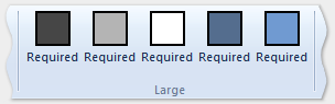
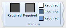
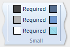
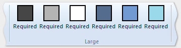
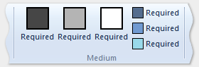
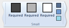
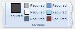
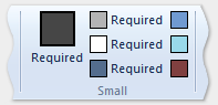
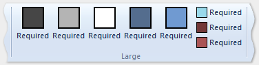
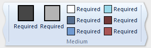
此代码部分演示如何定义大型、中型和小型 GroupSizeDefinition 模板,以各种大小和布局显示四个按钮。 选项卡的 ScalingPolicy 声明定义根据活动选项卡所需的功能区大小和空间对一组控件使用哪个模板。
        <Tab CommandName="cmdTab6">
          <Tab.ScalingPolicy>
            <ScalingPolicy>
              <ScalingPolicy.IdealSizes>
                <Scale Group="cmdButtonGroup"
                       Size="Large"/>
                <Scale Group="cmdButtonGroup2"
                       Size="Large"/>
                <Scale Group="cmdToggleButtonGroup"
                       Size="Large"/>
              </ScalingPolicy.IdealSizes>
              <Scale Group="cmdButtonGroup"
                     Size="Medium"/>
              <Scale Group="cmdButtonGroup2"
                     Size="Medium"/>
              <Scale Group="cmdButtonGroup2"
                     Size="Small"/>
              <Scale Group="cmdButtonGroup2"
                     Size="Popup"/>
            </ScalingPolicy>
          </Tab.ScalingPolicy>

          <Group CommandName="cmdButtonGroup2">
            <SizeDefinition>
              <ControlNameMap>
                <ControlNameDefinition Name="button1"/>
                <ControlNameDefinition Name="button2"/>
                <ControlNameDefinition Name="button3"/>
                <ControlNameDefinition Name="button4"/>
              </ControlNameMap>
              <GroupSizeDefinition Size="Large">
                <ControlGroup>
                  <ControlSizeDefinition ControlName="button1"
                                         ImageSize="Large"
                                         IsLabelVisible="true" />
                  <ControlSizeDefinition ControlName="button2"
                                         ImageSize="Large"
                                         IsLabelVisible="true" />
                </ControlGroup>
                <ColumnBreak ShowSeparator="true"/>
                <ControlGroup>
                  <ControlSizeDefinition ControlName="button3"
                                         ImageSize="Large"
                                        IsLabelVisible="true" />
                  <ControlSizeDefinition ControlName="button4"
                                        ImageSize="Large"
                                        IsLabelVisible="true" />
                </ControlGroup>
              </GroupSizeDefinition>
              <GroupSizeDefinition Size="Medium">
                <Row>
                  <ControlSizeDefinition ControlName="button1"
                                         ImageSize="Small"
                                         IsLabelVisible="true" />
                  <ControlSizeDefinition ControlName="button3"
                                         ImageSize="Small"
                                         IsLabelVisible="true" />
                </Row>
                <Row>
                  <ControlSizeDefinition ControlName="button2"
                                         ImageSize="Small"
                                         IsLabelVisible="true" />
                  <ControlSizeDefinition ControlName="button4"
                                         ImageSize="Small"
                                         IsLabelVisible="true" />
                </Row>
              </GroupSizeDefinition>
              <GroupSizeDefinition Size="Small">
                <Row>
                  <ControlSizeDefinition ControlName="button1"
                                         ImageSize="Small"
                                         IsLabelVisible="true" />
                  <ControlSizeDefinition ControlName="button3"
                                         ImageSize="Small"
                                         IsLabelVisible="false" />
                </Row>
                <Row>
                  <ControlSizeDefinition ControlName="button2"
                                         ImageSize="Small"
                                         IsLabelVisible="true" />
                  <ControlSizeDefinition ControlName="button4"
                                         ImageSize="Small"
                                         IsLabelVisible="false" />
                </Row>
              </GroupSizeDefinition>
            </SizeDefinition>
            <Button CommandName="cmdButtonG21"></Button>
            <Button CommandName="cmdButtonG22"></Button>
            <Button CommandName="cmdButtonG23"></Button>
            <Button CommandName="cmdButtonG24"></Button>
          </Group>
          <Group CommandName="cmdCheckBoxGroup">
            <CheckBox CommandName="cmdCheckBox"></CheckBox>
          </Group>
          <Group CommandName="cmdToggleButtonGroup"
                 SizeDefinition="OneButton">
            <ToggleButton CommandName="cmdToggleButton"></ToggleButton>
          </Group>
          <Group CommandName="cmdButtonGroup"
                 SizeDefinition="ThreeButtons">
            <Button CommandName="cmdButton1"></Button>
            <Button CommandName="cmdButton2"></Button>
            <Button CommandName="cmdButton3"></Button>
          </Group>
        </Tab>
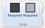
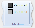
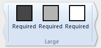
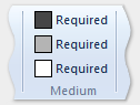
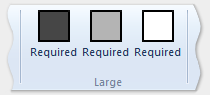
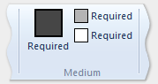
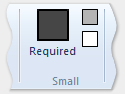
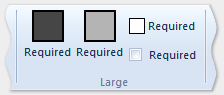
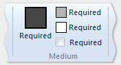
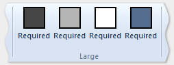
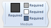
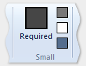
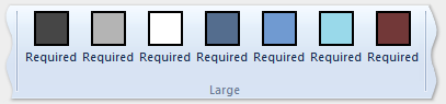
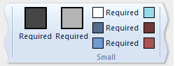
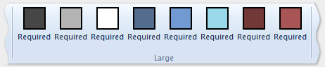
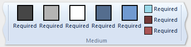
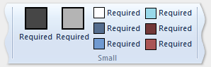
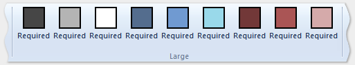
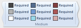
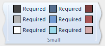
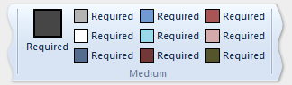
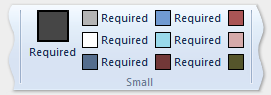
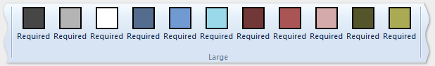
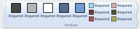
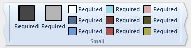
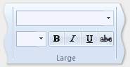
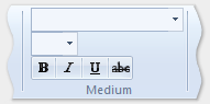
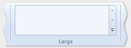
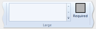
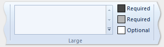
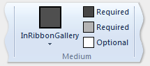
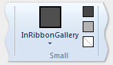
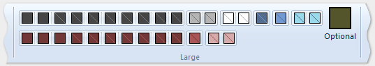
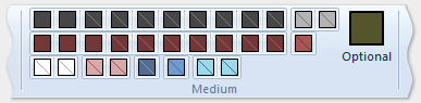
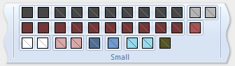
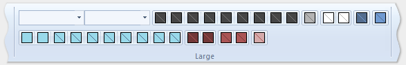
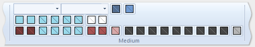
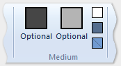
下图显示了上一示例中的模板如何应用于功能区 UI,以适应功能区大小的减少。
| 类型 | 映像 |
|---|---|
| 大型 | 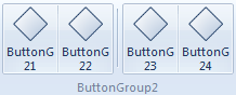 |
| 中 | 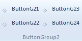 |
| 小型 | 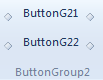 |
| Popup | 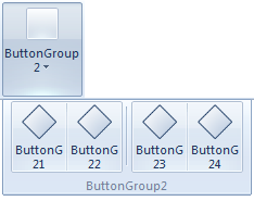 |