教學課程:在 Visual Studio 2019 中建立您的第一個 WPF 應用程式
本文說明如何開發 Windows Presentation Foundation (WPF) 傳統型應用程式,其中包含大多數 WPF 應用程式通用的專案:可延伸的應用程式標記語言(XAML) 標記、程式碼後置、應用程式定義、控制項、版面配置、資料系結和樣式。 若要開發應用程式,您將使用 Visual Studio。
重要
本文是針對 .NET Framework 撰寫的。 若要開始使用 .NET 7,請參閱 教學課程:建立新的 WPF 應用程式(WPF .NET)。
在本教學課程中,您會了解如何:
- 建立 WPF 專案。
- 使用 XAML 設計應用程式使用者介面 (UI) 的外觀。
- 撰寫程式碼以建置應用程式的行為。
- 建立應用程式定義來管理應用程式。
- 新增控制項並建立配置以撰寫應用程式 UI。
- 建立樣式,以在整個應用程式的 UI 中一致的外觀。
- 將 UI 系結至資料,同時從資料填入 UI,以及讓資料和 UI 保持同步。
在教學課程結束時,您將建置獨立的 Windows 應用程式,讓使用者檢視所選人員的費用報告。 應用程式是由裝載在瀏覽器樣式視窗中的數個 WPF 頁面所組成。
提示
本教學課程中使用的範例程式碼適用于 Visual Basic 和 C# 教學 課程 WPF 應用程式範例程式碼 。
您可以使用此頁面頂端的語言選取器,在 C# 和 Visual Basic 之間切換範例程式碼的程式碼語言。
必要條件
已安裝 .NET 桌面開發 工作負載的 Visual Studio 2019 。
如需安裝最新版 Visual Studio 的詳細資訊,請參閱 安裝 Visual Studio 。
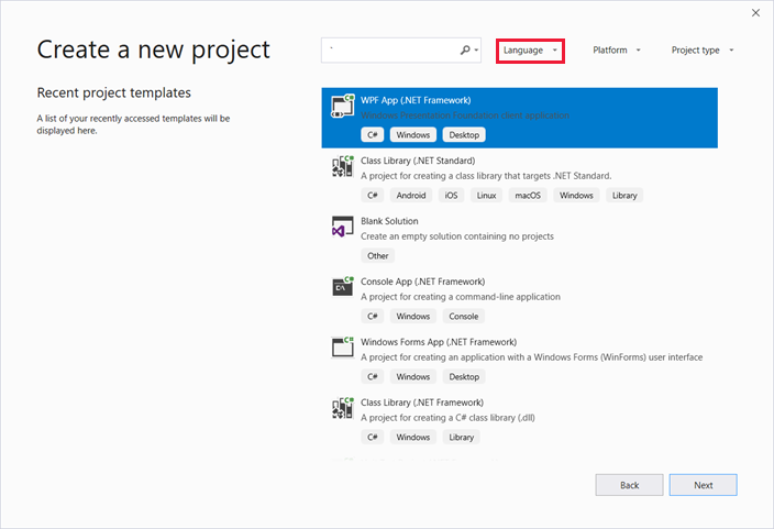
建立應用程式專案
第一個步驟是建立應用程式基礎結構,其中包括應用程式定義、兩頁和影像。
在 Visual Basic 或 Visual C# 中建立名為
ExpenseIt的新 WPF 應用程式專案:開啟 Visual Studio,然後選取 [ 開始使用 ] 功能表下的 [建立新專案 ]。
[ 建立新專案 ] 對話方塊隨即開啟。
在 [ 語言] 下拉式清單中,選取 C# 或 Visual Basic 。
選取 WPF 應用程式 (.NET Framework) 範本,然後選取 [ 下一步 ]。
[設定 您的新專案 ] 對話方塊隨即開啟。
輸入專案名稱
ExpenseIt,然後選取 [ 建立 ]。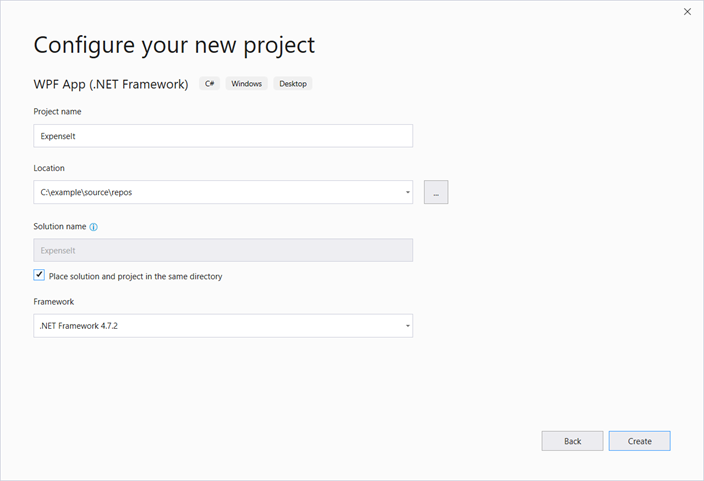
Visual Studio 會建立專案,並開啟名為 MainWindow.xaml 的預設應用程式視窗設計工具。
開啟 Application.xaml (Visual Basic) 或 App.xaml (C#)。
此 XAML 檔案會定義 WPF 應用程式和任何應用程式資源。 您也可以使用此檔案來指定 UI,在此案例 中,MainWindow.xaml 會在應用程式啟動時自動顯示。
您的 XAML 在 Visual Basic 中看起來應該像下面這樣:
<Application x:Class="Application"
    xmlns="http://schemas.microsoft.com/winfx/2006/xaml/presentation"
    xmlns:x="http://schemas.microsoft.com/winfx/2006/xaml"
    StartupUri="MainWindow.xaml">
    <Application.Resources>

    </Application.Resources>
</Application>
如同 C# 中的下列內容:
<Application x:Class="ExpenseIt.App"
     xmlns="http://schemas.microsoft.com/winfx/2006/xaml/presentation"
     xmlns:x="http://schemas.microsoft.com/winfx/2006/xaml"
     StartupUri="MainWindow.xaml">
    <Application.Resources>

    </Application.Resources>
</Application>
開啟 MainWindow.xaml。
此 XAML 檔案是應用程式的主視窗,會顯示在頁面中建立的內容。 類別 Window 會定義視窗的屬性,例如其標題、大小或圖示,以及處理事件,例如關閉或隱藏。
將 Window 專案變更為 NavigationWindow ,如下列 XAML 所示:
<NavigationWindow x:Class="ExpenseIt.MainWindow"
     xmlns="http://schemas.microsoft.com/winfx/2006/xaml/presentation"
     xmlns:x="http://schemas.microsoft.com/winfx/2006/xaml"
     ...
</NavigationWindow>
此應用程式會根據使用者輸入流覽至不同的內容。 這就是為什麼主要 Window 必須變更為 NavigationWindow 。 NavigationWindow 會繼承 的所有屬性 Window 。 NavigationWindowXAML 檔案中的 專案會建立 類別的 NavigationWindow 實例。 如需詳細資訊,請參閱 流覽概觀 。
從標記 Grid 之間 NavigationWindow 移除專案。
變更 元素之 XAML 程式碼 NavigationWindow 中的下列屬性:
您的 XAML 看起來應該類似 Visual Basic:
<NavigationWindow x:Class="MainWindow"
    xmlns="http://schemas.microsoft.com/winfx/2006/xaml/presentation"
    xmlns:x="http://schemas.microsoft.com/winfx/2006/xaml"
    Title="ExpenseIt" Height="350" Width="500">

</NavigationWindow>
如同 C# 的下列內容:
<NavigationWindow x:Class="ExpenseIt.MainWindow"
    xmlns="http://schemas.microsoft.com/winfx/2006/xaml/presentation"
    xmlns:x="http://schemas.microsoft.com/winfx/2006/xaml"
    Title="ExpenseIt" Height="350" Width="500">

</NavigationWindow>
開啟 MainWindow.xaml.vb 或 MainWindow.xaml.cs 。
此檔案是程式碼後置檔案,其中包含程式碼來處理 MainWindow.xaml 中 宣告的事件。 這個檔案包含 XAML 中定義之視窗的部分類別。
如果您使用 C#,請將 類別
MainWindow變更為衍生自 NavigationWindow 。 (在 Visual Basic 中,當您在 XAML 中變更視窗時,就會自動發生此情況。您的 C# 程式碼現在看起來應該像這樣:using System; using System.Collections.Generic; using System.Linq; using System.Text; using System.Windows; using System.Windows.Controls; using System.Windows.Data; using System.Windows.Documents; using System.Windows.Input; using System.Windows.Media; using System.Windows.Media.Imaging; using System.Windows.Navigation; using System.Windows.Shapes; namespace ExpenseIt { /// <summary> /// Interaction logic for MainWindow.xaml /// </summary> public partial class MainWindow : NavigationWindow { public MainWindow() { InitializeComponent(); } } }
將檔案新增至應用程式
在本節中,您要在應用程式中加入兩頁網頁和一個影像。
將新頁面新增至專案,並將它命名為
ExpenseItHome.xaml:在 方案總管中,以滑鼠右鍵按一下
ExpenseIt專案節點,然後選擇 [ 新增 > 頁面 ]。在 [ 新增專案 ] 對話方塊中, 已選取 [頁面] [WPF] 範本。 輸入名稱
ExpenseItHome,然後選取 [ 新增 ]。
此頁面是啟動應用程式時顯示的第一頁。 它會顯示要從中選取的人員清單,以顯示費用報表。
開啟 [
ExpenseItHome.xaml]。Title將 設定為 「
ExpenseIt - Home」。將
DesignHeight設定為 350 圖元,並將DesignWidth設定為 500 圖元。VISUAL Basic 現在會顯示 XAML,如下所示:
<Page x:Class="ExpenseItHome"
  xmlns="http://schemas.microsoft.com/winfx/2006/xaml/presentation"
  xmlns:x="http://schemas.microsoft.com/winfx/2006/xaml"
  xmlns:mc="http://schemas.openxmlformats.org/markup-compatibility/2006"
  xmlns:d="http://schemas.microsoft.com/expression/blend/2008"
  mc:Ignorable="d"
  d:DesignHeight="350" d:DesignWidth="500"
  Title="ExpenseIt - Home">
    <Grid>

    </Grid>
</Page>
如同 C# 的下列內容:
<Page x:Class="ExpenseIt.ExpenseItHome"
      xmlns="http://schemas.microsoft.com/winfx/2006/xaml/presentation"
      xmlns:x="http://schemas.microsoft.com/winfx/2006/xaml"
      xmlns:mc="http://schemas.openxmlformats.org/markup-compatibility/2006"
      xmlns:d="http://schemas.microsoft.com/expression/blend/2008"
      mc:Ignorable="d"
      d:DesignHeight="350" d:DesignWidth="500"
    Title="ExpenseIt - Home">

    <Grid>

    </Grid>
</Page>
開啟 MainWindow.xaml。
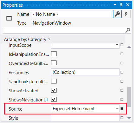
Source將屬性新增至 專案, NavigationWindow 並將其設定為 「
ExpenseItHome.xaml」。這會設定
ExpenseItHome.xaml為應用程式啟動時開啟的第一頁。Visual Basic 中的範例 XAML:
<NavigationWindow x:Class="MainWindow"
    xmlns="http://schemas.microsoft.com/winfx/2006/xaml/presentation"
    xmlns:x="http://schemas.microsoft.com/winfx/2006/xaml"
    Title="ExpenseIt" Height="350" Width="500" Source="ExpenseItHome.xaml">

</NavigationWindow>
在 C# 中:
<NavigationWindow x:Class="ExpenseIt.MainWindow"
    xmlns="http://schemas.microsoft.com/winfx/2006/xaml/presentation"
    xmlns:x="http://schemas.microsoft.com/winfx/2006/xaml"
    Title="ExpenseIt" Height="350" Width="500" Source="ExpenseItHome.xaml">

</NavigationWindow>
提示
您也可以在 [屬性 ] 視窗的 [其他] 類別中 設定 Source 屬性。
將另一個新的 WPF 頁面新增至專案,並將它命名為 ExpenseReportPage.xaml ::
在 方案總管中,以滑鼠右鍵按一下
ExpenseIt專案節點,然後選擇 [ 新增 > 頁面 ]。在 [ 新增專案 ] 對話方塊中,選取 [頁面] (WPF) 範本。 輸入名稱 ExpenseReportPage ,然後選取 [ 新增 ]。
此頁面會顯示頁面上所選取
ExpenseItHome人員的費用報表。開啟 ExpenseReportPage.xaml。
Title將 設定為 「
ExpenseIt - View Expense」。將
DesignHeight設定為 350 圖元,並將DesignWidth設定為 500 圖元。ExpenseReportPage.xaml 現在在 Visual Basic 中看起來如下:
<Page x:Class="ExpenseReportPage"
      xmlns="http://schemas.microsoft.com/winfx/2006/xaml/presentation"
      xmlns:x="http://schemas.microsoft.com/winfx/2006/xaml"
      xmlns:mc="http://schemas.openxmlformats.org/markup-compatibility/2006"
      xmlns:d="http://schemas.microsoft.com/expression/blend/2008"
      mc:Ignorable="d"
      d:DesignHeight="350" d:DesignWidth="500"
      Title="ExpenseIt - View Expense">
    <Grid>

    </Grid>
</Page>
如同 C# 中的下列內容:
<Page x:Class="ExpenseIt.ExpenseReportPage"
      xmlns="http://schemas.microsoft.com/winfx/2006/xaml/presentation"
      xmlns:x="http://schemas.microsoft.com/winfx/2006/xaml"
      xmlns:mc="http://schemas.openxmlformats.org/markup-compatibility/2006"
      xmlns:d="http://schemas.microsoft.com/expression/blend/2008"
      mc:Ignorable="d"
      d:DesignHeight="350" d:DesignWidth="500"
    Title="ExpenseIt - View Expense">

    <Grid>

    </Grid>
</Page>
開啟 ExpenseItHome.xaml.vb 和 ExpenseReportPage.xaml.vb 或 ExpenseItHome.xaml.cs 和 ExpenseReportPage.xaml.cs 。
當您建立新的 Page 檔案時,Visual Studio 會自動建立其 程式碼後置 檔案。 這些程式碼後置檔案會處理用於回應使用者輸入的邏輯。
您的程式碼看起來應該如下所示
ExpenseItHome:using System; using System.Collections.Generic; using System.Linq; using System.Text; using System.Windows; using System.Windows.Controls; using System.Windows.Data; using System.Windows.Documents; using System.Windows.Input; using System.Windows.Media; using System.Windows.Media.Imaging; using System.Windows.Navigation; using System.Windows.Shapes; namespace ExpenseIt { /// <summary> /// Interaction logic for ExpenseItHome.xaml /// </summary> public partial class ExpenseItHome : Page { public ExpenseItHome() { InitializeComponent(); } } }Class ExpenseItHome End Class以及 ExpenseReportPage 的下列專案 :
using System;
using System.Collections.Generic;
using System.Linq;
using System.Text;
using System.Windows;
using System.Windows.Controls;
using System.Windows.Data;
using System.Windows.Documents;
using System.Windows.Input;
using System.Windows.Media;
using System.Windows.Media.Imaging;
using System.Windows.Navigation;
using System.Windows.Shapes;

namespace ExpenseIt
{
    /// <summary>
    /// Interaction logic for ExpenseReportPage.xaml
    /// </summary>
    public partial class ExpenseReportPage : Page
    {
        public ExpenseReportPage()
        {
            InitializeComponent();
        }
    }
}
Class ExpenseReportPage End Class將名為 watermark.png 的影像新增至專案。 您可以建立自己的映射、從範例程式碼複製檔案,或從 microsoft/WPF-Samples GitHub 存放庫取得檔案。
以滑鼠右鍵按一下專案節點,然後選取 [ 新增 > 現有專案 ],或按 Shift + Alt + A。
在 [ 新增現有專案 ] 對話方塊中,將檔案篩選設定為 [所有檔案 ] 或 [影像檔案],流覽至您想要使用的映射檔 ,然後選取 [ 新增 ]。
選取方案總管中的 映射檔,然後在 [ 屬性 ] 視窗中,將 [建置動作 ] 設定 為 [資源 ]。
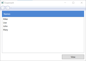
建立和執行應用程式
若要建置並執行應用程式,請按 F5 ,或從 [ 偵錯] 功能表中選取 [ 開始 偵錯]。
下圖顯示具有 NavigationWindow 按鈕的應用程式:
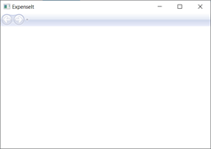
關閉應用程式以返回 Visual Studio。
建立配置
版面配置提供放置 UI 元素的排序方式,也會在調整 UI 大小時管理這些專案的大小和位置。 您通常會建立具有下列其中一個版面配置控制項的版面配置:
- Canvas - 定義一個區域,您可以使用相對於 Canvas 區域的座標,明確定位子專案。
- DockPanel - 定義區域,您可以在其中水準或垂直排列子專案,彼此相對。
- Grid - 定義由資料行和資料列組成的彈性方格區域。
- StackPanel - 將子專案排列成可水準或垂直方向的單行。
- VirtualizingStackPanel - 在水準或垂直方向的單一行上排列和虛擬化內容。
- WrapPanel - 將子專案從左至右的順序位置,將內容中斷至包含方塊邊緣的下一行。 根據 Orientation 屬性的值,後續順序會依序從上到下或從右至左進行。
每個配置控制項都支援其子項目的特定版面配置類型。 ExpenseIt 頁面可以調整大小,而且每個頁面都有與其他元素水準和垂直排列的元素。 在此範例中, Grid 會當做應用程式的版面設定項目使用。
在本節中,您會將資料行和資料列定義新增至 Grid 中的 ExpenseItHome.xaml ,以建立具有三個數據列和 10 圖元邊界的單一資料行資料表。
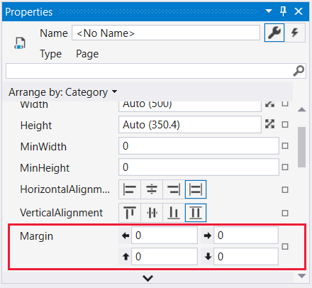
在
ExpenseItHome.xaml中,將 Margin 元素上的 Grid 屬性設定為 「10,0,10,10」,其對應至左、上、右和下邊界:<Grid Margin="10,0,10,10">提示
您也可以 在 [屬性 ] 視窗中設定 [版面配置 ] 類別下的 [邊界 ] 值:
在標記之間 Grid 新增下列 XAML,以建立資料列和資料行定義:
<Grid.ColumnDefinitions> <ColumnDefinition /> </Grid.ColumnDefinitions> <Grid.RowDefinitions> <RowDefinition Height="Auto"/> <RowDefinition /> <RowDefinition Height="Auto"/> </Grid.RowDefinitions>Height兩個數據列的 設定為 Auto ,這表示資料列會根據資料列中的內容來調整資料列大小。 預設值 Height 是 Star 調整大小,這表示資料列高度是可用空間的加權比例。 例如,如果兩個數據列各有 Height 「*」,則每個資料列的高度都是可用空間的一半。
您 Grid 現在應該包含下列 XAML:
<Grid Margin="10,0,10,10">
    <Grid.ColumnDefinitions>
        <ColumnDefinition />
    </Grid.ColumnDefinitions>
    <Grid.RowDefinitions>
        <RowDefinition Height="Auto"/>
        <RowDefinition />
        <RowDefinition Height="Auto"/>
    </Grid.RowDefinitions>
</Grid>
新增控制項
在本節中,您將更新首頁 UI 以顯示人員清單,您可以在其中選取一個人來顯示其費用報表。 控制項是可讓使用者與您應用程式互動的 UI 物件。 如需詳細資訊,請參閱 控制項。
若要建立此 UI,您會將下列元素新增至 ExpenseItHome.xaml :
每個控制項都會藉由設定 Grid.Row 附加屬性,放在 的資料 Grid 列中。 如需附加屬性的詳細資訊,請參閱 附加屬性概觀。
在 中
ExpenseItHome.xaml,在 標記之間 Grid 新增下列 XAML:<!-- People list --> <Border Grid.Column="0" Grid.Row="0" Height="35" Padding="5" Background="#4E87D4"> <Label VerticalAlignment="Center" Foreground="White">Names</Label> </Border> <ListBox Name="peopleListBox" Grid.Column="0" Grid.Row="1"> <ListBoxItem>Mike</ListBoxItem> <ListBoxItem>Lisa</ListBoxItem> <ListBoxItem>John</ListBoxItem> <ListBoxItem>Mary</ListBoxItem> </ListBox> <!-- View report button --> <Button Grid.Column="0" Grid.Row="2" Margin="0,10,0,10" Width="125" Height="25" HorizontalAlignment="Right">View</Button>提示
您也可以將控制項從 [工具箱 ] 視窗拖曳到設計視窗,然後在 [屬性 ] 視窗中設定其屬性 ,以建立控制項。
建置並執行應用程式。
下圖顯示您所建立的控制項:
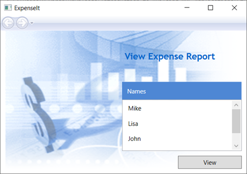
新增影像和標題
在本節中,您將使用影像和頁面標題來更新首頁 UI。
在 中
ExpenseItHome.xaml,將另一個資料行加入固定 ColumnDefinitionsWidth 為 230 圖元的 :<Grid.ColumnDefinitions> <ColumnDefinition Width="230" /> <ColumnDefinition /> </Grid.ColumnDefinitions>將另一個資料列新增至 RowDefinitions ,總共四個數據列:
<Grid.RowDefinitions>
    <RowDefinition/>
    <RowDefinition Height="Auto"/>
    <RowDefinition />
    <RowDefinition Height="Auto"/>
</Grid.RowDefinitions>
將屬性設定 Grid.Column 為三個控制項中的 1,將控制項移至第二欄(Border、ListBox 和 Button)。
將每一個控制項的值遞增為 1,以將每個控制項遞減 Grid.Row 一個資料列(Border、ListBox 和 Button)和 Border 元素的值。
三個控制項的 XAML 現在看起來如下:
  <Border Grid.Column="1" Grid.Row="1" Height="35" Padding="5" Background="#4E87D4">
      <Label VerticalAlignment="Center" Foreground="White">Names</Label>
  </Border>
  <ListBox Name="peopleListBox" Grid.Column="1" Grid.Row="2">
      <ListBoxItem>Mike</ListBoxItem>
      <ListBoxItem>Lisa</ListBoxItem>
      <ListBoxItem>John</ListBoxItem>
      <ListBoxItem>Mary</ListBoxItem>
  </ListBox>

  <!-- View report button -->
  <Button Grid.Column="1" Grid.Row="3" Margin="0,10,0,0" Width="125"
Height="25" HorizontalAlignment="Right">View</Button>
將 Background 屬性設定為 watermark.png 影像檔,方法是在 和
</Grid>標記之間<Grid>新增下列 XAML:<Grid.Background> <ImageBrush ImageSource="watermark.png"/> </Grid.Background>在 Border 元素之前,新增 Label 包含「檢視費用報表」內容的 。 此標籤是頁面的標題。
<Label Grid.Column="1" VerticalAlignment="Center" FontFamily="Trebuchet MS"
        FontWeight="Bold" FontSize="18" Foreground="#0066cc">
    View Expense Report
</Label>
建置並執行應用程式。
下圖顯示您剛才新增的內容結果:
新增程式碼以處理事件
在 中
ExpenseItHome.xaml,將事件處理常式新增 Click 至 Button 專案。 如需詳細資訊,請參閱 如何:建立簡單的事件處理常式 。<!-- View report button --> <Button Grid.Column="1" Grid.Row="3" Margin="0,10,0,0" Width="125" Height="25" HorizontalAlignment="Right" Click="Button_Click">View</Button>開啟
ExpenseItHome.xaml.vb或ExpenseItHome.xaml.cs。將下列程式碼新增至
ExpenseItHome類別,以新增按鈕 click 事件處理常式。 事件處理常式會 開啟 ExpenseReportPage 頁面。private void Button_Click(object sender, RoutedEventArgs e) { // View Expense Report ExpenseReportPage expenseReportPage = new ExpenseReportPage(); this.NavigationService.Navigate(expenseReportPage); }Private Sub Button_Click(ByVal sender As Object, ByVal e As RoutedEventArgs) ' View Expense Report Dim expenseReportPage As New ExpenseReportPage() Me.NavigationService.Navigate(expenseReportPage) End Sub
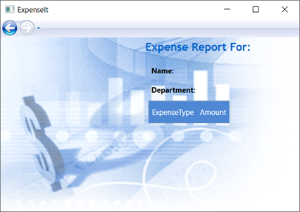
建立 ExpenseReportPage 的 UI
ExpenseReportPage.xaml 會顯示頁面上所選取 ExpenseItHome 人員的費用報表。 在本節中,您將建立 ExpenseReportPage 的 UI。 您也會將背景和填滿色彩新增至各種 UI 元素。
開啟 ExpenseReportPage.xaml。
在標記之間 Grid 新增下列 XAML:
 <Grid.Background>
     <ImageBrush ImageSource="watermark.png" />
 </Grid.Background>
 <Grid.ColumnDefinitions>
     <ColumnDefinition Width="230" />
     <ColumnDefinition />
 </Grid.ColumnDefinitions>
 <Grid.RowDefinitions>
     <RowDefinition Height="Auto" />
     <RowDefinition />
 </Grid.RowDefinitions>


 <Label Grid.Column="1" VerticalAlignment="Center" FontFamily="Trebuchet MS"
 FontWeight="Bold" FontSize="18" Foreground="#0066cc">
     Expense Report For:
 </Label>
 <Grid Margin="10" Grid.Column="1" Grid.Row="1">

     <Grid.ColumnDefinitions>
         <ColumnDefinition />
         <ColumnDefinition />
     </Grid.ColumnDefinitions>
     <Grid.RowDefinitions>
         <RowDefinition Height="Auto" />
         <RowDefinition Height="Auto" />
         <RowDefinition />
     </Grid.RowDefinitions>

     <!-- Name -->
     <StackPanel Grid.Column="0" Grid.ColumnSpan="2" Grid.Row="0" Orientation="Horizontal">
         <Label Margin="0,0,0,5" FontWeight="Bold">Name:</Label>
         <Label Margin="0,0,0,5" FontWeight="Bold"></Label>
     </StackPanel>

     <!-- Department -->
     <StackPanel Grid.Column="0" Grid.ColumnSpan="2" Grid.Row="1" Orientation="Horizontal">
         <Label Margin="0,0,0,5" FontWeight="Bold">Department:</Label>
         <Label Margin="0,0,0,5" FontWeight="Bold"></Label>
     </StackPanel>

     <Grid Grid.Column="0" Grid.ColumnSpan="2" Grid.Row="2" VerticalAlignment="Top"
           HorizontalAlignment="Left">
         <!-- Expense type and Amount table -->
         <DataGrid  AutoGenerateColumns="False" RowHeaderWidth="0" >
             <DataGrid.ColumnHeaderStyle>
                 <Style TargetType="{x:Type DataGridColumnHeader}">
                     <Setter Property="Height" Value="35" />
                     <Setter Property="Padding" Value="5" />
                     <Setter Property="Background" Value="#4E87D4" />
                     <Setter Property="Foreground" Value="White" />
                 </Style>
             </DataGrid.ColumnHeaderStyle>
             <DataGrid.Columns>
                 <DataGridTextColumn Header="ExpenseType" />
                 <DataGridTextColumn Header="Amount"  />
             </DataGrid.Columns>
         </DataGrid>
     </Grid>
 </Grid>
此 UI 類似于
ExpenseItHome.xaml,但報表資料會顯示在 中 DataGrid 。建置並執行應用程式。
選取 [ 檢視] 按鈕。
報表頁面隨即出現。 另請注意,已啟用返回瀏覽按鈕。
下圖顯示新增至 ExpenseReportPage.xaml 的 UI 元素。
樣式控制項
對於 UI 中相同類型的所有元素,各種元素的外觀通常相同。 UI 會使用 樣式 讓外觀在多個元素之間重複使用。 樣式的重複使用性有助於簡化 XAML 建立和管理。 本節會將先前步驟中定義的個別元素屬性 (Attribute) 取代為樣式。
開啟 Application.xaml 或 App.xaml 。
在標記之間 Application.Resources 新增下列 XAML:
<!-- Header text style -->
<Style x:Key="headerTextStyle">
    <Setter Property="Label.VerticalAlignment" Value="Center"></Setter>
    <Setter Property="Label.FontFamily" Value="Trebuchet MS"></Setter>
    <Setter Property="Label.FontWeight" Value="Bold"></Setter>
    <Setter Property="Label.FontSize" Value="18"></Setter>
    <Setter Property="Label.Foreground" Value="#0066cc"></Setter>
</Style>

<!-- Label style -->
<Style x:Key="labelStyle" TargetType="{x:Type Label}">
    <Setter Property="VerticalAlignment" Value="Top" />
    <Setter Property="HorizontalAlignment" Value="Left" />
    <Setter Property="FontWeight" Value="Bold" />
    <Setter Property="Margin" Value="0,0,0,5" />
</Style>

<!-- DataGrid header style -->
<Style x:Key="columnHeaderStyle" TargetType="{x:Type DataGridColumnHeader}">
    <Setter Property="Height" Value="35" />
    <Setter Property="Padding" Value="5" />
    <Setter Property="Background" Value="#4E87D4" />
    <Setter Property="Foreground" Value="White" />
</Style>

<!-- List header style -->
<Style x:Key="listHeaderStyle" TargetType="{x:Type Border}">
    <Setter Property="Height" Value="35" />
    <Setter Property="Padding" Value="5" />
    <Setter Property="Background" Value="#4E87D4" />
</Style>

<!-- List header text style -->
<Style x:Key="listHeaderTextStyle" TargetType="{x:Type Label}">
    <Setter Property="Foreground" Value="White" />
    <Setter Property="VerticalAlignment" Value="Center" />
    <Setter Property="HorizontalAlignment" Value="Left" />
</Style>

<!-- Button style -->
<Style x:Key="buttonStyle" TargetType="{x:Type Button}">
    <Setter Property="Width" Value="125" />
    <Setter Property="Height" Value="25" />
    <Setter Property="Margin" Value="0,10,0,0" />
    <Setter Property="HorizontalAlignment" Value="Right" />
</Style>
這個 XAML 會加入下列樣式:
headerTextStyle:格式化頁面標題 Label。labelStyle:格式化 Label 控制項。columnHeaderStyle:格式化 DataGridColumnHeader。listHeaderStyle:格式化清單標頭 Border 控制項。listHeaderTextStyle:格式化清單標頭 Label 。buttonStyle:在 上ExpenseItHome.xaml格式化 Button 。
請注意,樣式是屬性元素的資源 Application.Resources 和子系。 在這裡,樣式會套用至應用程式中的所有元素。 如需在 .NET 應用程式中使用資源的範例,請參閱 使用應用程式資源 。
在
ExpenseItHome.xaml中,以下列 XAML 取代 元素之間的 Grid 所有專案:<Grid.Background> <ImageBrush ImageSource="watermark.png" /> </Grid.Background> <Grid.ColumnDefinitions> <ColumnDefinition Width="230" /> <ColumnDefinition /> </Grid.ColumnDefinitions> <Grid.RowDefinitions> <RowDefinition/> <RowDefinition Height="Auto"/> <RowDefinition /> <RowDefinition Height="Auto"/> </Grid.RowDefinitions> <!-- People list --> <Label Grid.Column="1" Style="{StaticResource headerTextStyle}" > View Expense Report </Label> <Border Grid.Column="1" Grid.Row="1" Style="{StaticResource listHeaderStyle}"> <Label Style="{StaticResource listHeaderTextStyle}">Names</Label> </Border> <ListBox Name="peopleListBox" Grid.Column="1" Grid.Row="2"> <ListBoxItem>Mike</ListBoxItem> <ListBoxItem>Lisa</ListBoxItem> <ListBoxItem>John</ListBoxItem> <ListBoxItem>Mary</ListBoxItem> </ListBox> <!-- View report button --> <Button Grid.Column="1" Grid.Row="3" Click="Button_Click" Style="{StaticResource buttonStyle}">View</Button>套用樣式會移除並取代諸如 VerticalAlignment 和 FontFamily 這類會定義每個控制項外觀的屬性。 例如,會
headerTextStyle套用至 「檢視費用報表」 Label 。開啟 ExpenseReportPage.xaml。
使用下列 XAML 取代 元素之間的 Grid 所有專案:
<Grid.Background> <ImageBrush ImageSource="watermark.png" /> </Grid.Background> <Grid.ColumnDefinitions> <ColumnDefinition Width="230" /> <ColumnDefinition /> </Grid.ColumnDefinitions> <Grid.RowDefinitions> <RowDefinition Height="Auto" /> <RowDefinition /> </Grid.RowDefinitions> <Label Grid.Column="1" Style="{StaticResource headerTextStyle}"> Expense Report For: </Label> <Grid Margin="10" Grid.Column="1" Grid.Row="1"> <Grid.ColumnDefinitions> <ColumnDefinition /> <ColumnDefinition /> </Grid.ColumnDefinitions> <Grid.RowDefinitions> <RowDefinition Height="Auto" /> <RowDefinition Height="Auto" /> <RowDefinition /> </Grid.RowDefinitions> <!-- Name --> <StackPanel Grid.Column="0" Grid.ColumnSpan="2" Grid.Row="0" Orientation="Horizontal"> <Label Style="{StaticResource labelStyle}">Name:</Label> <Label Style="{StaticResource labelStyle}"></Label> </StackPanel> <!-- Department --> <StackPanel Grid.Column="0" Grid.ColumnSpan="2" Grid.Row="1" Orientation="Horizontal"> <Label Style="{StaticResource labelStyle}">Department:</Label> <Label Style="{StaticResource labelStyle}"></Label> </StackPanel> <Grid Grid.Column="0" Grid.ColumnSpan="2" Grid.Row="2" VerticalAlignment="Top" HorizontalAlignment="Left"> <!-- Expense type and Amount table --> <DataGrid ColumnHeaderStyle="{StaticResource columnHeaderStyle}" AutoGenerateColumns="False" RowHeaderWidth="0" > <DataGrid.Columns> <DataGridTextColumn Header="ExpenseType" /> <DataGridTextColumn Header="Amount" /> </DataGrid.Columns> </DataGrid> </Grid> </Grid>建置並執行應用程式。 視窗外觀與先前相同。
關閉應用程式以返回 Visual Studio。
將資料系結至控制項
在本節中,您將建立系結至各種控制項的 XML 資料。
在 中,在
ExpenseItHome.xaml開頭 Grid 元素之後,新增下列 XAML 來建立 XmlDataProvider ,其中包含每個人的資料:<Grid.Resources> <!-- Expense Report Data --> <XmlDataProvider x:Key="ExpenseDataSource" XPath="Expenses"> <x:XData> <Expenses xmlns=""> <Person Name="Mike" Department="Legal"> <Expense ExpenseType="Lunch" ExpenseAmount="50" /> <Expense ExpenseType="Transportation" ExpenseAmount="50" /> </Person> <Person Name="Lisa" Department="Marketing"> <Expense ExpenseType="Document printing" ExpenseAmount="50"/> <Expense ExpenseType="Gift" ExpenseAmount="125" /> </Person> <Person Name="John" Department="Engineering"> <Expense ExpenseType="Magazine subscription" ExpenseAmount="50"/> <Expense ExpenseType="New machine" ExpenseAmount="600" /> <Expense ExpenseType="Software" ExpenseAmount="500" /> </Person> <Person Name="Mary" Department="Finance"> <Expense ExpenseType="Dinner" ExpenseAmount="100" /> </Person> </Expenses> </x:XData> </XmlDataProvider> </Grid.Resources>資料會建立為 Grid 資源。 通常,此資料會載入為檔案,但為了簡單起見,資料會內嵌新增。
在 元素中
<Grid.Resources>,新增下列<xref:System.Windows.DataTemplate>元素,定義如何在 元素之後<XmlDataProvider>顯示 中的資料 ListBox :<Grid.Resources> <!-- Name item template --> <DataTemplate x:Key="nameItemTemplate"> <Label Content="{Binding XPath=@Name}"/> </DataTemplate> </Grid.Resources>如需資料範本的詳細資訊,請參閱 資料範本化概觀 。
以下列 XAML 取代現有的 ListBox :
<ListBox Name="peopleListBox" Grid.Column="1" Grid.Row="2"
         ItemsSource="{Binding Source={StaticResource ExpenseDataSource}, XPath=Person}"
         ItemTemplate="{StaticResource nameItemTemplate}">
</ListBox>
這個 XAML 會將 ItemsSource 的 ListBox 屬性系結至資料來源,並將資料範本套用為 ItemTemplate 。
將資料連線至控制項
接下來,您將新增程式碼以擷取頁面上選取 ExpenseItHome 的名稱,並將它傳遞至 ExpenseReportPage 的 建構函式。 ExpenseReportPage 會使用傳遞的專案來設定其資料內容,這是 ExpenseReportPage.xaml 中所 定義的控制項系結至的專案。
開啟 ExpenseReportPage.xaml.vb 或 ExpenseReportPage.xaml.cs。
加入一個可接受物件的建構函式,如此您就可以傳遞選取之人員的費用報表資料。
public partial class ExpenseReportPage : Page
{
    public ExpenseReportPage()
    {
        InitializeComponent();
    }

    // Custom constructor to pass expense report data
    public ExpenseReportPage(object data):this()
    {
        // Bind to expense report data.
        this.DataContext = data;
    }
}
Partial Public Class ExpenseReportPage Inherits Page Public Sub New() InitializeComponent() End Sub ' Custom constructor to pass expense report data Public Sub New(ByVal data As Object) Me.New() ' Bind to expense report data. Me.DataContext = data End Sub End Class開啟
ExpenseItHome.xaml.vb或ExpenseItHome.xaml.cs。Click變更事件處理常式以呼叫新的建構函式,以傳遞所選人員的費用報表資料。
private void Button_Click(object sender, RoutedEventArgs e)
{
    // View Expense Report
    ExpenseReportPage expenseReportPage = new ExpenseReportPage(this.peopleListBox.SelectedItem);
    this.NavigationService.Navigate(expenseReportPage);
}
Private Sub Button_Click(ByVal sender As Object, ByVal e As RoutedEventArgs) ' View Expense Report Dim expenseReportPage As New ExpenseReportPage(Me.peopleListBox.SelectedItem) Me.NavigationService.Navigate(expenseReportPage) End Sub
使用資料範本設定資料樣式
在本節中,您將使用資料範本來更新資料繫結清單中每個專案的 UI。
開啟 ExpenseReportPage.xaml。
將 「Name」 和 「Department」 Label 元素的內容系結至適當的資料來源屬性。 如需資料系結的詳細資訊,請參閱 資料系結概觀 。
<!-- Name -->
<StackPanel Grid.Column="0" Grid.ColumnSpan="2" Grid.Row="0" Orientation="Horizontal">
    <Label Style="{StaticResource labelStyle}">Name:</Label>
    <Label Style="{StaticResource labelStyle}" Content="{Binding XPath=@Name}"></Label>
</StackPanel>

<!-- Department -->
<StackPanel Grid.Column="0" Grid.ColumnSpan="2" Grid.Row="1" Orientation="Horizontal">
    <Label Style="{StaticResource labelStyle}">Department:</Label>
    <Label Style="{StaticResource labelStyle}" Content="{Binding XPath=@Department}"></Label>
</StackPanel>
在開頭 Grid 元素之後,新增下列資料範本,以定義如何顯示費用報表資料:
<!--Templates to display expense report data-->
<Grid.Resources>
    <!-- Reason item template -->
    <DataTemplate x:Key="typeItemTemplate">
        <Label Content="{Binding XPath=@ExpenseType}"/>
    </DataTemplate>
    <!-- Amount item template -->
    <DataTemplate x:Key="amountItemTemplate">
        <Label Content="{Binding XPath=@ExpenseAmount}"/>
    </DataTemplate>
</Grid.Resources>
將 專案 DataGridTextColumn 取代為 DataGridTemplateColumn 元素底下的 DataGrid ,並將範本套用至這些專案。 此外,請在
ItemsSourceElement 中DataGrid指定屬性及其值。<!-- Expense type and Amount table --> <DataGrid ItemsSource="{Binding XPath=Expense}" ColumnHeaderStyle="{StaticResource columnHeaderStyle}" AutoGenerateColumns="False" RowHeaderWidth="0" > <DataGrid.Columns> <DataGridTemplateColumn Header="ExpenseType" CellTemplate="{StaticResource typeItemTemplate}" /> <DataGridTemplateColumn Header="Amount" CellTemplate="{StaticResource amountItemTemplate}" /> </DataGrid.Columns> </DataGrid>建置並執行應用程式。
選取人員,然後選取 [ 檢視] 按鈕。
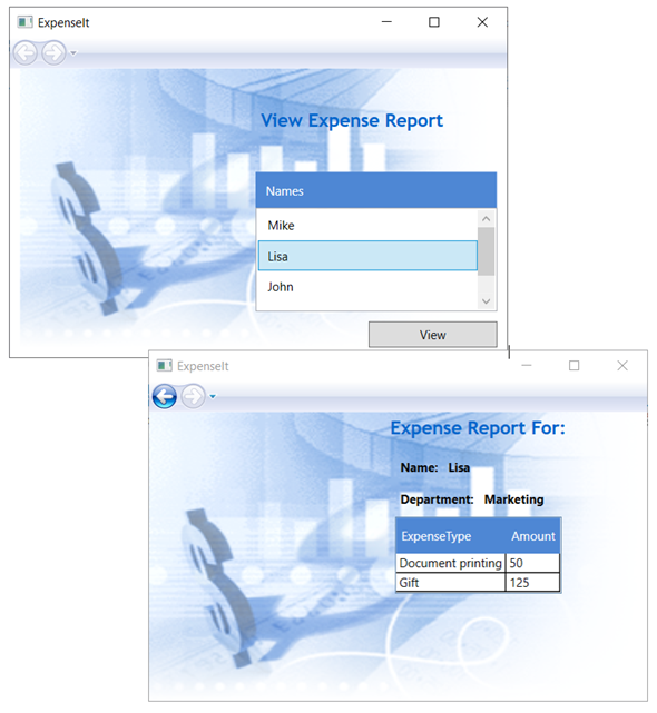
下圖顯示應用程式的兩個頁面 ExpenseIt ,並套用控制項、版面配置、樣式、資料系結和資料範本:
注意
此範例示範 WPF 的特定功能,且不會遵循安全性、當地語系化和協助工具等所有最佳做法。 如需 WPF 和 .NET 應用程式開發最佳做法的完整涵蓋範圍,請參閱下列主題:
下一步
在本逐步解說中,您已瞭解一些使用 Windows Presentation Foundation 建立 UI 的技術(WPF)。 您現在應該已基本瞭解資料系結 .NET 應用程式的建置組塊。 如需 WPF 架構和程式設計模型的詳細資訊,請參閱下列主題:
如需建立應用程式的詳細資訊,請參閱下列主題:
另請參閱
意見反應
即將登場:在 2024 年,我們將逐步淘汰 GitHub 問題作為內容的意見反應機制,並將它取代為新的意見反應系統。 如需詳細資訊,請參閱:https://aka.ms/ContentUserFeedback。
提交並檢視相關的意見反應