基本 XAML 語法
 流覽範例
流覽範例XAML 主要是針對具現化和初始化對象所設計。 但是,屬性通常必須設定為無法輕易表示為 XML 字串的複雜物件,而某個類別所定義的屬性有時必須在子類別上設定。 這兩個需求需要屬性元素和附加屬性的基本 XAML 語法功能。
屬性元素
在 .NET 多平臺應用程式 UI (.NET MAUI) XAML 中,類別的屬性通常會設定為 XML 屬性:
<Label Text="Hello, XAML!"
       VerticalOptions="Center"
       FontAttributes="Bold"
       FontSize="18"
       TextColor="Aqua" />
不過,在 XAML 中設定屬性有替代方式:
<Label Text="Hello, XAML!"
       VerticalOptions="Center"
       FontAttributes="Bold"
       FontSize="18">
    <Label.TextColor>
        Aqua
    </Label.TextColor>
</Label>
這兩個指定 TextColor 屬性的範例在功能上相等,並啟用一些基本術語的引進:
- Label是物件專案。 它是以 XML 元素表示的 .NET MAUI 物件。
Text、VerticalOptionsFontAttributes和FontSize屬性屬性。 它們是以 XML 屬性表示的 .NET MAUI 屬性。- 在第二個範例中,
TextColor已成為屬性專案。 它是以 XML 元素表示的 .NET MAUI 屬性。
注意
在屬性元素中,屬性的值一律定義為屬性專案開始和結束標記之間的內容。
Property-element 語法也可以在物件的多個屬性上使用:
<Label Text="Hello, XAML!"
       VerticalOptions="Center">
    <Label.FontAttributes>
        Bold
    </Label.FontAttributes>
    <Label.FontSize>
        Large
    </Label.FontSize>
    <Label.TextColor>
        Aqua
    </Label.TextColor>
</Label>
雖然屬性元素語法似乎不必要,但當屬性的值太複雜而無法表示為簡單字串時,就很重要。 在 property-element 標記中,您可以具現化另一個物件並設定其屬性。 例如,版面配置 Grid 具有名為 RowDefinitions 和 ColumnDefinitions的屬性,其類型 RowDefinitionCollection 分別為 和 ColumnDefinitionCollection 。 這些類型是 和 ColumnDefinition 物件的集合RowDefinition,而且您通常會使用屬性元素語法來設定它們:
<ContentPage xmlns="http://schemas.microsoft.com/dotnet/2021/maui"
             xmlns:x="http://schemas.microsoft.com/winfx/2009/xaml"
             x:Class="XamlSamples.GridDemoPage"
             Title="Grid Demo Page">
    <Grid>
        <Grid.RowDefinitions>
            <RowDefinition Height="Auto" />
            <RowDefinition Height="*" />
            <RowDefinition Height="100" />
        </Grid.RowDefinitions>
        <Grid.ColumnDefinitions>
            <ColumnDefinition Width="Auto" />
            <ColumnDefinition Width="*" />
            <ColumnDefinition Width="100" />
        </Grid.ColumnDefinitions>
        ...
    </Grid>
</ContentPage>
附加屬性
在上一個範例中,Grid您會看到 需要 和 ColumnDefinitions 集合的屬性元素RowDefinitions來定義數據列和數據行。 這表示必須有一個技術來指出每個子系 Grid 所在的數據列和數據行。
在標記中,使用 和 Grid.Column 屬性指定該子GridGrid.Row系的數據列和數據行,其預設值為 0。 您也可以指出子系是否跨越多個數據列或具有 Grid.RowSpan 和 Grid.ColumnSpan 屬性的數據列或數據行,其預設值為 1。
下列範例示範將子系放在 中 Grid:
<ContentPage xmlns="http://schemas.microsoft.com/dotnet/2021/maui"
             xmlns:x="http://schemas.microsoft.com/winfx/2009/xaml"
             x:Class="XamlSamples.GridDemoPage"
             Title="Grid Demo Page">
    <Grid>
        <Grid.RowDefinitions>
            <RowDefinition Height="Auto" />
            <RowDefinition Height="*" />
            <RowDefinition Height="100" />
        </Grid.RowDefinitions>
        <Grid.ColumnDefinitions>
            <ColumnDefinition Width="Auto" />
            <ColumnDefinition Width="*" />
            <ColumnDefinition Width="100" />
        </Grid.ColumnDefinitions>

        <Label Text="Autosized cell"
               TextColor="White"
               BackgroundColor="Blue" />
        <BoxView Color="Silver"
                 Grid.Column="1" />
        <BoxView Color="Teal"
                 Grid.Row="1" />
        <Label Text="Leftover space"
               Grid.Row="1" Grid.Column="1"
               TextColor="Purple"
               BackgroundColor="Aqua"
               HorizontalTextAlignment="Center"
               VerticalTextAlignment="Center" />
        <Label Text="Span two rows (or more if you want)"
               Grid.Column="2" Grid.RowSpan="2"
               TextColor="Yellow"
               BackgroundColor="Blue"
               HorizontalTextAlignment="Center"
               VerticalTextAlignment="Center" />
        <Label Text="Span two columns"
               Grid.Row="2" Grid.ColumnSpan="2"
               TextColor="Blue"
               BackgroundColor="Yellow"
               HorizontalTextAlignment="Center"
               VerticalTextAlignment="Center" />
        <Label Text="Fixed 100x100"
               Grid.Row="2" Grid.Column="2"
               TextColor="Aqua"
               BackgroundColor="Red"
               HorizontalTextAlignment="Center"
               VerticalTextAlignment="Center" />

    </Grid>
</ContentPage>
此 XAML 會產生下列設定:
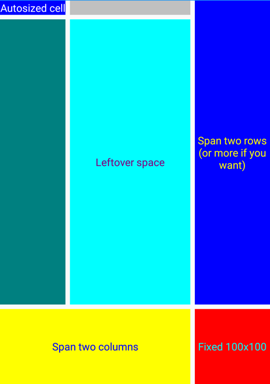
、、 和 屬性似乎是 類別的屬性Grid,但這個類別不會定義名為 、Column、 RowSpan或 ColumnSpan的任何專案Row。Grid.ColumnSpanGrid.RowSpanGrid.ColumnGrid.Row 相反地,類別Grid會定義名為 、、 ColumnPropertyRowSpanProperty和 ColumnSpanProperty的四個可系結屬性,這些屬性RowProperty是稱為附加屬性的特殊型別。 它們是由 類別所定義, Grid 但在的 Grid子系上設定。
注意
當您想要在程式代碼中使用這些附加屬性時,類別Grid會提供名為 GetRow、SetRow、、、GetColumn、GetRowSpanSetColumn、、 SetRowSpanGetColumnSpan和 的SetColumnSpan靜態方法。
附加屬性可在 XAML 中辨識為同時包含類別和以句點分隔的屬性名稱的屬性。 它們稱為 附加屬性 ,因為它們是由一個類別所定義, Grid但附加至其他物件(在此案例中為的子系 Grid)。 在配置期間, Grid 可以詢問這些附加屬性的值,以瞭解放置每個子系的位置。
內容屬性
在上一個範例中 Grid ,對象已設定為 Content 的 ContentPage屬性。 不過, Content 屬性並未在 XAML 中參考,但可以是:
<ContentPage xmlns="http://schemas.microsoft.com/dotnet/2021/maui"
             xmlns:x="http://schemas.microsoft.com/winfx/2009/xaml"
             x:Class="XamlSamples.XamlPlusCodePage"
             Title="XAML + Code Page">
    <ContentPage.Content>
        <Grid>
            ...
        </Grid>
    </ContentPage.Content>
</ContentPage>
XAML 中不需要 屬性 Content ,因為定義在 .NET MAUI XAML 中使用的專案可以有一個屬性指定為 ContentProperty 類別上的 屬性:
[ContentProperty("Content")]
public class ContentPage : TemplatedPage
{
    ...
}
指定為 ContentProperty 類別 之的任何屬性表示不需要屬性的 property-element 標記。 因此,上述範例會指定在開始和結束 ContentPage 卷標之間出現的任何 XAML 內容會指派給 Content 屬性。
許多類別也有 ContentProperty 屬性定義。 例如,的內容屬性 Label 是 Text。
平台差異
.NET MAUI 應用程式可以根據每個平臺自定義 UI 外觀。 這可以在 XAML 中使用 OnPlatform 和 On 類別來達成:
<ContentPage xmlns="http://schemas.microsoft.com/dotnet/2021/maui"
             xmlns:x="http://schemas.microsoft.com/winfx/2009/xaml"
             x:Class="...">
    <ContentPage.Padding>
        <OnPlatform x:TypeArguments="Thickness">
            <On Platform="iOS" Value="0,20,0,0" />
            <On Platform="Android" Value="10,20,20,10" />
        </OnPlatform>
    </ContentPage.Padding>
    ...
</ContentPage>
OnPlatform 是泛型類別,因此您必須指定泛型型別自變數,在此案例中為 , Thickness這是 屬性的類型 Padding 。 這是使用 x:TypeArguments XAML 屬性達成的。 類別 OnPlatform 會 Default 定義屬性,該屬性可設定為將套用至所有平臺的值:
<ContentPage xmlns="http://schemas.microsoft.com/dotnet/2021/maui"
             xmlns:x="http://schemas.microsoft.com/winfx/2009/xaml"
             x:Class="...">
    <ContentPage.Padding>
        <OnPlatform x:TypeArguments="Thickness" Default="20">
            <On Platform="iOS" Value="0,20,0,0" />
            <On Platform="Android" Value="10,20,20,10" />
        </OnPlatform>
    </ContentPage.Padding>
    ...
</ContentPage>
在此範例中, Padding 屬性會設定為iOS和Android上的不同值,而其他平台則設定為預設值。
類別 OnPlatform 也會定義 Platforms 屬性,這是 IList 物件的 On 。 每個 On 物件都可以設定 Platform 和 Value 屬性,以定義 Thickness 特定平臺的值。 此外, Platform 的 On 屬性的類型為 IList<string>,因此如果值相同,您可以包含多個平臺:
<ContentPage xmlns="http://schemas.microsoft.com/dotnet/2021/maui"
             xmlns:x="http://schemas.microsoft.com/winfx/2009/xaml"
             x:Class="...">
    <ContentPage.Padding>
        <OnPlatform x:TypeArguments="Thickness" Default="20">
            <On Platform="iOS, Android" Value="10,20,20,10" />
        </OnPlatform>
    </ContentPage.Padding>
    ...
</ContentPage>
這是在 XAML 中設定平臺相依 Padding 屬性的標準方式。
注意
Value如果對象的屬性On不能以單一字串表示,您可以為其定義屬性元素。
如需詳細資訊,請參閱 根據平臺自定義UI外觀。
下一步
.NET MAUI XAML 標記延伸可讓屬性設定為從其他來源間接參考的物件或值。 XAML 標記延伸對於共享物件以及參考整個應用程式中使用的常數特別重要。
意見反應
即將登場:在 2024 年,我們將逐步淘汰 GitHub 問題作為內容的意見反應機制,並將它取代為新的意見反應系統。 如需詳細資訊,請參閱:https://aka.ms/ContentUserFeedback。
提交並檢視相關的意見反應