此配方示範如何在 Apache Spark 上使用 SynapseML 和 Azure AI 服務進行多變數異常偵測。 多變量異常偵測涉及偵測許多變數或時間序列之間的異常,同時考慮不同變數之間的所有相互關聯和相依性。 此案例會使用 SynapseML 和 Azure AI 服務來定型模型,以進行多變數異常偵測。 然後,我們使用該模型來推斷包含來自三個物聯網感測器的合成測量值的資料集中的多變量異常。
重要
從 2023 年 9 月 20 日開始,您無法建立新的異常偵測器資源。 異常偵測器服務將於 2026 年 10 月 1 日淘汰。
如需 Azure AI 異常偵測器的詳細資訊,請流覽異常 偵測器 資訊資源。
必要條件
- Azure 訂用帳戶 - 建立免費帳戶
- 將筆記本連結至 Lakehouse。 在左側,選取 [新增],以新增現有的 Lakehouse 或建立 Lakehouse。
設定
從現有 Anomaly Detector 資源開始,您可以探索處理各種形式資料的方法。 Azure AI 內的服務目錄提供數個選項:
建立異常偵測器資源
- 在 Azure 入口網站中,選取資源群組中的 [建立],然後輸入 [異常偵測程式]。 選取異常偵測程式資源。
- 命名資源,並最好使用與資源群組其餘部分相同的區域。 其餘部分使用預設選項,然後選取 [檢閱 + 建立],再然後選取 [建立]。
- 建立異常偵測器資源之後,請開啟它,然後選取
Keys and Endpoints左側導覽中的面板。 將異常偵測程式資源的金鑰複製到ANOMALY_API_KEY環境變數中,或將其儲存在anomalyKey變數中。
建立儲存體帳戶資源
若要儲存中繼資料,您必須建立 Azure Blob 儲存體帳戶。 在該儲存體帳戶內,建立用來儲存中繼資料的容器。 記下容器名稱,並將連接字串複製到該容器。 您需要它稍後填入 containerName 變數和 BLOB_CONNECTION_STRING 環境變數。
輸入您的服務金鑰
首先,設定服務金鑰的環境變數。 下一個儲存格會根據儲存在 Azure 金鑰保存庫中的值來設定 和 ANOMALY_API_KEYBLOB_CONNECTION_STRING 環境變數。 如果您在自己的環境中執行本教學課程,請務必先設定這些環境變數,然後再繼續:
import os
from pyspark.sql import SparkSession
from synapse.ml.core.platform import find_secret

# Bootstrap Spark Session
spark = SparkSession.builder.getOrCreate()
讀取 ANOMALY_API_KEY 和 BLOB_CONNECTION_STRING 環境變數,並設定 containerName 和 location 變數:
# An Anomaly Dectector subscription key
anomalyKey = find_secret("anomaly-api-key") # use your own anomaly api key
# Your storage account name
storageName = "anomalydetectiontest" # use your own storage account name
# A connection string to your blob storage account
storageKey = find_secret("madtest-storage-key") # use your own storage key
# A place to save intermediate MVAD results
intermediateSaveDir = (
    "wasbs://madtest@anomalydetectiontest.blob.core.windows.net/intermediateData"
)
# The location of the anomaly detector resource that you created
location = "westus2"
連線到我們的儲存體帳戶,讓異常偵測器可以將中繼結果儲存在該儲存體帳戶中:
spark.sparkContext._jsc.hadoopConfiguration().set(
    f"fs.azure.account.key.{storageName}.blob.core.windows.net", storageKey
)
匯入所有必要的模組:
import numpy as np
import pandas as pd

import pyspark
from pyspark.sql.functions import col
from pyspark.sql.functions import lit
from pyspark.sql.types import DoubleType
import matplotlib.pyplot as plt

import synapse.ml
from synapse.ml.cognitive import *
將範例資料讀取至 Spark DataFrame:
df = (
    spark.read.format("csv")
    .option("header", "true")
    .load("wasbs://publicwasb@mmlspark.blob.core.windows.net/MVAD/sample.csv")
)

df = (
    df.withColumn("sensor_1", col("sensor_1").cast(DoubleType()))
    .withColumn("sensor_2", col("sensor_2").cast(DoubleType()))
    .withColumn("sensor_3", col("sensor_3").cast(DoubleType()))
)

# Let's inspect the dataframe:
df.show(5)
我們現在可以建立一個 estimator 對象,用它來訓練我們的模型。 我們會指定訓練資料的開始和結束時間。 我們也會指定要使用的輸入資料行,以及包含時間戳記的資料行名稱。 最後,我們指定要在異常偵測滑動視窗中使用的資料點數目,並將連接字串設定為 Azure Blob 儲存體帳戶:
trainingStartTime = "2020-06-01T12:00:00Z"
trainingEndTime = "2020-07-02T17:55:00Z"
timestampColumn = "timestamp"
inputColumns = ["sensor_1", "sensor_2", "sensor_3"]

estimator = (
    FitMultivariateAnomaly()
    .setSubscriptionKey(anomalyKey)
    .setLocation(location)
    .setStartTime(trainingStartTime)
    .setEndTime(trainingEndTime)
    .setIntermediateSaveDir(intermediateSaveDir)
    .setTimestampCol(timestampColumn)
    .setInputCols(inputColumns)
    .setSlidingWindow(200)
)
讓我們將estimator擬合到數據中。
model = estimator.fit(df)
訓練完成後,我們就可以使用模型進行推理。 下一個儲存格中的程式碼會指定我們想要偵測異常之資料的開始和結束時間:
inferenceStartTime = "2020-07-02T18:00:00Z"
inferenceEndTime = "2020-07-06T05:15:00Z"

result = (
    model.setStartTime(inferenceStartTime)
    .setEndTime(inferenceEndTime)
    .setOutputCol("results")
    .setErrorCol("errors")
    .setInputCols(inputColumns)
    .setTimestampCol(timestampColumn)
    .transform(df)
)

result.show(5)
在上一個單元格中, .show(5) 向我們展示了前五個數據幀行。 結果全都是 null 因為它們超出了推斷區間。
若要只顯示推斷資料的結果,請選取所需的資料行。 然後,我們可以按升序對資料框中的行進行排序,並過濾結果以僅顯示推理視窗範圍內的行。 這裡, inferenceEndTime 匹配數據框中的最後一行,因此可以忽略它。
最後,為了更好地繪製結果,請將 Spark 資料框轉換為 Pandas 資料框:
rdf = (
    result.select(
        "timestamp",
        *inputColumns,
        "results.contributors",
        "results.isAnomaly",
        "results.severity"
    )
    .orderBy("timestamp", ascending=True)
    .filter(col("timestamp") >= lit(inferenceStartTime))
    .toPandas()
)

rdf
格式化 contributors 資料行,以將貢獻分數從每個感應器儲存到偵測到的異常。 下一個儲存格會處理此問題,並將每個感測器的貢獻分數拆分為各自的資料行:
def parse(x):
    if type(x) is list:
        return dict([item[::-1] for item in x])
    else:
        return {"series_0": 0, "series_1": 0, "series_2": 0}

rdf["contributors"] = rdf["contributors"].apply(parse)
rdf = pd.concat(
    [rdf.drop(["contributors"], axis=1), pd.json_normalize(rdf["contributors"])], axis=1
)
rdf
我們現在在 series_0、series_1 和 series_2 資料行中分別具有感測器 1、2 和 3 的貢獻分數。
要繪製結果,請運行下一個儲存格。 此 minSeverity 參數指定要繪製的異常的最小嚴重性:
minSeverity = 0.1

####### Main Figure #######
plt.figure(figsize=(23, 8))
plt.plot(
    rdf["timestamp"],
    rdf["sensor_1"],
    color="tab:orange",
    linestyle="solid",
    linewidth=2,
    label="sensor_1",
)
plt.plot(
    rdf["timestamp"],
    rdf["sensor_2"],
    color="tab:green",
    linestyle="solid",
    linewidth=2,
    label="sensor_2",
)
plt.plot(
    rdf["timestamp"],
    rdf["sensor_3"],
    color="tab:blue",
    linestyle="solid",
    linewidth=2,
    label="sensor_3",
)
plt.grid(axis="y")
plt.tick_params(axis="x", which="both", bottom=False, labelbottom=False)
plt.legend()

anoms = list(rdf["severity"] >= minSeverity)
_, _, ymin, ymax = plt.axis()
plt.vlines(np.where(anoms), ymin=ymin, ymax=ymax, color="r", alpha=0.8)

plt.legend()
plt.title(
    "A plot of the values from the three sensors with the detected anomalies highlighted in red."
)
plt.show()

####### Severity Figure #######
plt.figure(figsize=(23, 1))
plt.tick_params(axis="x", which="both", bottom=False, labelbottom=False)
plt.plot(
    rdf["timestamp"],
    rdf["severity"],
    color="black",
    linestyle="solid",
    linewidth=2,
    label="Severity score",
)
plt.plot(
    rdf["timestamp"],
    [minSeverity] * len(rdf["severity"]),
    color="red",
    linestyle="dotted",
    linewidth=1,
    label="minSeverity",
)
plt.grid(axis="y")
plt.legend()
plt.ylim([0, 1])
plt.title("Severity of the detected anomalies")
plt.show()

####### Contributors Figure #######
plt.figure(figsize=(23, 1))
plt.tick_params(axis="x", which="both", bottom=False, labelbottom=False)
plt.bar(
    rdf["timestamp"], rdf["series_0"], width=2, color="tab:orange", label="sensor_1"
)
plt.bar(
    rdf["timestamp"],
    rdf["series_1"],
    width=2,
    color="tab:green",
    label="sensor_2",
    bottom=rdf["series_0"],
)
plt.bar(
    rdf["timestamp"],
    rdf["series_2"],
    width=2,
    color="tab:blue",
    label="sensor_3",
    bottom=rdf["series_0"] + rdf["series_1"],
)
plt.grid(axis="y")
plt.legend()
plt.ylim([0, 1])
plt.title("The contribution of each sensor to the detected anomaly")
plt.show()
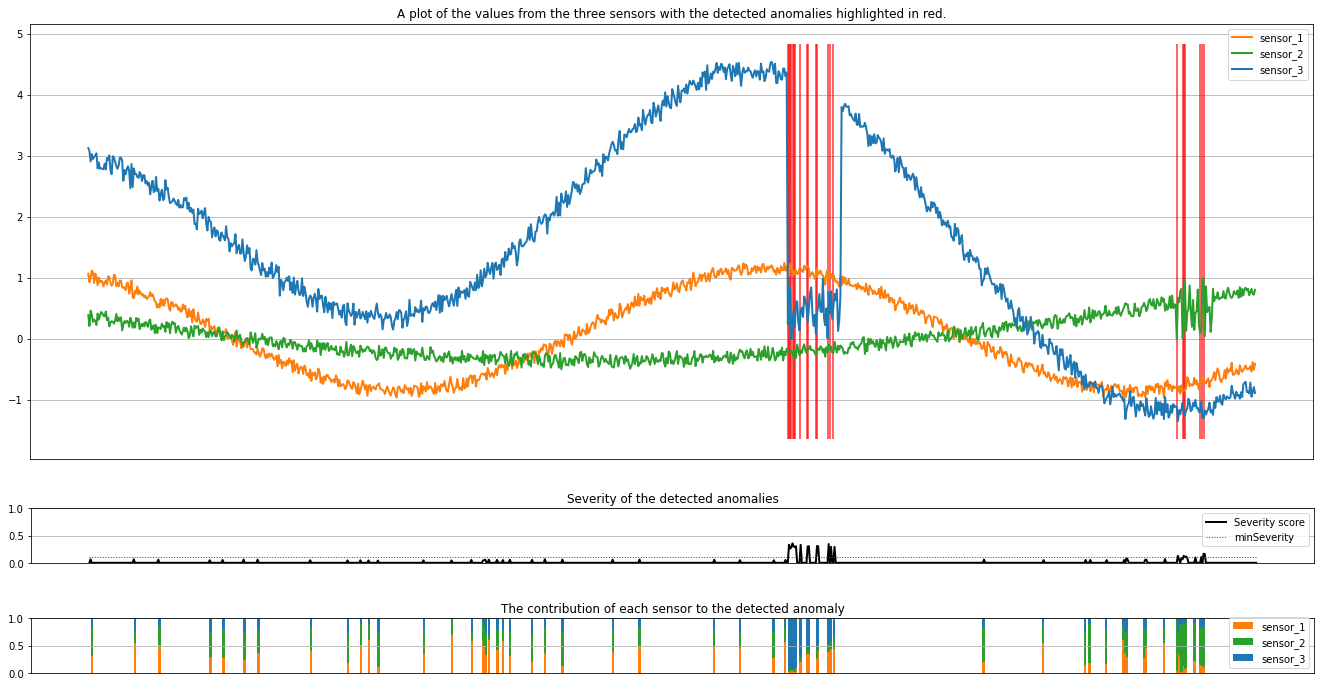
這些繪圖會以橙色、綠色和藍色顯示感測器 (在推斷視窗內) 的未經處理資料。 第一個圖中的紅色垂直線顯示所偵測到的異常,其嚴重性大於或等於 minSeverity。
第二個繪圖顯示了所有偵測到異常的嚴重性分數,且 minSeverity 閾值會顯示在虛線紅色線條中。
最後,最後一個繪圖會顯示每個感測器的資料對偵測到異常的貢獻。 它可協助我們診斷和了解每個異常最有可能的原因。