教學提示
教學提示是半持續性的內容豐富飛出視窗,可提供內容資訊。 它通常用於通知、提醒,以及教導使用者有關可能增強使用者體驗的重要功能和新功能。
教學提示可以是消失關閉,或是需要明確動作來關閉。 教學提示可以用其尾端將特定 UI 元素作為目標,也可以使用它但不包含尾端或目標。
這是正確的控制項嗎?
使用 TeachingTip 控制項,讓使用者注意力集中在新的或重要的更新或功能上、提醒使用者能改進其體驗的非必要選項,或是教使用者如何完成工作。
因為教學提示是暫時性的,所以不建議將此控制項用於提示使用者錯誤或重要狀態更新。
建議
- 提示是暫時的,所以不應該包含對應用程式體驗影響重大的資訊或選項。
- 請盡量避免太頻繁顯示教學提示。 教學提示最有可能在長時間的課程或跨多個課程時收到個別的注意。
- 保持提示簡潔且其主題明確。 研究顯示使用者在決定是否要與提示互動之前,平均只讀 3-5 個字,且只理解 2-3 個字。
- 不保證教學提示的遊戲台協助工具。 對於預測遊戲台輸入的應用程式,請參閱遊戲台與遙控器的互動。 建議您測試的使用應用程式 UI 的所有可能設定,測試每個教學提示的遊戲台協助工具。
- 啟用讓叫學提示逸出 XAML 根之後,建議您也啟用 IsLightDismissEnabled 屬性,並將 PreferredPlacement 模式設定在最接近 XAML 根中央的位置。
重新設定開啟的教學提示
當教學提示是開啟的時候,可以重新設定某些內容和屬性,而且會立即生效。 其他內容和屬性,例如,圖示屬性、動作和關閉按鈕,以及重新設定消失關閉和明確關閉,都需要關閉並重新開啟教學提示,這對些屬性的變更才會生效。 請注意,當教學提示是開啟的時候,將關閉行為從手動關閉變更為消失關閉,會導致教學提示在啟用消失關閉之前,先將其 [關閉] 按鈕移除,並使提示停滯在畫面上。
範例
教學提示可以有數個設定,包括這些值得注意的:
教學提示可以用其尾端,將特定 UI 元素作為目標,以增強所呈現資訊的內容清晰度。
![範例應用程式,包含以 [儲存] 按鈕為目標的教學提示。提示標題為 [自動儲存],子標題為 [系統會在您工作時儲存您的變更,您永遠不需要再自行儲存了。]。教學提示的右上角有關閉按鈕。](../images/teaching-tip-targeted.png)
當呈現的資訊不限於特定 UI 元素時,可以移除尾端,建立無目標教學提示。
![範例應用程式,包含位在右下角的教學提示。提示標題為 [自動儲存],子標題為 [系統會在您工作時儲存您的變更,您永遠不需要再自行儲存了。]。教學提示的右上角有關閉按鈕。](../images/teaching-tip-non-targeted.png)
教學提示可要求使用者透過頂端角落的 "X" 按鈕或底部的 [關閉] 按鈕來關閉它。 也可以為教學提示啟用消失關閉,這樣就不會有關閉按鈕,當使用者捲動或與應用程式其他元素互動時,教學提示就會關閉。 因為此行為,當您要在捲動區域中放置提示時,消失關閉提示是最佳解決方案。
![範例應用程式,包含位在右下角的消失關閉教學提示。提示標題為 [自動儲存],子標題為 [系統會在您工作時儲存您的變更,您永遠不需要再自行儲存了。]。](../images/teaching-tip-light-dismiss.png)
UWP 和 WinUI 2
重要
本文中的資訊和範例針對使用 Windows App SDK 和 WinUI 3 的應用程式進行了最佳化,但通常適用於使用 WinUI 2 的 UWP 應用程式。 如需平台特定資訊和範例,請參閱 UWP API 參考。
本節包含您在 UWP 或 WinUI 2 應用程式中使用控制項所需的資訊。
UWP 應用程式的 TeachingTip 需要 WinUI 2。 如需詳細資訊 (包括安裝指示),請參閱 WinUI。 此控制項的 API 位在 Microsoft.UI.Xaml.Controls 命名空間中。
- WinUI 2 Apis:TeachingTip 類別
- 開啟 WinUI 2 資源庫應用程式,並查看 TeachingTip 運作情形。 WinUI 2 程式庫應用程式包含大部分 WinUI 2 控制項、特性和功能的互動式範例。 從 Microsoft Store 取得應用程式,或在 Github 上取得原始程式碼。
若要在 WinUI 2 中使用本文中的程式碼,請在 XAML 中使用別名 (我們使用 muxc) 來表示專案中包含的 Windows UI 程式庫 API。 如需詳細資訊,請參閱開始使用 WinUI 2。
xmlns:muxc="using:Microsoft.UI.Xaml.Controls"

<muxc:TeachingTip />
建立教學提示
- 重要 API:TeachingTip 類別
WinUI 3 資源庫應用程式包含大多數 WinUI 3 控制項和功能的互動式範例。 從 Microsoft Store 取得應用程式,或在 GitHub 上取得原始程式碼
以下是有目標教學提示控制項的 XAML,示範 TeachingTip 的預設外觀,包含標題和子標題。 請注意,教學提示可以出現在元素樹狀結構或程式碼後置中的任何位置。 在此範例中,它位於 ResourceDictionary 中。
<Button x:Name="SaveButton" Content="Save">
    <Button.Resources>
        <TeachingTip x:Name="AutoSaveTip"
            Target="{x:Bind SaveButton}"
            Title="Save automatically"
            Subtitle="When you save your file to OneDrive, we save your changes as you go - so you never have to.">
        </TeachingTip>
    </Button.Resources>
</Button>
public MainPage()
{
    this.InitializeComponent();

    if(!HaveExplainedAutoSave())
    {
        AutoSaveTip.IsOpen = true;
        SetHaveExplainedAutoSave();
    }
}
當包含按鈕和教學提示的頁面顯示時的結果如下所示:
上述範例使用 Title 和 Subtitle 屬性來設定教學提示的標題和子標題。 Target 屬性可設定為 "SaveButton",以建立其本身與按鈕之間的視覺連結。 為了顯示教學提示,其 IsOpen 屬性會設定為 true。
無目標提示
並非所有提示都與畫面上的元素相關聯。 針對這些案例,請勿設定目標,教學提示會改為顯示在相對於 XAML 根的邊緣。 不過,若要移除教學提示的尾端,但仍保持在相對於 UI 元素的位置,可以將 TailVisibility 屬性設定為 "Collapsed"。 下列示無目標教學提示的範例。
<Button x:Name="SaveButton" Content="Save" />

<TeachingTip x:Name="AutoSaveTip"
    Title="Saving automatically"
    Subtitle="We save your changes as you go - so you never have to.">
</TeachingTip>
請注意,在此範例中,TeachingTip 是在元素樹狀結構中,而不是在 ResourceDictionary 或程式碼後置中。 這不影響行為;TeachingTip 只在開啟時顯示,且不佔版面配置空間。
慣用位置
教學提示使用 PreferredPlacement 屬性,複寫 Flyout 的FlyoutPlacementMode 放置行為。 預設放置模式會嘗試將有目標教學提示放置在其目標上方,並將無目標教學提示置中在 XAML 根底部。 和 Flyout 一樣,如果慣用放置模式會沒有空間顯示教學提示,系統會自動選擇其他放置模式。
對於預測遊戲台輸入的應用程式,請參閱遊戲台與遙控器的互動。 建議您測試的使用應用程式 UI 的所有可能設定,測試每個教學提示的遊戲台協助工具。
PreferredPlacement 設定為 "BottomLeft" 的有目標教學提示會顯示為尾端置中在其目標底部,且提示的主體會向右位移。
<Button x:Name="SaveButton" Content="Save">
    <Button.Resources>
        <TeachingTip x:Name="AutoSaveTip"
            Target="{x:Bind SaveButton}"
            Title="Saving automatically"
            Subtitle="We save your changes as you go - so you never have to."
            PreferredPlacement="BottomLeft">
        </TeachingTip>
    </Button.Resources>
</Button>
![範例應用程式,包含 [儲存] 按鈕,一個教學提示以此按鈕為目標顯示在其左側角落。提示標題為 [自動儲存],子標題為 [系統會在您工作時儲存您的變更,您永遠不需要再自行儲存了。]。教學提示的右上角有關閉按鈕。](../images/teaching-tip-targeted-preferred-placement.png)
PreferredPlacement 設定為 "BottomLeft" 的無目標教學提示,會顯示在 XAML 根的左下角。
<Button x:Name="SaveButton" Content="Save" />

<TeachingTip x:Name="AutoSaveTip"
    Title="Saving automatically"
    Subtitle="We save your changes as you go - so you never have to."
    PreferredPlacement="BottomLeft">
</TeachingTip>
![範例應用程式,包含位在左下角的教學提示。提示標題為 [自動儲存],子標題為 [系統會在您工作時儲存您的變更,您永遠不需要再自行儲存了。]。教學提示的右上角有關閉按鈕。](../images/teaching-tip-non-targeted-preferred-placement.png)
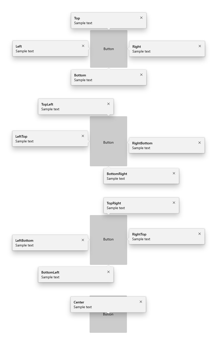
以下圖表描述有目標教學提示可設定的所有 13 個 PreferredPlacement 模式。
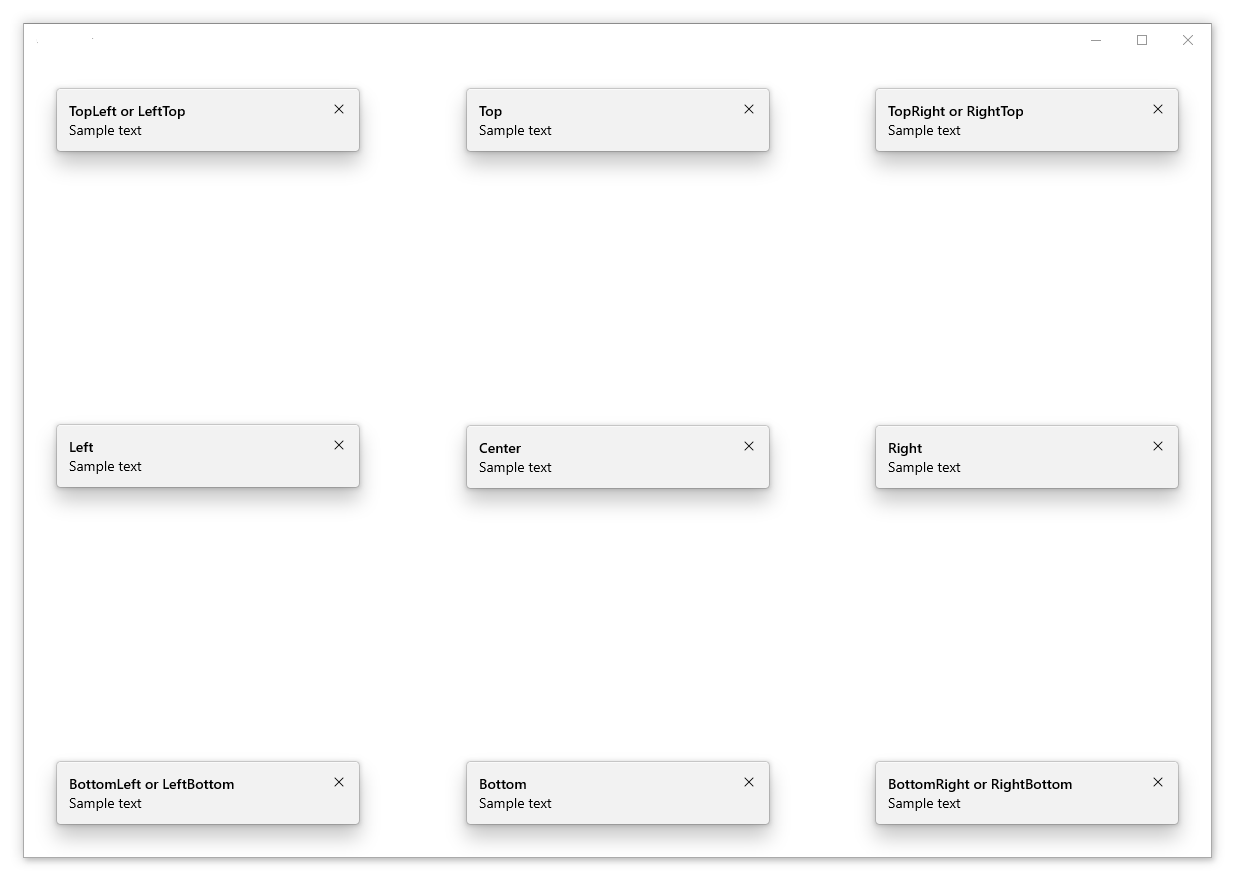
以下圖表描述無目標教學提示可設定的所有 13 個 PreferredPlacement 模式。
新增放置邊界
您可以使用 PlacementMargin 屬性來控制有目標教學提示與其目標的距離,也可控制無目標教學提示與 XAML 根邊緣的距離。 和 Margin 一樣,PlacementMargin 有四個值 (左、右、上和下),因此只會使用相關的值。 例如,PlacementMargin.Left 適用於提示是在目標左側時,或是在 XAML 根的左側邊緣時。
下列範例顯示 PlacementMargin 的 Left/Top/Right/Bottom 都設定為 80 的無目標提示。
<Button x:Name="SaveButton" Content="Save" />

<TeachingTip x:Name="AutoSaveTip"
    Title="Saving automatically"
    Subtitle="We save your changes as you go - so you never have to."
    PreferredPlacement="BottomLeft"
    PlacementMargin="80">
</TeachingTip>
![範例應用程式,包含放置在右下角方向,但未完全接觸角落的教學提示。提示標題為 [自動儲存],子標題為 [系統會在您工作時儲存您的變更,您永遠不需要再自行儲存了。]。教學提示的右上角有關閉按鈕。](../images/teaching-tip-placement-margin.png)
新增內容
可以使用 Content 屬性將內容新增至教學提示。 如果要顯示的內容大小超過教學提示所允許的,系統會自動啟用卷軸,讓使用者能捲動內容區域。
<Button x:Name="SaveButton" Content="Save">
    <Button.Resources>
        <TeachingTip x:Name="AutoSaveTip"
            Target="{x:Bind SaveButton}"
            Title="Saving automatically"
            Subtitle="We save your changes as you go - so you never have to.">
                <StackPanel>
                    <CheckBox x:Name="HideTipsCheckBox" Content="Don't show tips at start up" IsChecked="{x:Bind HidingTips, Mode=TwoWay}" />
                    <TextBlock>You can change your tip preferences in <Hyperlink NavigateUri="app:/item/SettingsPage">Settings</Hyperlink> if you change your mind.</TextBlock>
                </StackPanel>
        </TeachingTip>
    </Button.Resources>
</Button>
![範例應用程式,包含以 [儲存] 按鈕為目標的教學提示。提示標題為 [自動儲存],子標題為 [系統會在您工作時儲存您的變更,您永遠不需要再自行儲存了。]。教學提示的內容區域中是標示為 [不要在啟動時顯示提示] 的核取方塊,再下面是 [如果您改變心意,可以在 [設定] 中變更提示喜好設定] 文字,其中 [設定] 是應用程式設定頁面的連結。教學提示的右上角有關閉按鈕。](../images/teaching-tip-content.png)
新增按鈕
預設會顯示標準 "X" 關閉按鈕,接著是教學提示的標題。 關閉按鈕可以使用 CloseButtonContent 屬性來自訂,在此情況下,按鈕會移動到教學提示的底部。
請注意:啟用消失關閉的提示不會顯示關閉按鈕
藉由設定 ActionButtonContent 屬性 (以及選用的 ActionButtonCommand 和 ActionButtonCommandParameter 屬性),可以新增自訂動作按鈕。
<Button x:Name="SaveButton" Content="Save">
    <Button.Resources>
        <TeachingTip x:Name="AutoSaveTip"
            Target="{x:Bind SaveButton}"
            Title="Saving automatically"
            Subtitle="We save your changes as you go - so you never have to."
            ActionButtonContent="Disable"
            ActionButtonCommand="{x:Bind DisableAutoSaveCommand}"
            CloseButtonContent="Got it!">
                <StackPanel>
                    <CheckBox x:Name="HideTipsCheckBox" Content="Don't show tips at start up" IsChecked="{x:Bind HidingTips, Mode=TwoWay}" />
                    <TextBlock>You can change your tip preferences in <Hyperlink NavigateUri="app:/item/SettingsPage">Settings</Hyperlink> if you change your mind.</TextBlock>
                </StackPanel>
        </TeachingTip>
    </Button.Resources>
</Button>
![範例應用程式,包含以 [儲存] 按鈕為目標的教學提示。提示標題為 [自動儲存],子標題為 [系統會在您工作時儲存您的變更,您永遠不需要再自行儲存了。]。教學提示的內容區域中是標示為 [不要在啟動時顯示提示] 的核取方塊,再下面是 [如果您改變心意,可以在 [設定] 中變更提示喜好設定] 文字,其中 [設定] 是應用程式設定頁面的連結。教學的底部有兩個按鈕,左側灰色的顯示 [停用],而右側藍色的顯示 [了解!]。](../images/teaching-tip-buttons.png)
主圖內容
藉由設定 HeroContent 屬性,可以將邊緣到邊緣內容新增至教學提示。 藉由設定 HeroContentPlacement 屬性,可以將主圖內容的位置可以設定在教學提示的頂端或底部。
<Button x:Name="SaveButton" Content="Save">
    <Button.Resources>
        <TeachingTip x:Name="AutoSaveTip"
            Target="{x:Bind SaveButton}"
            Title="Saving automatically"
            Subtitle="We save your changes as you go - so you never have to.">
            <TeachingTip.HeroContent>
                <Image Source="Assets/cloud.png" />
            </TeachingTip.HeroContent>
        </TeachingTip>
    </Button.Resources>
</Button>
![範例應用程式,包含以 [儲存] 按鈕為目標的教學提示。提示標題為 [自動儲存],子標題為 [系統會在您工作時儲存您的變更,您永遠不需要再自行儲存了。]。教學提示的底部是邊緣到邊緣影像,顯示卡通男士將檔案放在雲端。教學提示的右上角有關閉按鈕。](../images/teaching-tip-hero-content.png)
新增圖示
使用 IconSource 屬性可以在標題和子標題旁邊新增圖示。 建議的圖示大小包括 16px、24px 和 32px。
<Button x:Name="SaveButton" Content="Save">
    <Button.Resources>
        <TeachingTip x:Name="AutoSaveTip"
            Target="{x:Bind SaveButton}"
            Title="Saving automatically"
            Subtitle="We save your changes as you go - so you never have to."
            <TeachingTip.IconSource>
                <SymbolIconSource Symbol="Save" />
            </TeachingTip.IconSource>
        </TeachingTip>
    </Button.Resources>
</Button>
![範例應用程式,包含以 [儲存] 按鈕為目標的教學提示。提示標題為 [自動儲存],子標題為 [系統會在您工作時儲存您的變更,您永遠不需要再自行儲存了。]。標題和子標題的左側有磁碟片圖示。教學提示的右上角有關閉按鈕。](../images/teaching-tip-icon.png)
啟用消失關閉
消失關閉功能預設是停用的,但可藉由設定 IsLightDismissEnabled 屬性來加以啟用,如此一來,教學提示就會關閉 (例如,當使用者捲動時或與應用程式的其他元素互動時)。 因為此行為,當您要在捲動區域中放置提示時,消失關閉提示是最佳解決方案。
系統會將關閉按鈕從已啟用消失關閉的教學提示中移除,讓使用者識別其消失關閉行為。
<Button x:Name="SaveButton" Content="Save" />

<TeachingTip x:Name="AutoSaveTip"
    Title="Saving automatically"
    Subtitle="We save your changes as you go - so you never have to."
    IsLightDismissEnabled="True">
</TeachingTip>
逸出 XAML 根範圍
從 Windows 10 版本1903 (組建 18362) 開始,可以透過設定 ShouldConstrainToRootBounds 屬性讓教學提示逸出 XAML 根範圍和畫面。 啟用此屬性之後,教學提示不會嘗試保持在 XAML 根或畫面的範圍中,且一律會放置在 PreferredPlacement 模式設定的位置。 建議您啟用 IsLightDismissEnabled 屬性,並將 PreferredPlacement 模式設定為最接近 XAML 根中央的位置,以確保有最佳使用者體驗。
在舊版 Windows 中,系統會忽略此屬性,教學提示會一律保持在 XAML 根範圍內。
<Button x:Name="SaveButton" Content="Save" />

<TeachingTip x:Name="AutoSaveTip"
    Title="Saving automatically"
    Subtitle="We save your changes as you go - so you never have to."
    PreferredPlacement="BottomRight"
    PlacementMargin="-80,-50,0,0"
    ShouldConstrainToRootBounds="False">
</TeachingTip>
![範例應用程式,包含超出應用程式右下角的教學提示。提示標題為 [自動儲存],子標題為 [系統會在您工作時儲存您的變更,您永遠不需要再自行儲存了。]。教學提示的右上角有關閉按鈕。](../images/teaching-tip-escape-xaml-root.png)
取消和延後關閉
Closing 事件可用來取消和/或延遲教學提示的關閉。 這可用來保持教學提示開啟,或讓動作或自訂動畫有時間顯示。 當取消教學提示的關閉時,IsOpen 會恢復為 true,不過,在延遲期間它會保持為 false。 也可以取消程式設計方式的關閉。
注意
如果沒有放置選項能讓教學提示完整顯示,則教學提示會在其事件生命週期期間強制執行關閉,而不會顯示為沒有可用的關閉按鈕。 如果應用程式取消 Closing 事件,教學提示可能會保持開啟,且沒有可用的關閉按鈕。
<TeachingTip x:Name="EnableNewSettingsTip"
    Title="New ways to protect your privacy!"
    Subtitle="Please close this tip and review our updated privacy policy and privacy settings."
    Closing="OnTipClosing">
</TeachingTip>
private void OnTipClosing(muxc.TeachingTip sender, muxc.TeachingTipClosingEventArgs args)
{
    if (args.Reason == muxc.TeachingTipCloseReason.CloseButton)
    {
        using(args.GetDeferral())
        {
            bool success = UpdateUserSettings(User thisUsersID);
            if(!success)
            {
                // We were not able to update the settings!
                // Don't close the tip and display the reason why.
                args.Cancel = true;
                ShowLastErrorMessage();
            }
        }
    }
}
相關文章

意見反應
即將登場:在 2024 年,我們將逐步淘汰 GitHub 問題作為內容的意見反應機制,並將它取代為新的意見反應系統。 如需詳細資訊,請參閱:https://aka.ms/ContentUserFeedback。
提交並檢視相關的意見反應