繪製圖形
瞭解如何繪製省略號、矩形、多邊形和路徑等圖形。 Path 類別是在 XAML UI 中將相當複雜的向量型繪圖語言視覺化的方式;舉例來說,您可以繪製貝茲曲線。
有兩組類別可為 XAML UI 的空間定義區域:Shape 類別和 Geometry 類別。 這些類別的主要差異在於 Shape 有與它關聯的筆刷,而且可以呈現在畫面中,而Geometry 只會定義空間區域,且除非有助於將資訊提供給其他 UI 屬性,否則不會顯示。 您可以將 Shape 視為 UIElement,其邊界是由 Geometry 所定義。 本主題主要探討 Shape 類別。
Shape 類別有Line、Ellipse、Rectangle、Polygon、Polyline 和 Path。 Path 的有趣之處在於,它可以定義任意幾何,而 Geometry 類別在此的用處,則是它能定義部分的 Path。
UWP 和 WinUI 2
重要
本文中的資訊和範例針對使用 Windows App SDK 和 WinUI 3 的應用程式進行了最佳化,但通常適用於使用 WinUI 2 的 UWP 應用程式。 如需平台特定資訊和範例,請參閱 UWP API 參考。
本節包含您在 UWP 或 WinUI 2 應用程式中使用控制項所需的資訊。
這些圖形的 API 位在 Windows.UI.Xaml.Shapes 命名空間中。
圖形的填滿和筆劃
若要讓 Shape 轉譯到應用程式畫布,您必須讓它與 Brush 產生關聯。 將 Shape 的 Fill 屬性設定為您要的 Brush。 如需詳細瞭解筆刷,請參閱使用筆刷。
Shape 也可能有 Stroke,也就是繞著圖形周邊繪製的線條。 Stroke 也需要 Brush 來定義外觀,且 StrokeThickness 的值不能是零。 StrokeThickness 是定義圖形邊緣周長粗細的屬性。 如果您未指定 Stroke 的 Brush 值,或將 StrokeThickness 設為 0,就無法繪製圖形周圍的框線。
橢圓形
Ellipse是有弧形周長的圖形。 若要建立基本的 Ellipse,請指定Width、Height 和 Fill 的 Brush。
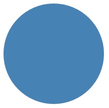
下個範例會在建立 Ellipse 時使用 200 的 Width 和 200 的 Height,並使用 SteelBlue 顏色的 SolidColorBrush 當作 Fill。
<Ellipse Fill="SteelBlue" Height="200" Width="200" />
var ellipse1 = new Ellipse();
ellipse1.Fill = new SolidColorBrush(Colors.SteelBlue);
ellipse1.Width = 200;
ellipse1.Height = 200;

// When you create a XAML element in code, you have to add
// it to the XAML visual tree. This example assumes you have
// a panel named 'layoutRoot' in your XAML file, like this:
// <Grid x:Name="layoutRoot>
layoutRoot.Children.Add(ellipse1);
以下是轉譯後的 Ellipse。
大多數人會將這裡的 Ellipse 視為圓形,事實上您在 XAML 宣告圓形的方式正是:使用相等 Width 與 Height。
Ellipse 如果位於 UI 版面配置中,其大小會假設為與具有相同 Width 和 Height 的矩形一樣;周邊以外的區域不會顯示,但仍屬於其版面配置位置的大小。
ProgressRing 控制項的控制項範本中包含一組 6 個 Ellipse 元素,而 RadioButton 則包含 2 個同心 Ellipse 元素。
矩形
Rectangle 是一種四邊的圖形,各自對面的兩側相等。 若要建立基本的 Rectangle,請指定 Width、Height 和 Fill。
您可以將 Rectangle 的邊角設為圓角。 若要建立圓角,請指定RadiusX 和 RadiusY 屬性的值。 這些屬性會指定橢圓形的 X 軸和 Y 軸,這些軸定義了圓角的曲線。 RadiusX 的最大容許值是 Width 除以 2,RadiusY 的最大容許值為 Height 除以 2。
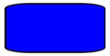
以下範例會建立 Width 200 和 Height 100 的 Rectangle。 它的 Fill 使用 SolidColorBrush 的 Blue 值,Stroke 使用 SolidColorBrush 的 Black 值。 我們將 StrokeThickness 設成 3。 我們將 RadiusX 屬性設為 50,並將 RadiusY 屬性設為 10,讓 Rectangle 擁有圓角。
<Rectangle Fill="Blue"
           Width="200"
           Height="100"
           Stroke="Black"
           StrokeThickness="3"
           RadiusX="50"
           RadiusY="10" />
var rectangle1 = new Rectangle();
rectangle1.Fill = new SolidColorBrush(Colors.Blue);
rectangle1.Width = 200;
rectangle1.Height = 100;
rectangle1.Stroke = new SolidColorBrush(Colors.Black);
rectangle1.StrokeThickness = 3;
rectangle1.RadiusX = 50;
rectangle1.RadiusY = 10;

// When you create a XAML element in code, you have to add
// it to the XAML visual tree. This example assumes you have
// a panel named 'layoutRoot' in your XAML file, like this:
// <Grid x:Name="layoutRoot>
layoutRoot.Children.Add(rectangle1);
以下是轉譯後的 Rectangle。
在某些情況下,UI 定義使用 Border 會比使用 Rectangle 更恰當。 如果您打算在其他內容周圍建立矩形圖形,建議使用 Border,因為它可以有子內容,而且會自動調整內容的大小,而不是像 Rectangle 那樣使用固定尺寸的高度和寬度。 如果您設定 CornerRadius 屬性,Border 也可以選擇使用圓角。
另一 方面,Rectangle 可能是組成控制項的較佳選擇。 許多控制項範本中都有 Rectangle 圖形,因為它的用途是當作可設為焦點的控制項的「FocusVisual」部分。 只要控制項處於「設為焦點」的視覺狀態,矩形就會顯示,在其他狀態中則會隱藏。
多邊形
多邊形這種圖形的邊界可由任意數量的點來定義。 邊界的建立方式是在各個點之間連接起一條線,而最後一個點再連接到第一個點。 Points 屬性定義了構成邊界的點集合。 在 XAML 中,定義點時需使用逗號分隔清單。 在程式碼後置中,您會使用 PointCollection 來定義點,並將每個點新增到集合中的 Point 值。
您不需要明確宣告點,才能讓起點和終點都指定為相同的 Point 值。 Polygon 的轉譯邏輯會假設您在定義的是封閉的圖形,且終點會隱含地連接到起點。
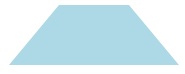
下一個範例建立的 Polygon 中,4 個點設為 (10,200)、(60,140)、(130,140) 和 (180,200)。 它的 Fill 會使用 LightBlue 值的 SolidColorBrush,且 Stroke 則沒有值,因此沒有周邊外框。
<Polygon Fill="LightBlue"
         Points="10,200,60,140,130,140,180,200" />
var polygon1 = new Polygon();
polygon1.Fill = new SolidColorBrush(Colors.LightBlue);

var points = new PointCollection();
points.Add(new Windows.Foundation.Point(10, 200));
points.Add(new Windows.Foundation.Point(60, 140));
points.Add(new Windows.Foundation.Point(130, 140));
points.Add(new Windows.Foundation.Point(180, 200));
polygon1.Points = points;

// When you create a XAML element in code, you have to add
// it to the XAML visual tree. This example assumes you have
// a panel named 'layoutRoot' in your XAML file, like this:
// <Grid x:Name="layoutRoot>
layoutRoot.Children.Add(polygon1);
以下是轉譯後的 Polygon。
提示
在宣告圖形頂點以外的 XAML 中,Point 值通常會當作類型來使用。 舉例來說,Point 屬於觸控事件的事件資料,因此您可以確切知道觸控動作在座標空間中發生的位置。 如需詳細瞭解 Point 以及如何在 XAML 或程式碼中使用,請參閱 Point 的 API 參考主題。
線條
Line 是座標空間中的兩點之間繪製的線條。 Line 會忽略提供給 Fill 的任何值,因為它沒有內部空間。 繪製 Line 時,請務必指定 Stroke 和 StrokeThickness 屬性的值,否則 Line 不會顯示。
指定 Line 圖形時,無需使用 Point 值,而是為 X1、Y1、X2 和 Y2 使用離散的 Double 值。 這麼做可讓水平或垂直線條有最小的標記。 舉例來說,<Line Stroke="Red" X2="400"/> 定義了長度為 400 像素的水平線。 其他 X,Y 屬性預設為 0,因此這個 XAML 繪製線條時選擇的點是從 (0,0) 到 (400,0)。 如果想要從 (0,0) 以外的點開始繪製,您可以使用 TranslateTransform 來移動整個 Line。
<Line Stroke="Red" X2="400"/>
var line1 = new Line();
line1.Stroke = new SolidColorBrush(Colors.Red);
line1.X2 = 400;

// When you create a XAML element in code, you have to add
// it to the XAML visual tree. This example assumes you have
// a panel named 'layoutRoot' in your XAML file, like this:
// <Grid x:Name="layoutRoot>
layoutRoot.Children.Add(line1);
聚合線條
Polyline 與 Polygon 的相似之處在於,圖形的邊界限都是由一組點所定義,但 Polyline 的最後一個點未連接到第一個點。
如果指定 Polyline 的 Fill,Fill 就會繪製圖形的內部空間,即使設定給 Polyline 的 Points 的起點與終點未交叉也一樣。 如果未指定 Fill,Polyline 會與指定數個個別 Line 元素的轉譯結果一樣,即連續線條的起點與終點會交叉。
如同 Polygon,Points 屬性會定義構成邊界的點集合。 在 XAML 中,定義點時需使用逗號分隔清單。 在程式碼後置中,您會使用 PointCollection 來定義點,並將每個點新增到集合中的 Point 結構。
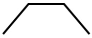
此範例建立的 Polyline 中,四個點設為 (10,200)、(60,140)、(130,140) 和 (180,200)。 Stroke已定義,Fill 則否。
<Polyline Stroke="Black"
          StrokeThickness="4"
          Points="10,200,60,140,130,140,180,200" />
var polyline1 = new Polyline();
polyline1.Stroke = new SolidColorBrush(Colors.Black);
polyline1.StrokeThickness = 4;

var points = new PointCollection();
points.Add(new Windows.Foundation.Point(10, 200));
points.Add(new Windows.Foundation.Point(60, 140));
points.Add(new Windows.Foundation.Point(130, 140));
points.Add(new Windows.Foundation.Point(180, 200));
polyline1.Points = points;

// When you create a XAML element in code, you have to add
// it to the XAML visual tree. This example assumes you have
// a panel named 'layoutRoot' in your XAML file, like this:
// <Grid x:Name="layoutRoot>
layoutRoot.Children.Add(polyline1);
以下是轉譯的 Polyline。 請注意,第一個和最後一個點不會由 Stroke 的外框連接,因為它們位於 Polygon 中。
路徑
Path 是最多用途的 Shape,因為您可以使用它來定義任意幾何。 但這種多功能性也帶來了複雜性。 接著我們來說明如何在 XAML 建立基本 Path。
您可以使用 Data 屬性定義路徑的幾何。 設定 Data 有兩種技巧:
- 您可以在 XAML 中設定 Data 的字串值。 在此格式中,Path.Data 值會取用圖形的序列化格式。 初次建立此值後,您通常不會以字串形式對此值進行文字編輯。 相反地,您會透過設計工具在介面上設計或繪製隱喻。 接著您會儲存或匯出輸出,讓您得到內含 Path.Data 資訊的 XAML 檔案或 XAML 字串片段。
- 您可以將 Data 屬性設為單一 Geometry 物件。 這個動作可在程式碼或 XAML 中完成。 該單一 Geometry 通常是 GeometryGroup,作用是擔任容器,將多個幾何定義組合成單一物件來應對物件模型的目的。 這麼做的最常見理由,是您想要使用一或多個曲線和複雜圖形,這些圖形可定義為 athFigure 的 Segment 值,例如 BezierSegment。
此範例示範的 Path,可能是先使用 Blend for Visual Studio 產生向量圖形,然後再將結果儲存為 XAML。 Path 整體包含貝茲曲線和線條。 此範例的主要目的是提供範例說明 Path.Data 序列化格式中有哪些元素,以及數字代表的意義。
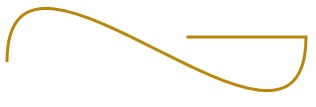
此 Data 的開頭是移動命令,以「M」表示,會為路徑建立絕對起點。
第一個線段是立體的貝茲曲線,開頭為 (100,200),結尾為 (400,175),是以 (100,25) 和 (400,350) 兩個控制點來繪製。 此線段在 Data 屬性字串中以「C」命令來表示。
第二個線段的開頭為絕對水平的線條命令「H」,它會指定從前面的子路徑的端點 (400,175) 到新端點 (280,175) 繪製的線段。 因為它是水平的線條命令,指定的值是 x 座標。
<Path Stroke="DarkGoldenRod"
      StrokeThickness="3"
      Data="M 100,200 C 100,25 400,350 400,175 H 280" />
以下是轉譯的 Path。
下一個範例示範了我們討論過的其他技巧的用法:內含 PathGeometry 的 GeometryGroup。 此範例實作了幾個可當作 PathGeometry 一部分的幾何類型:PathFigure,以及可在 PathFigure.Segments 當作線段的各種元素。
<Path Stroke="Black" StrokeThickness="1" Fill="#CCCCFF">
    <Path.Data>
        <GeometryGroup>
            <RectangleGeometry Rect="50,5 100,10" />
            <RectangleGeometry Rect="5,5 95,180" />
            <EllipseGeometry Center="100, 100" RadiusX="20" RadiusY="30"/>
            <RectangleGeometry Rect="50,175 100,10" />
            <PathGeometry>
                <PathGeometry.Figures>
                    <PathFigureCollection>
                        <PathFigure IsClosed="true" StartPoint="50,50">
                            <PathFigure.Segments>
                                <PathSegmentCollection>
                                    <BezierSegment Point1="75,300" Point2="125,100" Point3="150,50"/>
                                    <BezierSegment Point1="125,300" Point2="75,100"  Point3="50,50"/>
                                </PathSegmentCollection>
                            </PathFigure.Segments>
                        </PathFigure>
                    </PathFigureCollection>
                </PathGeometry.Figures>
            </PathGeometry>
        </GeometryGroup>
    </Path.Data>
</Path>
var path1 = new Microsoft.UI.Xaml.Shapes.Path();
path1.Fill = new SolidColorBrush(Windows.UI.Color.FromArgb(255, 204, 204, 255));
path1.Stroke = new SolidColorBrush(Colors.Black);
path1.StrokeThickness = 1;

var geometryGroup1 = new GeometryGroup();
var rectangleGeometry1 = new RectangleGeometry();
rectangleGeometry1.Rect = new Rect(50, 5, 100, 10);
var rectangleGeometry2 = new RectangleGeometry();
rectangleGeometry2.Rect = new Rect(5, 5, 95, 180);
geometryGroup1.Children.Add(rectangleGeometry1);
geometryGroup1.Children.Add(rectangleGeometry2);

var ellipseGeometry1 = new EllipseGeometry();
ellipseGeometry1.Center = new Point(100, 100);
ellipseGeometry1.RadiusX = 20;
ellipseGeometry1.RadiusY = 30;
geometryGroup1.Children.Add(ellipseGeometry1);

var pathGeometry1 = new PathGeometry();
var pathFigureCollection1 = new PathFigureCollection();
var pathFigure1 = new PathFigure();
pathFigure1.IsClosed = true;
pathFigure1.StartPoint = new Windows.Foundation.Point(50, 50);
pathFigureCollection1.Add(pathFigure1);
pathGeometry1.Figures = pathFigureCollection1;

var pathSegmentCollection1 = new PathSegmentCollection();
var pathSegment1 = new BezierSegment();
pathSegment1.Point1 = new Point(75, 300);
pathSegment1.Point2 = new Point(125, 100);
pathSegment1.Point3 = new Point(150, 50);
pathSegmentCollection1.Add(pathSegment1);

var pathSegment2 = new BezierSegment();
pathSegment2.Point1 = new Point(125, 300);
pathSegment2.Point2 = new Point(75, 100);
pathSegment2.Point3 = new Point(50, 50);
pathSegmentCollection1.Add(pathSegment2);
pathFigure1.Segments = pathSegmentCollection1;

geometryGroup1.Children.Add(pathGeometry1);
path1.Data = geometryGroup1;

// When you create a XAML element in code, you have to add
// it to the XAML visual tree. This example assumes you have
// a panel named 'layoutRoot' in your XAML file, like this:
// <Grid x:Name="layoutRoot">
layoutRoot.Children.Add(path1);
以下是轉譯的 Path。
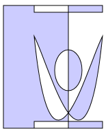
使用 PathGeometry 可能比填入Path.Data 字串更容易閱讀。 另一方面,Path.Data 使用的語法可與可縮放向量圖形 (SVG) 影像路徑定義相容,因此可能有助於從 SVG 移植圖形,或當作 Blend 這類工具的輸出。

意見反應
即將登場:在 2024 年,我們將逐步淘汰 GitHub 問題作為內容的意見反應機制,並將它取代為新的意見反應系統。 如需詳細資訊,請參閱:https://aka.ms/ContentUserFeedback。
提交並檢視相關的意見反應