Mica 是一種不透明的動態材質,其中包含主題和桌面桌布,以繪製長壽視窗的背景,例如應用程式和設定。 你可以將 Mica 應用在應用程式背景中,透過取悅使用者並建立視覺層次,有助於提升生產力,提升使用者對於哪個視窗聚焦的清晰度。 Mica 專為應用程式效能而設計,因為只取樣桌面桌布一次,以建立其視覺效果。
淺色主題中的Mica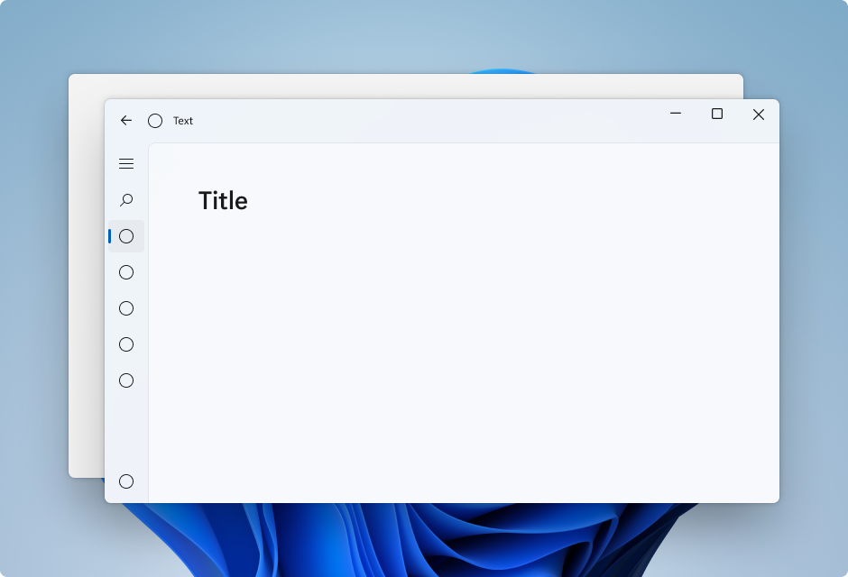
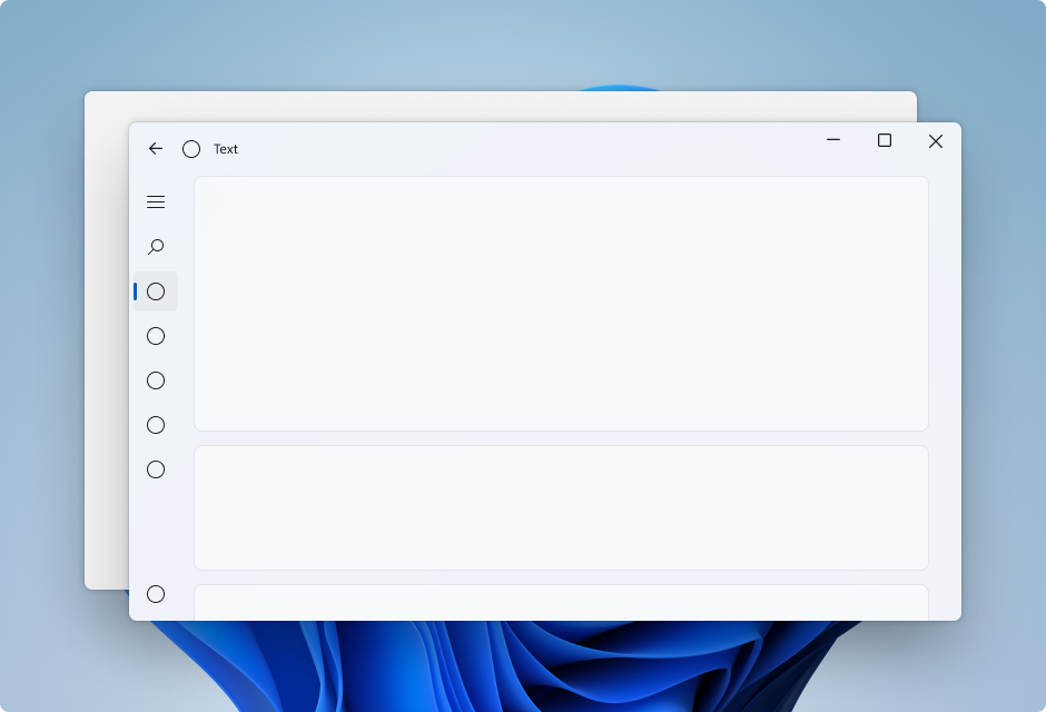
在深色主題中的Mica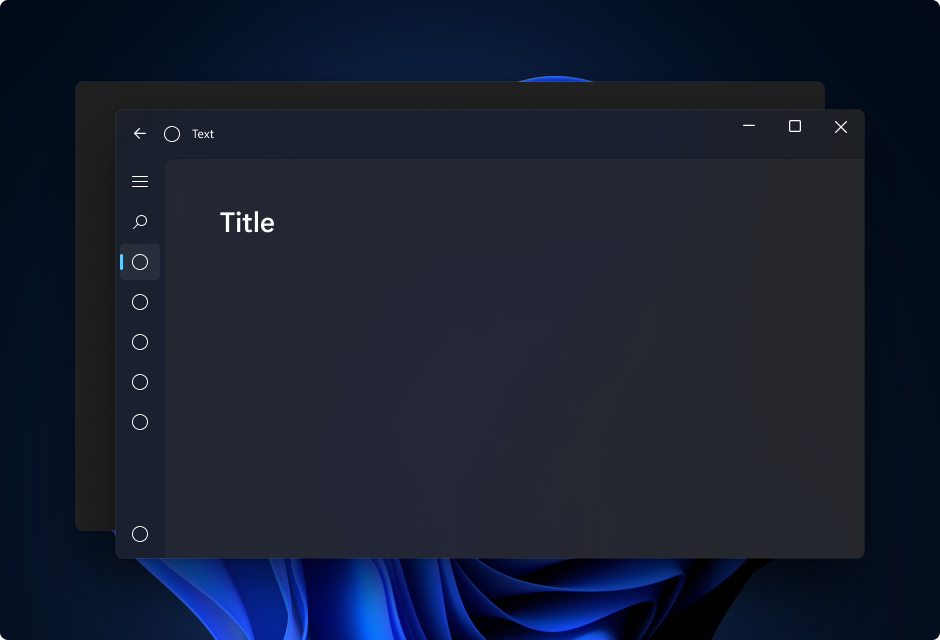
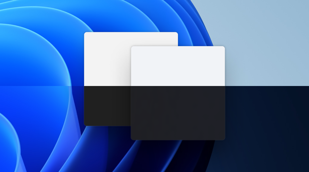
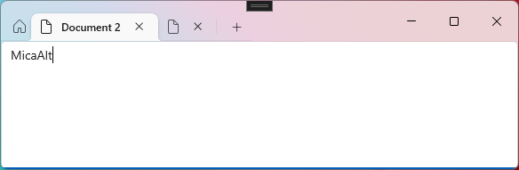
Mica Alt 是Mica 的變體,具有更濃淡的使用者桌面背景色彩。 您可以將 Mica Alt 套用至應用程式的背景,以提供比 Mica 更深的視覺階層,尤其是在建立具有索引標籤式標題列的應用程式時。 Mica Alt 適用於使用 Windows App SDK 1.1 或更新版本的應用程式,且運行於 Windows 11 22000 或更新版本。
這些圖片顯示了在帶有索引標籤的標題列中,Mica 和 Mica Alt 之間的差異。 第一個影像使用 Mica,第二個影像使用 Mica Alt。
使用 Mica 或 Mica Alt 的時機
Mica 和 Mica Alt 是出現在應用程式背景上 (位於所有其他內容後面) 的材質。 每種材質都是不透明的,並結合了使用者的主題和桌布,以建立其高度個人化的外觀。 當使用者在畫面上移動視窗時,Mica 材質會動態調整,以使用應用程式下方的桌布來建立豐富的視覺效果。 此外,當應用程式處於非使用中狀態時,材質會恢復為中性色,以協助使用者專注於目前的工作。
我們建議您將 Mica 或 Mica Alt 套用為應用程式的基礎層,並優先考慮在標題列提高可見性。 如需更具體的分層指引,請參閱本文的 分層和視覺升層 和 使用 Mica 進行應用程式分層 一節。
可用性與適應性
Mica 材質會自動調整其外觀以適應各種裝置和環境。 它們設計時重視效能,因為只需擷取一次背景圖來生成其視覺化效果。
在高對比度模式中,用戶會繼續看到他們選擇的熟悉背景色彩,以取代Mica或Mica Alt。此外,Mica 材質會在下列情況下顯示為純色後援色彩(SolidBackgroundFillColorBase 針對 Mica, SolidBackgroundFillColorBaseAlt 適用於 Mica Alt) :
- 使用者在 [設定] >[個人化]> [色彩] 中關閉透明度。
- 省電模式啟動。
- 應用程式在低階硬體上執行。
- 桌面上的應用程式視窗停用。
- Windows 版本低於 22000。
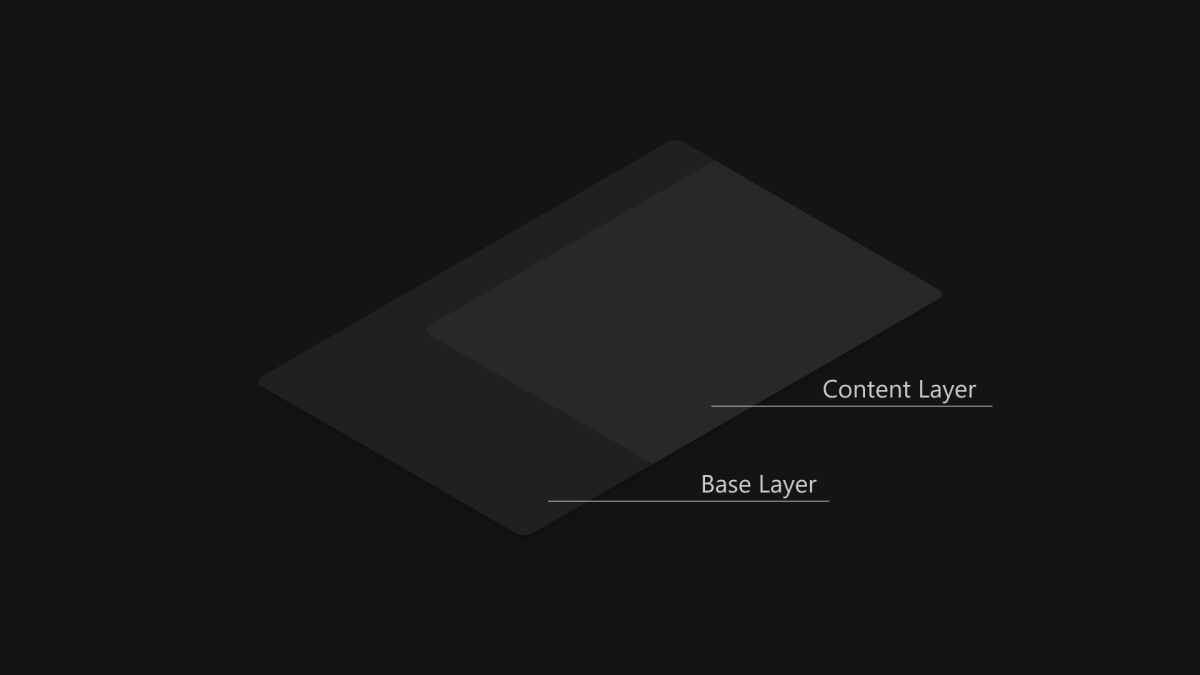
使用 Mica 進行應用程式分層
標準模式內容層
卡片圖案內容層
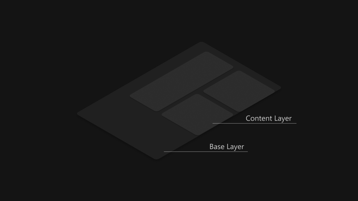
Mica 由於其非活動和活動狀態以及微妙的個人化特性,非常適合作為應用程式層次結構中的基礎層。 若要遵循兩層 分層和提升 系統,建議您將Mica套用為應用程式的基底層,並新增位於基底層之上的其他內容層。 內容層應該透過其背後的材質 Mica,以 LayerFillColorDefaultBrush 作為背景,並使用低不透明度的純色。 我們建議的內容層模式如下:
-
標準模式:大型區域連續的背景,需要與基底層不同的階層式區分。 這個
LayerFillColorDefaultBrush應該套用在你的 WinUI 3 應用程式界面的容器背景(例如 Grids、StackPanels、Frames 等)上。 -
卡片模式:針對使用多個區段和不連續UI元件所設計之應用程式的區段卡片。 如需使用
LayerFillColorDefaultBrush的卡片 UI 定義,請參閱 分層和層次效果 指引。
若要讓應用程式的視窗擁有無縫外觀,如果您選擇將材質套用至您的應用程式,Mica 應該會顯示在標題列中。 您可以將應用程式延伸至非工作區並建立透明的自訂標題列,以在標題列中顯示 Mica。 如需詳細資訊,請參閱 標題列。
下列範例會向 NavigationView 展示分層策略的常見實作,其中 Mica 會顯示在標題欄區域中。
- 左側 NavigationView 中的標準模式。
- 頂部 NavigationView 中的標準模式。
- 左側 NavigationView 中的卡片模式。
左側 NavigationView 中的標準模式
根據預設,左側模式中的 NavigationView 會在其內容區域中包含內容層。 本範例會將 Mica 延伸至標題列區域,並建立自訂標題列。
頂部導航檢視中的標準模式
根據預設,頂部模式中的 NavigationView 會在其內容區域中包含內容層。 本範例會將 Mica 延伸至標題列區域,並建立自訂標題列。
左側 NavigationView 中的卡片模式
若要在使用 NavigationView 時遵循卡片模式,您必須覆寫背景和邊框主題資源來移除預設內容層。 然後,您可以在控制項的內容區域中建立卡片。 此範例會建立數張卡片、將 Mica 延伸至標題列區域,並建立自訂標題列。 如需卡片 UI 的詳細資訊,請參閱 分層和提升 指引。
使用 Mica Alt 進行應用程式分層
Mica Alt 是 Mica 的替代品,作為應用程式層次結構中的基礎層,具有相同的功能,例如非活動和活動狀態以及微妙的個人化特性。 當您需要標題列元素與應用程式命令區域的對比時,建議您將Mica Alt 套用為應用程式的基底層(例如導覽功能表)。
使用 Mica Alt 的常見案例是當您建立具有索引標籤式標題列的應用程式時。 若要遵循 分層和升高 指引,建議您將 Mica Alt 套用為應用程式的基底層,新增覆蓋在基底層之上的命令層,最後再新增覆蓋在命令層之上的其他內容層。 命令層應該使用 Mica Alt 作為其背景,並採用低透明度的純色來顯示其背後的材質 LayerOnMicaBaseAltFillColorDefaultBrush。 內容層應採用其下方圖層,並使用 LayerFillColorDefaultBrush,這是一種低透明度的純色。 分層系統如下所示:
- Mica Alt:基底層。
-
命令層:需要與基底層不同的階層式差異。
LayerOnMicaBaseAltFillColorDefaultBrush應該套用至 WinUI 應用程式介面的命令區域 (例如:MenuBar、導覽結構等) -
內容層:大型區域連續的背景,需要與命令層不同的階層式區分。
LayerFillColorDefaultBrush應該套用至 WinUI 應用程式介面的容器背景 (例如 Grids、StackPanels、Frames 等等)。
若要讓應用程式的視窗看起來順暢,如果您選擇將材質套用至您的應用程式,則應該會在標題列中看到 Mica Alt。 您可以透過將應用程式延伸至非用戶區域並建立透明的自訂標題列,來使標題列顯示 Mica Alt。
建議
- 請將您想要看到Mica的所有層次的背景設定為透明,這樣Mica會透過背景顯示。
- 請勿 在應用程式中多次套用背景材質。
- 請勿 將背景材質套用至 UI 元素。 背景材質不會出現在元素本身。 只有當 UI 元素與視窗之間的所有圖層都設定為透明時,才會顯示。
範例

WinUI 3 圖庫應用程式包含互動式的 WinUI 控制項與功能範例。 你可以從 Microsoft Store下載 App,或在 GitHub 瀏覽原始碼。
如何使用 Mica
若要在 WinUI 應用程式中使用 Mica,請參閱 Windows 11 的桌面應用程式中套用雲母或壓克力材質。
要在 Win32 應用程式中使用 Mica,請參見 在適用於 Windows 11 的 Win32 桌面應用程式中套用 Mica。
