功能表飛出視窗用於功能表和操作功能表案例,以在使用者要求時顯示命令或選項的清單。 功能表飛出視窗會顯示可以有功能表項目和子功能表的單一內嵌最上層選單。 若要在水平列中顯示一組最上層的多個功能表,請使用功能表列 (通常位於應用程式視窗頂端)。
這是正確的控制嗎?
如需識別功能表與捷徑功能表的案例說明,請參閱 功能表和捷徑功能表 ,以及何時使用功能表快顯視窗和 命令列快顯功能表的指導。
功能表飛出視窗可用來做為功能表和操作功能表以組織命令。 若要顯示任意內容 (如通知或確認要求),請使用對話方塊或飛出視窗。
如果經常使用特定命令,而且您有可用的空間,請參閱 集合命令 ,以取得將命令直接放在其本身元素中的範例,讓使用者不必瀏覽功能表來取得命令。
建立功能表飛出視窗
WinUI 3 Gallery 應用程式包含大部分 WinUI 3 控制項、特性和功能的互動式範例。 從 Microsoft Store 取得應用程式,或在 GitHub 上取得原始程式碼
若要創建彈出式功能表,您可以使用 MenuFlyout 類別。 您可以將 MenuFlyoutItem、MenuFlyoutSubItem、ToggleMenuFlyoutItem、RadioMenuFlyoutItem 和 MenuFlyoutSeparator 物件新增至 MenuFlyout,以定義功能表的內容。
這些物件用於:
- MenuFlyoutItem - 執行立即動作。
- MenuFlyoutSubItem - 包含功能表項的串聯清單。
- ToggleMenuFlyoutItem—開啟或關閉選項。
- RadioMenuFlyoutItem—在互斥選單項目之間切換。
- MenuFlyoutSeparator — 以可視化方式分隔功能表項。
此範例會建立 MenuFlyout,並使用 ContextFlyout 屬性,大多數控制項都可使用的屬性,將 MenuFlyout 顯示為內容功能表。
<Rectangle
  Height="100" Width="100">
  <Rectangle.ContextFlyout>
    <MenuFlyout>
      <MenuFlyoutItem Text="Change color" Click="ChangeColorItem_Click" />
    </MenuFlyout>
  </Rectangle.ContextFlyout>
  <Rectangle.Fill>
    <SolidColorBrush x:Name="rectangleFill" Color="Red" />
  </Rectangle.Fill>
</Rectangle>
private void ChangeColorItem_Click(object sender, RoutedEventArgs e)
{
    // Change the color from red to blue or blue to red.
    if (rectangleFill.Color == Windows.UI.Colors.Red)
    {
        rectangleFill.Color = Windows.UI.Colors.Blue;
    }
    else
    {
        rectangleFill.Color = Windows.UI.Colors.Red;
    }
}
下一個範例幾乎完全相同,但不是使用 ContextFlyout 屬性將 MenuFlyout 類別 顯示為作功能表,而是使用 FlyoutBase.ShowAttachedFlyout 屬性將它顯示為功能表。
<Rectangle
  Height="100" Width="100"
  Tapped="Rectangle_Tapped">
  <FlyoutBase.AttachedFlyout>
    <MenuFlyout>
      <MenuFlyoutItem Text="Change color" Click="ChangeColorItem_Click" />
    </MenuFlyout>
  </FlyoutBase.AttachedFlyout>
  <Rectangle.Fill>
    <SolidColorBrush x:Name="rectangleFill" Color="Red" />
  </Rectangle.Fill>
</Rectangle>
private void Rectangle_Tapped(object sender, TappedRoutedEventArgs e)
{
    FlyoutBase.ShowAttachedFlyout((FrameworkElement)sender);
}

private void ChangeColorItem_Click(object sender, RoutedEventArgs e)
{
    // Change the color from red to blue or blue to red.
    if (rectangleFill.Color == Windows.UI.Colors.Red)
    {
        rectangleFill.Color = Windows.UI.Colors.Blue;
    }
    else
    {
        rectangleFill.Color = Windows.UI.Colors.Red;
    }
}
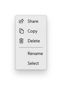
Icons
考慮將功能表項目圖示提供給:
- 最常使用的項目。
- 其圖示為標準或眾所周知的功能表項目。
- 其圖示能清楚表明命令所做動作的功能表項目。
不要覺得一定要為沒有標準視覺效果的命令提供圖示。 含義模糊的圖示本身並沒有幫助、會使顯示畫面凌亂,也會讓使用者無法專注在重要的功能表項目上。
<MenuFlyout>
<MenuFlyoutItem Text="Share" >
<MenuFlyoutItem.Icon>
<FontIcon Glyph="" />
</MenuFlyoutItem.Icon>
</MenuFlyoutItem>
<MenuFlyoutItem Text="Copy" Icon="Copy" />
<MenuFlyoutItem Text="Delete" Icon="Delete" />
<MenuFlyoutSeparator />
<MenuFlyoutItem Text="Rename" />
<MenuFlyoutItem Text="Select" />
</MenuFlyout>
小提示
MenuFlyoutItem 中的圖示大小為 16x16px。 如果您使用 SymbolIcon、FontIcon 或 PathIcon,圖示會自動縮放成正確大小,但不會失去逼真度。 如果您使用 BitmapIcon,請確定您的資產為 16x16px。
輕鬆關閉
消失關閉控制項 (例如功能表、操作功能表及其他飛出視窗) 會將鍵盤和遊戲控制器的焦點困在暫時性 UI 內,直到關閉為止。 若要為此行為提供視覺提示,Xbox 上的輕觸關閉控制項會繪製一個覆疊層,以降低超出範圍 UI 的可見度。 您可以使用 LightDismissOverlayMode 屬性來修改此行為。 根據預設,暫時性 UI 會在 Xbox 上繪製輕量消失疊加層 ([自動]),但不會在其他裝置系列上進行繪製。 您可以選擇將重疊強制設為一律 開啟 或 關閉。
<MenuFlyout LightDismissOverlayMode="Off" />
建立功能表列
- 重要 API:MenuBar 類別。 MenuBarItem 類別
WinUI 3 Gallery 應用程式包含大部分 WinUI 3 控制項、特性和功能的互動式範例。 從 Microsoft Store 取得應用程式,或在 GitHub 上取得原始程式碼
您會使用和功能表飛出視窗相同的元素來在功能表列中建立功能表。 不過,與其將 MenuFlyoutItem 物件分組到 MenuFlyout 中,您會將它們分組到 MenuBarItem 元素中。 每個 MenuBarItem 都會被新增至 MenuBar 中作為最上層功能表。
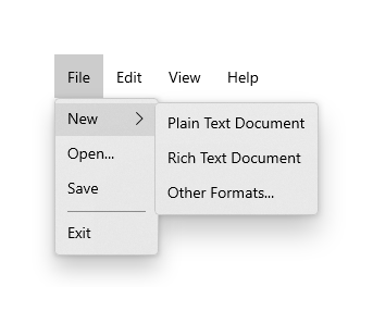
備註
此範例僅示範如何建立 UI 結構,但不會示範任何命令的實作。
<muxc:MenuBar>
    <muxc:MenuBarItem Title="File">
        <MenuFlyoutSubItem Text="New">
            <MenuFlyoutItem Text="Plain Text Document"/>
            <MenuFlyoutItem Text="Rich Text Document"/>
            <MenuFlyoutItem Text="Other Formats..."/>
        </MenuFlyoutSubItem>
        <MenuFlyoutItem Text="Open..."/>
        <MenuFlyoutItem Text="Save"/>
        <MenuFlyoutSeparator />
        <MenuFlyoutItem Text="Exit"/>
    </muxc:MenuBarItem>

    <muxc:MenuBarItem Title="Edit">
        <MenuFlyoutItem Text="Undo"/>
        <MenuFlyoutItem Text="Cut"/>
        <MenuFlyoutItem Text="Copy"/>
        <MenuFlyoutItem Text="Paste"/>
    </muxc:MenuBarItem>

    <muxc:MenuBarItem Title="View">
        <MenuFlyoutItem Text="Output"/>
        <MenuFlyoutSeparator/>
        <muxc:RadioMenuFlyoutItem Text="Landscape" GroupName="OrientationGroup"/>
        <muxc:RadioMenuFlyoutItem Text="Portrait" GroupName="OrientationGroup" IsChecked="True"/>
        <MenuFlyoutSeparator/>
        <muxc:RadioMenuFlyoutItem Text="Small icons" GroupName="SizeGroup"/>
        <muxc:RadioMenuFlyoutItem Text="Medium icons" IsChecked="True" GroupName="SizeGroup"/>
        <muxc:RadioMenuFlyoutItem Text="Large icons" GroupName="SizeGroup"/>
    </muxc:MenuBarItem>

    <muxc:MenuBarItem Title="Help">
        <MenuFlyoutItem Text="About"/>
    </muxc:MenuBarItem>
</muxc:MenuBar>
UWP 和 WinUI 2
這很重要
本文中的資訊和範例針對使用 Windows App SDK 和 WinUI 3 的應用程式進行了最佳化,但通常適用於使用 WinUI 2 的 UWP 應用程式。 如需平台特定資訊和範例,請參閱 UWP API 參考。
本節包含您在 UWP 或 WinUI 2 應用程式中使用控制項所需的資訊。
MenuBar 需要 Windows 10 版本 1809(SDK 17763)或更新版本,或 WinUI 2。
UWP 應用程式的 MenuFlyout 和 MenuBar 控制項是作為 WinUI 2 的一部分包含在內。 如需詳細資訊 (包括安裝指示),請參閱 WinUI 2。 這些控件的 API 同時存在於 Windows.UI.Xaml.Controls 和 Microsoft.UI.Xaml.Controls 命名空間中。
- UWP API:MenuFlyout 類別、MenuBar 類別、ContextFlyout 屬性、FlyoutBase.AttachedFlyout 屬性
- WinUI 2 Apis:MenuBar 類別、 ContextFlyout 屬性、 FlyoutBase.AttachedFlyout 屬性
- 開啟 WinUI 2 資源庫應用程式,並查看 MenuBar 的實際操作。 WinUI 2 圖庫應用程式包含了大部分 WinUI 2 控制項、特性和功能的互動式範例。 從 Microsoft Store 取得應用程式,或在 GitHub 上取得原始程式碼。
建議使用最新的 WinUI 2 來取得所有控制項的最新樣式和範本。 WinUI 2.2 或更高版本包含這些使用圓角的控制項的新範本。 如需詳細資訊,請參閱圓角半徑。
若要在 WinUI 2 中使用本文中的程式碼,請在 XAML 中使用別名 (我們使用 muxc) 來表示專案中包含的 Windows UI 程式庫 API。 如需詳細資訊,請參閱開始使用 WinUI 2。
xmlns:muxc="using:Microsoft.UI.Xaml.Controls"

<muxc:MenuFlyout />
<muxc:MenuBar />
