命令列快顯視窗透過在 UI 畫布上與元素相關的浮動工具列中顯示命令,讓使用者能輕鬆地存取常用任務。

如同 CommandBar,CommandBarFlyout 有可用來新增命令的 PrimaryCommands 和 SecondaryCommands 屬性。 您可以將命令放在任一集合中,或同時放在兩者中。 顯示主要和次要命令的時機和方式取決於顯示模式。
命令列飛出視窗有兩個顯示模式:摺疊和展開。
- 在摺疊模式中,只會顯示主要命令。 如果您的命令列飛出視窗同時有主要與次要命令,則會顯示「查看更多」按鈕 (以省略符號 [...] 表示)。 這可讓使用者藉由轉換為展開模式來取得次要命令的存取權。
- 在展開模式中,主要和次要命令會同時顯示 (如果控制項只有次要項目,則會以類似 MenuFlyout 控制項的方式顯示)。
這是正確的控制嗎?
使用命令列彈出控制項,在應用程式畫布上的元素的上下文中向使用者顯示命令集合,例如按鈕和功能表項目。
命令列快顯視窗是建立內容功能表的建議控制項。 這允許將與上下文選單場景最相關的常用命令 (例如複製、剪下、貼上、刪除、共享或文字選擇命令) 新增為主要命令,以便它們顯示為單一水平行在命令列彈出視窗中。 TextCommandBarFlyout 已進行適當配置,可自動在 TextBox、TextBlock、RichEditBox、RichTextBlock 和 PasswordBox 控制項中顯示文字指令。 使用 CommandBarFlyout 來取代文字控制項上的預設文字命令。
若要在清單項目上顯示關聯式命令,請遵循集合和清單的關聯式命令中的指導方針。
主動調用與反應性調用
通常有兩種方式可以調用與 UI 介面的元素相關聯的飛出視窗或功能表:「主動呼叫」和「回應呼叫」。
在主動式引動過程中,當使用者與命令相關聯的項目互動時,命令就會自動出現。 例如,文字格式化命令可能會在使用者選取文字方塊中的文字時跳出。 在此情況下,命令列飛出視窗不會獲得鍵盤焦點。 相反地,它會呈現靠近使用者正在互動的物件的相關命令。 如果使用者並未與命令互動,則命令會被取消。
在回應式調用中,命令會在使用者明確執行某些動作時顯示;例如右鍵點擊。 這對應於操作功能表的傳統概念。
您可以任一種方法使用 CommandBarFlyout,或甚至混合使用兩者。
建立命令列飛出視窗
- 重要 API:CommandBarFlyout 類別、TextCommandBarFlyout 類別、AppBarButton 類別、AppBarToggleButton 類別、AppBarSeparator 類別
WinUI 3 Gallery 應用程式包含大部分 WinUI 3 控制項、特性和功能的互動式範例。 從 Microsoft Store 取得應用程式,或在 GitHub 上取得原始程式碼
此範例示範如何建立命令列飛出視窗,並以主動和回應方式使用它。 點選影像後,飛出視窗會以摺疊模式顯示。 若顯示為內容功能表,則快顯視窗會以展開模式顯示。 在任一情況下,使用者可以展開或摺疊已開啟的彈出視窗。
<Grid>
    <Grid.Resources>
        <CommandBarFlyout x:Name="ImageCommandsFlyout">
            <AppBarButton Label="Favorite" Icon="OutlineStar" ToolTipService.ToolTip="Favorite"/>
            <AppBarButton Label="Copy" Icon="Copy" ToolTipService.ToolTip="Copy"/>
            <AppBarButton Label="Share" Icon="Share" ToolTipService.ToolTip="Share"/>
            <CommandBarFlyout.SecondaryCommands>
                <AppBarButton Label="Rotate" Icon="Rotate"/>
                <AppBarButton Label="Delete" Icon="Delete"/>
            </CommandBarFlyout.SecondaryCommands>
        </CommandBarFlyout>
    </Grid.Resources>

    <Image Source="Assets/image1.png" Width="300"
           Tapped="Image_Tapped"
           FlyoutBase.AttachedFlyout="{x:Bind ImageCommandsFlyout}"
           ContextFlyout="{x:Bind ImageCommandsFlyout}"/>
</Grid>
private void Image_Tapped(object sender, TappedRoutedEventArgs e)
{
    var flyout = FlyoutBase.GetAttachedFlyout((FrameworkElement)sender);
    var options = new FlyoutShowOptions()
    {
        // Position shows the flyout next to the pointer.
        // "Transient" ShowMode makes the flyout open in its collapsed state.
        Position = e.GetPosition((FrameworkElement)sender),
        ShowMode = FlyoutShowMode.Transient
    };
    flyout?.ShowAt((FrameworkElement)sender, options);
}
這是處於折疊狀態的命令列彈出選單。

以下是顯示次要命令之展開狀態的相同命令行飛出視窗。

主動顯示命令
當您主動顯示上下文命令時,預設應僅顯示主要命令,並應確保命令列的飛出選單是摺疊的。 將最重要的命令放在主要命令集合中,以及將傳統上納入操作功能表中的其他命令放在次要命令集合中。
若要主動顯示命令,通常會處理 Click 或 Tapped 事件以顯示命令列飛出視窗。 將飛出視窗的 ShowMode 設定為 Transient 或 TransientWithDismissOnPointerMoveAway,即可在其摺疊模式中開啟飛出視窗,而不需取得焦點。
文字控制件具有 SelectionFlyout 屬性。 當您將飛出視窗指派給這個屬性時,它會在選取文字時自動顯示。
以回應方式顯示命令
當您以反應式將上下文命令顯示為內容選單時,次要命令會預設顯示(命令列彈出視窗應展開)。 在此情況下,命令列飛出視窗可能同時有主要和次要命令,或只有次要命令。
若要在操作功能表中顯示命令,通常會將飛出視窗指派給 UI 元素的 ContextFlyout 屬性。 如此一來,開啟彈出視窗是由元素處理的,您不需再執行任何動作。
如果您自行處理飛出視窗顯示 (例如,在 RightTapped 事件上),請將飛出視窗的 ShowMode 設定為 [標準],以展開模式開啟飛出視窗並給予焦點。
小提示
如需有關顯示飛出視窗時的選項以及如何控制飛出視窗放置方式的詳細資訊,請參閱飛出視窗。
顯示總是展開的 CommandBarFlyout
當您在 CommandBarFlyout 中有主要和次要命令時,預設會顯示 [查看更多] [...] 按鈕,並可用來展開和折疊次要命令。 如果您想要讓 CommandBarFlyout 保持展開模式,並隨時顯示次要命令,您可以使用 CommandBarFlyout.AlwaysExpanded 屬性。
當 AlwaysExpanded 屬性設定為 true 時,不會顯示查看更多按鈕,而且使用者無法切換控件的展開狀態。 當使用者單擊輔助命令或在彈出視窗外部單擊時,CommandBarFlyout 仍會如常關閉。
只有當 CommandBarFlyout 有次要命令時,這個屬性才會有效果。 如果沒有次要命令,CommandBarFlyout 一律會處於折疊模式。
命令和內容
CommandBarFlyout 控制項有 2 個可用於新增指令和內容的屬性:PrimaryCommands 和 secondaryCommands。
預設會將命令列項目新增至 PrimaryCommands 集合。 這些命令會顯示在命令列中,而且會同時出現在摺疊或展開模式中。 不同於 CommandBar,主要命令不會自動溢位到次要命令,且可能會被截斷。
您也可以將命令新增至 SecondaryCommands 集合。 次要命令會顯示在控制項的功能表部分,且只會在展開模式中出現。
如果常見 命令 (例如複製、剪下、貼上、刪除、共用或文字選取命令) 對於案例很重要,建議將它們新增為主要命令,而不是次要命令。
應用程式列按鈕
您可直接以 AppBarButton、AppBarToggleButton 和 AppBarSeparator 控制項填入 PrimaryCommands 和 SecondaryCommands。
應用程式列按鈕控制項可依圖示和文字標籤加以區分。 這些控制項最適合在命令列中使用,其外觀會改變,取決於控制項是顯示在命令列還是溢位功能表中。
-
在 Windows 應用程式 SDK 1.5 和更新版本中:作為主要命令的應用程式行按鈕會顯示在命令行中,其中包含文字標籤和圖示 (如果兩者皆已設定)。
<AppBarButton Icon="Copy" Label="Copy"/> -
在 Windows App SDK 1.4 及更早版本中:作為主要命令的應用程式列按鈕會以其圖示顯示在命令列中;不會顯示文字標籤。 我們建議您使用工具提示來顯示命令的文字描述,如下所示。
<AppBarButton Icon="Copy" ToolTipService.ToolTip="Copy"/> - 作為次要命令的應用程式列按鈕會顯示在功能表中 (標籤和圖示兩者都可見)。
Icons
考慮將功能表項目圖示提供給:
- 最常使用的項目。
- 其圖示為標準或眾所周知的功能表項目。
- 其圖示能清楚表明命令所做動作的功能表項目。
不要覺得一定要為沒有標準視覺效果的命令提供圖示。 含義模糊的圖示本身並沒有幫助、會使顯示畫面凌亂,也會讓使用者無法專注在重要的功能表項目上。
其他內容
您可以在 AppBarElementContainer 中包裝其他控制項,即可將其新增至命令列飛出視窗。 這可讓您新增 DropDownButton 或 SplitButton 之類的控制項,或新增 StackPanel 之類的容器,以建立更複雜的 UI。
元素必須實作 ICommandBarElement 介面,才能夠新增至命令列飛出視窗的主要或次要命令集合。 AppBarElementContainer 是實作這個介面的包裝函式,因此您可以將元素新增至命令列,即使它不會實作介面本身。
在此,AppBarElementContainer 用來將額外的元素新增至命令列飛出視窗。 SplitButton 被加入至主要命令群組,以啟用文字對齊。 StackPanel 會新增至次要命令,以允許縮放控制項的配置更複雜。
小提示
根據預設,專為應用程式畫布設計的元素在命令列中可能看起來不太合適。 當您使用 AppBarElementContainer 新增元素時,您應該採取一些步驟,讓該元素符合其他命令列元素:
- 以輕量級樣式修改預設筆刷,使元素的背景和框線與應用程式列按鈕一致。
- 調整元素的大小和位置。
- 在寬度和高度均為 16px 的 Viewbox 中包裹圖示。
<CommandBarFlyout>
    <AppBarButton Icon="Cut" Label="Cut" ToolTipService.ToolTip="Cut"/>
    <AppBarButton Icon="Copy" Label="Copy" ToolTipService.ToolTip="Copy"/>
    <AppBarButton Icon="Paste" Label="Paste" ToolTipService.ToolTip="Paste"/>
    <!-- Alignment controls -->
    <AppBarElementContainer>
         <SplitButton ToolTipService.ToolTip="Alignment">
            <SplitButton.Resources>
                <!-- Override default brushes to make the SplitButton
                     match other command bar elements. -->
                <Style TargetType="SplitButton">
                    <Setter Property="Height" Value="38"/>
                </Style>
                <SolidColorBrush x:Key="SplitButtonBackground"
                                 Color="Transparent"/>
                <SolidColorBrush x:Key="SplitButtonBackgroundPressed"
                                 Color="{ThemeResource SystemListMediumColor}"/>
                <SolidColorBrush x:Key="SplitButtonBackgroundPointerOver"
                                 Color="{ThemeResource SystemListLowColor}"/>
                <SolidColorBrush x:Key="SplitButtonBorderBrush" Color="Transparent"/>
                <SolidColorBrush x:Key="SplitButtonBorderBrushPointerOver"
                                 Color="Transparent"/>
                <SolidColorBrush x:Key="SplitButtonBorderBrushChecked"
                                 Color="Transparent"/>
            </SplitButton.Resources>
            <SplitButton.Content>
                <Viewbox Width="16" Height="16" Margin="0,2,0,0">
                    <SymbolIcon Symbol="AlignLeft"/>
                </Viewbox>
            </SplitButton.Content>
            <SplitButton.Flyout>
                <MenuFlyout>
                    <MenuFlyoutItem Icon="AlignLeft" Text="Align left"/>
                    <MenuFlyoutItem Icon="AlignCenter" Text="Center"/>
                    <MenuFlyoutItem Icon="AlignRight" Text="Align right"/>
                </MenuFlyout>
            </SplitButton.Flyout>
        </SplitButton>
    </AppBarElementContainer>
    <!-- end Alignment controls -->
    <CommandBarFlyout.SecondaryCommands>
        <!-- Zoom controls -->
        <AppBarElementContainer>
            <AppBarElementContainer.Resources>
                <!-- Override default brushes to make the Buttons
                     match other command bar elements. -->
                <SolidColorBrush x:Key="ButtonBackground"
                                 Color="Transparent"/>
                <SolidColorBrush x:Key="ButtonBackgroundPressed"
                                 Color="{ThemeResource SystemListMediumColor}"/>
                <SolidColorBrush x:Key="ButtonBackgroundPointerOver"
                                 Color="{ThemeResource SystemListLowColor}"/>
                <SolidColorBrush x:Key="ButtonBorderBrush"
                                 Color="Transparent"/>
                <SolidColorBrush x:Key="ButtonBorderBrushPointerOver"
                                 Color="Transparent"/>
                <SolidColorBrush x:Key="ButtonBorderBrushChecked"
                                 Color="Transparent"/>
                <Style TargetType="TextBlock">
                    <Setter Property="VerticalAlignment" Value="Center"/>
                </Style>
                <Style TargetType="Button">
                    <Setter Property="Height" Value="40"/>
                    <Setter Property="Width" Value="40"/>
                </Style>
            </AppBarElementContainer.Resources>
            <Grid Margin="12,-4">
                <Grid.ColumnDefinitions>
                    <ColumnDefinition Width="Auto"/>
                    <ColumnDefinition Width="76"/>
                    <ColumnDefinition Width="Auto"/>
                </Grid.ColumnDefinitions>
                <Viewbox Width="16" Height="16" Margin="0,2,0,0">
                    <SymbolIcon Symbol="Zoom"/>
                </Viewbox>
                <TextBlock Text="Zoom" Margin="10,0,0,0" Grid.Column="1"/>
                <StackPanel Orientation="Horizontal" Grid.Column="2">
                    <Button ToolTipService.ToolTip="Zoom out">
                        <Viewbox Width="16" Height="16">
                            <SymbolIcon Symbol="ZoomOut"/>
                        </Viewbox>
                    </Button>
                    <TextBlock Text="50%" Width="40"
                               HorizontalTextAlignment="Center"/>
                    <Button ToolTipService.ToolTip="Zoom in">
                        <Viewbox Width="16" Height="16">
                            <SymbolIcon Symbol="ZoomIn"/>
                        </Viewbox>
                    </Button>
                </StackPanel>
            </Grid>
        </AppBarElementContainer>
        <!-- end Zoom controls -->
        <AppBarSeparator/>
        <AppBarButton Label="Undo" Icon="Undo"/>
        <AppBarButton Label="Redo" Icon="Redo"/>
        <AppBarButton Label="Select all" Icon="SelectAll"/>
    </CommandBarFlyout.SecondaryCommands>
</CommandBarFlyout>
這是帶有開啟的分離按鈕的收合命令列彈出視窗。

功能表中有帶有自訂縮放介面的展開指令列工具列快捷視窗

建立只有次要命令的操作功能表
您可以使用命令欄飛出視窗搭配次要命令來建立內容功能表,以達到功能表飛出視窗的相同外觀和行為。
<Grid>
    <Grid.Resources>
        <!-- A command bar flyout with only secondary commands. -->
        <CommandBarFlyout x:Name="ContextMenu">
            <CommandBarFlyout.SecondaryCommands>
                <AppBarButton Label="Copy" Icon="Copy"/>
                <AppBarButton Label="Save" Icon="Save"/>
                <AppBarButton Label="Print" Icon="Print"/>
                <AppBarSeparator />
                <AppBarButton Label="Properties"/>
            </CommandBarFlyout.SecondaryCommands>
        </CommandBarFlyout>
    </Grid.Resources>

    <Image Source="Assets/image1.png" Width="300"
           ContextFlyout="{x:Bind ContextMenu}"/>
</Grid>
下面是作為上下文功能表的命令列浮出控制項。

您還可以使用附有 DropDownButton 的 CommandBarFlyout 來建立標準功能表。
<CommandBarFlyout>
    <AppBarButton Icon="Placeholder"/>
    <AppBarElementContainer>
        <DropDownButton Content="Mail">
            <DropDownButton.Resources>
                <!-- Override default brushes to make the DropDownButton
                     match other command bar elements. -->
                <Style TargetType="DropDownButton">
                    <Setter Property="Height" Value="38"/>
                </Style>
                <SolidColorBrush x:Key="ButtonBackground"
                                 Color="Transparent"/>
                <SolidColorBrush x:Key="ButtonBackgroundPressed"
                                 Color="{ThemeResource SystemListMediumColor}"/>
                <SolidColorBrush x:Key="ButtonBackgroundPointerOver"
                                 Color="{ThemeResource SystemListLowColor}"/>

                <SolidColorBrush x:Key="ButtonBorderBrush"
                                 Color="Transparent"/>
                <SolidColorBrush x:Key="ButtonBorderBrushPointerOver"
                                 Color="Transparent"/>
                <SolidColorBrush x:Key="ButtonBorderBrushChecked"
                                 Color="Transparent"/>
            </DropDownButton.Resources>
            <DropDownButton.Flyout>
                <CommandBarFlyout Placement="BottomEdgeAlignedLeft">
                    <CommandBarFlyout.SecondaryCommands>
                        <AppBarButton Icon="MailReply" Label="Reply"/>
                        <AppBarButton Icon="MailReplyAll" Label="Reply all"/>
                        <AppBarButton Icon="MailForward" Label="Forward"/>
                    </CommandBarFlyout.SecondaryCommands>
                </CommandBarFlyout>
            </DropDownButton.Flyout>
        </DropDownButton>
    </AppBarElementContainer>
    <AppBarButton Icon="Placeholder"/>
    <AppBarButton Icon="Placeholder"/>
</CommandBarFlyout>
命令列彈出視窗中的下拉式按鈕功能表。
具有下拉按鈕選單的命令列快顯視窗
文字控制項的命令列彈出式視窗
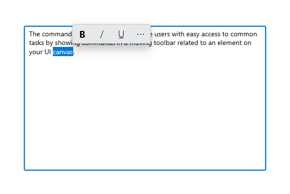
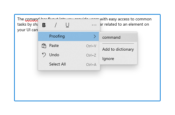
TextCommandBarFlyout 是特製化的命令列飛出視窗,其中包含用來編輯文字的命令。 每個文字控制項會自動顯示 TextCommandBarFlyout 作為上下文選單(按一下滑鼠右鍵),或是在選取文字時顯示。 文字命令列飛出視窗會將文字選取範圍調整為只顯示相關的命令。
文字選取時的命令欄快捷窗口。
以下是顯示次要命令的展開文字命令列選單。
可用的命令
下表顯示 TextCommandBarFlyout 中包含的命令,以及其顯示時間。
| Command | 顯示... |
|---|---|
| Bold | 當文字控制項不是唯讀狀態 (僅限 RichEditBox)。 |
| 斜體字 | 當文字控制項不是唯讀狀態 (僅限 RichEditBox)。 |
| 下劃線 | 當文字控制項不是唯讀狀態 (僅限 RichEditBox)。 |
| 校訂 | 當 IsSpellCheckEnabled 為 true 並已選取拼字錯誤的文字時。 |
| 剪下 | 當文字控制項不是唯讀狀態並已選取文字時。 |
| 複本 | 選取文字時。 |
| 貼上 | 當文字控制項不是唯讀狀態且剪貼簿有內容時。 |
| 還原 | 當有動作可以復原時。 |
| 全選 | 當可以選取文字時。 |
自訂文字命令列飛出視窗
TextCommandBarFlyout 無法加以自訂,並由每個文字控制項自動管理。 不過,您可以自訂命令取代預設 TextCommandBarFlyout。
- 若要取代文字選取範圍上顯示的預設 TextCommandBarFlyout,您可以建立自訂 CommandBarFlyout (或其他飛出視窗類型),並將它指派給 SelectionFlyout 屬性。 如果您將 SelectionFlyout 設定為 null,則選取範圍上沒有顯示任何命令。
- 若要取代顯示為操作功能表的預設 TextCommandBarFlyout,請將自訂 CommandBarFlyout (或其他飛出視窗類型) 指派給文字控制項上的 ContextFlyout 屬性。 如果您將 ContextFlyout 設定為 null,則會顯示舊版文字控制項中顯示的快顯功能表,而不會顯示 TextCommandBarFlyout。
輕鬆關閉
輕量消失控制項 (例如功能表、內容選單及其他飛出視窗) 會將鍵盤和遊戲控制器的焦點困在暫時性 UI 內,直到關閉為止。 若要為此行為提供視覺提示,Xbox 上的輕觸關閉控制項會繪製一個覆疊層,以降低超出範圍 UI 的可見度。 您可以使用 LightDismissOverlayMode 屬性來修改此行為。 根據預設,暫時性 UI 會在 Xbox 上繪製輕量消失疊加層 ([自動]),但不會在其他裝置系列上進行繪製。 您可以選擇將重疊強制設為一律 開啟 或 關閉。
<CommandBarFlyout LightDismissOverlayMode="Off" /> >
UWP 和 WinUI 2
這很重要
本文中的資訊和範例針對使用 Windows App SDK 和 WinUI 3 的應用程式進行了最佳化,但通常適用於使用 WinUI 2 的 UWP 應用程式。 如需平台特定資訊和範例,請參閱 UWP API 參考。
本節包含您在 UWP 或 WinUI 2 應用程式中使用控制項所需的資訊。
UWP 應用程式的 CommandBarFlyout 控制項包含在 WinUI 2 中。 如需詳細資訊 (包括安裝指示),請參閱 WinUI 2。 此控制項的 API 同時位於 Windows.UI.Xaml.Controls (WinUI) 和 Microsoft.UI.Xaml.Controls (WinUI) 命名空間中。
- UWP API:CommandBarFlyout 類別、TextCommandBarFlyout 類別、AppBarButton 類別、AppBarToggleButton 類別、AppBarSeparator 類別
- WinUI 2 Apis:CommandBarFlyout 類別、TextCommandBarFlyout 類別
- 開啟 WinUI 2 Gallery 應用程式,並感受 CommandBarFlyout 的功能展示。 WinUI 2 圖庫應用程式包含了大部分 WinUI 2 控制項、特性和功能的互動式範例。 從 Microsoft Store 取得應用程式,或在 GitHub 上取得原始程式碼。
建議使用最新的 WinUI 2 來取得所有控制項的最新樣式和範本。 WinUI 2.2 或更新版本包含一個供此控制項使用的新範本,其採用了圓角設計。 如需詳細資訊,請參閱圓角半徑。
若要在 WinUI 2 中使用本文中的程式碼,請在 XAML 中使用別名 (我們使用 muxc) 來表示專案中包含的 Windows UI 程式庫 API。 如需詳細資訊,請參閱開始使用 WinUI 2。
xmlns:muxc="using:Microsoft.UI.Xaml.Controls"

<muxc:CommandBarFlyout />
