Xamarin.Forms 標籤
 下載範例
下載範例在中顯示文字 Xamarin.Forms
檢視 Label 用於顯示單行和多行文字。 標籤可以有文字裝飾、彩色文字,以及使用自訂字型(系列、大小和選項)。
文字裝飾
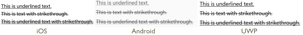
藉由將 屬性設定Label.TextDecorations為一或多個TextDecorations列舉成員,即可將底線和刪除線文字裝飾套用至Label實例:
NoneUnderlineStrikethrough
下列 XAML 範例示範如何設定 Label.TextDecorations 屬性:
<Label Text="This is underlined text." TextDecorations="Underline"  />
<Label Text="This is text with strikethrough." TextDecorations="Strikethrough" />
<Label Text="This is underlined text with strikethrough." TextDecorations="Underline, Strikethrough" />
對等的 C# 程式碼為:
var underlineLabel = new Label { Text = "This is underlined text.", TextDecorations = TextDecorations.Underline };
var strikethroughLabel = new Label { Text = "This is text with strikethrough.", TextDecorations = TextDecorations.Strikethrough };
var bothLabel = new Label { Text = "This is underlined text with strikethrough.", TextDecorations = TextDecorations.Underline | TextDecorations.Strikethrough };
下列螢幕快照顯示套用至Label實例的TextDecorations列舉成員:
轉換文字
Label可以藉由將 TextTransform 屬性設定為 列舉值TextTransform,來轉換儲存在 屬性中的Text文字大小寫。 此列舉具有四個值:
None表示不會轉換文字。Default表示將使用平台的預設行為。 此為TextTransform屬性的預設值。Lowercase表示文字將會轉換成小寫。Uppercase表示文字會轉換成大寫。
下列範例顯示將文字轉換成大寫:
<Label Text="This text will be displayed in uppercase."
       TextTransform="Uppercase" />
對等的 C# 程式碼為:
Label label = new Label
{
    Text = "This text will be displayed in uppercase.",
    TextTransform = TextTransform.Uppercase
};
字元間距
將 屬性double設定Label.CharacterSpacing為值,即可將字元間距套用至Label實例:
<Label Text="Character spaced text"
       CharacterSpacing="10" />
對等的 C# 程式碼為:
Label label = new Label { Text = "Character spaced text", CharacterSpacing = 10 };
結果是 ,所顯示的LabelCharacterSpacing文字中的字元會分開分隔裝置獨立單位。
新行
有兩種主要技術可從 XAML 將文字 Label 強制到新行:
- 使用 Unicode 行摘要字元,也就是 “ ”。
- 使用 屬性元素 語法指定您的文字。
下列程式代碼顯示這兩種技術的範例:
<!-- Unicode line feed character -->
<Label Text="First line Second line" />
<!-- Property element syntax -->
<Label>
<Label.Text>
First line
Second line
</Label.Text>
</Label>
在 C# 中,文字可以強制使用 「\n」 字元進入新行:
Label label = new Label { Text = "First line\nSecond line" };
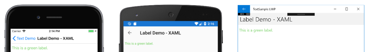
顏色
標籤可以設定為透過可 TextColor 系結屬性使用自訂文字色彩。
必須特別小心,以確保每個平臺上都能使用色彩。 由於每個平臺的文字和背景色彩都有不同的預設值,因此您必須小心挑選適用於每個色彩的預設值。
下列 XAML 範例會設定 的 Label文字色彩:
<ContentPage xmlns="http://xamarin.com/schemas/2014/forms"
             xmlns:x="http://schemas.microsoft.com/winfx/2009/xaml"
             x:Class="TextSample.LabelPage"
             Title="Label Demo">
    <StackLayout Padding="5,10">
      <Label TextColor="#77d065" FontSize = "20" Text="This is a green label." />
    </StackLayout>
</ContentPage>
對等的 C# 程式碼為:
public partial class LabelPage : ContentPage
{
    public LabelPage ()
    {
        InitializeComponent ();

        var layout = new StackLayout { Padding = new Thickness(5,10) };
        var label = new Label { Text="This is a green label.", TextColor = Color.FromHex("#77d065"), FontSize = 20 };
        layout.Children.Add(label);
        this.Content = layout;
    }
}
下列螢幕快照顯示設定 TextColor 屬性的結果:
如需色彩的詳細資訊,請參閱 色彩。
字型
如需在 上 Label指定字型的詳細資訊,請參閱 字型。
截斷和換行
標籤可以設定為處理無法以數種方式之一放在一行上的文字,由 LineBreakMode 屬性公開。 LineBreakMode 是具有下列值的列舉:
- HeadTruncation – 截斷文字的前端,顯示結尾。
- CharacterWrap – 將文字包裝在字元界限的新行上。
- MiddleTruncation – 顯示文字的開頭和結尾,中間取代為省略號。
- NoWrap – 不會換行文字,只顯示一行所能容納的文字量。
- TailTruncation – 顯示文字的開頭,截斷結尾。
- WordWrap – 在文字界限上換行文字。
顯示特定行數
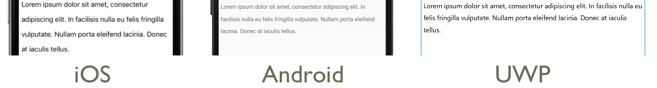
可以藉由將 屬性設定Label.MaxLines為 int 值來指定 所Label顯示的行數:
- 當
MaxLines為 -1,也就是其預設值時,Label會採用 屬性的值LineBreakMode,只顯示一行、可能截斷,或是所有文字的所有行。 - 當 0 時
MaxLines,Label不會顯示 。 - 當
MaxLines為 1 時,結果會與將LineBreakMode屬性設定為NoWrap、、HeadTruncationMiddleTruncation或TailTruncation相同。 不過,如果適用,Label則會遵守 屬性的值LineBreakMode,以放置省略號。 - 當 大於 1 時
MaxLines,Label將會顯示最多指定的行數,同時遵守 屬性的值LineBreakMode,以在適用時放置省略號。 不過,如果將 屬性設定MaxLines為大於1的值,如果LineBreakMode屬性設定為NoWrap,則沒有任何作用。
下列 XAML 範例示範在 上Label設定 MaxLines 屬性:
<Label Text="Lorem ipsum dolor sit amet, consectetur adipiscing elit. In facilisis nulla eu felis fringilla vulputate. Nullam porta eleifend lacinia. Donec at iaculis tellus."
       LineBreakMode="WordWrap"
       MaxLines="2" />
對等的 C# 程式碼為:
var label =
{
  Text = "Lorem ipsum dolor sit amet, consectetur adipiscing elit. In facilisis nulla eu felis fringilla vulputate. Nullam porta eleifend lacinia. Donec at iaculis tellus.", LineBreakMode = LineBreakMode.WordWrap,
  MaxLines = 2
};
下列螢幕快照顯示當文字夠長而佔用超過 2 行時,將 屬性設定 MaxLines 為 2 的結果:

顯示 HTML
類別 Label 具有 TextType 屬性,可判斷實例是否 Label 應該顯示純文本或 HTML 文字。 此屬性應該設定為列舉的 TextType 其中一個成員:
Text表示Label將會顯示純文字,而是屬性的Label.TextType預設值。HtmlLabel表示將顯示 HTML 文字。
因此, Label 實例可以藉由將 Label.TextType 屬性設定為 Html來顯示 HTML,並將 Label.Text 屬性設定為 HTML 字串:
Label label = new Label
{
    Text = "This is <strong style=\"color:red\">HTML</strong> text.",
    TextType = TextType.Html
};
在上述範例中,HTML 中的雙引號字元必須使用 符號逸出 \ 。
在 XAML 中,HTML 字串可能會因為另外逸出 < 和 > 符號而變得無法讀取:
<Label Text="This is <strong style="color:red">HTML</strong> text."
TextType="Html" />
或者,為了提高可讀性,HTML 可以內嵌在區 CDATA 段中:
<Label TextType="Html">
    <![CDATA[
    This is <strong style="color:red">HTML</strong> text.
    ]]>
</Label>
在此範例中,屬性 Label.Text 會設定為 區段中內嵌的 CDATA HTML 字串。 這可運作, Text 因為屬性是 ContentProperty 類別的 Label 。
下列螢幕快照顯示顯示 Label HTML:

重要
在中 Label 顯示 HTML 僅限於基礎平台支援的 HTML 標籤。
格式化文字
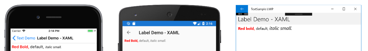
卷標會公開 FormattedText 屬性,允許在相同檢視中呈現具有多個字型和色彩的文字。
屬性FormattedText的類型為 FormattedString,其中包含透過 Spans 屬性設定的一或多個Span實例。 下列 Span 屬性可用來設定視覺外觀:
BackgroundColor– 範圍背景的色彩。CharacterSpacing類型double為 的 ,是文字字元Span之間的間距。Font– 範圍中文字的字型。FontAttributes– 範圍中文字的字型屬性。FontFamily– 範圍中文字字型所屬的字型系列。FontSize– 範圍中文字的字型大小。ForegroundColor– 範圍中文字的色彩。 這個屬性已經過時,且已由TextColor屬性取代。LineHeight- 要套用至範圍之預設線條高度的乘數。 如需詳細資訊,請參閱 行高。Style– 要套用至範圍的樣式。Text– 範圍文字。TextColor– 範圍中文字的色彩。TextDecorations- 要套用至範圍中文字的裝飾。 如需詳細資訊,請參閱 文字裝飾。
BackgroundColor、 Text與 Text 可繫結屬性的預設系結模式為 OneWay。 如需此系結模式的詳細資訊,請參閱系結模式指南中的預設系結模式。
此外, GestureRecognizers 屬性可以用來定義手勢辨識器集合,以回應 上的 Span手勢。
注意
無法在 中 Span顯示 HTML。
下列 XAML 範例示範由三Span個FormattedText實例組成的屬性:
<ContentPage xmlns="http://xamarin.com/schemas/2014/forms"
             xmlns:x="http://schemas.microsoft.com/winfx/2009/xaml"
             x:Class="TextSample.LabelPage"
             Title="Label Demo - XAML">
    <StackLayout Padding="5,10">
        ...
        <Label LineBreakMode="WordWrap">
            <Label.FormattedText>
                <FormattedString>
                    <Span Text="Red Bold, " TextColor="Red" FontAttributes="Bold" />
                    <Span Text="default, " Style="{DynamicResource BodyStyle}">
                        <Span.GestureRecognizers>
                            <TapGestureRecognizer Command="{Binding TapCommand}" />
                        </Span.GestureRecognizers>
                    </Span>
                    <Span Text="italic small." FontAttributes="Italic" FontSize="Small" />
                </FormattedString>
            </Label.FormattedText>
        </Label>
    </StackLayout>
</ContentPage>
對等的 C# 程式碼為:
public class LabelPageCode : ContentPage
{
    public LabelPageCode ()
    {
        var layout = new StackLayout{ Padding = new Thickness (5, 10) };
        ...
        var formattedString = new FormattedString ();
        formattedString.Spans.Add (new Span{ Text = "Red bold, ", ForegroundColor = Color.Red, FontAttributes = FontAttributes.Bold });

        var span = new Span { Text = "default, " };
        span.GestureRecognizers.Add(new TapGestureRecognizer { Command = new Command(async () => await DisplayAlert("Tapped", "This is a tapped Span.", "OK")) });
        formattedString.Spans.Add(span);
        formattedString.Spans.Add (new Span { Text = "italic small.", FontAttributes = FontAttributes.Italic, FontSize =  Device.GetNamedSize(NamedSize.Small, typeof(Label)) });

        layout.Children.Add (new Label { FormattedText = formattedString });
        this.Content = layout;
    }
}
請注意, Span 也可以回應加入至範圍 GestureRecognizers 集合的任何手勢。 例如, TapGestureRecognizer 已將 新增至上述程式代碼範例中的第二 Span 個 。 因此,點選時 Span , TapGestureRecognizer 會藉由執行 ICommand 屬性所 Command 定義的 回應。 如需手勢辨識器的詳細資訊,請參閱 Xamarin.Forms 手勢。
下列螢幕快照顯示將 屬性設定 FormattedString 為三 Span 個實例的結果:
行高
您可以藉由將 屬性或 Span.LineHeight 值設定Label.LineHeight為 double ,來自定義 和 Span 的垂直高度Label。 在iOS和Android上,這些值是原始行高度的乘數,而 通用 Windows 平台 (UWP) 上的Label.LineHeight屬性值是標籤的乘數。
注意
- 在 iOS 上
Label.LineHeight,和Span.LineHeight屬性會變更符合單行的文字行高,以及換行到多行的文字。 - 在 Android 上
Label.LineHeight,和Span.LineHeight屬性只會變更換行到多行的文字行高度。 - 在UWP上
Label.LineHeight,屬性會變更換行到多行的文字行高,而且Span.LineHeight屬性沒有作用。
下列 XAML 範例示範在 上Label設定 LineHeight 屬性:
<Label Text="Lorem ipsum dolor sit amet, consectetur adipiscing elit. In facilisis nulla eu felis fringilla vulputate. Nullam porta eleifend lacinia. Donec at iaculis tellus."
       LineBreakMode="WordWrap"
       LineHeight="1.8" />
對等的 C# 程式碼為:
var label =
{
  Text = "Lorem ipsum dolor sit amet, consectetur adipiscing elit. In facilisis nulla eu felis fringilla vulputate. Nullam porta eleifend lacinia. Donec at iaculis tellus.", LineBreakMode = LineBreakMode.WordWrap,
  LineHeight = 1.8
};
下列螢幕快照顯示將 屬性設定 Label.LineHeight 為 1.8 的結果:
下列 XAML 範例示範在 上Span設定 LineHeight 屬性:
<Label LineBreakMode="WordWrap">
    <Label.FormattedText>
        <FormattedString>
            <Span Text="Lorem ipsum dolor sit amet, consectetur adipiscing elit. In a tincidunt sem. Phasellus mollis sit amet turpis in rutrum. Sed aliquam ac urna id scelerisque. "
                  LineHeight="1.8"/>
            <Span Text="Nullam feugiat sodales elit, et maximus nibh vulputate id."
                  LineHeight="1.8" />
        </FormattedString>
    </Label.FormattedText>
</Label>
對等的 C# 程式碼為:
var formattedString = new FormattedString();
formattedString.Spans.Add(new Span
{
  Text = "Lorem ipsum dolor sit amet, consectetur adipiscing elit. In a tincidunt sem. Phasellus mollis sit amet turpis in rutrum. Sed aliquam ac urna id scelerisque. ",
  LineHeight = 1.8
});
formattedString.Spans.Add(new Span
{
  Text = "Nullam feugiat sodales elit, et maximus nibh vulputate id.",
  LineHeight = 1.8
});
var label = new Label
{
  FormattedText = formattedString,
  LineBreakMode = LineBreakMode.WordWrap
};
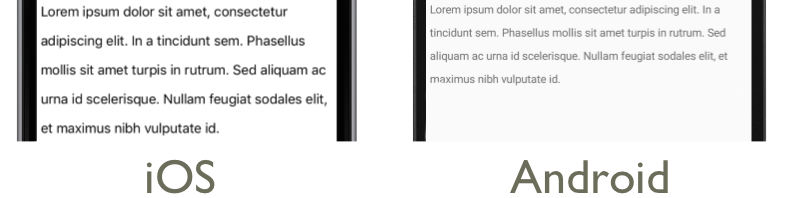
下列螢幕快照顯示將 屬性設定 Span.LineHeight 為 1.8 的結果:
邊距
Padding 代表專案與其子專案之間的空間,並用來分隔專案與其本身內容。 將 屬性Thickness設定Label.Padding為值,即可將填補套用至Label實例:
<Label Padding="10">
    <Label.FormattedText>
        <FormattedString>
            <Span Text="Lorem ipsum" />
            <Span Text="dolor sit amet." />
        </FormattedString>
    </Label.FormattedText>
</Label>
對等的 C# 程式碼為:
FormattedString formattedString = new FormattedString();
formattedString.Spans.Add(new Span
{
  Text = "Lorem ipsum"
});
formattedString.Spans.Add(new Span
{
  Text = "dolor sit amet."
});
Label label = new Label
{
    FormattedText = formattedString,
    Padding = new Thickness(20)
};
重要
在 iOS 上,建立 設定 屬性的 Padding 時Label,將會套用填補,稍後可以更新填補值。 不過,當 建立未設定 屬性的 Padding 時Label,稍後嘗試加以設定將不會有任何作用。
在 Android 和 通用 Windows 平台 上,Padding可以在建立 或更新版本時Label指定 屬性值。
如需邊框間距的詳細資訊,請參閱 邊界和邊框間距。
超連結
與 Span 實體顯示Label的文字可以轉換成具有下列方法的超連結:
TextColor設定或Span的Label和TextDecoration屬性。TapGestureRecognizer將 加入 至GestureRecognizers或Span的Label集合,其Command屬性系結至ICommand,而其CommandParameter屬性包含要開啟的URL。ICommand定義將由執行的TapGestureRecognizer。- 撰寫 將由 執行
ICommand的程序代碼。
下列程式代碼範例取自 超連結示範 範例,顯示 Label 其內容是從多個 Span 實例設定的 :
<Label>
    <Label.FormattedText>
        <FormattedString>
            <Span Text="Alternatively, click " />
            <Span Text="here"
                  TextColor="Blue"
                  TextDecorations="Underline">
                <Span.GestureRecognizers>
                    <TapGestureRecognizer Command="{Binding TapCommand}"
                                          CommandParameter="https://learn.microsoft.com/xamarin/" />
                </Span.GestureRecognizers>
            </Span>
            <Span Text=" to view Xamarin documentation." />
        </FormattedString>
    </Label.FormattedText>
</Label>
在此範例中,第一個和第三 Span 個實例組成文字,而第二 Span 個實例則代表可套用的超連結。 它的文字色彩設定為藍色,並具有底線文字裝飾。 這會建立超連結的外觀,如下列螢幕快照所示:

點選超連結時, TapGestureRecognizer 會執行 ICommand 其 Command 屬性所定義的 回應。 此外,屬性所 CommandParameter 指定的 URL 將會傳遞至 ICommand 做為參數。
XAML 頁面的程式代碼後置包含實 TapCommand 作:
public partial class MainPage : ContentPage
{
    // Launcher.OpenAsync is provided by Xamarin.Essentials.
    public ICommand TapCommand => new Command<string>(async (url) => await Launcher.OpenAsync(url));

    public MainPage()
    {
        InitializeComponent();
        BindingContext = this;
    }
}
會TapCommandLauncher.OpenAsync執行 方法,將 TapGestureRecognizer.CommandParameter 屬性值當做參數傳遞。 方法 Launcher.OpenAsync 由 Xamarin.Essentials提供,並在網頁瀏覽器中開啟URL。 因此,整體效果是當點選頁面上的超連結時,網頁瀏覽器隨即出現,並流覽與超連結相關聯的 URL。
建立可重複使用的超連結類別
建立超連結的先前方法每次需要應用程式中的超連結時,都需要撰寫重複的程序代碼。 不過,和 LabelSpan 類別都可以子類別來建立 HyperlinkLabel 和 HyperlinkSpan 類別,並在該處新增手勢辨識器和文字格式設定程序代碼。
下列程式代碼範例取自 超連結示範 範例,會顯示 類別 HyperlinkSpan :
public class HyperlinkSpan : Span
{
    public static readonly BindableProperty UrlProperty =
        BindableProperty.Create(nameof(Url), typeof(string), typeof(HyperlinkSpan), null);

    public string Url
    {
        get { return (string)GetValue(UrlProperty); }
        set { SetValue(UrlProperty, value); }
    }

    public HyperlinkSpan()
    {
        TextDecorations = TextDecorations.Underline;
        TextColor = Color.Blue;
        GestureRecognizers.Add(new TapGestureRecognizer
        {
            // Launcher.OpenAsync is provided by Xamarin.Essentials.
            Command = new Command(async () => await Launcher.OpenAsync(Url))
        });
    }
}
類別會Url定義屬性和相關聯的 BindableProperty,而建HyperlinkSpan構函式會設定超連結外觀,以及TapGestureRecognizer點選超連結時將回應的 。 HyperlinkSpan點選 時,TapGestureRecognizer會執行 Launcher.OpenAsync 方法以在網頁瀏覽器中開啟 屬性所Url指定的網址,以回應 。
將 HyperlinkSpan 類別的實例新增至 XAML,即可取用類別:
<ContentPage xmlns="http://xamarin.com/schemas/2014/forms"
             xmlns:x="http://schemas.microsoft.com/winfx/2009/xaml"
             xmlns:local="clr-namespace:HyperlinkDemo"
             x:Class="HyperlinkDemo.MainPage">
    <StackLayout>
        ...
        <Label>
            <Label.FormattedText>
                <FormattedString>
                    <Span Text="Alternatively, click " />
                    <local:HyperlinkSpan Text="here"
                                         Url="https://learn.microsoft.com/appcenter/" />
                    <Span Text=" to view AppCenter documentation." />
                </FormattedString>
            </Label.FormattedText>
        </Label>
    </StackLayout>
</ContentPage>
設定標籤的樣式
前幾節涵蓋每個實例的設定 Label 和 Span 屬性。 不過,屬性集可以分組成一致套用至一或多個檢視的一個樣式。 這會增加程式代碼的可讀性,並讓設計變更更容易實作。 如需詳細資訊,請參閱 樣式。