CSS template reference guide
Configuring your company branding for the user sign-in process provides a seamless experience in your applications that use Microsoft Entra ID as the identity and access management service. Use this CSS reference guide if you're using the CSS template as part of the customize company branding process.
HTML selectors
The following CSS styles become the default body and link styles for the whole page. Applying styles for other links or text override CSS selectors.
body- Styles for the whole page- Styles for links:
a, a:link- All linksa:hover- When the mouse is over the linka:focus- When the link has focusa:focus:hover- When the link has focus and the mouse is over the linka:active- When the link is being clicked
Microsoft Entra CSS selectors
Use the following CSS selectors to configure the details of the sign-in experience.
.ext-background-image- Container that includes the background image in the default lightbox template.ext-header- Header at the top of the container.ext-header-logo- Header logo at the top of the container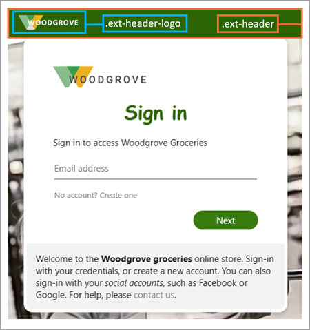
.ext-middle- Style for the full-screen background that aligns the sign-in box vertically to the middle and horizontally to the center.ext-vertical-split-main-section- Style for the container of the partial-screen background in the vertical split template that contains both a sign-in box and a background (This style is also known as the Active Directory Federation Services (ADFS) template.).ext-vertical-split-background-image-container- Sign-in box background in the vertical split/ADFS template.ext-sign-in-box- Sign-in box container.ext-title- Title text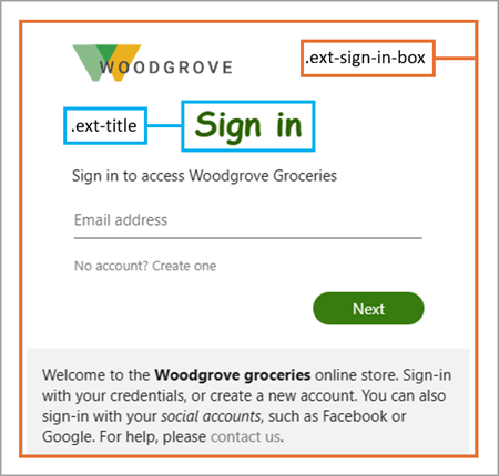
.ext-subtitle- Subtitle textStyles for primary buttons:
.ext-button.ext-primary- Primary button default style.ext-button.ext-primary:hover- When the mouse is over the button.ext-button.ext-primary:focus- When the button has focus.ext-button.ext-primary:focus:hover- When the button has focus and the mouse is over the button.ext-button.ext-primary:active- When the button is being clicked
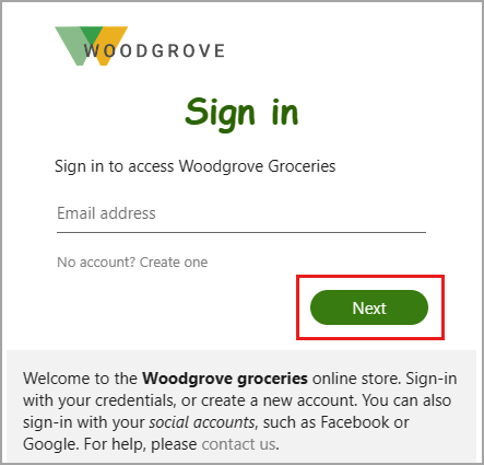
Styles for secondary buttons:
.ext-button.ext-secondary- Secondary buttons.ext-button.ext-secondary:hover- When the mouse is over the button.ext-button.ext-secondary:focusWhen the button has focus.ext-button.ext-secondary:focus:hover- When the button has focus and the mouse is over the button.ext-button.ext-secondary:active- When the button is being clicked
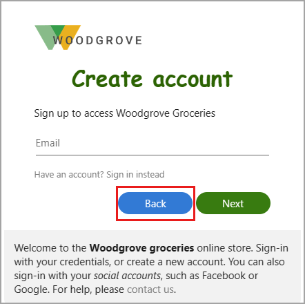
.ext-error- Error text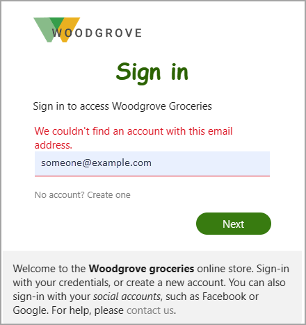
Styles for text boxes:
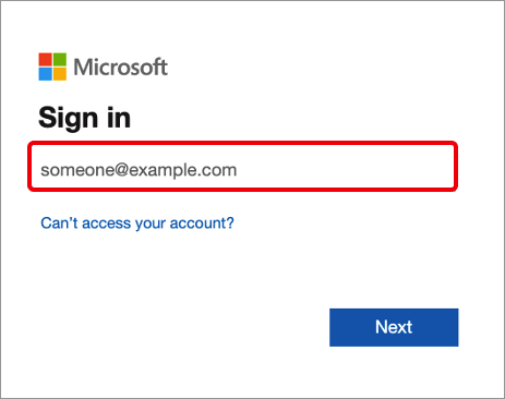
.ext-input.ext-text-box- Text boxes.ext-input.ext-text-box.ext-has-error- When there's a validation error associated with the text box.ext-input.ext-text-box:hover- When the mouse is over the text box.ext-input.ext-text-box:focus- When the text box has focus.ext-input.ext-text-box:focus:hover- When the text box has focus and the mouse is over the text box
.ext-boilerplate-text- Custom message text at the bottom of the sign-in box.ext-promoted-fed-cred-box- Sign-in options text box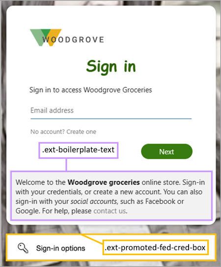
Styles for the footer:
.ext-footer- Footer area at the bottom of the page.ext-footer-links- Links area in the footer at the bottom of the page.ext-footer-item- Link items (such as "Terms of use" or "Privacy & cookies") in the footer at the bottom of the page.ext-debug-item- Debug details ellipsis in the footer at the bottom of the page