Poznámka:
Přístup k této stránce vyžaduje autorizaci. Můžete se zkusit přihlásit nebo změnit adresáře.
Přístup k této stránce vyžaduje autorizaci. Můžete zkusit změnit adresáře.
In this tutorial, you build a linear slider code component that users can use to change numeric values with a visual slider instead of typing the values in the column.
You can find the sample code for the completed linear slider code component at PowerApps-Samples/component-framework/LinearInputControl/.
To build a linear slider code component, complete the following steps:
- Create a new component project
- Implement the manifest
- Implement component logic using TypeScript
- Add style to the code components
- Build your code components
- Package your code components
- Add your code component to an app
Prerequisites
For this tutorial, install the following components:
- Visual Studio Code (VSCode) (Ensure the Add to PATH option is selected)
- Node.js (LTS version is recommended)
- Microsoft Power Platform CLI (Use either Power Platform Tools for Visual Studio Code or Power Platform CLI for Windows)
- .NET Build tools by installing one of the following options. At minimum, select the workload
.NET build tools:- Visual Studio 2022
- Visual Studio 2019
Note
You might prefer to use the .NET 6.x SDK instead of the Build Tools for Visual Studio. In this case, instead of using msbuild, use dotnet build.
Tip
Install git for source control.
Creating a new component project
For this tutorial, start in a folder located at C:\repos, but you can use any folder you like. Choose a folder where you want to check in your code.
Create a new folder named
LinearInput.Open the
LinearInputfolder by using Visual Studio Code.The quickest way to start is by using a command prompt window. Navigate to your
LinearInputfolder and typecode ..c:\repos\LinearInput>code .This command opens your component project in Visual Studio Code.
Open a new terminal inside Visual Studio Code by using Terminal -> New Terminal.
At the terminal prompt, create a new component project by passing basic parameters by using the pac pcf init command.
pac pcf init --namespace SampleNamespace --name LinearInputControl --template field --run-npm-installThe command also runs the
npm installcommand to set up the project build tools.Running 'npm install' for you...Note
If you receive the error
The term 'npm' is not recognized as the name of a cmdlet, function, script file, or operable program., make sure you install node.js (LTS version is recommended) and all other prerequisites.
Implementing manifest
The control manifest is an XML file that contains the metadata of the code component. It also defines the behavior of the code component. In this tutorial, you create this manifest file under the LinearInputControl subfolder. When you open the ControlManifest.Input.xml file in Visual Studio Code, you see that the manifest file is predefined with some properties. For more information, see Manifest.
The control node defines the namespace, version, and display name of the code component.
The tooling generates the control element. It provides a good starting point for your control.
Tip
You may find the XML easier to read by formatting it so that attributes appear on separate lines. Find and install an XML formatting tool of your choice in the Visual Studio Code Marketplace: Search for xml formatting extensions.
The examples below have been formatted with attributes on separate lines to make them easier to read.
| Attribute | Description |
|---|---|
namespace |
Namespace of the code component. |
constructor |
Constructor of the code component. |
version |
Version of the component. Whenever you update the component, update the version to see the latest changes in the runtime. |
display-name-key |
Name of the code component that displays on the UI. |
description-key |
Description of the code component that displays on the UI. |
control-type |
The code component type. This value is a standard control. |
If you ignore the commented areas and format the document, you see the manifest that was generated for you:
<?xml version="1.0" encoding="utf-8" ?>
<manifest>
<control namespace="SampleNamespace"
   constructor="LinearInputControl"
   version="0.0.1"
   display-name-key="LinearInputControl"
   description-key="LinearInputControl description"
   control-type="standard">
   <external-service-usage enabled="false">
   </external-service-usage>
   <property name="sampleProperty"
      display-name-key="Property_Display_Key"
      description-key="Property_Desc_Key"
      of-type="SingleLine.Text"
      usage="bound"
      required="true" />
   <resources>
      <code path="index.ts"
         order="1" />
   </resources>
</control>
</manifest>
From this starting point, make the following changes:
Add type-group element
Add the definition of a type-group element named numbers within the control element. This element specifies the component value and can contain whole, currency, floating point, or decimal values.
Replace the external-service-usage element with the type-group element since the external-service-usage functionality isn't used by this control.
<control namespace="SampleNamespace"
   constructor="LinearInputControl"
   version="0.0.1"
   display-name-key="LinearInputControl"
   description-key="LinearInputControl description"
   control-type="standard">
   <external-service-usage enabled="false">
   </external-service-usage>
   <property name="sampleProperty"
      display-name-key="Property_Display_Key"
      description-key="Property_Desc_Key"
      of-type="SingleLine.Text"
      usage="bound"
      required="true" />
   <resources>
      <code path="index.ts"
         order="1" />
   </resources>
   </control>
Edit the property element
Edit the generated sampleProperty property element within the control element. This element defines the properties of the code component, such as the data type of the column.
| Attribute | Description |
|---|---|
name |
Name of the property. |
display-name-key |
Display name of the property that appears on the UI. |
description-key |
Description of the property that appears on the UI. |
of-type-group |
Use the of-type-group attribute to refer to the name of a specific type group. In this case, refer to the type-group named numbers that you created in the previous step. |
usage |
Has two properties, bound and input.- Bound properties are bound only to the value of the column. - Input properties are either bound to a column or allow a static value. |
required |
Defines whether the property is required. |
Edit the property node as shown in the following code:
<property name="sampleProperty"
   display-name-key="Property_Display_Key"
   description-key="Property_Desc_Key"
   of-type="SingleLine.Text"
   usage="bound"
   required="true" />
Edit resources element
The resources node defines the visualization of the code component. It contains all the resources that build the visualization and styling of the code component. The code is specified as a child element under the resources element.
The generated manifest already includes a definition of the code element with path and order attribute values set. Use these values. In the following Adding style to the code component section, you add CSS styles for the control. To support that step, edit the manifest to add them while you have it open.
Edit the resources node to add the following css element:
Completed manifest
The completed manifest file should look like this:
<?xml version="1.0" encoding="utf-8" ?>
<manifest>
<control namespace="SampleNamespace"
constructor="LinearInputControl"
version="0.0.1"
display-name-key="LinearInputControl"
description-key="LinearInputControl description"
control-type="standard">
<type-group name="numbers">
<type>Whole.None</type>
<type>Currency</type>
<type>FP</type>
<type>Decimal</type>
</type-group>
<property name="controlValue"
   display-name-key="Control Value"
   description-key="Control value description."
   of-type-group="numbers"
   usage="bound"
   required="true" />
<resources>
   <code path="index.ts"
   order="1" />
   <css path="css/LinearInputControl.css"
   order="1" />
</resources>
</control>
</manifest>
Save the changes to the
ControlManifest.Input.xmlfile.Generate
ManifestDesignTypes.d.tsfile by using the following command.npm run refreshTypesThe output should look like this:
PS C:\repos\LinearInput> npm run refreshTypes

> pcf-project@1.0.0 refreshTypes
> pcf-scripts refreshTypes

[12:38:06 PM] [refreshTypes]  Initializing...
[12:38:06 PM] [refreshTypes]  Generating manifest types...
[12:38:06 PM] [refreshTypes]  Generating design types...
[12:38:06 PM] [refreshTypes]  Succeeded
To see the results, open the
C:\repos\LinearInput\LinearInputControl\generated\ManifestTypes.d.tsfile to see the types generated:/* *This is auto generated from the ControlManifest.Input.xml file */ // Define IInputs and IOutputs Type. They should match with ControlManifest. export interface IInputs { controlValue: ComponentFramework.PropertyTypes.NumberProperty; } export interface IOutputs { controlValue?: number; }
Implementing component logic
After implementing the manifest file, implement the component logic by using TypeScript. Implement the component logic inside the index.ts file. When you open the index.ts file in Visual Studio Code, you see that the four essential functions (init, updateView, getOutputs, and destroy) are predefined. Now, implement the logic for the code component.
Open the index.ts file in the code editor of your choice and make the following changes:
- Add properties for the control
- Add the
refreshDatafunction as the event handler - Update the
initfunction - Edit the
updateViewfunction - Edit the
getOutputsfunction - Edit the
destroyfunction
Add properties for the control
export class LinearInputControl
implements ComponentFramework.StandardControl<IInputs, IOutputs>
{
/**
   * Empty constructor.
*/
constructor() {}
Add the refreshData function as the event handler
public refreshData(evt: Event): void {
this._value = this.inputElement.value as any as number;
this.labelElement.innerHTML = this.inputElement.value;
this._notifyOutputChanged();
}
Update the init function
public init(
context: ComponentFramework.Context<IInputs>,
notifyOutputChanged: () => void,
state: ComponentFramework.Dictionary,
container: HTMLDivElement
): void {
// Add control initialization code
}
Edit the updateView function
public updateView(context: ComponentFramework.Context<IInputs>): void {
// Add code to update control view
}
Edit the getOutputs function
Edit the destroy function
The complete index.ts file should look like this:
import { IInputs, IOutputs } from "./generated/ManifestTypes";
export class LinearInputControl
implements ComponentFramework.StandardControl<IInputs, IOutputs>
{
private _value: number;
private _notifyOutputChanged: () => void;
private labelElement: HTMLLabelElement;
private inputElement: HTMLInputElement;
private _container: HTMLDivElement;
private _context: ComponentFramework.Context<IInputs>;
private _refreshData: EventListenerOrEventListenerObject;
/**
   * Empty constructor.
*/
constructor() {}
/**
* Used to initialize the control instance. Controls can kick off remote server calls
and other initialization actions here.
* Data-set values are not initialized here, use updateView.
* @param context The entire property bag available to control via Context Object;
It contains values as set up by the customizer mapped to property names defined
in the manifest, as well as utility functions.
* @param notifyOutputChanged A callback method to alert the framework that the
control has new outputs ready to be retrieved asynchronously.
* @param state A piece of data that persists in one session for a single user.
Can be set at any point in a controls life cycle by calling 'setControlState'
in the Mode interface.
* @param container If a control is marked control-type='standard', it will receive
an empty div element within which it can render its content.
*/
public init(
context: ComponentFramework.Context<IInputs>,
notifyOutputChanged: () => void,
state: ComponentFramework.Dictionary,
container: HTMLDivElement
): void {
// Add control initialization code
this._context = context;
this._container = document.createElement("div");
this._notifyOutputChanged = notifyOutputChanged;
this._refreshData = this.refreshData.bind(this);
// creating HTML elements for the input type range and binding it to the function which
// refreshes the control data
this.inputElement = document.createElement("input");
this.inputElement.setAttribute("type", "range");
this.inputElement.addEventListener("input", this._refreshData);
//setting the max and min values for the control.
this.inputElement.setAttribute("min", "1");
this.inputElement.setAttribute("max", "1000");
this.inputElement.setAttribute("class", "linearslider");
this.inputElement.setAttribute("id", "linearrangeinput");
// creating a HTML label element that shows the value that is set on the linear range control
this.labelElement = document.createElement("label");
this.labelElement.setAttribute("class", "LinearRangeLabel");
this.labelElement.setAttribute("id", "lrclabel");
// retrieving the latest value from the control and setting it to the HTMl elements.
this._value = context.parameters.controlValue.raw!;
this.inputElement.setAttribute(
"value",
context.parameters.controlValue.formatted
? context.parameters.controlValue.formatted
: "0"
);
this.labelElement.innerHTML = context.parameters.controlValue.formatted
? context.parameters.controlValue.formatted
: "0";
// appending the HTML elements to the control's HTML container element.
this._container.appendChild(this.inputElement);
this._container.appendChild(this.labelElement);
container.appendChild(this._container);
}
public refreshData(evt: Event): void {
   this._value = this.inputElement.value as any as number;
   this.labelElement.innerHTML = this.inputElement.value;
   this._notifyOutputChanged();
}
/**
* Called when any value in the property bag has changed. This includes field values,
data-sets, global values such as container height and width, offline status, control
metadata values such as label, visible, etc.
* @param context The entire property bag available to control via Context Object;
It contains values as set up by the customizer mapped to names defined in the manifest,
as well as utility functions
*/
public updateView(context: ComponentFramework.Context<IInputs>): void {
   // Add code to update control view
   // storing the latest context from the control.
   this._value = context.parameters.controlValue.raw!;
   this._context = context;
   this.inputElement.setAttribute(
      "value",
      context.parameters.controlValue.formatted
      ? context.parameters.controlValue.formatted
      : ""
   );
   this.labelElement.innerHTML = context.parameters.controlValue.formatted
      ? context.parameters.controlValue.formatted
      : "";
}
/**
* It is called by the framework prior to a control receiving new data.
* @returns an object based on nomenclature defined in manifest,
expecting object[s] for property marked as "bound" or "output"
*/
public getOutputs(): IOutputs {
   return {
      controlValue: this._value,
   };
}
/**
* Called when the control is to be removed from the DOM tree.
Controls should use this call for cleanup.
* i.e. cancelling any pending remote calls, removing listeners, etc.
*/
public destroy(): void {
   // Add code to cleanup control if necessary
   this.inputElement.removeEventListener("input", this._refreshData);
   }
}
When you're finished, save the changes to the index.ts file.
Adding style to the code component
Developers and app makers can define their styling to represent their code components visually by using CSS. CSS allows developers to describe the presentation of code components, including style, colors, layouts, and fonts. The linear input component's init method creates an input element and sets the class attribute to linearslider. The style for the linearslider class is defined in a separate CSS file. You can include additional component resources like CSS files with the code component to support further customizations.
Important
When you implement styling to your code components by using CSS, ensure that the CSS is scoped to your control by using the automatically generated CSS classes applied to the container DIV element for your component.
If your CSS is scoped globally, it likely breaks the existing styling of the form or screen where the code component is rendered.
If you're using a third-party CSS framework, use a version of that framework that is already namespaced or otherwise wrap that framework in a namespace manually either by hand or by using a CSS preprocessor.
Create a new
csssubfolder under theLinearInputControlfolder.Create a new
LinearInputControl.cssfile inside thecsssubfolder.Add the following style content to the
LinearInputControl.cssfile:.SampleNamespace\.LinearInputControl input[type=range].linearslider { margin: 1px 0; background:transparent; -webkit-appearance:none; width:100%;padding:0; height:24px; -webkit-tap-highlight-color:transparent } .SampleNamespace\.LinearInputControl input[type=range].linearslider:focus { outline: none; } .SampleNamespace\.LinearInputControl input[type=range].linearslider::-webkit-slider-runnable-track { background: #666; height:2px; cursor:pointer } .SampleNamespace\.LinearInputControl input[type=range].linearslider::-webkit-slider-thumb { background: #666; border:0 solid #f00; height:24px; width:10px; border-radius:48px; cursor:pointer; opacity:1; -webkit-appearance:none; margin-top:-12px } .SampleNamespace\.LinearInputControl input[type=range].linearslider::-moz-range-track { background: #666; height:2px; cursor:pointer } .SampleNamespace\.LinearInputControl input[type=range].linearslider::-moz-range-thumb { background: #666; border:0 solid #f00; height:24px; width:10px; border-radius:48px; cursor:pointer; opacity:1; -webkit-appearance:none; margin-top:-12px } .SampleNamespace\.LinearInputControl input[type=range].linearslider::-ms-track { background: #666; height:2px; cursor:pointer } .SampleNamespace\.LinearInputControl input[type=range].linearslider::-ms-thumb { background: #666; border:0 solid #f00; height:24px; width:10px; border-radius:48px; cursor:pointer; opacity:1; -webkit-appearance:none; }Save the
LinearInputControl.cssfile.Note that the
ControlManifest.Input.xmlfile already includes thecssresource file inside the resources element because that step was completed in the Implementing manifest section earlier.<resources> <code path="index.ts" order="1" /> <css path="css/LinearInputControl.css" order="1" /> </resources>
Note
Power Apps component framework uses RESX web resources to manage the localized strings shown on any user interface. The resources to support localization are also registered in the resources node.
This first tutorial doesn't include localization capability. Localization is included in other tutorials.
To learn how to localize code components by using resx web resources, see the Localization API sample.
Build your code components
After you finish adding the manifest, component logic, and styling, build the code components by using the following command:
npm run build
The output should look similar to the following result:
> pcf-project@1.0.0 build
> pcf-scripts build

[2:05:41 PM] [build]  Initializing...
[2:05:41 PM] [build]  Validating manifest...
[2:05:41 PM] [build]  Validating control...
[2:05:42 PM] [build]  Running ESLint...
[2:05:43 PM] [build]  Generating manifest types...
[2:05:43 PM] [build]  Generating design types...
[2:05:43 PM] [build]  Compiling and bundling control...
[Webpack stats]:
asset bundle.js 6.56 KiB [emitted] (name: main)
./LinearInputControl/index.ts 4.9 KiB [built] [code generated]
webpack 5.75.0 compiled successfully in 2049 ms
[2:05:45 PM] [build]  Generating build outputs...
[2:05:45 PM] [build]  Succeeded
PS C:\repos\LinearInput\LinearInputcontrol>
The build generates an updated TypeScript type declaration file under the LinearInputControl/generated folder.
The component is compiled into the out/controls/LinearInputControl folder. The build artifacts include:
bundle.js– Bundled component source code.ControlManifest.xml– Actual component manifest file that you upload to the Microsoft Dataverse organization.
Note
eslint rules might affect your build, depending on how they're configured. If you receive an error during the build:
[12:58:30 PM] [build]  Failed:
[pcf-1065] [Error] ESLint validation error:
C:\project\LinearInput\LinearInputControl\index.ts
  10:26  error  'EventListenerOrEventListenerObject' is not defined  no-undef
Check your eslint rules in .eslintrc.json and set linting rules to ["warn"]. For example, if you receive the error:
error 'EventListenerOrEventListenerObject' is not defined no-undef
Then you can open .eslintrc.json and edit the rules to add a ["warn"] value for the rule no-undef:
    "rules": {
      "no-unused-vars": "off",
      "no-undef": ["warn"]
    }
After you update the eslint rules, your control should build without errors.
Debug your code component
When you finish implementing the code component logic, run the following command to start the debugging process. For more information, see Debug code components.
npm start watch
The output should look similar to the following result:
> pcf-project@1.0.0 start
> pcf-scripts start "watch"

[2:09:10 PM] [start] [watch] Initializing...
[2:09:10 PM] [start] [watch] Validating manifest...
[2:09:10 PM] [start] [watch] Validating control...
[2:09:11 PM] [start] [watch] Generating manifest types...
[2:09:11 PM] [start] [watch] Generating design types...
[2:09:11 PM] [start] [watch] Compiling and bundling control...
[Webpack stats]:
asset bundle.js 6.56 KiB [emitted] (name: main)
./LinearInputControl/index.ts 4.9 KiB [built] [code generated]
webpack 5.75.0 compiled successfully in 2060 ms
[2:09:13 PM] [start] [watch] Generating build outputs...
[2:09:13 PM] [start] [watch] Starting control harness...

Starting control harness...

[Browsersync] Access URLs:

 ----------------------------
 Local: http://localhost:8181
 ----------------------------

[Browsersync] Serving files from: C:\repos\LinearInput\out\controls\LinearInputControl

[Browsersync] Watching files...
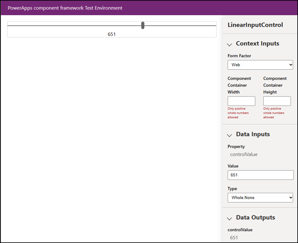
A browser also opens to the PCF Control Sandbox so that you can see the control and test it.
Packaging your code components
Follow these steps to create and import a solution file:
Create a new folder named Solutions inside the LinearInputControl folder and go to the new folder.
  mkdir Solutions
  cd Solutions
Create a new solution project in the LinearInputControl folder by using the pac solution init command:
pac solution init --publisher-name Samples --publisher-prefix samplesNote
The publisher-name and publisher-prefix values must match either an existing solution publisher or a new one that you want to create in your target environment.
You can retrieve a list of current values by running this query on your target environment:
[Environment URI]/api/data/v9.2/publishers?$select=uniquename,customizationprefixFor more information, see Query data using the Web API.
The output of the pac solution init command looks like this:
Dataverse solution project with name 'solutions' created successfully in: 'C:\repos\LinearInput\linearinputcontrol\solutions'
Dataverse solution files were successfully created for this project in the sub-directory Other, using solution name solutions, publisher name Samples, and customization prefix samples.
Please verify the publisher information and solution name found in the Solution.xml file.
PS C:\repos\LinearInput\linearinputcontrol\solutions>
After creating the new solution project, add a reference to the location of the created component. Use the following command:
pac solution add-reference --path ..\..\Note
The path you provide is related to the current Solutions folder that you created under the LinearInputControl folder. You can also provide an absolute path.
The output of the command looks like this:
Project reference successfully added to Dataverse solution project.To generate a zip file from your solution project, when inside the
cdsprojsolution project directory, use the following command:msbuild /t:restoreOr, if you installed the .NET 6 SDK, use:
dotnet buildRun the following command again:
msbuildNote
If you receive the error
Missing required tool: MSBuild.exe/dotnet.exe, addMSBuild.exe/dotnet.exeto the Path environment variable or useDeveloper Command Prompt for Visual Studio Code. As mentioned in Prerequisites, you must install .NET build tools.Tip
You see the message Do not use the
evalfunction or its functional equivalents, when you build the solution file by using themsbuildcommand and import it into Dataverse and run the solution checker. Rebuild the solution file by using the commandmsbuild/property:configuration=Release. Reimport the solution into Dataverse and run the solution checker. For more information, see Debug code components.The generated solution zip file is located in the
Solution\bin\debugfolder.Manually import the solution into Dataverse by using Power Apps once the zip file is ready, or automatically by using the Microsoft Power Platform Build Tools.
Note
Manually publish the customizations if you're importing unmanaged solution.
Add your code component to an app
To add a code component to an app, follow the steps in these articles:
- Add components to columns and tables for model-driven apps
- Add code components to a canvas app
- Use code components in portals
See also
Download sample components
Learn Power Apps component framework
Overview of tools and apps used with ALM
Power Apps component framework API reference
Power Apps component framework overview
Debug code components