Note
Access to this page requires authorization. You can try signing in or changing directories.
Access to this page requires authorization. You can try changing directories.
The map control supports several different map style options and base map styles. All styles can be set when the map control is being initialized. Or, you can set styles by using the map control's setStyle function. This article shows you how to use these style options to customize the map's appearance and how to implement the style picker control in your map. The style picker control allows the user to toggle between different base styles.
Set map style options
Style options can be set during web control initialization. Or, you can update style options by calling the map control's setStyle function. To see all available style options, see style options.
//Set the style options when creating the map.
var map = new atlas.Map('map', {
    renderWorldCopies: false,
    showLogo: true,
    showFeedbackLink: true,
    style: 'road'

    //Additional map options.
});

//Update the style options at anytime using `setStyle` function.
map.setStyle({
    renderWorldCopies: true,
    showLogo: false,
    showFeedbackLink: false
});
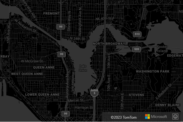
Set a base map style
You can also initialize the map control with one of the base map styles that are available in the Web SDK. You can then use the setStyle function to update the base style with a different map style.
Set a base map style on initialization
Base styles of the map control can be set during initialization. In the following code, the style option of the map control is set to the
grayscale_dark base map style.
var map = new atlas.Map('map', {
    style: 'grayscale_dark',

    //Additional map options
});
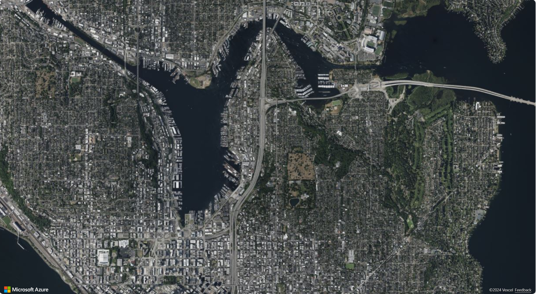
Update the base map style
The base map style can be updated by using the setStyle function and setting the style option to either change to a different base map style or add more style options.
In the following code, after a map instance is loaded, the map style is updated from grayscale_dark to satellite using the setStyle function.
map.setStyle({ style: 'satellite' });
Customize the base map
The styleOverrides options enable users to streamline the base map by turning off specific map elements like country/region borders, administrative district borders, building footprints, and road detail layers. This allows for a cleaner and simpler map view, making it easier to visualize geometry data.
The following code shows how to disable country/region borders and building footprints on the map.
var map = new atlas.Map('map', {
    styleOverrides: {
        countryRegion: { borderVisible: false },
        buildingFootprint: { visible: false },
    },

    //Additional map options
});
Here are examples of all five available styleOverrides options:
- Country/region borders
styleOverrides: {
    countryRegion: { borderVisible: false }
}
- Admin district borders
styleOverrides: {
    adminDistrict: { borderVisible: false }
}
- Second admin district borders
styleOverrides: {
    adminDistrict2: { borderVisible: false }
}
- Building footprints
styleOverrides: {
    buildingFootprint: { visible: false }
}
- Road details
styleOverrides: {
    roadDetails: { visible: false }
}
Note
For more information on the supported map styles on each styleOverrides option, see the styleOverrides API documentation.
For a sample showing the different styles and how they affect how the map is rendered, see Map style options in the Azure Maps Samples. For this sample's source code, see Map style options source code.
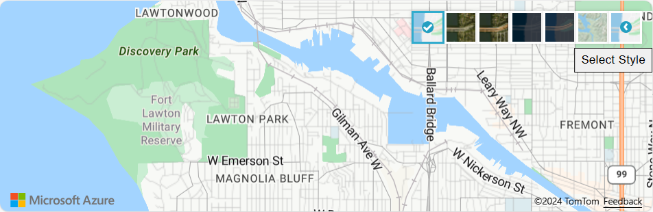
Add the style picker control
The style picker control provides an easy to use button with flyout panel that can be used by the end user to switch between base styles.
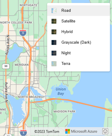
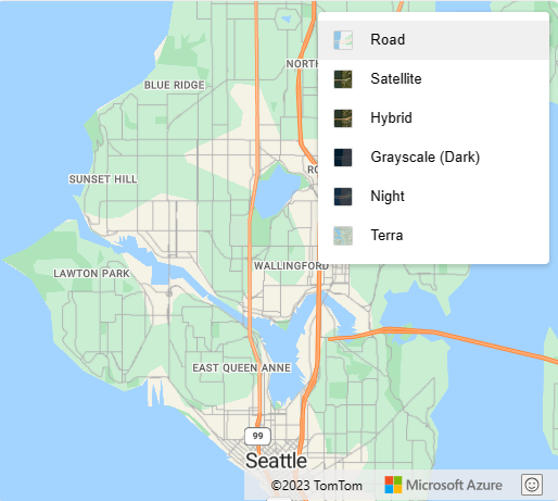
The style picker has two different layout options: icon and list. Also, the style picker allows you to choose two different style picker control style options: light and dark. In this example, the style picker uses the icon layout and displays a select list of base map styles in the form of icons. The style control picker includes the following base set of styles: ["road", "grayscale_light", "grayscale_dark", "night", "road_shaded_relief"]. For more information on style picker control options, see Style Control Options.
The following image shows the style picker control displayed in icon layout.
The following image shows the style picker control displayed in list layout.
Important
By default the style picker control lists all the styles available under the Gen1 (S0) pricing tier of Azure Maps. If you want to reduce the number of styles in this list, pass an array of the styles you want to appear in the list into the mapStyle option of the style picker. If you are using Gen1 (S1) or Gen2 pricing tier and want to show all available styles, set the mapStyles option of the style picker to "all".
Azure Maps Gen1 pricing tier retirement
Gen1 pricing tier is now deprecated and will be retired on 9/15/26. Gen2 pricing tier replaces Gen1 (both S0 and S1) pricing tier. If your Azure Maps account has Gen1 pricing tier selected, you can switch to Gen2 pricing tier before it’s retired, otherwise it will automatically be updated. For more information, see Manage the pricing tier of your Azure Maps account.
The following code shows you how to override the default mapStyles base style list. In this example, we're setting the mapStyles option to list the base styles to display in the style picker control.
/*Add the Style Control to the map*/
map.controls.add(new atlas.control.StyleControl({
  mapStyles: ['road', 'grayscale_dark', 'night', 'road_shaded_relief', 'satellite', 'satellite_road_labels'],
  layout: 'list'
}), {
  position: 'top-right'
});
Next steps
To learn more about the classes and methods used in this article:
See the following articles for more code samples to add to your maps: