Add a cluster bubble layer
Cluster bubble layers enable you to use enhanced data aggregation capabilities based on different zoom levels. Cluster bubble layers are designed to optimize the visualization and analysis of data by allowing dynamic adjustments to granularity as users zoom in or out on the map.

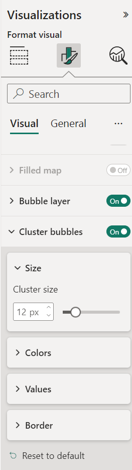
Azure Maps Power BI visual offers a range of configuration options to provide flexibility when customizing the appearance of cluster bubbles. With parameters like cluster bubble size, color, text size, text color, border color, and border width, you can tailor the visual representation of clustered data to align with your reporting needs.
| Setting | Description | Values |
|---|---|---|
| Bubble Size | The size of each cluster bubble. Default: 12 px | 1-50 px |
| Cluster Color | Fill color of each cluster bubble. | |
| Text Size | The size of the number indicating the quantity of clustered bubbles. Default: 18 px. | 1-60 px |
| Text Color | Text color of the number displayed in the cluster bubbles. | |
| Border Color | The color of the bubbles outline. | |
| Border Width | The width of the border in pixels. Default: 2 px | 1-20 px |
Next steps
Change how your data is displayed on the map:
Add more context to the map:
Customize the visual:
Feedback
Coming soon: Throughout 2024 we will be phasing out GitHub Issues as the feedback mechanism for content and replacing it with a new feedback system. For more information see: https://aka.ms/ContentUserFeedback.
Submit and view feedback for