Note
Access to this page requires authorization. You can try signing in or changing directories.
Access to this page requires authorization. You can try changing directories.
This tutorial presents an end-to-end example of a Synapse Data Science workflow in Microsoft Fabric. It uses both the nycflights13 data resource, and R, to predict whether or not a plane arrives more than 30 minutes late. It then uses the prediction results to build an interactive Power BI dashboard.
In this tutorial, you learn how to:
Use tidymodels packages
Write the output data to a lakehouse as a delta table
Build a Power BI visual report to directly access data in that lakehouse
Prerequisites
Get a Microsoft Fabric subscription. Or, sign up for a free Microsoft Fabric trial.
Sign in to Microsoft Fabric.
Switch to Fabric by using the experience switcher on the lower-left side of your home page.

Open or create a notebook. To learn how, see How to use Microsoft Fabric notebooks.
Set the language option to SparkR (R) to change the primary language.
Attach your notebook to a lakehouse. On the left side, select Add to add an existing lakehouse or to create a lakehouse.
Install packages
Install the nycflights13 package to use the code in this tutorial.
install.packages("nycflights13")
# Load the packages
library(tidymodels)      # For tidymodels packages
library(nycflights13)    # For flight data
Explore the data
The nycflights13 data has information about 325,819 flights that arrived near New York City in 2013. First, examine the distribution of flight delays. The following code cell generates a graph showing that the arrival delay distribution is right skewed:
ggplot(flights, aes(arr_delay)) + geom_histogram(color="blue", bins = 300)
It has a long tail in the high values, as shown in the following image:

Load the data, and make a few changes to the variables:
set.seed(123)

flight_data <-
  flights %>%
  mutate(
    # Convert the arrival delay to a factor
    arr_delay = ifelse(arr_delay >= 30, "late", "on_time"),
    arr_delay = factor(arr_delay),
    # You'll use the date (not date-time) for the recipe that you'll create
    date = lubridate::as_date(time_hour)
  ) %>%
  # Include weather data
  inner_join(weather, by = c("origin", "time_hour")) %>%
  # Retain only the specific columns that you'll use
  select(dep_time, flight, origin, dest, air_time, distance,
         carrier, date, arr_delay, time_hour) %>%
  # Exclude missing data
  na.omit() %>%
  # For creating models, it's better to have qualitative columns
  # encoded as factors (instead of character strings)
  mutate_if(is.character, as.factor)
Before we build the model, consider a few specific variables that have importance for both preprocessing and modeling.
The arr_delay variable is a factor variable. For logistic regression model training, it's important that the outcome variable is a factor variable.
glimpse(flight_data)
About 16% of the flights in this dataset arrived more than 30 minutes late:
flight_data %>%
  count(arr_delay) %>%
  mutate(prop = n/sum(n))
The dest feature has 104 flight destinations:
unique(flight_data$dest)
There are 16 distinct carriers:
unique(flight_data$carrier)
Split the data
Split the single dataset into two sets: a training set and a testing set. Keep most of the rows in the original dataset (as a randomly chosen subset) in the training dataset. Use the training dataset to fit the model, and use the test dataset to measure model performance.
Use the rsample package to create an object that contains information about how to split the data. Then, use two more rsample functions to create DataFrames for the training and testing sets:
set.seed(123)
# Keep most of the data in the training set
data_split <- initial_split(flight_data, prop = 0.75)

# Create DataFrames for the two sets:
train_data <- training(data_split)
test_data  <- testing(data_split)
Create a recipe and roles
Create a recipe for a simple logistic regression model. Before training the model, use a recipe to create new predictors, and conduct the preprocessing that the model requires.
Use the update_role() function, with a custom role named ID, so that the recipes know that flight and time_hour are variables. A role can have any character value. The formula includes all variables in the training set as predictors, except for arr_delay. The recipe keeps these two ID variables but doesn't use them as either outcomes or predictors:
flights_rec <-
  recipe(arr_delay ~ ., data = train_data) %>%
  update_role(flight, time_hour, new_role = "ID")
To view the current set of variables and roles, use the summary() function:
summary(flights_rec)
Create features
Feature engineering can improve your model. The flight date might have a reasonable effect on the likelihood of a late arrival:
flight_data %>%
  distinct(date) %>%
  mutate(numeric_date = as.numeric(date))
It might help to add model terms, derived from the date, that have potential importance for the model. Derive the following meaningful features from the single date variable:
- Day of the week
- Month
- Whether or not the date corresponds to a holiday
Add the three steps to your recipe:
flights_rec <-
  recipe(arr_delay ~ ., data = train_data) %>%
  update_role(flight, time_hour, new_role = "ID") %>%
  step_date(date, features = c("dow", "month")) %>%
  step_holiday(date,
               holidays = timeDate::listHolidays("US"),
               keep_original_cols = FALSE) %>%
  step_dummy(all_nominal_predictors()) %>%
  step_zv(all_predictors())
Fit a model with a recipe
Use logistic regression to model the flight data. First, build a model specification with the parsnip package:
lr_mod <-
  logistic_reg() %>%
  set_engine("glm")
Use the workflows package to bundle your parsnip model (lr_mod) with your recipe (flights_rec):
flights_wflow <-
  workflow() %>%
  add_model(lr_mod) %>%
  add_recipe(flights_rec)

flights_wflow
Train the model
This function can prepare the recipe, and train the model from the resulting predictors:
flights_fit <-
  flights_wflow %>%
  fit(data = train_data)
Use the helper functions xtract_fit_parsnip() and extract_recipe() to extract the model or recipe objects from the workflow. In this example, pull the fitted model object, then use the broom::tidy() function to get a tidy tibble of model coefficients:
flights_fit %>%
  extract_fit_parsnip() %>%
  tidy()
Predict results
A single call to predict() uses the trained workflow (flights_fit) to make predictions with the unseen test data. The predict() method applies the recipe to the new data, then passes the results to the fitted model.
predict(flights_fit, test_data)
Get the output from predict() to return the predicted class: late versus on_time. However, for the predicted class probabilities for each flight, use augment() with the model, combined with test data, to save them together:
flights_aug <-
  augment(flights_fit, test_data)
Review the data:
glimpse(flights_aug)
Evaluate the model
We now have a tibble with the predicted class probabilities. In the first few rows, the model correctly predicted five on-time flights (values of .pred_on_time are p > 0.50). However, we need predictions for a total of 81,455 rows.
We need a metric that tells how well the model predicted late arrivals, compared to the true status of the arr_delay outcome variable.
Use the Area Under the Curve Receiver Operating Characteristic (AUC-ROC) as the metric. Compute it with roc_curve() and roc_auc(), from the yardstick package:
flights_aug %>%
  roc_curve(truth = arr_delay, .pred_late) %>%
  autoplot()
Build a Power BI report
The model result looks good. Use the flight delay prediction results to build an interactive Power BI dashboard. The dashboard shows the number of flights by carrier, and the number of flights by destination. The dashboard can filter by the delay prediction results.

Include the carrier name and airport name in the prediction result dataset:
  flights_clean <- flights_aug %>%
  # Include the airline data
  left_join(airlines, c("carrier"="carrier"))%>%
  rename("carrier_name"="name") %>%
  # Include the airport data for origin
  left_join(airports, c("origin"="faa")) %>%
  rename("origin_name"="name") %>%
  # Include the airport data for destination
  left_join(airports, c("dest"="faa")) %>%
  rename("dest_name"="name") %>%
  # Retain only the specific columns you'll use
  select(flight, origin, origin_name, dest,dest_name, air_time,distance, carrier, carrier_name, date, arr_delay, time_hour, .pred_class, .pred_late, .pred_on_time)
Review the data:
glimpse(flights_clean)
Convert the data to a Spark DataFrame:
sparkdf <- as.DataFrame(flights_clean)
display(sparkdf)
Write the data into a delta table in your lakehouse:
# Write data into a delta table
temp_delta<-"Tables/nycflight13"
write.df(sparkdf, temp_delta ,source="delta", mode = "overwrite", header = "true")
Use the delta table to create a semantic model.
In the left nav, select your workspace, and in the upper right textbox, enter the name of the lakehouse you attached to your notebook. The following screenshot shows that we selected My Workspace:
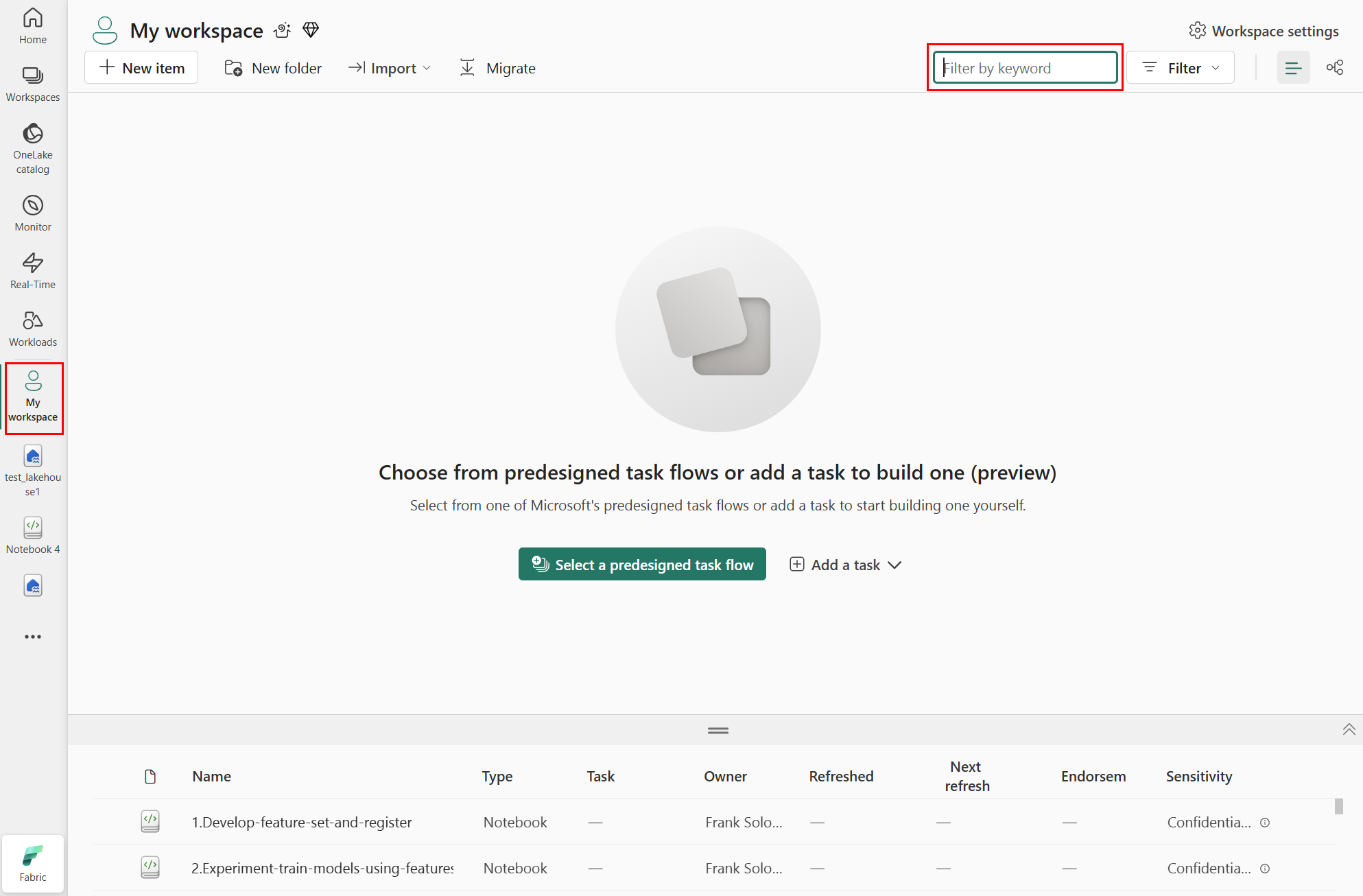
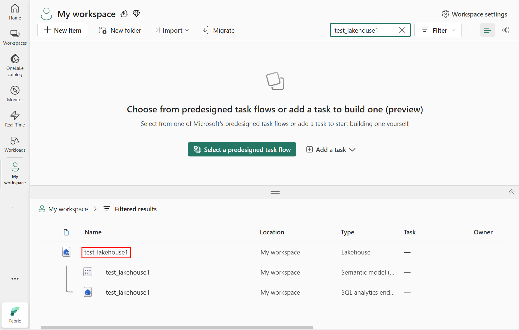
Enter the name of the lakehouse that you attached to your notebook. We enter test_lakehouse1, as shown in the following screenshot:

In the filtered results area, select the lakehouse, as shown in the following screenshot:
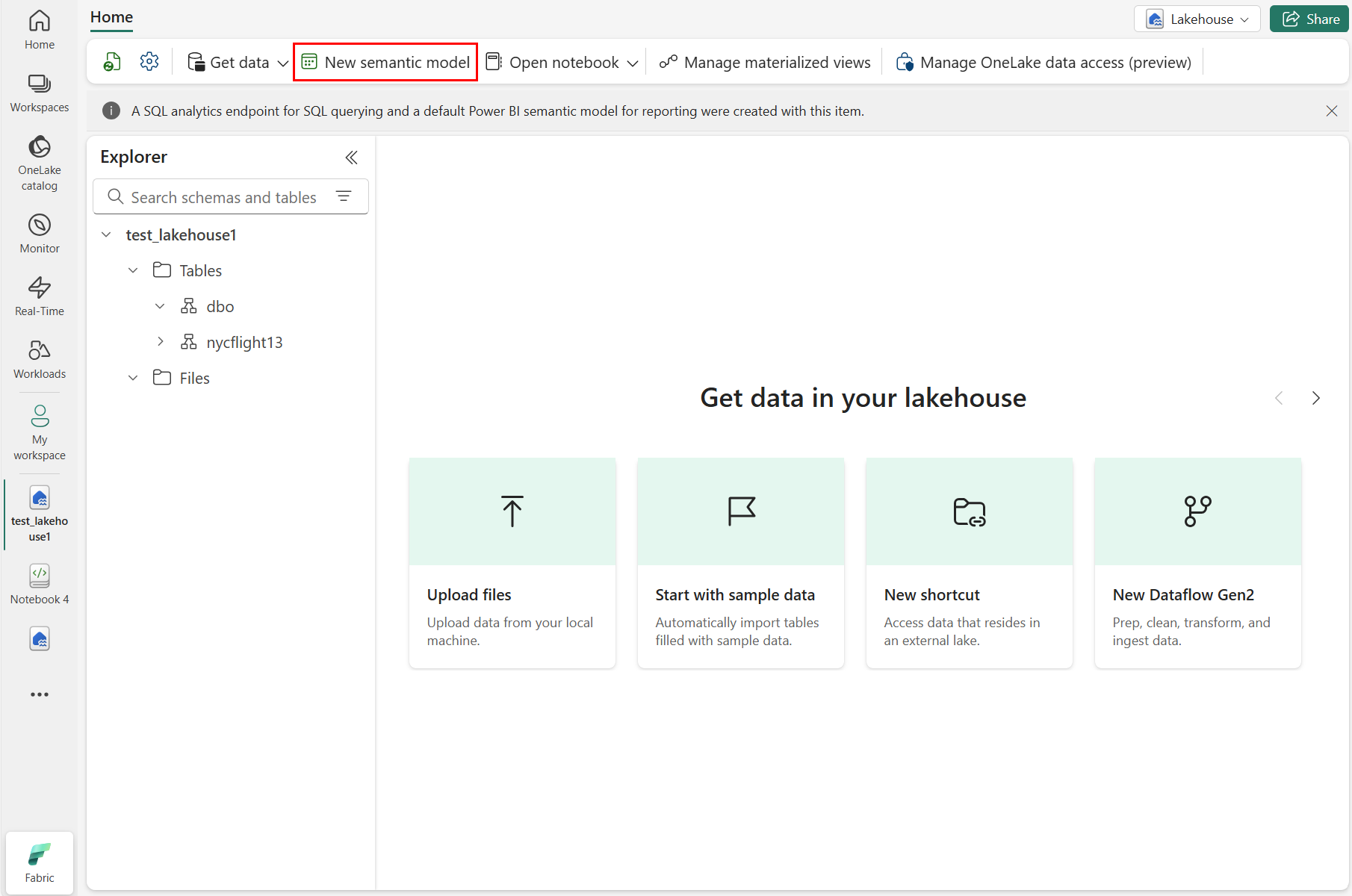
Select New semantic model as shown in the following screenshot:
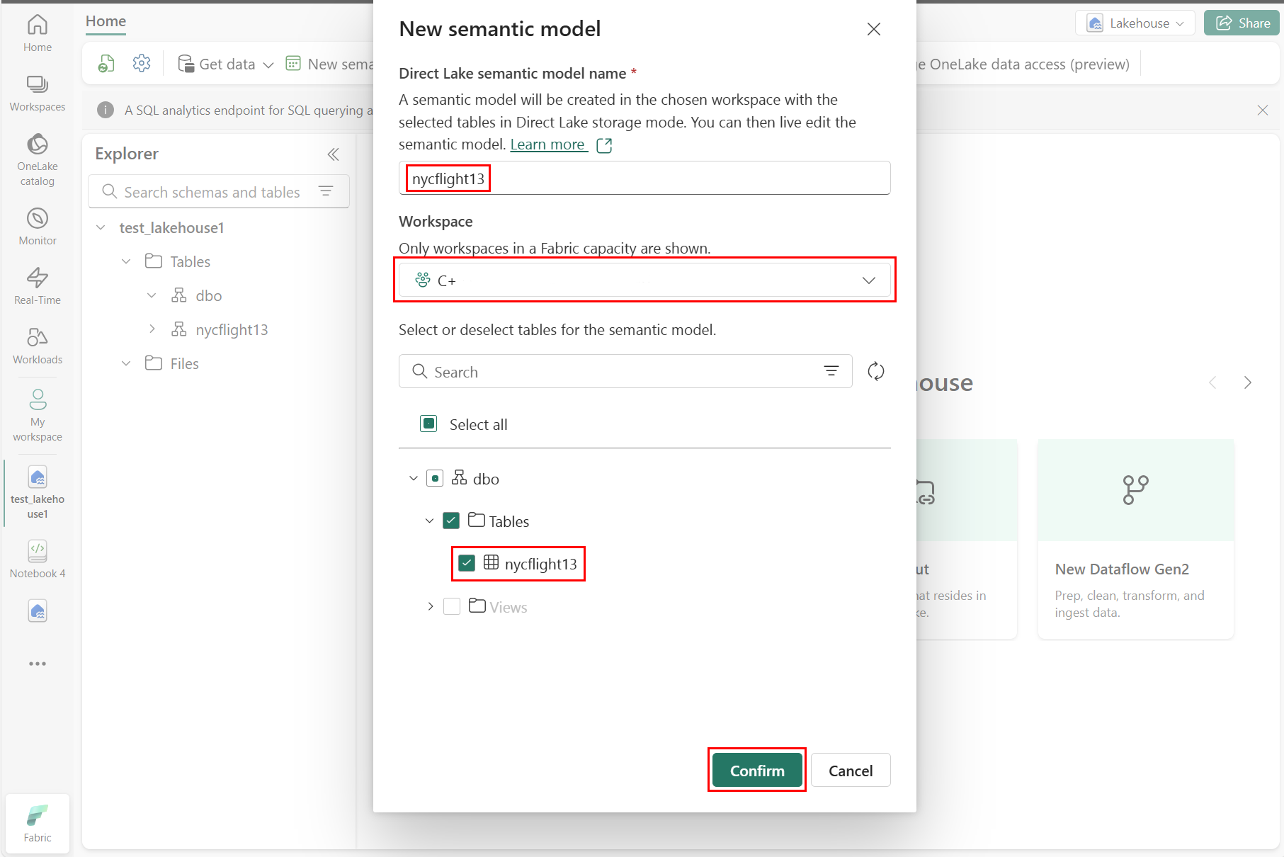
At the New semantic model pane, enter a name for the new semantic model, select a workspace, and select the tables to use for that new model, then select Confirm, as shown in the following screenshot:
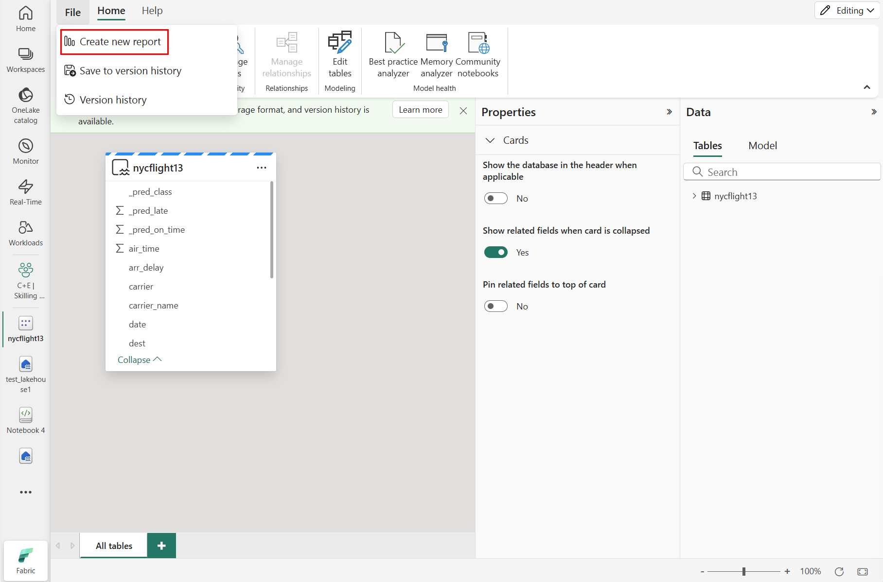
To create a new report, select Create new report, as shown in the following screenshot:
Select or drag fields from the Data and Visualizations panes onto the report canvas to build your report


To create the report shown at the beginning of this section, use these visualizations and data:
 Stacked bar chart with:
- Y-axis: carrier_name
- X-axis: flight. Select Count for the aggregation
- Legend: origin_name
-
Stacked bar chart with:
- Y-axis: dest_name
- X-axis: flight. Select Count for the aggregation
- Legend: origin_name
 Slicer with:
- Field: _pred_class
-
Slicer with:
- Field: _pred_late