Note
Access to this page requires authorization. You can try signing in or changing directories.
Access to this page requires authorization. You can try changing directories.
Applies to: ✅ SQL analytics endpoint and Warehouse in Microsoft Fabric
In this tutorial, you will create a Direct Lake semantic model and a Power BI report.
Note
This tutorial forms part of an end-to-end scenario. In order to complete this tutorial, you must first complete these tutorials:
Create a semantic model
In this task, learn how to create a Direct Lake semantic model based the Wide World Importers warehouse.
Ensure that the workspace you created in the first tutorial is open.
Open the
Wide World Importerswarehouse.Select New semantic model.
In the New semantic model window, in the Direct Lake semantic model name box, enter
Sales Model.Expand the
dboschema, expand the Tables folder, and then check thedimension_cityandfact_saletables.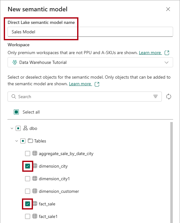
Select Confirm.
To open the semantic model, return to the workspace landing page, and then select the
Sales Modelsemantic model.To open the model designer, on the menu, select Open data model.

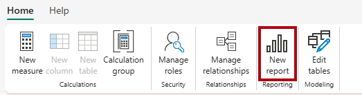
To create a relationship, in the model designer, on the Home ribbon, select Manage relationships.
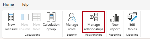
In the Manage relationship window, select + New relationship.
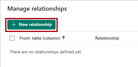
In the New relationship window, complete the following steps to create the relationship:
In the From table dropdown list, select the
dimension_citytable.In the To table dropdown list, select the
fact_saletable.In the Cardinality dropdown list, select One to many (1:*).
In the Cross-filter direction dropdown list, select Single.
Check the Assume referential integrity box.
Select Save.
In the Manage relationship window, select Close.
Create a Power BI report
In this task, learn how to create a Power BI report based on the semantic model you created in the first task.
On the Home ribbon, select New report.
In the report designer, complete the following steps to create a column chart visual:
In the Data pane, expand the
fact_saletable, and then check theProfitfield.In the Data pane, expand the
dimension_citytable, and then check theSalesTerritoryfield.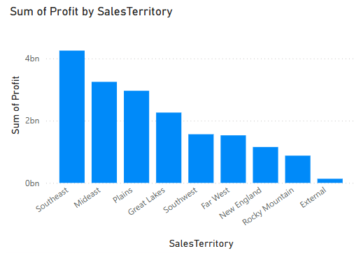
If necessary, resize the column chart visual by dragging the corner of the visual.

Select anywhere on the blank canvas to ensure that the column chart visual is no longer selected.
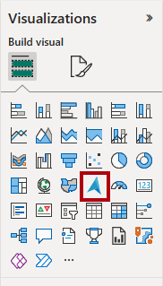
Complete the following steps to create a map visual:
In the Visualizations pane, select the Azure Map visual.
In the Data pane, from inside the
dimension_citytable, drag theStateProvincefields to the Location well in the Visualizations pane.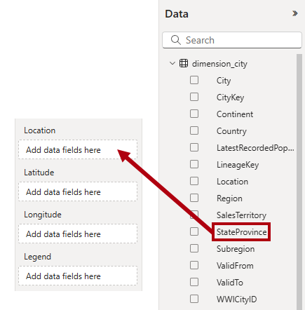
In the Data pane, from inside the
fact_saletable, check theProfitfield to add it to the map visual Size well.
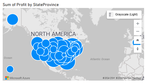
If necessary, reposition and resize the map visual to place it beneath the column chart visual at the bottom-left region of the report page.
Select anywhere on the blank canvas to ensure that the map visual is no longer selected.
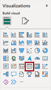
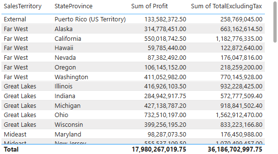
Complete the following steps to create a table visual:
In the Visualizations pane, select the Table visual.
In the Data pane, check the following fields:
SalesTerritoryfrom thedimension_citytableStateProvincefrom thedimension_citytableProfitfrom thefact_saletableTotalExcludingTaxfrom thefact_saletable
If necessary, reposition and resize the table visual to place it in an empty region of the report page.
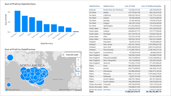
Verify that the completed design of the report page resembles the following image.
To save the report, on the Home ribbon, select File > Save.
In the Save your report window, in the Enter a name for your report box, enter
Sales Analysis.Select Save.