People picker component in Microsoft Graph Toolkit
You can use the mgt-people-picker web component to search for people, groups, or both. By default, the component searches for all people and users in the organization, but you can change the behavior to also search for groups, or only groups. You can also filter the search to a specific group. You can also allow the user to enter and select any email address.
Example
The following example shows the mgt-people-picker component. Start searching for a name to see the results render and use the code editor to see how properties change the behavior of the component.
Properties
By default, the mgt-people-picker component fetches people from the /me/people and /users endpoints. Use the following attributes to change this behavior.
| Attribute | Property | Description |
|---|---|---|
| show-max | showMax | A number value to indicate the maximum number of people to show. The default value is 6. |
| group-id | groupId | A string value that belongs to a Microsoft Graph defined group for further filtering of the search results. |
| transitive-search | transitiveSearch | A Boolean value to perform a transitive search returning a flat list of all nested members - by default transitive search isn't used. |
| type | type | The type of entities to search for. Available options are: person, group, any. Default value is person. If this attribute is set to group and either group-id or group-ids are set, then userFilters and peopleFilters have no effect. |
| user-type | userType | The type of user to search for. Available options are: any, user for organizational users, or contact for contacts. Default value is any. |
| group-type | groupType | The group type or types to search for. Available options are: unified, security, mailenabledsecurity, distribution, any. Default value is any. This attribute has no effect if the type property is set to person. This attribute accepts a comma-separated list of values; the property accepts an array or values. |
| selected-people | selectedPeople | An array of selected people. Set this value to select people programmatically. |
| people | people | An array of people found and rendered in the search result |
| placeholder | placeholder | The default text that appears to explain how to use the component. Default value is Start typing a name. |
| default-selected-user-ids | defaultSelectedUserIds | When provided a string of comma-separated Microsoft Graph user IDs, the component renders the respective users as selected upon initialization. |
| default-selected-group-ids | defaultSelectedGroupIds | Similar to default-selected-user-ids, when provided a string of comma-separated Microsoft Graph group IDs, the component renders the respective groups as selected upon initialization. |
| selection-mode | selectionMode | Used to indicate whether to allow selecting multiple items (users or groups) or just a single item. Available options are: single, multiple. Default value is multiple. |
| disabled | disabled | Sets whether the people picker is disabled. When disabled, the user isn't able to search or select people. Default is false. |
| disable-images | disableImages | Sets whether to disable fetching and display of person images. When set to true, user initials are displayed instead. Default is false. |
| person-card | personCardInteraction | Sets the behavior to show the person card of a selected person. The allowed values are none, hover or click. Default is none. |
| allow-any-email | allowAnyEmail | Indicates whether the people picker can accept email addresses without selecting a person. Default value is false. When you finish typing an email address, you can press comma (,), semicolon (;), tab or enter keys to add it. |
| user-ids | userIds | A string of comma-separated user IDs. They only appear on the dropdown menu or your search results when you type a query. For example, 48d31887-5fad-4d73-a9f5-3c356e68a038,24fcbca3-c3e2-48bf-9ffc-c7f81b81483d only displays the two users in the dropdown when the input is focused. When you type a search text, it returns results that match the users in the two user IDs only. |
| user-filters | userFilters | Specifies the filter criteria to use when querying the users' endpoint. It requires the user-type to be set to user or contact. By default, the user-type is any and leads the querying to take place in the people endpoint block. Example: user-filters="startsWith(displayName,'a')". This attribute is optional. Learn more about the support for filter on user properties of directory objects. When you use only the User.ReadBasic.All permission, the list of available properties is limited and the component adapts accordingly. Under the User.ReadBasic.All scope, you're limited to the following properties: id, displayName, givenName, mail, securityIdentifier, surname, and userPrincipalName. By default, this component uses the jobTitle and department properties. The mail property serves as a fallback for jobTitle when User.ReadBasic.All is in use and other properties aren't rendered. Use the User.Read.All permission to query more properties. |
| group-filters | groupFilters | Specifies the filter criteria to use when querying the groups endpoint. It requires the type to be set to group. Example: group-filters="startsWith(displayName,'a')". This attribute is optional. |
| people-filters | peopleFilters | Specifies the filter criteria to use when querying the people endpoint. It's used as it is. Example: people-filters="jobTitle eq 'Web Marketing Manager'". This attribute is optional. Learn more about filtering and the supported capabilities on the people resource. |
| group-ids | groupIds | A string of comma-separated group IDs. The available results should be limited to the specified groups. Users that appear on the dropdown menu and via the search experience should only come from the specified group IDs. For example, 02bd9fd6-8f93-4758-87c3-1fb73740a315,06f62f70-9827-4e6e-93ef-8e0f2d9b7b23 only displays users belonging to these groups. When you type a search text, it returns results that match the users in the two group IDs only. This property isn't used if group-id is defined. If the property is set, the type is group by default and transitive-search is true by default. If the group-type is set with the property, the type can be any or group. If the type is person, the property isn't used. |
| aria-label | ariaLabel | A string provided to help assistive technologies provide context for the people picker. |
The following example shows the show-max attribute.
<mgt-people-picker show-max="4"> </mgt-people-picker>
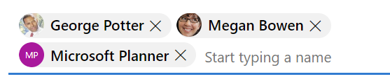
Selected people
The selected people section of the component renders each person chosen by the developer or user.
You can populate selected people data with the following options:
Setting the
selectedPeopleproperty directly, as shown in the following example.// personObject is the User or Person object from Microsoft Graph document.querySelector("mgt-people-picker").selectedPeople.push(personObject);Using the
selectUsersById()method, which accepts an array of Microsoft graph user IDs to find associated user details for selection.Note: If no user is found for an
id, no data will be rendered for thatid.// id = Microsoft graph User "id" document.querySelector("mgt-people-picker").selectUsersById(["id", "id"]);Using the
selectGroupsById()method, which accepts an array of Microsoft graph group IDs to find the group(s) with associated users.// groupid = Microsoft graph group "id" document .querySelector("mgt-people-picker") .selectGroupsById(["groupid", "groupid"]);
CSS custom properties
The mgt-people-picker component defines the following CSS custom properties.
<mgt-people-picker class="people-picker"></mgt-people-picker>
.people-picker {
  --people-picker-selected-option-background-color: orange;
  --people-picker-selected-option-highlight-background-color: red;
  --people-picker-dropdown-background-color: blue;
  --people-picker-dropdown-result-background-color: yellow;
  --people-picker-dropdown-result-hover-background-color: gold;
  --people-picker-dropdown-result-focus-background-color: green;
  --people-picker-no-results-text-color: orange;
  --people-picker-input-background: gray;
  --people-picker-input-border-color: yellow;
  --people-picker-input-hover-background: green;
  --people-picker-input-hover-border-color: red;
  --people-picker-input-focus-background: purple;
  --people-picker-input-focus-border-color: orange;

  --people-picker-input-placeholder-focus-text-color: yellow;
  --people-picker-input-placeholder-hover-text-color: gold;
  --people-picker-input-placeholder-text-color: white;
  --people-picker-search-icon-color: yellow;
  --people-picker-remove-selected-close-icon-color: blue;

  /** Style for the avatar-size in the people-picker **/
  --people-picker-result-person-avatar-size: 50px;
  --people-picker-selected-person-avatar-size: 30px;

  /** You can also change the person tokens **/
  --person-line1-text-color: blue;
  --person-line2-text-color: red;
}
To learn more, see styling components.
Events
The following events are fired from the component.
| Event | When is it emitted | Custom data | Cancelable | Bubbles | Works with custom template |
|---|---|---|---|---|---|
selectionChanged |
The user added or removed a person from the list of selected/picked people | Array of selected people, where a person can be a Graph user, person or contact with another personImage property that contains the URL of the user's photo |
No | No | Yes, unless you override the default template |
For more information about handling events, see events.
Templates
mgt-people-picker supports several templates that you can use to replace certain parts of the component. To specify a template, include a <template> element inside a component and set the data-type to one of the following values.
| Data type | Data context | Description |
|---|---|---|
| default | null: no data | The template used to override the rendering of the entire component. |
| loading | null: no data | The template used to render the state of picker while request to graph is being made. |
| error | null: no data | The template used if user search returns no users. |
| no-data | null: no data | An alternative template used if user search returns no users. |
| selected-person | person: The person details object | The template to render selected people. |
| person | person: The person details object | The template to render people in the dropdown. |
The following examples show how to use the error template.
<mgt-people-picker>
  <template data-type="error">
    <p>Sorry, no people were found</p>
  </template>
</mgt-people-picker>
Microsoft Graph permissions
This component might make many queries depending on configuration and state. The following table splits the Microsoft Graph APIs and permissions that are required into three sections for simplicity. For each API called, the user must have at least one of the permissions listed.
Regardless of the user input state
| Configuration | Permission | API | Additional options |
|---|---|---|---|
default-selected-user-ids set |
User.ReadBasic.All, User.Read.All, Directory.Read.All, User.ReadWrite.All, Directory.ReadWrite.All | /users/$({userId} | When user-filters is set this is added as the $filter parameter to the request with $count=true and the ConsistencyLevel: 'eventual' header is set on the request |
default-selected-group-ids set |
GroupMember.Read.All, Group.Read.All, Directory.Read.All, Group.ReadWrite.All, Directory.ReadWrite.All | /groups | When people-filters is set, its value is added as the $filter parameter to the request |
When a configuration below depends on user-ids being set, if there's an entry of me in user-ids |
User.Read, User.ReadWrite | /me |
When no user input is present
| Configuration | Permission | API | Additional options |
|---|---|---|---|
group-id set |
GroupMember.Read.All, Group.Read.All, Directory.Read.All, GroupMember.ReadWrite.All, Group.ReadWrite.All | /groups/${groupId}/members | When type is person or group either /microsoft.graph.user or /microsoft.graph.group will be appended to the request path |
group-id set AND transitive-search is true |
GroupMember.Read.All, Group.Read.All, Directory.Read.All, GroupMember.ReadWrite.All, Group.ReadWrite.All | /groups/${groupId}/transitiveMembers | When type is person or group either /microsoft.graph.user or /microsoft.graph.group will be appended to the request path |
group-ids set AND type is group |
GroupMember.Read.All, Group.Read.All, Directory.Read.All, Group.ReadWrite.All, Directory.ReadWrite.All | /groups/${id} | |
group-ids set AND type is NOT group |
GroupMember.Read.All, Group.Read.All, Directory.Read.All, GroupMember.ReadWrite.All, Group.ReadWrite.All | /groups/${groupId}/members | When type is person then /microsoft.graph.user is appended to the request path |
group-ids set AND type is NOT group AND transitive-search is true |
GroupMember.Read.All, Group.Read.All, Directory.Read.All, GroupMember.ReadWrite.All, Group.ReadWrite.All | /groups/${groupId}/transitiveMembers | When type is person then /microsoft.graph.user is appended to the request path |
type is group and neither group-id nor group-ids are set |
GroupMember.Read.All, Group.Read.All, Directory.Read.All, Group.ReadWrite.All, Directory.ReadWrite.All | /groups | |
type set to person or any and userIds is set |
User.ReadBasic.All, User.Read.All, Directory.Read.All, User.ReadWrite.All, Directory.ReadWrite.All | /users/$({userId} | When user-filters is set this is added as the $filter parameter to the request with $count=true and the ConsistencyLevel: 'eventual' header is set on the request |
type set to person or any and user-filters is set and user-type is set to either user or contact |
User.ReadBasic.All, User.Read.All, Directory.Read.All, User.ReadWrite.All, Directory.ReadWrite.All | /users | When user-filters is set this is added as the $filter parameter to the request with $count=true and the ConsistencyLevel: 'eventual' header is set on the request |
type set to person or any and either user-filters isn't set or user-type is set to neither user nor contact |
People.Read, People.Read.All | /me/people | When people-filters is set or user-type isn't any a $filter parameter is added to the request. If user-type isn't contact the X-PeopleQuery-QuerySources: 'Mailbox,Directory' header is set on the request |
When a user has supplied a search term
| Configuration | Permission | API | Additional options |
|---|---|---|---|
group-id is set |
GroupMember.Read.All, Group.Read.All, Directory.Read.All, GroupMember.ReadWrite.All, Group.ReadWrite.All | /groups/${groupId}/members | When type is person or group either /microsoft.graph.user or /microsoft.graph.group is appended to the request path, a $filter parameter is composed with the user input value |
group-id is set and transitive-search is true |
GroupMember.Read.All, Group.Read.All, Directory.Read.All, GroupMember.ReadWrite.All, Group.ReadWrite.All | /groups/${groupId}/transitiveMembers | When type is person or group either /microsoft.graph.user or /microsoft.graph.group is appended to the request path, a $filter parameter is composed with the user input value |
group-id isn't set and type set to person or any and user-type set to any and group-ids is set |
GroupMember.Read.All, Group.Read.All, Directory.Read.All, GroupMember.ReadWrite.All, Group.ReadWrite.All | /groups/${groupId}/members | When type is person then /microsoft.graph.user is appended to the request path, a $filter parameter is composed with the user input value |
group-id isn't set and type set to person or any and user-type set to any and group-ids is set and transitive-search is true |
GroupMember.Read.All, Group.Read.All, Directory.Read.All, GroupMember.ReadWrite.All, Group.ReadWrite.All | /groups/${groupId}/transitiveMembers | When type is person then /microsoft.graph.user is appended to the request path, a $filter parameter is composed with the user input value |
type set to person or any and user-type not set to any and user-ids is set |
User.ReadBasic.All, User.Read.All, Directory.Read.All, User.ReadWrite.All, Directory.ReadWrite.All | /users/$({userId} | When user-filters is set this is added as the $filter parameter to the request with $count=true and the ConsistencyLevel: 'eventual' header is set on the request |
type set to person or any and user-type set to any and group-ids isn't set and user-ids is set |
User.ReadBasic.All, User.Read.All, Directory.Read.All, User.ReadWrite.All, Directory.ReadWrite.All | /users/$({userId} | When user-filters is set this is added as the $filter parameter to the request with $count=true and the ConsistencyLevel: 'eventual' header is set on the request |
group-id isn't set and type is group or type is any and fewer results than show-max were found |
GroupMember.Read.All, Group.Read.All, Directory.Read.All, Group.ReadWrite.All, Directory.ReadWrite.All | /groups | A $filter is composed using the supplied user input, group-filters, and group-type values |
group-id isn't set and group-ids is set and type is group or type is any and fewer results than show-max were found |
GroupMember.Read.All, Group.Read.All, Directory.Read.All, Group.ReadWrite.All, Directory.ReadWrite.All | /groups | A $filter is composed using the supplied user input, user-filters, and group-type values |
Subcomponents
The mgt-people-picker component consists of one or more subcomponents that might require other permissions than the ones listed previously. For more information, see the documentation for each subcomponent: mgt-person.
Authentication
The control uses the global authentication provider described in the authentication documentation.
Cache
| Object store | Cached data | Remarks |
|---|---|---|
groups |
List of groups | Used when type is set to PersonType.group |
people |
List of people | Used when type is set to PersonType.person or PersonType.any |
users |
List of users | Used when groupId specified |
For more information about how to configure the cache, see Caching.
Extend for more control
For more complex scenarios or a truly custom UX, this component exposes several protected render* methods for override in component extensions.
| Method | Description |
|---|---|
| renderInput | Renders the input text box. |
| renderSelectedPeople | Renders the selected people tokens. |
| renderSelectedPerson | Renders an individual person token. |
| renderFlyout | Renders the flyout chrome. |
| renderFlyoutContent | Renders the appropriate state in the results flyout. |
| renderLoading | Renders the loading state. |
| renderNoData | Renders the state when no results are found for the search query. |
| renderSearchResults | Renders the list of search results. |
| renderPersonResult | Renders an individual person search result. |
Localization
The control exposes the following variables that can be localized. For details about localization, see Localizing components.
| String name | Default value |
|---|---|
| inputPlaceholderText | Search for a name |
| maxSelectionsPlaceHolder | Max contacts added |
| maxSelectionsAriaLabel | Maximum contact selections reached |
| noResultsFound | We didn't find any matches. |
| loadingMessage | Loading... |
| selected | selected |
| removeSelectedUser | Remove |
| selectContact | select a contact |
| suggestionsTitle | Suggested contacts |
Feedback
Coming soon: Throughout 2024 we will be phasing out GitHub Issues as the feedback mechanism for content and replacing it with a new feedback system. For more information see: https://aka.ms/ContentUserFeedback.
Submit and view feedback for