Note
Access to this page requires authorization. You can try signing in or changing directories.
Access to this page requires authorization. You can try changing directories.
Important
Effective August 29, 2025, Cards for Power Apps will be deprecated and no longer supported. As a result, any Cards for Power Apps that have been built and shared in Microsoft Teams will not function. Users will not be able to create new cards or execute existing ones.
We recommend migrating any functionality you rely on from Cards for Power Apps before the deprecation date. Consider transitioning to either Adaptive Cards in Copilot Studio or adaptive cards for Microsoft Teams for similar functionality. More information: Deprecation of Cards for Power Apps
Buttons are a type of control that lets users perform actions in cards without entering any input aside from a click. Insert, modify, and remove them in the card designer.
Buttons can do one of four things:
- Run a Power Fx expression
- Open a screen
- Open a URL in an external or embedded web browser
- Show or hide other controls in the card
Prerequisites
- A Power Apps account
- A card
Insert a button
Sign in to Power Apps and then select Cards. If the item isn’t in the side panel pane, select …More and then select the item you want.
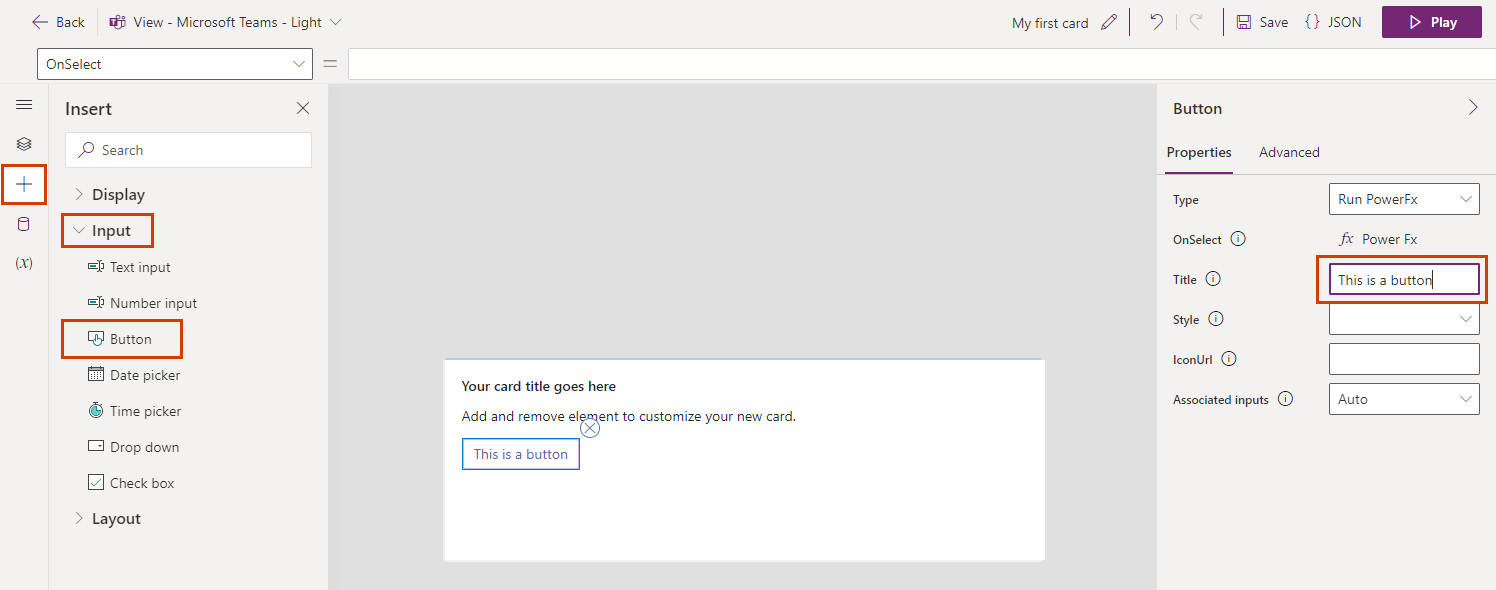
In the left pane of the card designer, select Insert.
In the tool pane, select the Input category to expand it, and then select Button to add a button to your card.
In the properties pane, enter a Title to display as the button label. Edit the other properties as needed.
Button types
You can add four types of buttons to your cards:
- Run PowerFx
- Show Screen
- Open Url
- Toggle Visibility
Run Power Fx
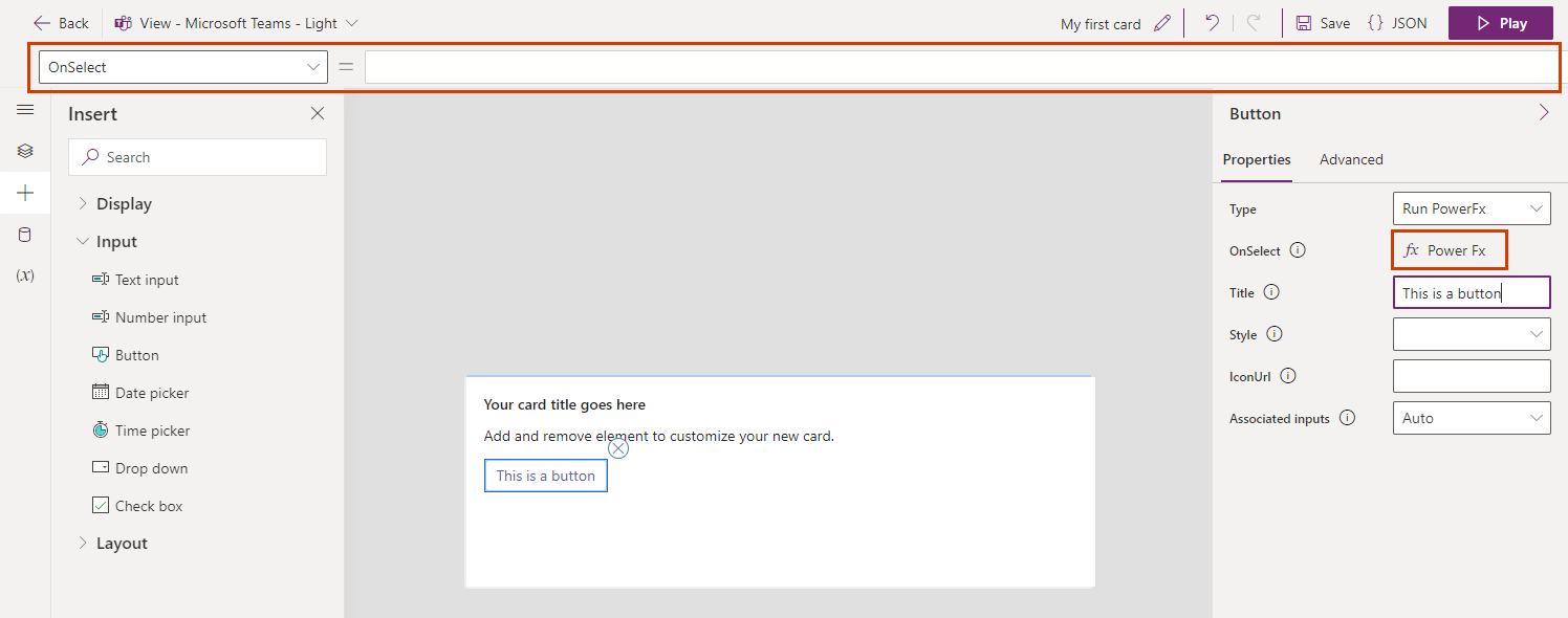
Use a Run PowerFx button to run Power Fx expressions. Learn more about Power Fx and the functions and formulas you can use in an expression.
Select the Power Fx link in the button properties pane to start entering an expression in the formula bar.
Show Screen
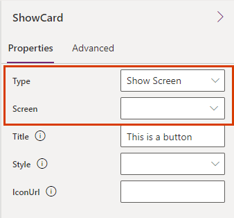
Use a Show Screen button to display a specific screen beneath the current view. Learn about screens in Power Apps.
In the button properties pane, set the Type to Show Screen, and then select a Screen to open. If you don't have any screens yet, only main will appear in the list.
Open Url
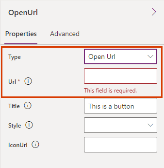
Use an Open Url button to open a web page.
In the button properties pane, set the Type to Open Url and then enter a Url.
Toggle Visibility
Use a Toggle Visibility button to show or hide other controls in the card.
In the button properties pane, set the Type to Toggle Visibility.
Select the Target Elements tab, and then select + Add new.
Enter the ElementID and toggle the Visibility property to make the element visible or invisible.
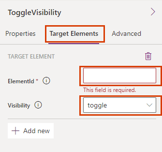
Continue to add elements as needed.