Note
Access to this page requires authorization. You can try signing in or changing directories.
Access to this page requires authorization. You can try changing directories.
Building experiences where tasks can be completed quickly and effectively is crucial to user satisfaction.
Model-driven apps provide many options to build good user experiences, including:
- Application-level options.
- Site map organization options.
- Many form-creation options.
This article shows how to design highly efficient and productive forms in a model-driven app, including how to work with:
- Main forms.
- Main form dialogs.
- Form component controls.
- Quick create forms.
- Quick view forms.
Form layout and design are important to building better forms. However, it's also important to build forms that load quickly and allow for fast navigation within the form and across tabs.
We also recommend an understanding of best practices for optimizing form performance and how to make forms load fast in your model-driven app. More information: Design forms for performance in model-driven apps
Working with main forms
Main forms are used in a model-driven app when working with and editing a specific record's data for a table to ensure that users interacting with that record stay within the constraints of the table structure.
Building around table data
A form allows an app maker to build around the table data, and often requires that you work with and interact with related records from other tables. One important consideration is how a model-driven form is bound to data. The out-of-the-box controls for a form are bound to fields from the table. These controls allow rapid development of a form for creating and editing data, but without more customization they aren't as flexible when using a form for multiple tasks that need user input, or where additional action is required before saving information.
Use of related data
One of the strengths of model-driven forms is the ease of use with standard (out-of-the-box) controls like lookups, subgrids, and reference panels to quickly view or edit related records. Forms also support custom Power Apps component framework controls to extend functionality beyond the standard controls. Forms primarily support child or secondary data relationships for a record; they don't easily support tertiary or higher-order relationships. For example, if there is an account record that has a one-to-one or one-to-many relationship with contacts, interactions with both the parent and child data can be quickly added with a form by using lookups that interact with other forms, including a main form dialog or embedded forms like a quick view or form component control. Each of these form types will be covered in more detail later in this article.
Working with related data requires configuration, including using a main form dialog to work with related records of the main form dialog or using a custom canvas page. Multiple-entity forms can be created by using main form dialogs or form component controls. However, a main form doesn't directly support tertiary-related records on the main form.
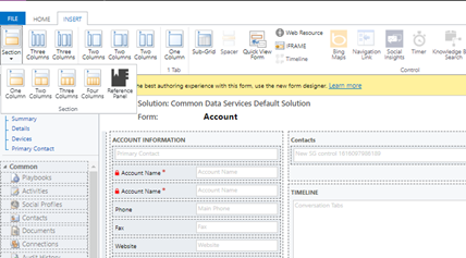
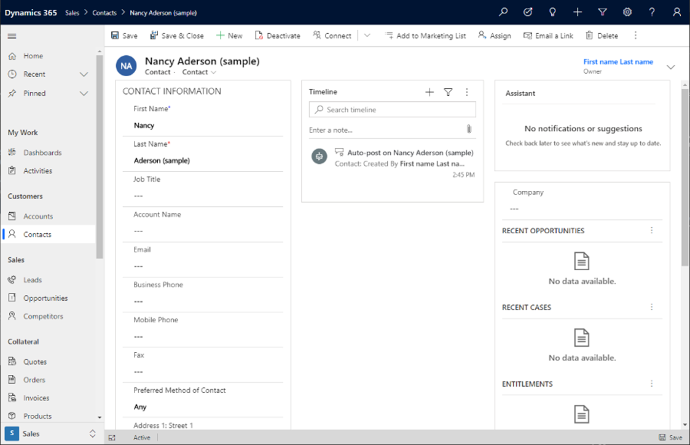
Understanding the main form layout
The following image shows the layout of a Unified Interface application.
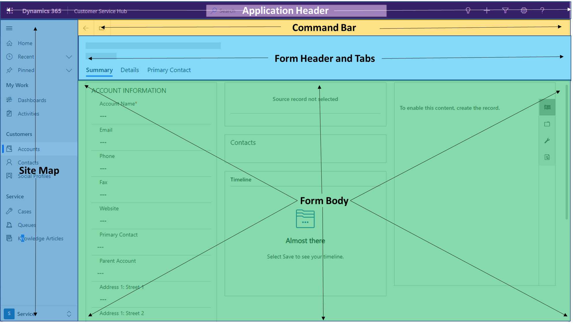
Visual elements that are not a part of the form
- The application header is part of the overall page structure of a model-driven app. The app header contains the application name and app-level actions, which include search, help, assistance, quick create forms, settings (personal and app level for admins), and so on.
- The application site map contains navigation across the application to pages that are included in your application. The navigation experience provided by the site map offers a quick way to access other areas of your application.
- The form command bar is also not part of the main form. It can be configured and set up by using the Ribbon Workbench community plug-in for XrmToolBox. Navigation and interaction on the form can be customized. Several out-of-the-box options include saving, creating a new record, sharing, merging, editing multiple records, and so on.
Note
Resources created by the community aren't supported by Microsoft. If you have questions or issues with community resources, contact the publisher of the resource.
Visual elements that are a part of the form
- The form header is part of the form. It includes the table and record name, the ability to switch to additional forms for the table, four read-only fields of the record, and the tabs included on the form. Forms only appear in the form selector if they've been enabled and added to the app. More information: Create and design model-driven app forms.
- Form headers also have a mode where more than four fields can be added and provide a simple navigation to edit the fields in the header and any additional field you want a user to easily access from the form header. Additional tabs should be used to access information that isn't primary to the task at hand, or to focus the user on data or information that's specific to a given task but isn't primary to the job. Information that's necessary and is primary to working with data should be on the first tab and should not be hidden.
- The form body is the area on the form that should be used to interact with data of the record and any related records that are essential to completing a task. We recommend that you limit the data to the top tasks that need to be done on the first tab and move secondary tasks to additional tabs. building forms based on specific business needs and roles should also be considered when designing your application.
If some data is rarely used you should consider building another form that can be accessed when a user needs to reference that data or information.
Important
Form footers are deprecated with the 2021 Release Wave 2 (August 2021 Preview / October 2021 GA). Remove any controls you have added out of the footer.
Example scenario of productive form design
The following scenario demonstrates the best use of a model-driven main form over data that uses the available controls.
Imagine a scenario where a salesperson needs to maintain data for an account that also has the following form components:
- A primary contact (lookup).
- Additional contacts (subgrid).
- A reference panel where a user can select to see lists of related records with access to read-only views (quick view) in the reference panel. The reference panel includes a timeline control that's used to quickly access and create activities for that record.
This form is in regular use, so it is worth spending time on the layout to ensure it is simple and efficient to operate.
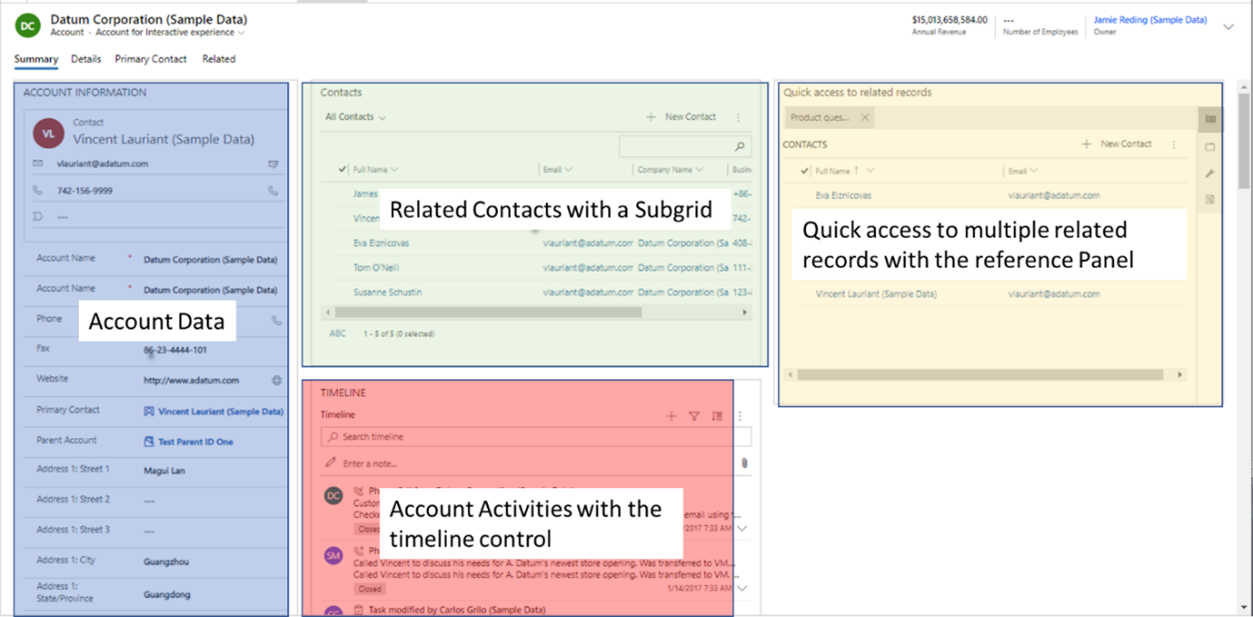
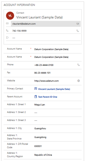
Account data
The first section on the form contains the fields that are used to manage the data and information for that record. Here, a user can quickly review and edit information they use throughout their workday. Points to note:
- Required fields and most-used fields are at the top of this section.
- A quick view form of the primary contact is added at the top so users can quickly view and use the information to contact the individual who's important for their daily tasks.
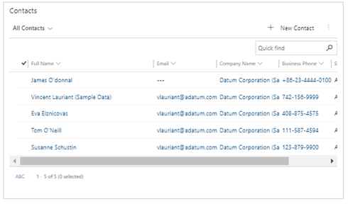
Related contacts with a subgrid
To the right of the account information section is the contact table subgrid. It shows all the contact records that are related to the main record. This allows the user speedy interaction with the contact record related to the account.
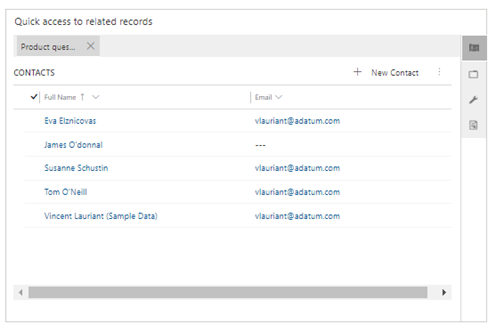
Quick access to multiple related records with the reference panel
Next to the contact subgrid is the reference panel. This control can give even further access to related records that go beyond just the contacts. A subgrid helps drive data density and efficiencies when working across all related records of the main form. In this example, the reference panel includes contacts, opportunities, leads, and products. One limitation of the reference panel is that it only provides read-only views of records. It doesn't support a main form of a related record like a main form dialog or a form component does. Reference panels are best used when you want to quickly view information of a related record.
Currently, you add a reference panel control by using the classic form designer. On the Insert tab, expand Sections, and then select Reference panel.
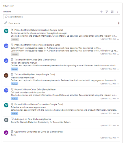
Account activities with the timeline control
Below the contacts subgrid is the activities timeline wall. The timeline control allows a user to quickly view recent information about activities that have an activity record associated to the account. Available activities found in a timeline are emails, phone calls, notes, appointments, and tasks. Users can also send new emails, log new phone calls, and add notes quickly and easily from the control. More information: Set up the timeline control
Working with data on a main form best practices
If additional requirements are added to data on the form that isn't configured on the table, it's important to make sure that the data that's required is always visible and editable—for example, a required field for a user that's based on a business rule. If a field is required and made read-only, it will block users from completing tasks and can create frustration and dissatisfaction. Although hidden and read-only components are supported by the Power Apps platform, it's important to know that if a user saves data on a form that includes a required field that isn't editable, the save will be processed. This ensures that a user is never blocked from completing a task based on a bad design pattern.
Hidden fields can be used like read-only fields and are handy when building data-dense forms. However, the same caution applies as when working with required fields: A required field may not be hidden if it can be null when editing a record. Business rules or events can be used to hide or show fields on a form; however, the form will behave the same as a read-only field when it's being saved. Model-driven forms will always allow for the save if a field is required but hidden on the form.
If data needs to always be available, regardless of the tab a user is on, it's vital to add that data to the header. It's important to know that the high-density headers in Unified Interface will only display up to four read-only fields. However, you can use the high-density headers with a flyout to add additional fields that also allow users to edit fields. This streamlines the experience to quickly access and edit information that you always want to make available without multiple clicks or additional navigation.
Building multiple-entity forms
The previous section provided good examples of how to work with data that's directly related to a record. However, what can drive even further efficiencies is working with related data directly from the main form, without navigating away. This keeps the user in context, and reduces friction and improves satisfaction by streamlining experiences using a main form dialog or a form component control.
The following sections walk through several scenarios that show how to build highly performant multiple-entity forms. The goal is to streamline user experiences that reduce clicks and unnecessary navigation, and speed up daily tasks that often require a user to interact with related records on a main form. Form components used for efficiency described here include:
- Main form dialog.
- Main form component control.
- Quick create form.
- Quick view form.
Using a main form dialog
Using a main form dialog is powerful when you need to have users access, and—more importantly—interact with, all the information of a related record. This includes when users need to work with a business process flow, access all the tabs, or access all the related records on the form. This is important when there are business processes that drive requirements on a related record that need to be followed to ensure data integrity. Users need access to timeline activities or related records of the child record without additional navigation. Note that a main form dialog can be configured directly from the lookup control and can be used on the command bars or with JavaScript by using the navigateTo client API. The dialog can be positioned on the left, middle, or right side of the page as a modal dialog overlay. More information: Open main form in a dialog using client API
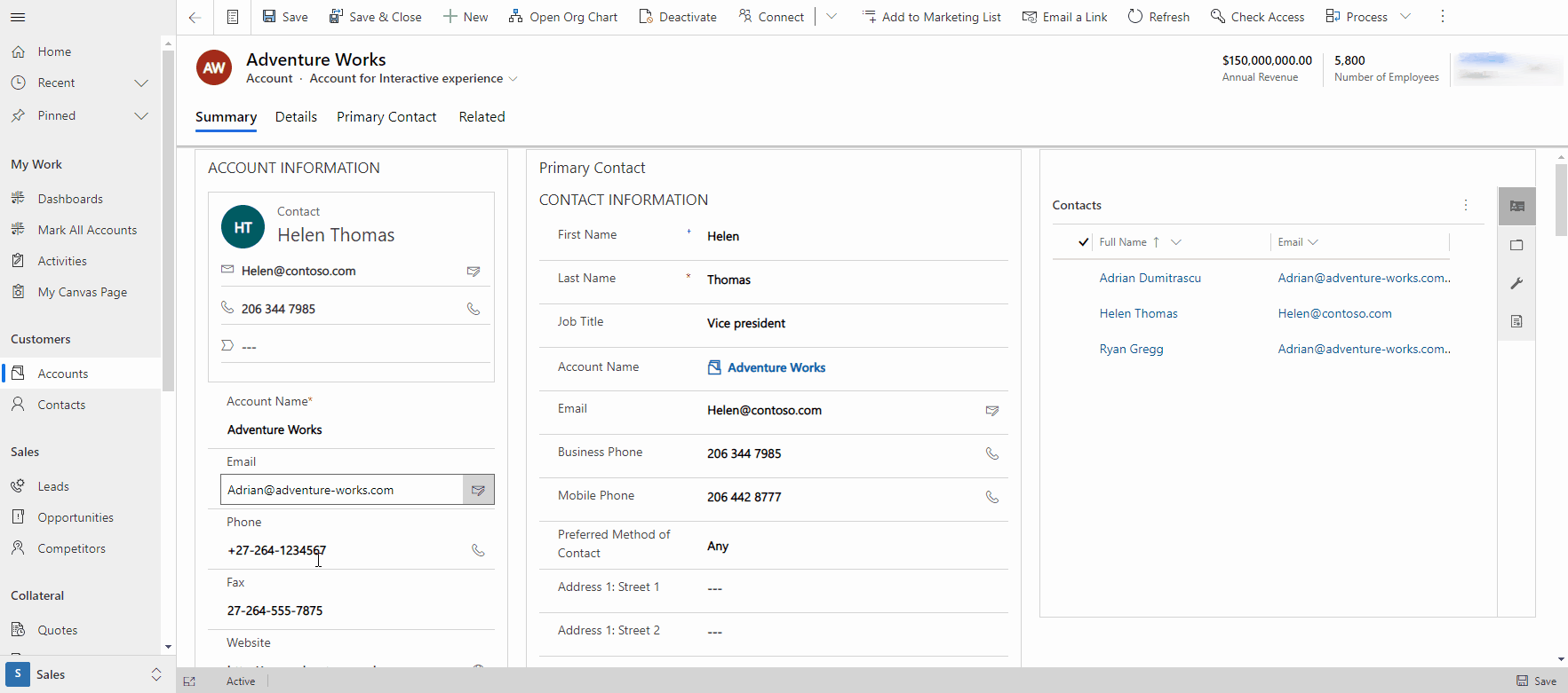
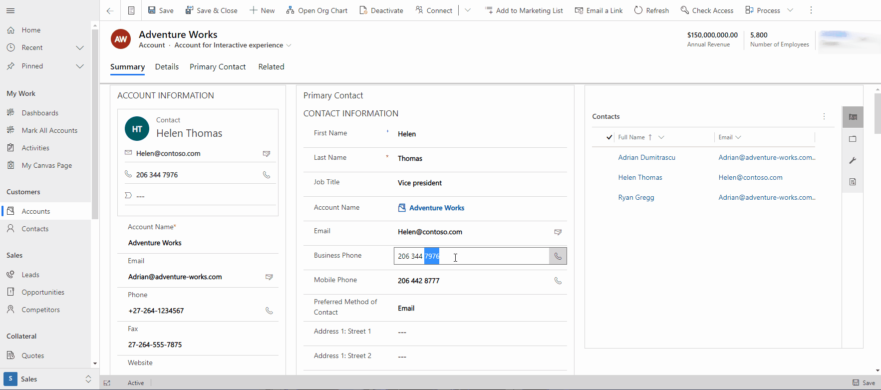
In this example, a user needs to access the primary contact record, update the phone number, add a note in the activities timeline, and create a new appointment from the contact form. To streamline this experience by reducing clicks and unnecessary navigation, the lookup control is configured to open the contact main form as a dialog. This example shows how the main form dialog can use quick create forms from the related record, incorporate duplicate records, and allow the user to fully interact with data on the related record.
Using the form component control
Often you only need to edit information on a related record that doesn't require the user to interact with the entire form and doesn't require an additional business process flow, but you don't want to give users the ability to navigate to the related form. To accomplish this scenario and streamline managing data inline on the main form, you can use a form component control. The form component control provides the user with access to the related record, including all the sections, controls, and fields on the related record form. Form components can also be used for specific actions with forms designed for only that task. An example of this is the Microsoft Dynamics Field Service Mobile experience. Form components are used to manage work orders and tasks related to those work orders in a streamlined and more efficient process.
Note that a form component control will use any form that you've created for that record and it will honor any event, including loading a form, saving data, or on change information. It will also honor any business rules and actions on the form, including opening a main form dialog from a lookup (if you've configured the form to work in that manner). It will also include any duplicate detection rules and parent/child relationships when working with data in the related record form component. The form control component promotes unsaved changes to the main form, and notifies users when a field is required and if there are data entry errors on the related form component. More information: Edit related table records directly from another table’s main form
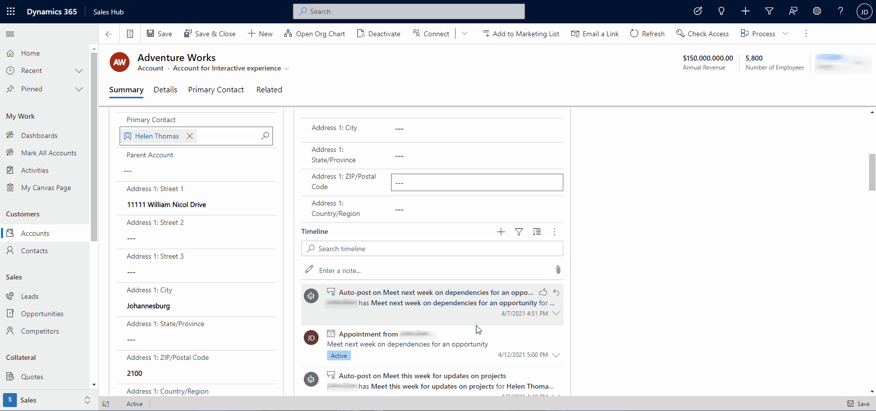
In this example, a user is editing the primary contact information directly on the account main form and scrolls down the form to create a new appointment for the primary contact without leaving the account form.
Using quick create forms
There will be times when you want to create an experience where users can quickly create records without additional navigation or clicks. A quick create form is a good solution for this. It can be used in multiple scenarios, which include creating appointments from an activity timeline wall, creating a contact from a lookup if a main form dialog isn't needed, or quickly creating a record—like an account or contact that doesn't require additional relationships for data integrity—from a view page (app menu + option). More information: Create or edit model-driven app quick create forms for a streamlined data entry experience
In the following example, a user needs to quickly create a lead by using the + menu option in the app header.
In this example, the quick create form is used to create an appointment for a contact from the timeline wall.
In this example, a user can quickly create an opportunity from a quote record form by using a lookup control.
Note
Opportunity and quote tables require a Dynamics 365 customer engagement app, such as Dynamics 365 Sales.
Using quick view forms to see data from related tables
In many scenarios, a user just needs to quickly view information from a related table without having to interact with it. To facilitate these scenarios, you can use quick view forms. An example of where a quick view form is used is in the reference panel of a main record. This demonstrates the power of accessing multiple related records without having to navigate away.
Note
While it is called a quick view form, it is in principle, a read only view of data. Users can't use this control to edit data.
More information: Create a model-driven app quick view form to view information about a related table
Using form display options to simplify forms
There are many times when you need to build an experience that focuses the user on the task at hand without additional distraction that might cause inefficiency. This is especially important when you're working with tables and records that have global components, which are created and automatically added to forms regardless of the task you're trying to build. Although this provides a shareable and easy-to-build infrastructure that drives consistency across an app, it does at times provide unnecessary distraction.
Form display options should be used when you want to lessen the number of actions, focus a user to complete a task, and reduce clutter by removing unnecessary components. Components that can be removed from a form include the command bar, the header body, and the form tabs.
All these types of options are only available via the client API and manual formxml updates. Manual formxml manipulation can cause issues importing solutions if done incorrectly. Remove global form components carefully when designing your form.
Navigation considerations
When certain components are hidden like the command bar or the tab list, this may remove navigation that might be necessary to complete a task. Be sure to account for those requirements in your form design by using additional controls created with the Power Apps component framework.
In this example, the command bar has been removed to reduce any unnecessary actions when working with an account. The command bar would ordinarily be shown as follows.

This form has been designed to not need the command bar, so the maker has removed it to keep the user on task. More information: setCommandBarVisible (Client API reference)
In this example, the header has been removed to promote a dense form that focuses the user on record details. This should only be used if the header doesn't provide additional value or displays information that doesn't always need to be available to a user. More information: setBodyVisible (Client API reference)
In this example, the tabs have been removed. This can be helpful when you build a form that only has a single tab or you want to focus the user on the first tab of a form without the distractions of additional tabs that can lead to loss in productivity for a specific task. More information: setTabNavigatorVisible (Client API reference)
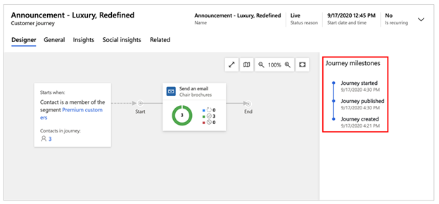
Form display option to use the entire space of a tab
In many scenarios, a form might exist with a tab and a single control, and you want that control to take up the entire available space within the body of the form on that tab. This can be done by using the form display option that allows the first control on a page in a tab to expand the full height and width of the form. All existing reflow rendering across view port sizes from large to small is honored, and will behave like a regular form except that the control will use the entire space. In this example, the Dynamics 365 Marketing application supports a full tab layout for the customer journey experience. The command bar is removed to further reduce clutter and ensure that the user is focused on the task of managing customer journeys in the application. More information: setContentType (Client API reference)