Note
Access to this page requires authorization. You can try signing in or changing directories.
Access to this page requires authorization. You can try changing directories.
The Employee Hiring and History built-in sample contains a report and semantic model for a human resources department.

Human resources departments have the same reporting model across different companies, even when they differ by industry or size. This sample looks at new hires, active employees, and employees who have left. It strives to uncover any trends in the hiring strategy. The main objectives are to understand:
- Who you hire
- Biases in your hiring strategy
- Trends in voluntary separations
This sample is part of a series that shows how you can use Power BI with business-oriented data, reports, and dashboards. The company obviEnce created samples using real, anonymized data. The data is available in several formats: built-in sample in the Power BI service and .pbix Power BI Desktop file. See Samples for Power BI.
This tour explores the Employee Hiring and History built-in sample in the Power BI service. Because the report experience is similar in Power BI Desktop and in the service, you can also follow along by using the sample .pbix file in Power BI Desktop.
Prerequisites
You don't need a Power BI license to explore the samples in Power BI Desktop. You just need a Fabric free license to explore the sample in the Power BI service, and save it to your My workspace.
Get the sample
Before you can use the sample, get the sample in one of the following ways:
- Get the built-in sample in the service.
- Download the .pbix file.
Get the built-in sample
Open the Power BI service (
app.powerbi.com), and select Learn in the left navigation.On the Learning center page, under Sample reports, scroll until you see Employee Hiring and History.
Select the sample. It opens the report in Reading mode.
Power BI imports the built-in sample, adding a report and a semantic model to your My workspace.
Get the .pbix file for this sample
Alternatively, you can download the Employee Hiring and History sample as a .pbix file, which is designed for use with Power BI Desktop.
Open the GitHub Samples repository to the Employee Hiring and History sample .pbix file.
Select Download in the upper-right corner. It downloads automatically to your Downloads folder.
If you'd like to view it in the Power BI service, you can publish it there.
Open the file in Power BI Desktop and select File > Publish > Publish to Power BI or choose Publish in the Home ribbon.
In the Publish to Power BI dialog box, choose a workspace, and then Select.
Power BI imports the sample, adding the report and semantic model to your selected workspace.
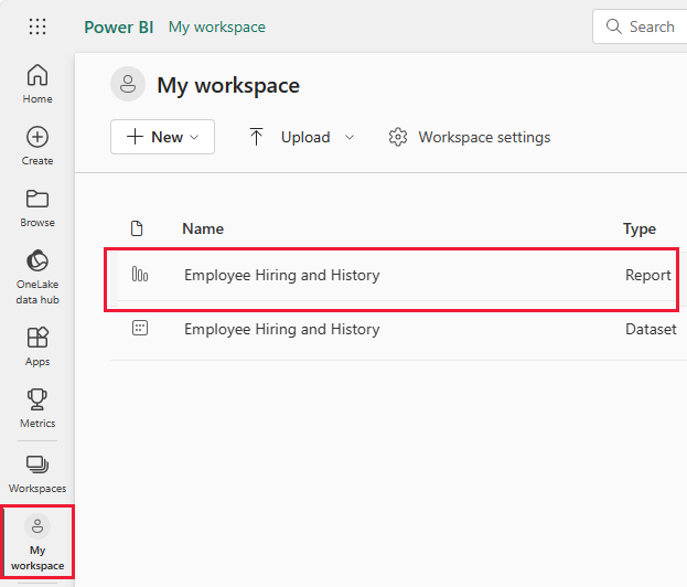
Explore the report
To open the Employee Hiring and History report, go to your workspace and select that report:
If you're following along in Power BI Desktop, open the .pbix file to see the report.
You can edit current visualizations and create your own visualizations that use the semantic model for this sample. This environment is a safe one to play in, because you can choose not to save your changes. But if you do save them, you can always return to the Learning center for a new copy of this sample.
Select Edit in the Power BI header bar to explore in the editing view:
- See how the pages are made, the fields in each chart, and the filters on the pages.
- Add pages and charts, based on the same data.
- Change the visualization type for each chart.
- Pin charts of interest to your dashboard.
Save or discard your changes.
Look at new hires
This report has a page called New Hires that has useful visualizations.
In the Power BI service, select the New Hires page. The upper left visualization shows Hires by Type.
Select YoY to see year-over-year comparing new hires and new hires for the same period last year.
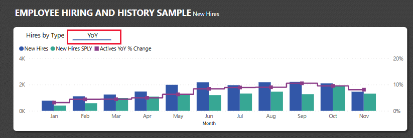
Hover over the elements in the visualization for details as tooltips.
Under New Hires by AgeGroup and Gender, select an element of the visualization. The other visualizations now include only the selected data.
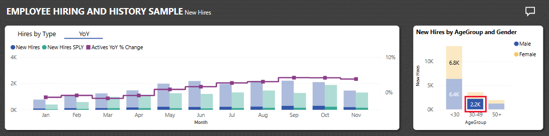
The table of data also reflects your choice in New Hires by AgeGroup and Gender.
Select whitespace to clear your selection and see all values again.


Look at separation data
You can explore the data for employees who no longer work for the company.
In the report view, select Actives and Separations.
In the upper left, compare voluntary and involuntary separations in a donut visualization. Select one or the other value to view only that data in the other visualizations of the page. Select whitespace to clear your previous selection.
To the right, view separations by month, with comparisons to the same period last year.

Select involuntary separations for June.

You can look at the raw data in the matrix. You can select voluntary, involuntary, or same period last year for any month to specific data.


Suppose you don't want to view numeric data. Instead, you can choose from many visualizations.
Select Edit to open the report in Edit mode.
Select the matrix visualization.
Choose a visualization. This example uses a clustered bar chart.
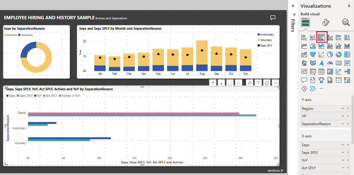
Try different visualizations to find one that makes your data easy to understand.
Select Reading view to leave Edit mode. Be sure to save your changes.

Review data for bad hires
Another area to explore is bad hires. Bad hires are defined as employees who didn't last for more than 60 days. You're hiring rapidly, but are you hiring good candidates? In the report, select the Bad Hires page. You can see several visualizations showing data by gender, age, and group.

Look at the BadHires YoY % changes by Month and AgeGroups visualization.

The line visualization shows variation by month for the selected age group. You can look at the raw numbers in the matrix to try to determine if there are underlying causes to the variation.
Use report pages as tooltips
Power BI report visualizations display details about elements when you hover over them. For instance, in the Employee Hiring and History report on the Bad Hires page, hover over a point in the Bad Hires YoY % Change by Month and AgeGroup line chart.
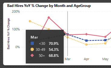
These values are the defaults, but you can add any field from the semantic model to appear in a tooltip, or multiple fields. For more information about tooltips, see Customize tooltips in Power BI.
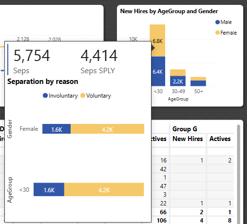
Power BI also supports a report page as a tooltip. To see an example, select the Actives and Separations page, and hover over Seps by SeparationReason. You can see a tooltip for the Voluntary field.
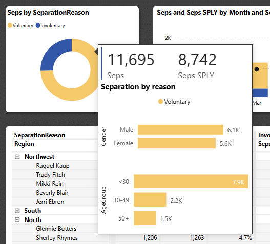
Then hover over the Involuntary field.
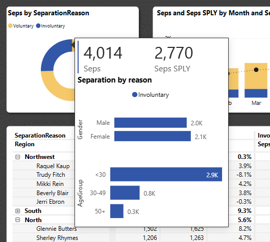
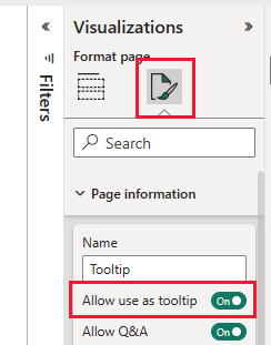
Now look at the report page itself. Under Pages, select Tooltip. This page contains a card visualization and two stacked bar charts. It could contain as many visualizations as you want, but keep in mind that a large page covers up more of your report.
To add this report page as a tooltip to another visualization, follow these steps.
Select Edit to open the report in Edit mode.
Select the Tooltip tab at the bottom.
Right-click the tab and select Hide Page.
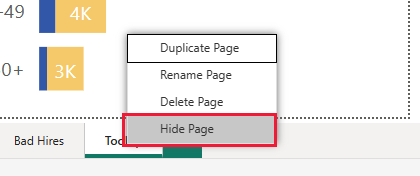
The page no longer appears in the report. You can only see or edit it in Edit mode.
Under Visualizations, select the Format page icon and then expand Page information. Select Allow use as tooltip.
Select the New Hires tab and then select the New Hires by AgeGroup and Gender visualization. This chart doesn't have a tooltip specified.
Under Visualizations, select Format visual > General, then expand Tooltips.
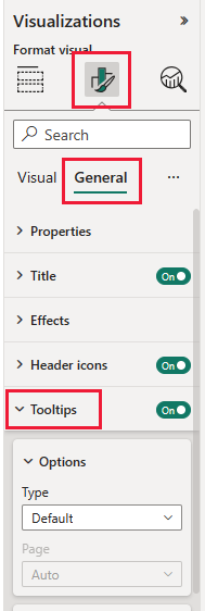
For Type, select Report page, then select Tooltip for Page.
Select Reading view to leave Edit mode. Be sure to save your changes.
If you hover over the New Hires by AgeGroup and Gender visualization, the report page appears.
For more information, see Create tooltips based on report pages.
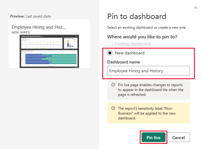
Create an Employee Hiring and History dashboard
A Power BI dashboard is a single page that contains visualizations that can come from one or more reports, and each report is based on one semantic model. You can also generate visualizations on the dashboard by using the Q&A Ask a question about your data feature to explore the data associated with a report. Think of a dashboard as an entryway into the underlying reports and semantic models. Select a visualization to take you to the report that was used to create it.
To create a dashboard in the Power BI service:
Open a report by selecting it in a workspace.
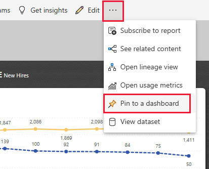
To add all of the visualizations in a page to a dashboard, from the report menu, select ... (More options) > Pin to a dashboard.
Or, to add a single visualization to a dashboard, hover over it and then select Pin visual.
In Pin to dashboard, select New Dashboard and enter a name for your dashboard.
You can add visuals to an existing dashboard to show visualizations from different reports.
Then select Pin live.
Your new dashboard now appears in My workspace.
For more information, see Introduction to dashboards for Power BI designers.
Ask questions of the data
A dashboard offers the ability to ask questions about data in natural language to create visuals. It doesn't matter how you create your dashboard or which tiles it has. You can ask questions about any semantic model attached to your dashboard.
In the dashboard, select Ask a question about your data.
Even before you start typing, the dashboard displays suggestions to help form your question. Select what is the seps by region seq.
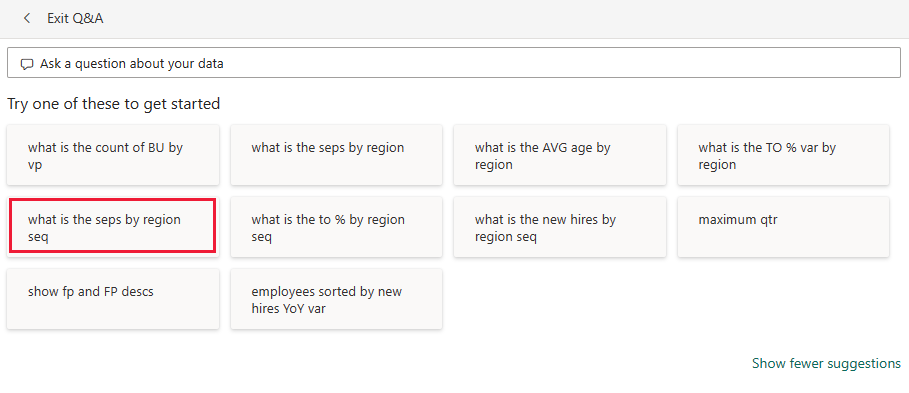
The dashboard displays the result.

Now replace that question with show age group, gender, and bad hires SPLY where region is East.

If desired, select Pin visual to add this visual to a new or existing dashboard.
Select Exit Q&A to return to the dashboard.


Related content
This environment is a safe one to play in, because you can choose not to save your changes. But if you do save them, you can always return to the Learning center for a new copy of this sample.
We hope this tour has shown how Power BI dashboards, Q&A, and reports can provide insights into sample data. Now it's your turn. Connect to your own data. With Power BI, you can connect to a wide variety of data sources. To learn more, see Get started with the Power BI service.