Retail Analysis sample for Power BI: Take a tour
Note
For an updated version of this sample, see Store Sales sample for Power BI: Take a tour.
The Retail Analysis built-in sample contains a dashboard, report, and semantic model that analyzes retail sales data of items sold across multiple stores and districts. The metrics compare this year's performance to last year's for sales, units, gross margin, variance, and new-store analysis.
This sample is part of a series that shows how you can use Power BI with business-oriented data, reports, and dashboards. The company obviEnce created this sample using real, anonymized data. The data is available in several formats: built-in sample in the Power BI service, .pbix Power BI Desktop file, or Excel workbook. See Samples for Power BI.
This tutorial explores the Retail Analysis sample in the Power BI service. Because the report experience is similar in Power BI Desktop and in the service, you can also follow along by using the sample .pbix file in Power BI Desktop. Get the sample in one of the following ways:
- Get the built-in sample in the service.
- Download the .pbix file.
- Download the Excel workbook.
Prerequisites
You don't need a Power BI license to explore the samples in Power BI Desktop. You just need a Fabric free license to explore the sample in the Power BI service, and save it to your My workspace.
Get the built-in sample in the Power BI service
Open the Power BI service (
app.powerbi.com), and select Learn in the left navigation.On the Learning center page, under Sample reports, scroll until you see the Retail Analysis Sample.
Select the sample. It opens in Reading mode.
Power BI imports the built-in sample, adding a new dashboard, report, and semantic model to your current workspace.

Select the dashboard to view the sample dashboard.
Get the .pbix file for this sample
Alternatively, you can download the Retail Analysis sample as a .pbix file, which is designed for use with Power BI Desktop.
After you open the file in Power BI Desktop, select File > Publish > Publish to Power BI or choose Publish in the Home ribbon.
In the Publish to Power BI dialog, choose a workspace and then Select.
In the Power BI service, in your workspace, scroll down to the Retail Analysis Sample report and select to open.
From the More options (...) menu, select Pin to a dashboard. Select New dashboard, enter a name, and choose Pin live.
The dashboard that you create this way isn't the same as the sample dashboard created by the built-in sample. You can still use Q&A in the dashboard to learn more about your data and make changes to your dashboard.
Get the Excel workbook for this sample
If you want to view the data source for this sample, it's also available as an Excel workbook. To see the raw data, enable the Data Analysis add-ins, and then select Power Pivot > Manage.
If you want to get and use the Excel file in the Power BI service, follow these steps:
Download the sample from Power BI Desktop samples. The file is called Retail Analysis Sample-no-PV.xlsx.
Open the file in Excel and then select File > Publish > Publish to Power BI.
Select a workspace, such as My workspace, and choose Export.
There are different ways to work with Excel files. For more information, see Explore the Excel samples in Excel.
In the Power BI service, the exported data appears as a semantic model in the selected workspace. Select More options (...) > Auto-create report.
Select Save, enter a name for your report, and then choose Save.
From the More options (...) menu, select Pin to a dashboard. Select New dashboard, enter a name, and choose Pin live.
The dashboard and report that you create this way aren't the same as the ones created by the built-in sample. You can still use Q&A in the dashboard to explore your data and make changes to your dashboard.
Use Q&A to dig deeper in the dashboard
No matter whether you downloaded the dashboard or created your own, you can use Q&A in the dashboard to discover other details in the data. Let's try it.
On the dashboard, select the This Year's Sales New & Existing Stores tile.
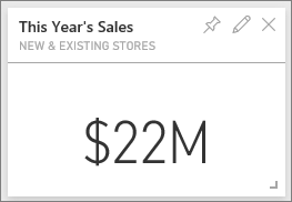
If your dashboard doesn't have that tile, type This year sales in the Q&A question box at the top of the dashboard. The Q&A results appear:
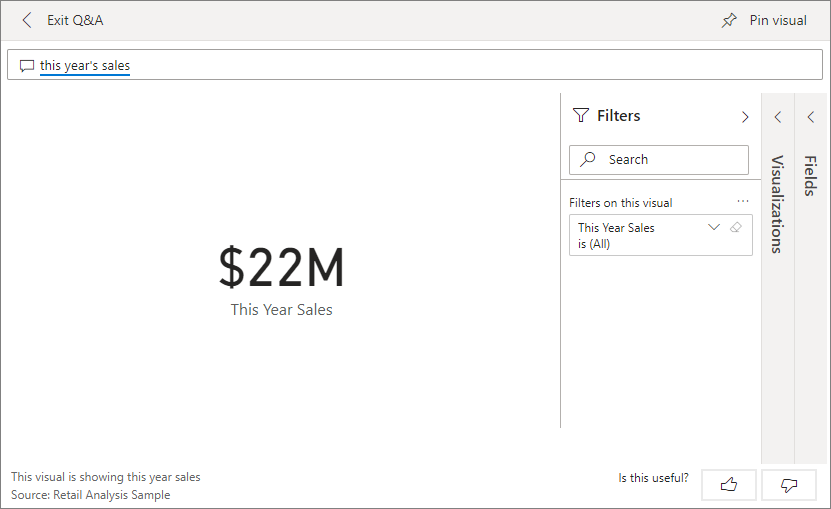
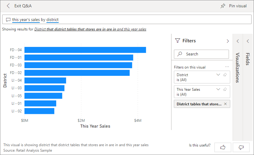
Change the question to this year's sales by district. Observe the result. Q&A automatically places the answer in a bar chart:
Now change the question to this year's sales by zip and chain.
Power BI answers the question as you type and displays the appropriate chart.
Experiment with more questions and see what kind of results you get.
When you're ready, return to the dashboard.
Explore the report
If you got the built-in report in the Power BI service or you published the .pbix file from Power BI Desktop, your report corresponds to the sample in this section. If you imported from Excel, your automatically generated report won't look as described.
Store Sales Overview page
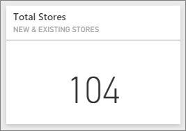
If you got the built-in report in the Power BI service, in the workspace where you saved the sample, open the Retail Analysis Sample dashboard. On the dashboard, select the Total Stores New & Existing Stores tile, which opens to the Store Sales Overview page in the Retail Analysis Sample report.
If you published the .pbix file from Power BI Desktop, open the Store Sales Overview page of the report.
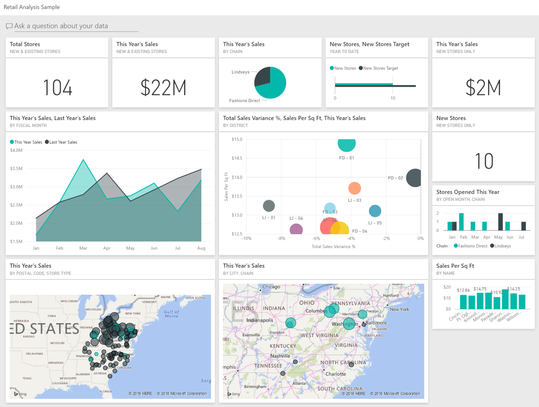
On this report page, you see we have a total of 104 stores, 10 of which are new. We have two chains, Fashions Direct and Lindseys. Fashions Direct stores are larger, on average.
In the This Year Sales by Chain pie chart, select Fashions Direct.
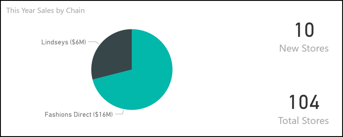
Notice the result in the Total Sales Variance % bubble chart:
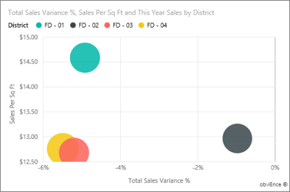
The FD-01 district has the highest average Sales per Square Foot and FD-02 has the lowest Total Sales Variance compared to last year. FD-03 and FD-04 are worst performers overall.
Select individual bubbles or other charts to see cross highlighting, revealing the effect of your selections.
To return to the dashboard, select Retail Analysis Sample from the left navigation bar.

Explore the District Monthly Sales page
Let's explore on a more detailed level, looking at the districts' performances.
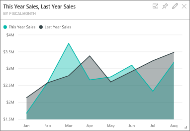
On the dashboard, select the This Year's Sales, Last Year's Sales tile, which opens the District Monthly Sales page of the report.
If you published the .pbix file from Power BI Desktop, open the District Monthly Sales page of the report.
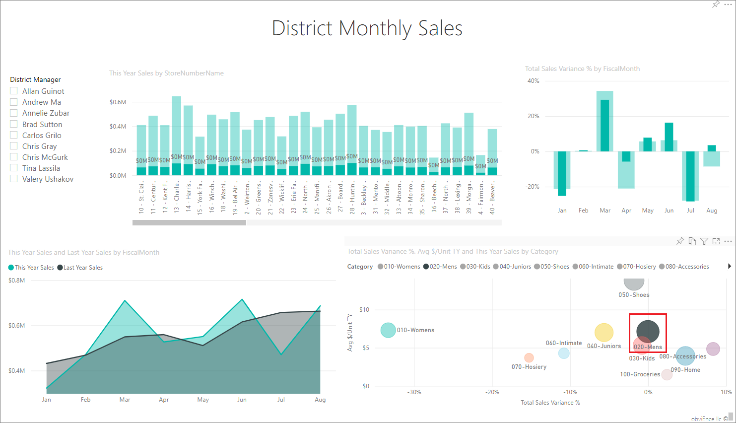
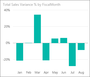
In the Total Sales Variance % by Fiscal Month chart, notice the large variability on variance % compared to last year, with January, April, and July being particularly bad months.
Let's see if we can narrow down where the issues might be.
In the bubble chart, select the 020-Mens bubble.
The men's category wasn't as severely affected in April as the overall business. January and July were still problematic months.
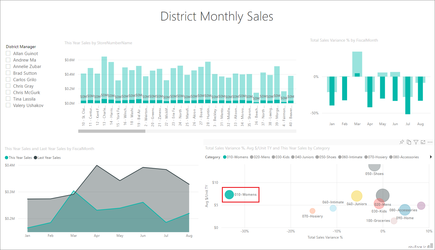
Select the 010-Womens bubble.
The women's category performed much worse than the overall business across all months, and in almost every month compared to the previous year.
Select the bubble again to clear the filter.
Try out the slicer
Let's look at how specific districts are doing.
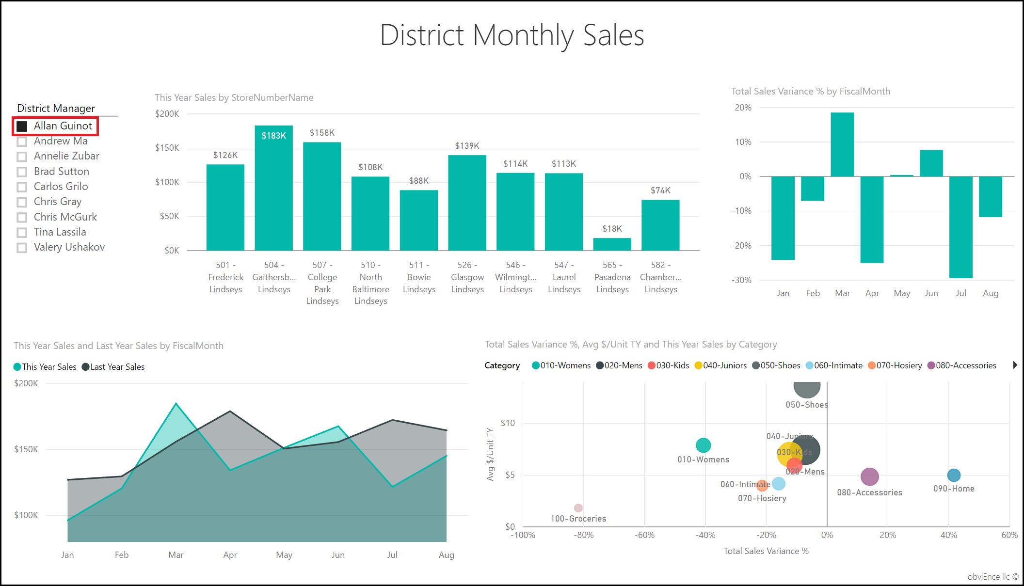
Select Allan Guinot in the District Manager slicer on the top left.
Allan's district outperformed in March and June, compared to last year.
With Allan Guinot still selected, select the Womens-10 bubble in the bubble chart.
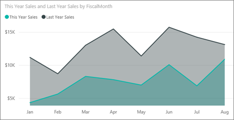
For the Womens-10 category, Allan's district didn't meet last year's volume.
Explore the other district managers and categories; what other insights can you find?
When you're ready, return to the dashboard.
What the data says about sales growth this year
The last area we want to explore is our growth by examining the new stores opened this year.
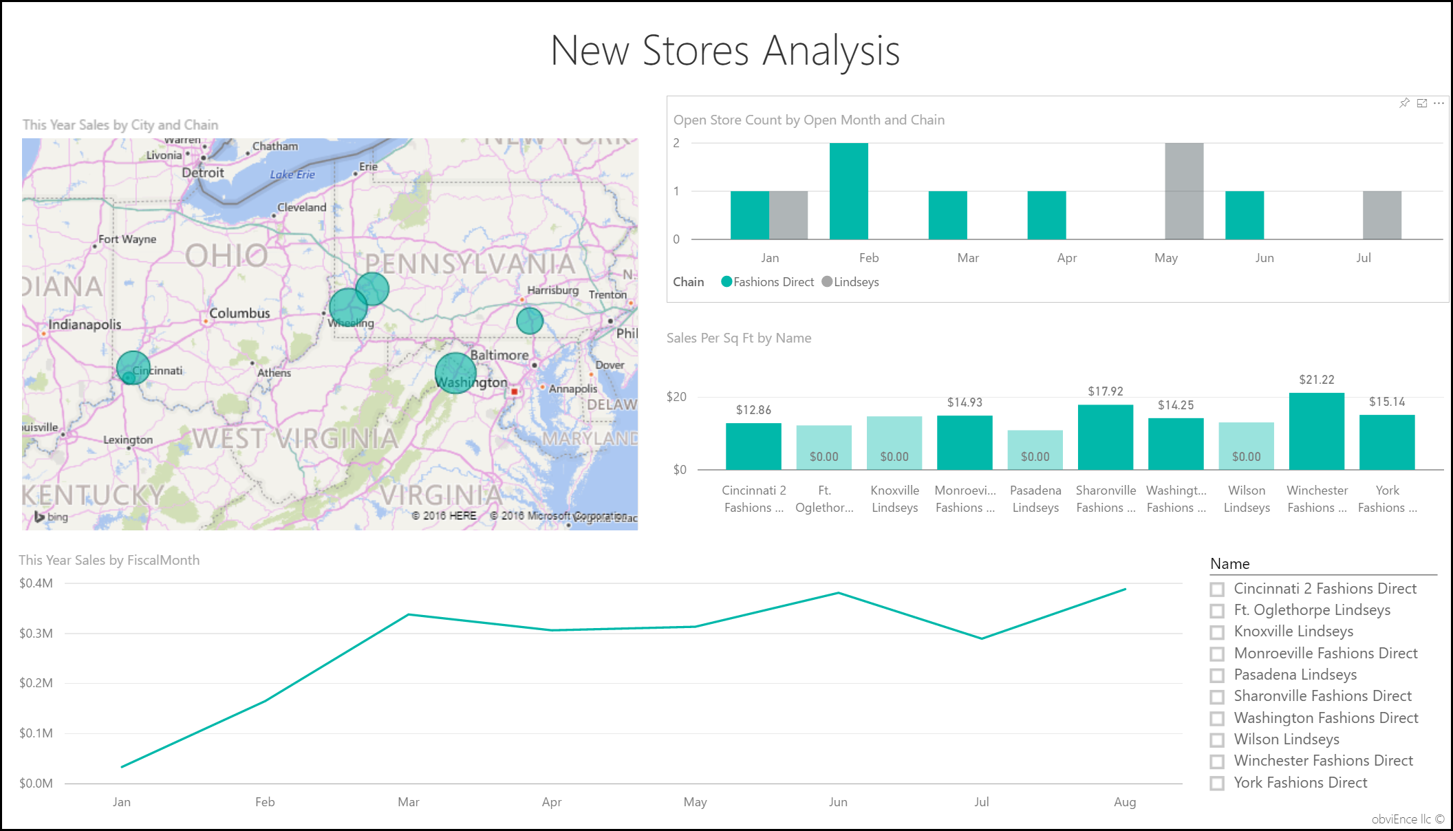
Select the Stores Opened This Year by Open Month, Chain tile, which opens the New Stores Analysis page of the report.
Or open the New Stores Analysis page of the report.
As evident from the tile, more Fashions Direct stores than Lindseys stores opened this year.
Observe the Sales Per Sq Ft by Name chart:

Notice the difference in average sales/square foot across the new stores.
Select the Fashions Direct legend item in the Open Store Count by Open Month and Chain top-right chart. Notice, even for the same chain, the best store (Winchester Fashions Direct) significantly outperforms the worst store (Cincinnati 2 Fashions Direct) by $21.22 vs $12.86, respectively.
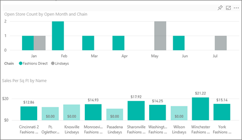
Select Winchester Fashions Direct in the Name slicer and observe the line chart. The first sales numbers were reported in February.
Select Cincinnati 2 Fashions Direct in the slicer and observe in the line chart that it opened in June and appears to be the worst performing store.
Explore by selecting other bars, lines, and bubbles throughout the charts and see what insights you can discover.
Related content
This environment is a safe one to play in, because you can choose not to save your changes. But if you do save them, you can always return to the Learning center for a new copy of this sample.
We hope this tour has shown how Power BI dashboards, Q&A, and reports can provide insights into sample data. Now it's your turn. Connect to your own data. With Power BI, you can connect to a wide variety of data sources. To learn more, see Get started with the Power BI service.
