Note
Access to this page requires authorization. You can try signing in or changing directories.
Access to this page requires authorization. You can try changing directories.
As a developer you can create your own Power BI visuals. These visuals can be used by you, your organization or by third parties.
In this tutorial, you develop a Power BI visual using React. The visual displays a formatted measure value inside a circle. The visual has adaptive size and allows you to customize its settings.
In this tutorial, you learn how to:
- Create a development project for your visual.
- Develop your visual using React.
- Configure your visual to process data.
- Configure your visual to adapt to size changes.
- Configure adaptive color and border settings for your visual.
Note
For the full source code of this visual, see React circle card Power BI visual.
Prerequisites
Before you start developing your Power BI visual, verify that you have everything listed in this section.
A Power BI Pro or Premium Per User (PPU) account. If you don't have one, sign up for a free trial.
Visual Studio Code (VS Code). VS Code is an ideal Integrated Development Environment (IDE) for developing JavaScript and TypeScript applications.
Windows PowerShell version 4 or later (for Windows). Or Terminal (for Mac).
An environment ready for developing a Power BI visual. Set up your environment for developing a Power BI visual.
This tutorial uses the US Sales Analysis report. You can download this report and upload it to Power BI service, or use your own report. If you need more information about Power BI service, and uploading files, refer to the Get started creating in the Power BI service tutorial.
Create a development project
In this section, you create a project for the React circle card visual.
Open PowerShell and navigate to the folder you want to create your project in.
Enter the following command:
pbiviz new ReactCircleCardNavigate to the project's folder.
cd ReactCircleCardStart the React circle card visual. Your visual is now running while being hosted on your computer.
pbiviz startImportant
To stop the visual from running, in PowerShell enter Ctrl+C and if prompted to terminate the batch job, enter Y, and press Enter.
View the React circle card in the Power BI service
To test the visual in Power BI service, we'll use the US Sales Analysis report. You can download this report and upload it to Power BI service.
You can also use your own report to test the visual.
Note
Before you continue, verify that you enabled the visuals developer mode.
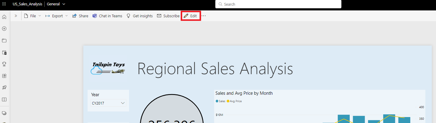
Sign in to PowerBI.com and open the US Sales Analysis report.
Select Edit.
Create a new page for testing, by clicking on the New page button at the bottom of the Power BI service interface.

From the Visualizations pane, select the Developer Visual.
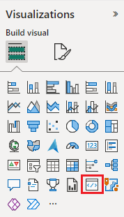
This visual represents the custom visual that you're running on your computer. It's only available when the custom visual debugging setting is enabled.
Verify that a visual was added to the report canvas.
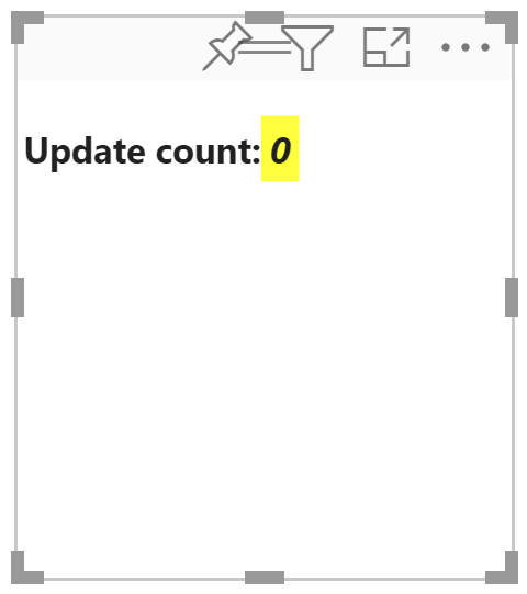
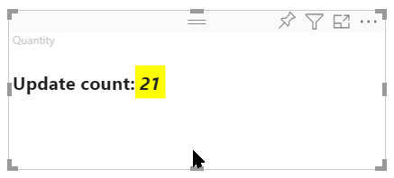
This is a simple visual that displays the number of times its update method has been called. At this stage, the visual does not retrieve any data.
Note
If the visual displays a connection error message, open a new tab in your browser, navigate to
https://localhost:8080/assets, and authorize your browser to use this address.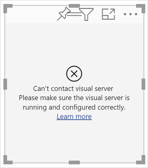
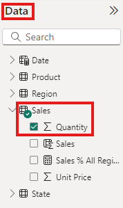
While the new visual is selected, go to the Data pane, expand Sales, and select Quantity.
To test how the visual is responding, resize it and notice that the Update count value increments every time you resize the visual.
Set up React in your project
In this section, you learn how to set up React for your Power BI visual project.
Open PowerShell and stop the visual from running by entering Ctrl+C. If prompted to terminate the batch job, enter Y, and press Enter.
Install React
To install the required React dependencies, open PowerShell in your ReactCircleCard folder, and run the following command:
npm i react react-dom
Install React type definitions
To install type definitions for React, open PowerShell in your reactCircleCard folder and run the following command:
npm i @types/react @types/react-dom
Create a React component class
Follow these steps to create a React component class.
Open VS Code and navigate to the reactCircleCard folder.
Create a new file by selecting File > New File.
Copy the following code into the new file.
import * as React from "react";

export class ReactCircleCard extends React.Component<{}>{
    render(){
        return (
            <div className="circleCard">
                Hello, React!
            </div>
        )
    }
}

export default ReactCircleCard;
Select Save As and navigate to the src folder.
Save the file as follows:
- In the File name field, enter component.
- From the Save as type drop-down menu, select TypeScript React.
Add React to the visual file
Replace the code in the visual.ts file with code that enables using React.
In the src folder, open visual.ts and replace the code in the file with the following code:
"use strict";
import powerbi from "powerbi-visuals-api";

import DataView = powerbi.DataView;
import VisualConstructorOptions = powerbi.extensibility.visual.VisualConstructorOptions;
import VisualUpdateOptions = powerbi.extensibility.visual.VisualUpdateOptions;
import IVisual = powerbi.extensibility.visual.IVisual;

// Import React dependencies and the added component
import * as React from "react";
import * as ReactDOM from "react-dom";
import ReactCircleCard from "./component";

import "./../style/visual.less";

export class Visual implements IVisual {

    constructor(options: VisualConstructorOptions) {

    }

    public update(options: VisualUpdateOptions) {

    }
}
Note
As default Power BI TypeScript settings don't recognize React tsx files, VS Code highlights
componentas an error.To render the component, add the target HTML element to visual.ts. This element is
HTMLElementinVisualConstructorOptions, which is passed into the constructor.In the src folder, open visual.ts.
Add the following code to the
Visualclass:
private target: HTMLElement; private reactRoot: React.ComponentElement<any, any>;- Add the following lines to the
VisualConstructorOptionsconstructor:
this.reactRoot = React.createElement(ReactCircleCard, {});
this.target = options.element;

ReactDOM.render(this.reactRoot, this.target);
Your visual.ts file should now look like this:
"use strict";
import powerbi from "powerbi-visuals-api";

import DataView = powerbi.DataView;
import VisualConstructorOptions = powerbi.extensibility.visual.VisualConstructorOptions;
import VisualUpdateOptions = powerbi.extensibility.visual.VisualUpdateOptions;
import IVisual = powerbi.extensibility.visual.IVisual;
import * as React from "react";
import * as ReactDOM from "react-dom";
import ReactCircleCard from "./component";

import "./../style/visual.less";

export class Visual implements IVisual {
    private target: HTMLElement;
    private reactRoot: React.ComponentElement<any, any>;

    constructor(options: VisualConstructorOptions) {
        this.reactRoot = React.createElement(ReactCircleCard, {});
        this.target = options.element;

        ReactDOM.render(this.reactRoot, this.target);
    }

    public update(options: VisualUpdateOptions) {

    }
}
Save visual.ts.
Edit the tsconfig file
Edit the tsconfig.json to work with React.
In the reactCircleCard folder, open tsconfig.json and add two lines to the beginning of the
compilerOptionsitem."jsx": "react", "types": ["react", "react-dom"],Your tsconfig.json file should now look like this, and the
componenterror in visual.ts should be gone.{ "compilerOptions": { "jsx": "react", "types": ["react", "react-dom"], "allowJs": false, "emitDecoratorMetadata": true, "experimentalDecorators": true, "target": "es6", "sourceMap": true, "outDir": "./.tmp/build/", "moduleResolution": "node", "declaration": true, "lib": [ "es2015", "dom" ] }, "files": [ "./src/visual.ts" ] }Save tsconfig.json.
Test your visual
Open PowerShell in the CircleCardVisual folder, and run your project:
pbiviz start
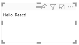
When you add a new Developer Visual to your report in the Power BI service, it looks like this:
Configure your visual's data field
Configure your visual's capabilities file so that only one data field can be submitted to the visual's Measure data field.
In VS Code, from the reactCircleCard folder, open capabilities.json.
The
ReactCircleCarddisplays a single value,Measure Data. Remove theCategory Dataobject fromdataRoles.After removing the
Category Dataobject, thedataRoleskey looks like this:"dataRoles": [ { "displayName": "Measure Data", "name": "measure", "kind": "Measure" } ],Remove all the content of the
objectskey (you'll fill it in later).After you remove its content, the
objectskey looks like this:"objects": {},Replace the
dataViewMappingsproperty with the following code.max: 1inmeasurespecifies that only one data field can be submitted to the visual's Measure data field."dataViewMappings": [ { "conditions": [ { "measure": { "max": 1 } } ], "single": { "role": "measure" } } ]Save the changes you made to capabilities.json.
Verify that
pbiviz startis running and in Power BI service, refresh your React Circle Card visual. The Measure data field can accept only one data field, as specified bymax: 1.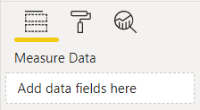
Update the visual's style
In this section, you turn the visual's shape into a circle. Use the visual.less file to control the style of your visual.
From the style folder, open visual.less.
Replace the content of visual.less with the following code.
.circleCard {
    position: relative;
    box-sizing: border-box;
    border: 1px solid #000;
    border-radius: 50%;
    width: 200px;
    height: 200px;
}

p {
    text-align: center;
    line-height: 30px;
    font-size: 20px;
    font-weight: bold;

    position: relative;
    top: -30px;
    margin: 50% 0 0 0;
}
Save visual.less.
Set your visual to receive properties from Power BI
In this section you configure the visual to receive data from Power BI, and send updates to the instances in the component.tsx file.
Render data using React
You can render data using React. The component can display data from its own state.
In VS Code, from the reactCircleCard folder, open component.tsx.
Replace the content of component.tsx with the following code.
import * as React from "react";

export interface State {
    textLabel: string,
    textValue: string
}

export const initialState: State = {
    textLabel: "",
    textValue: ""
}

export class ReactCircleCard extends React.Component<{}, State>{
    constructor(props: any){
        super(props);
        this.state = initialState;
    }

    render(){
        const { textLabel, textValue } = this.state;

        return (
            <div className="circleCard">
                <p>
                    {textLabel}
                    <br/>
                    <em>{textValue}</em>
                </p>
            </div>
        )
    }
}
Save component.tsx.
Set your visual to receive data
Visuals receive data as an argument of the update method. In this section, you update this method to receive data.
The following code selects textLabel and textValue from DataView, and if the data exists, updates the component state.
In VS Code, from the src folder, open visual.ts.
Replace the line
import ReactCircleCard from "./component";with the following code:import { ReactCircleCard, initialState } from "./component";Add the following code to the
updatemethod.if(options.dataViews && options.dataViews[0]){ const dataView: DataView = options.dataViews[0]; ReactCircleCard.update({ textLabel: dataView.metadata.columns[0].displayName, textValue: dataView.single.value.toString() }); } else { this.clear(); }Create a
clearmethod by adding the following code below theupdatemethod.private clear() { ReactCircleCard.update(initialState); }Save visual.ts
Set your visual to send data
In this section, you update the visual to send updates to instances in the component file.
In VS Code, from the src folder, open component.tsx.
Add the following code to the
ReactCircleCardclass:private static updateCallback: (data: object) => void = null; public static update(newState: State) { if(typeof ReactCircleCard.updateCallback === 'function'){ ReactCircleCard.updateCallback(newState); } } public state: State = initialState; public componentWillMount() { ReactCircleCard.updateCallback = (newState: State): void => { this.setState(newState); }; } public componentWillUnmount() { ReactCircleCard.updateCallback = null; }Save component.tsx.
View the changes to the visual
Test your React Circle Card visual to view the changes you made.
Verify that
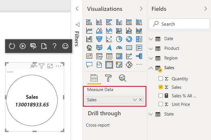
pbiviz startis running, and in the Power BI service, refresh your React Circle Card visual.Add Sales to the visual's Measure data field.
Make your visual resizable
Currently, your visual has fixed width and height. To make the visual resizable you need to define the size variable in both the visual.ts and component.tsx files. In this section, you make the visual resizable.
After you complete the steps outlined in this section, the circle diameter in your visual will correspond to the minimal width or height size, and you'll be able to resize it in Power BI service.
Configure the visual.ts file
Get the current size of the visual viewport from the options object.
In VS Code, from the src folder, open visual.ts.
Insert this code to import the
IViewportinterface.import IViewport = powerbi.IViewport;Add the
viewportproperty to thevisualclass.private viewport: IViewport;In the
updatemethod, beforeReactCircleCard.update, add the following code.this.viewport = options.viewport; const { width, height } = this.viewport; const size = Math.min(width, height);In the
updatemethod, inReactCircleCard.update, addsize.size,Save visual.ts.
Configure the component.tsx file
In VS Code, from the src folder, open component.tsx.
Add the following code to
export interface State.size: numberAdd the following code to
export const initialState: State.size: 200In the
rendermethod, make the following changes to the code:Add
sizetoconst { textLabel, textValue, size } = this.state;. This declaration should now look like this:const { textLabel, textValue, size } = this.state;Add the following code above
return.const style: React.CSSProperties = { width: size, height: size };Replace the first return line
<div className="circleCard">with:<div className="circleCard" style={style}>
Save component.tsx.
Configure the visual file
In VS Code, from the style folder, open visual.less.
In
.circleCard, replacewidthandheightwithmin-widthandmin-height.min-width: 200px; min-height: 200px;Save visual.less.
Make your Power BI visual customizable
In this section, you add the ability to customize your visual, allowing users to make changes to its color and border thickness.
Add color and thickness to the capabilities file
Add the color and border thickness to the object property in capabilities.json.
In VS Code, from the reactCircleCard folder, open capabilities.json.
Add the following settings to the
objectsproperty."circle": { "properties": { "circleColor": { "type": { "fill": { "solid": { "color": true } } } }, "circleThickness": { "type": { "numeric": true } } } }Save capabilities.json.
Add a circle formatting settings class to the settings file
Add the Circle formatting settings to settings.ts. For more information how to build formatting model settings, see formatting utils.
In VS Code, from the src folder, open settings.ts.
Replace the code in settings.ts with the following code:
"use strict";

import { formattingSettings } from "powerbi-visuals-utils-formattingmodel";

import FormattingSettingsCard = formattingSettings.SimpleCard;
import FormattingSettingsSlice = formattingSettings.Slice;
import FormattingSettingsModel = formattingSettings.Model;

/**
* Circle Formatting Card
*/
class CircleCardSettings extends FormattingSettingsCard {
    circleColor = new formattingSettings.ColorPicker({
        name: "circleColor", // circle color name should match circle color property name in capabilities.json
        displayName: "Color",
        description: "The fill color of the circle.",
        show: true,
        value: { value: "white" }
    });

    circleThickness = new formattingSettings.NumUpDown({
        name: "circleThickness", // circle thickness name should match circle color property name in capabilities.json
        displayName: "Thickness",
        description: "The circle thickness.",
        show: true,
        value: 2
    });

    name: string = "circle"; // circle card name should match circle object name in capabilities.json
    displayName: string = "Circle";
    show: boolean = true;
    slices: Array<FormattingSettingsSlice> = [this.circleColor, this.circleThickness];
}

/**
* visual settings model class
*
*/
export class VisualFormattingSettingsModel extends FormattingSettingsModel {
    // Create formatting settings model circle formatting card
    circleCard = new CircleCardSettings();

    cards = [this.circleCard];
}
Save settings.ts.
Add a method to apply visual settings
Add the getFormattingModel method used to apply visual settings and required imports to the visual.ts file.
In VS Code, from the src folder, open visual.ts.
Add these
importstatements at the top of visual.ts.import { FormattingSettingsService } from "powerbi-visuals-utils-formattingmodel"; import { VisualFormattingSettingsModel } from "./settings";Add the following declaration to Visual.
private formattingSettings: VisualFormattingSettingsModel;
private formattingSettingsService: FormattingSettingsService;
Add the
getFormattingModelmethod to Visual.public getFormattingModel(): powerbi.visuals.FormattingModel { return this.formattingSettingsService.buildFormattingModel(this.formattingSettings); }In the
Visualclass, add the following code line toconstructorto initializeformattingSettingsServicethis.formattingSettingsService = new FormattingSettingsService();In the
Visualclass, add the following code toupdateto update the visual formatting settings to the latest formatting properties values.Add this code to the if statement after
const size = Math.min(width, height);.this.formattingSettings = this.formattingSettingsService.populateFormattingSettingsModel(VisualFormattingSettingsModel, options.dataViews[0]); const circleSettings = this.formattingSettings.circleCard;Add this code to
ReactCircleCard.updateaftersize:borderWidth: circleSettings.circleThickness.value, background: circleSettings.circleColor.value.value, }
Save visual.ts.
Edit the component file
Edit the component file so that it can render the changes to the visual's color and border thickness.
In VS Code, from the src folder, open component.tsx.
Add these values to
State:background?: string, borderWidth?: numberIn the
rendermethod, replace the following code lines:const { textLabel, textValue, size } = this.state;with:const { textLabel, textValue, size, background, borderWidth } = this.state;const style: React.CSSProperties = { width: size, height: size };with:const style: React.CSSProperties = { width: size, height: size, background, borderWidth };
Save component.tsx.
Review your changes
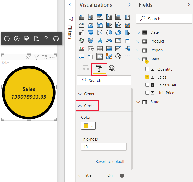
Experiment with the visual's color and border thickness, which you can now control.
Verify that
pbiviz startis running, and in the Power BI service, refresh your React Circle Card visual.Select the Format tab and expand Circle.
Adjust the visual's Color and Thickness settings, and review their effect on the visual.